Header: Courtesy of Xiaodi Xie
Xiaodi Xie is a brand designer based in Los Angeles who grew up in the highlands of Yunnan, China. After studying in New York and working across different global cities, she now runs a studio that creates visual identities for everything from bookshops to sports brands. She is also the co-founder of YarnGi, a home decor brand that turns cultural memories into everyday objects like textiles and pillows.
In this interview, we talk about how her roots in Yunnan influence her work and how her “Trace-Form Design” method helps her turn feelings into clear brand systems. We look at her past success with a bookstore chain in China and her move to the US creative scene. The conversation covers how she keeps brands consistent across different countries and her goal of making design a way for people to connect with new stories and places.

As an award-winning brand designer now based in Los Angeles, your work has expanded from bookstore chains and international visual systems to the launch of YarnGi. Could you share the core vision that currently drives your Los Angeles studio and highlight the projects that best define your focus in 2026?
At the center of my Los Angeles practice is a question I keep returning to: how can design give form to something that is emotionally precise, visually distinctive, and able to work in the real world?
I do not see design as surface styling. I see it as a way of giving structure to a brand’s inner world—its tone, rhythm, emotional temperature, and visual behavior. What interests me is how these elements can come together as a system that feels coherent, adaptable, and alive across different contexts.
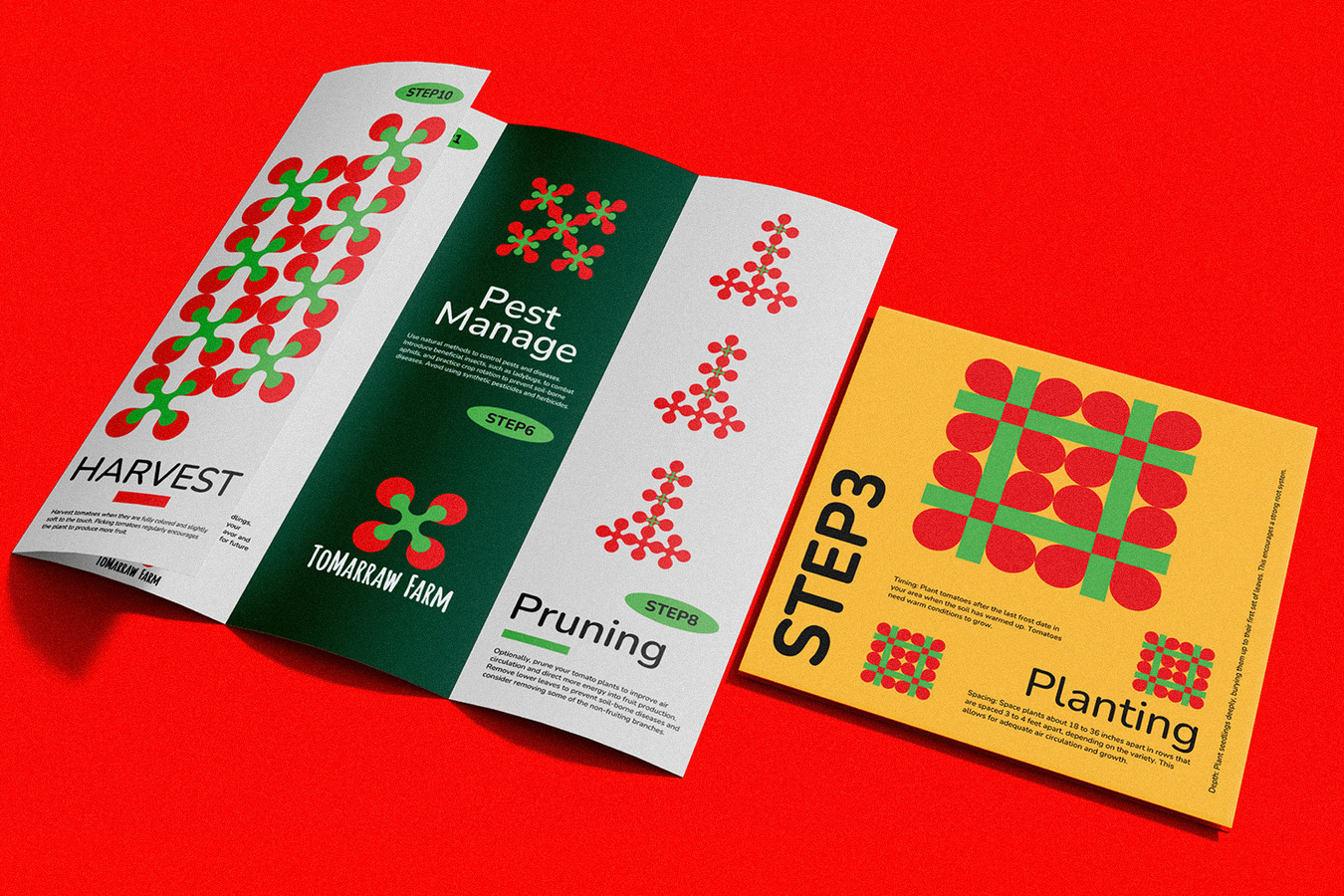
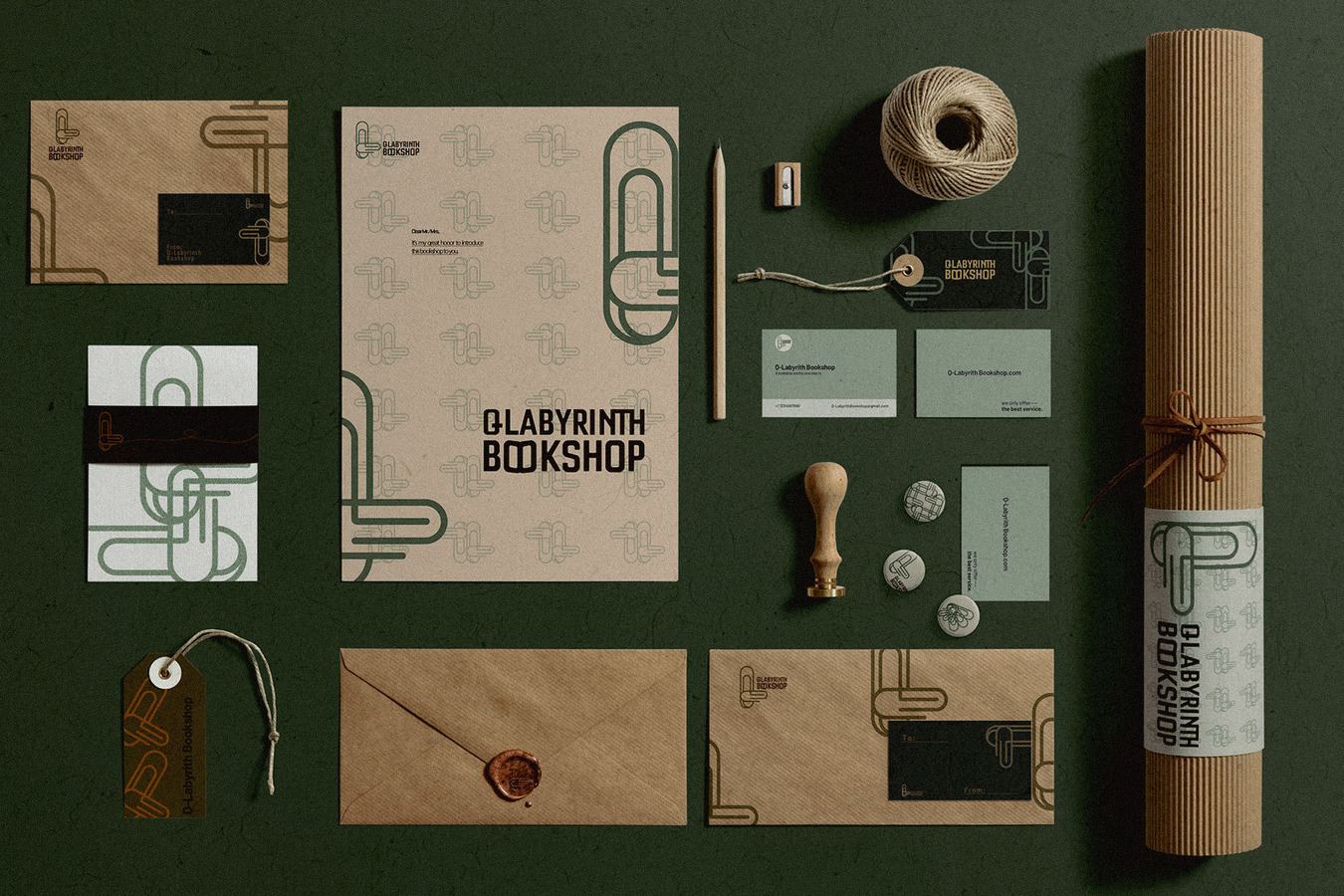
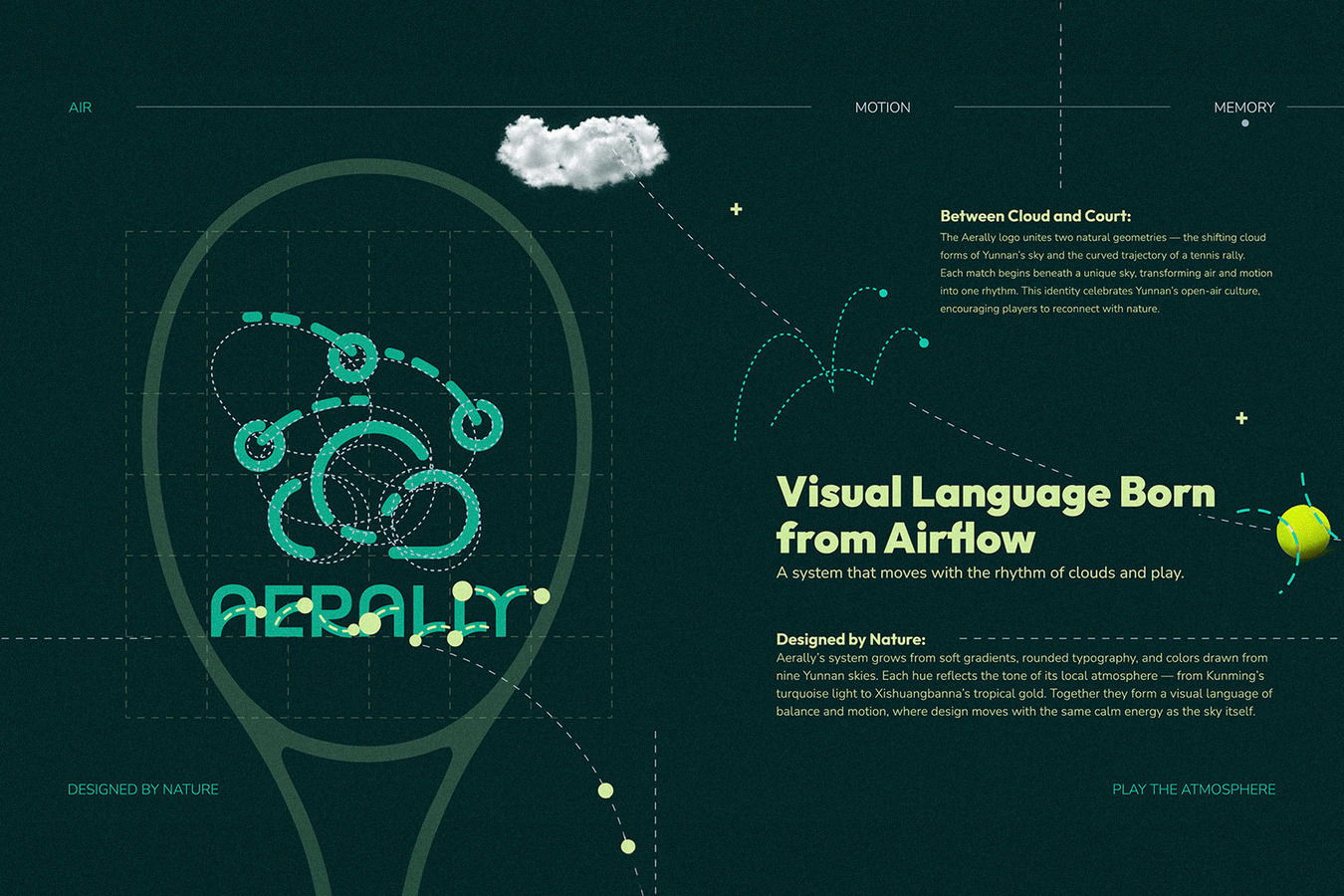
In 2026, my focus is moving toward projects where strategy, identity, and emotional resonance work together. Challenge Bookstore remains important to me because it showed how a visual and spatial refresh can directly support business performance. Aerally represents another side of my practice: bringing poetic atmosphere into a competitive sports identity. Other recent works, including ToMarraw Farm, an IDEA-shortlisted project, reflect my interest in building brand systems that connect product logic, visual identity, and contemporary consumer experience. YarnGi, the home decor brand I co-founded, is a more personal and founder-led expression of this direction. It allows me to apply my design thinking across brand identity, objects, material language, and everyday experience.
Together, these projects define the direction I am building now: design that is conceptually grounded, visually distinctive, and able to travel across markets without losing its inner logic.
The New York Times recently named Yunnan the only Chinese destination on its “52 Places to Go” list for 2026. As a designer from that region, do you feel a new sense of urgency or responsibility to represent your hometown’s heritage to the world?
I would not describe it as urgency in a heavy way. It feels more like a very natural reminder.
Yunnan has always been incredibly charming to me, but not in a postcard sense. What fascinates me is how alive, layered, and unexpected it is. There is color, humor, ritual, wilderness, craftsmanship, food, music, and a very particular way people relate to nature and daily life. A lot of that charm is hard to explain directly, but once you feel it, it stays with you.
I think the challenge is that many places with deep regional character are either over-romanticized or made to feel distant. I am more interested in making that world feel approachable, contemporary, and emotionally immediate. Not by simplifying it, but by finding a design language that allows people to enter it naturally.
So I do feel a sense of responsibility, but it is not about making a formal statement on behalf of Yunnan. It is more personal than that. I want to show that a place like Yunnan can be sophisticated, playful, mysterious, and modern at the same time. Design gives me a way to go for that—to bring out its energy without making it feel frozen or overly explained.
Your Trace-Form Design method seeks to move past simple “East-West” clichés. How do you create a design that feels like a shared global language rather than just a cultural export?
I try not to begin with labels such as “Eastern” or “Western.” Once design starts from those categories, it can easily become trapped in symbols people already expect.
Trace-Form Design begins with the idea that a form can carry more than appearance. It can hold rhythm, atmosphere, emotional weight, and a sense of origin. From there, I ask what needs to remain recognizable and what needs to be transformed. The final work should not feel like a direct quotation. It should feel like a translation.
To me, a shared global design language does not mean neutrality. It means specificity that remains open. The work should come from somewhere real, but it should not require the viewer to already know that background in order to feel something.
That balance is important to my practice. I want the work to carry depth, but I also want it to communicate immediately—through proportion, rhythm, clarity, and emotional tone.
The rebranding of the Challenge Bookstore chain contributed to a 30% increase in sales and helped it earn local recognition as one of the “Most Beautiful Urban Bookstores.” When designing for a legacy business, how can a designer balance beautiful design with the practical realities of retail performance?
For me, beauty is not the opposite of performance. In retail, beauty only becomes meaningful if it improves how people move, feel, remember, and buy.
When working with a legacy business, the first step is respect: understanding what people already trust, what emotional associations already exist, and what absolutely cannot be broken. But the second step is honesty. A legacy brand cannot survive on nostalgia alone. It needs a system that works operationally—clear hierarchy, stronger navigation, sharper differentiation, a more coherent customer journey, and a visual identity that supports sales rather than distracting from them.
The best retail design is emotionally attractive and strategically disciplined. It creates desire, but it also reduces friction. It makes a place memorable, but it also makes decision-making easier. I think that is why that project succeeded: the visual transformation was never just aesthetic. It was tied to behavior, perception, and business reality.
With Aerally, you translated the poetic formation of Yunnan’s clouds into a tennis brand. What is the biggest challenge in bringing “poetic rhythm” into the high-performance, functional world of sports branding?
The challenge is control. In sports branding, everything is pressured by speed, clarity, energy, and usability. Poetic ideas can easily become too soft, too abstract, or too decorative to survive in that environment.
So the task is not simply to add poetry onto performance. It is to structure poetry so that it behaves like performance. With Aerally, that meant translating the movement of clouds into forms that still felt aerodynamic, precise, and competitive. The visual language needed atmosphere, but it also needed tension. It had to feel light without losing force.
I think the most successful sports identities are those that carry an emotional charge beneath their function. They do not abandon poetry; they compress it into sharper forms.
Trace-Form Design is less about following a fixed style than about transforming what is felt, remembered, or inherited into a contemporary visual language. How does this approach guide your creative process without limiting your intuition?
For me, Trace-Form Design is not a strict set of rules. It is more like a sense of direction within the creative process.
I am not a designer who begins with formulas. Very often, my work starts from intuition: an atmosphere, an image, a color relationship, or a strong feeling that something leaves with me. But intuition without any grounding can easily become scattered. Trace-Form Design helps me ask where that feeling comes from, what makes it compelling, and how it can be translated into a clearer and more contemporary visual language.
In that sense, it does not limit my creativity. It helps me trust my intuition more. It allows me to understand what should be preserved, what can be opened up, and where restraint is needed. It does not dictate a final style; it helps me keep adjusting the direction as the work develops.
I have never wanted my work to be recognized only by one fixed look. What matters more to me is having a sustainable way of thinking: the ability to draw emotion, structure, and visual energy from different sources, and transform them into design that people today can understand and feel. That is what Trace-Form Design means to me.
Design is often described in your work as “organizing meaning” rather than just “decorating.” On global projects like YiiEC, how is a brand’s message kept clear and consistent across different countries and languages?
The key is to distinguish between what must stay constant and what must remain adaptable. A global brand cannot rely on literal repetition alone; language, context, and audience expectations change too much. What must remain stable is the core logic: the brand’s position, values, emotional tone, narrative priorities, and visual principles.
Once that core is clear, local adaptation becomes much easier. You can translate wording, adjust emphasis, and respond to cultural context without diluting the brand itself. I often think of it like a score and performance: the composition remains the same, but each setting requires a slightly different interpretation.
This is where systems matter. A strong brand system is not restrictive; it gives different teams a common structure for decision-making. That is how clarity survives across scale.

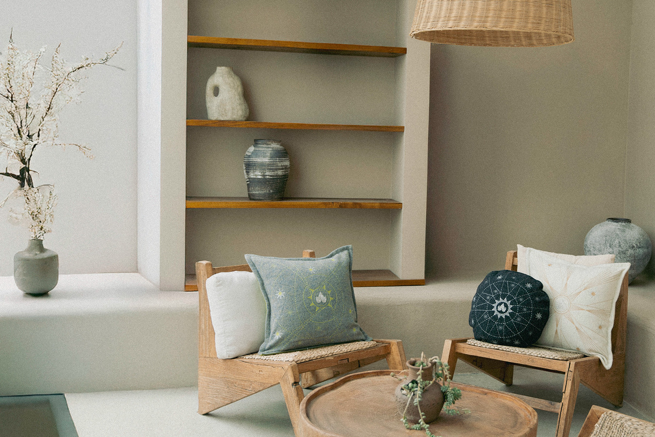
YarnGi is built on the idea of translating regional experience and symbolic warmth into home decor. How is the history and warmth of Yunnan made palpable for a customer in Los Angeles through a single piece of textile?
It happens through layers rather than through explanation. A customer in Los Angeles does not need a history lesson when they first encounter a piece. What they need is to feel something immediate—warmth, rhythm, intimacy, protection, wonder. The textile must first succeed as an object in the present.
Then the deeper layer begins to unfold. That can happen through material contrast, a motif derived from a spiritual symbol, a color relationship that recalls firelight or mountain air, or a form that carries the softness of something handmade and remembered. In YarnGi, I am interested in how a piece can hold both emotional accessibility and cultural depth.
So the goal is not to illustrate Yunnan literally. It is to make its atmosphere palpable. If someone touches a pillow and feels that it is tender but powerful, or playful but ancestral, then something real has already been communicated before a single word is spoken.
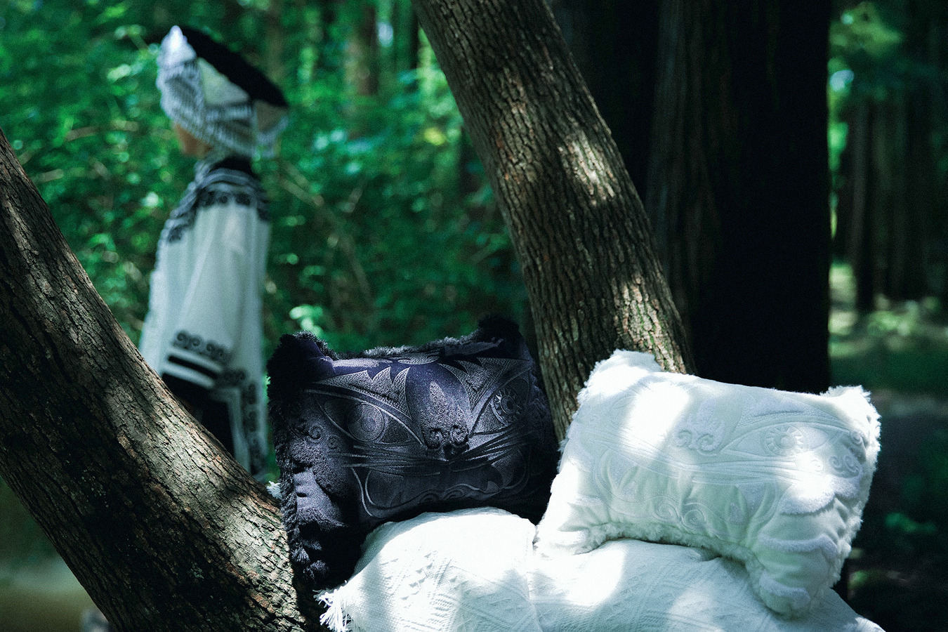
Within YarnGi, collections such as Tiger Lineage and Fire Bloom draw from Yi spiritual symbols. How are these sacred motifs turned into “invitations” for modern homes without making them feel like museum artifacts?
I think the first principle is that these motifs should never be treated as decorative patterns alone. They often carry deeper spiritual functions: protection, vitality, courage, fire, celebration, renewal, and the relationship between people and nature. If a designer only copies their surface appearance, they can easily become empty “ethnic-style” decoration.
For me, the more important question is what emotional role they once played, and how that feeling can enter contemporary life. In Tiger Lineage, the tiger becomes an accessible entry point: it carries strength, protection, wildness, and immediate visual energy. Someone may first be drawn to the color or form, and only later become curious about its connection to Yunnan, Yi visual traditions, and the idea of guardianship. Fire Bloom works similarly, translating fire, celebration, vitality, and renewal into a contemporary visual language for the home.
I do not want these works to feel like museum objects studied from a distance. They should first be beautiful, approachable, and usable, then gradually lead people toward a deeper story. For me, an “invitation” means offering an accessible point of entry that naturally sparks curiosity about Yunnan and the richer visual traditions and ways of life behind it.
Looking ahead, what kind of role do you hope design can play in a world where people are constantly moving between places, identities, and ways of living?
I hope design can become a form of connection, but not in a heavy or overly formal way.
Many people today live between different places, languages, and identities. We may be born in one place, educated in another, and build our lives in a completely different city. For me, the power of design lies in its ability to organize these scattered experiences and turn them into forms that can be seen, used, and shared.
I want my work to keep that sense of movement. It does not need to be defined by a single identity, nor does it need to explain itself too completely. It can come from a specific place while entering a more open contemporary context. It can carry traces of personal experience while still being understood by people from very different backgrounds.
That is the direction I want to continue exploring: how design can be rooted yet contemporary, emotionally resonant yet able to function in real markets and real life. For me, good design is not only about solving problems. It is also about creating new ways of encounter—between people, places, objects, and imagination.