Header: Federico Kulekdjian
As companies and brands start to understand how important it is to show their character in the market, they also start to turn their heads to their home: the office. Having an office that not only shows exactly what a company stands for but also creates a comfortable environment for their employees shows that there’s an authentic concern for the brand’s influence in the world. More importantly, when employees are given a nice space to work, they start feeling more connected to their company and can become more efficient and productive, making good design a win-win for everyone involved.
Knowing this, the next step when a brand wants to revamp their office space or start anew is to choose the best design studio to help them share their values and bring their vision to life. Some offices may care for comfort, others for aesthetics, but one thing they all have in common is that the end product must be a reflection of the brand’s culture and of the employees’ needs.
Because getting inspiration never hurts, we decided to put together a little list of office designs that recently caught our eye. From people-centric design to top-notch research facilities in World War II buildings, join us as we explore some options that bring offices into our century, both in aesthetics and in work mentality.
Y Fashion New Media Studio
This office is a 300-m2 single-story old factory set in the Wan Niancang-Cool Creative Park in China. The location has seen many changes throughout the years, as it is part of an urban renovation project.
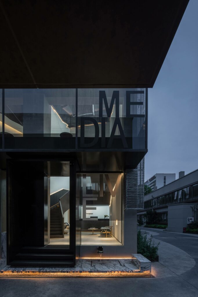
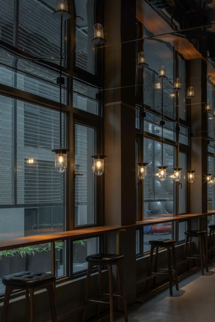
The Y Fashion New Media Studio was designed with the company in mind: a self-media company that strives for creativity and is constantly on the lookout for new customers and original minds. The goal of the design studio responsible for the project, The One Architectural Design, was to inspire the employees’ creativity and innovation through ingenious design while also bringing the attention of the public to the company. The design focused on the façade and interior design, both essential to achieving the primary goal of the renovation project.
As the wants and needs of the public are constantly changing due to globalization and the internet, media companies face several changes that, before, would have been silent. Now, a media company doesn’t only care about material scarcity or the next big character; it also becomes important to make sure that such a competitive field doesn’t end up leading to burnouts or negative emotions. As employee health and well-being gain a spotlight in our days, otherwise production, efficiency, and market competition would be lost, so design needs to address these problems and find solutions.
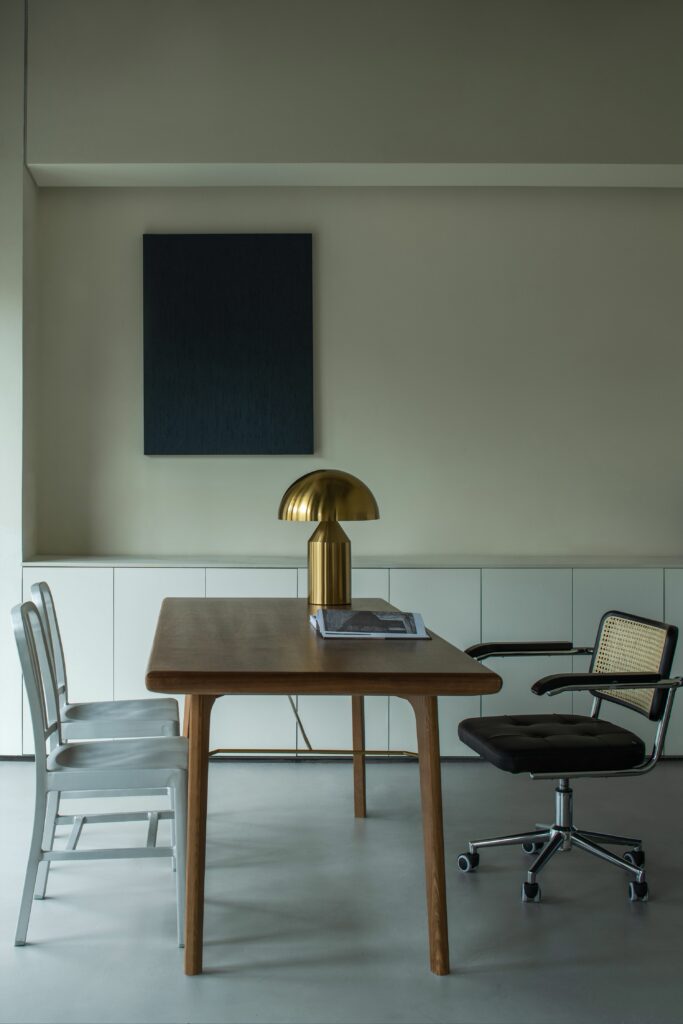
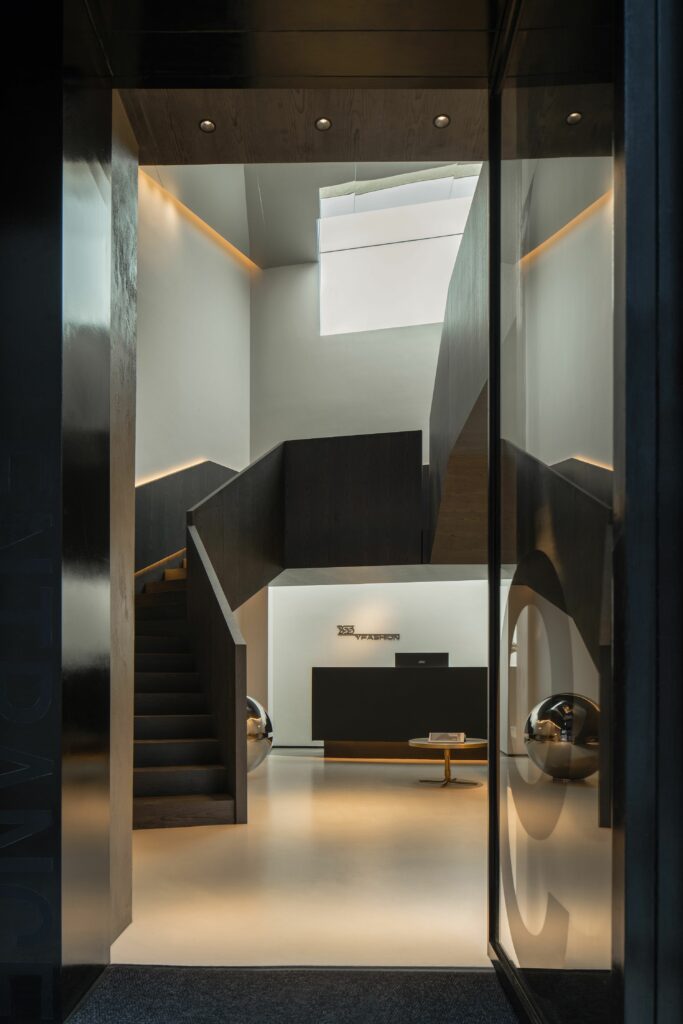
The team of designers, led by Wang Liang, developed a design able to create unique emotional, professional, and spiritual experiences for anyone that comes into contact with the office using the following three strategies:
- Infuse the office environment with elements that are both artistically profound and avant-garde. By integrating both, the office becomes a place where creativity and out-of-the-box thinking are profoundly stimulated.
- Protect collective memory by creating a space that respects and preserves the past while looking towards the future. By preserving part of the old building and adding modern touches, the new office shows both character and a sense of continuity.
- Balance shared and private spaces, encourage individual exploration, and create a community-style experiential office atmosphere with emotional warmth.
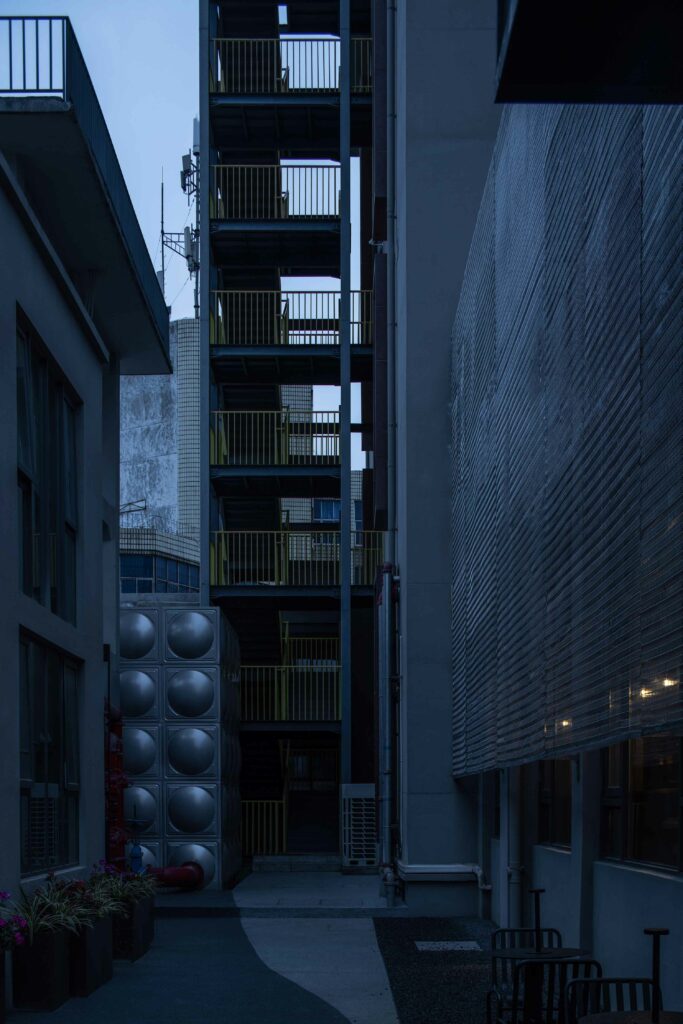
The Research Yard
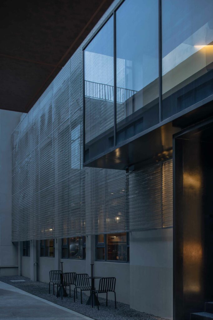
The Research Yard is a collaborative space for students of the Pratt Institute to do their research surrounded by a multidisciplinary environment, all within the walls of history: a World War II industrial building. Here, the students are presented with the chance to involve art, design, engineering, and technology in their research, or simply to admire the existence of so many fields of study.
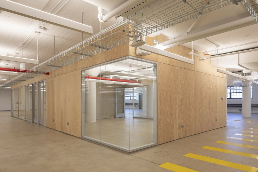
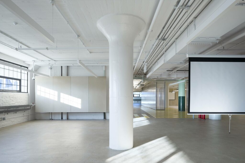
The new research space takes on an open workspace plan, consisting of a robotics area, fabrication labs, and conference rooms. By blending architectural historic elements with more modern ones and by making sure that every student, no matter their academic path, has a space to study and do their research, the Research Yard successfully becomes a concept in itself: connecting the past with the present to build the future.
Design studio Smith-Miller + Hawkinson Architects, with Laurie Hawkinson as the project’s lead designer, prioritised daylight and openness, making the space comfortable and appetising—any student knows the difference it makes.
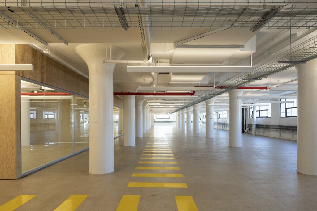
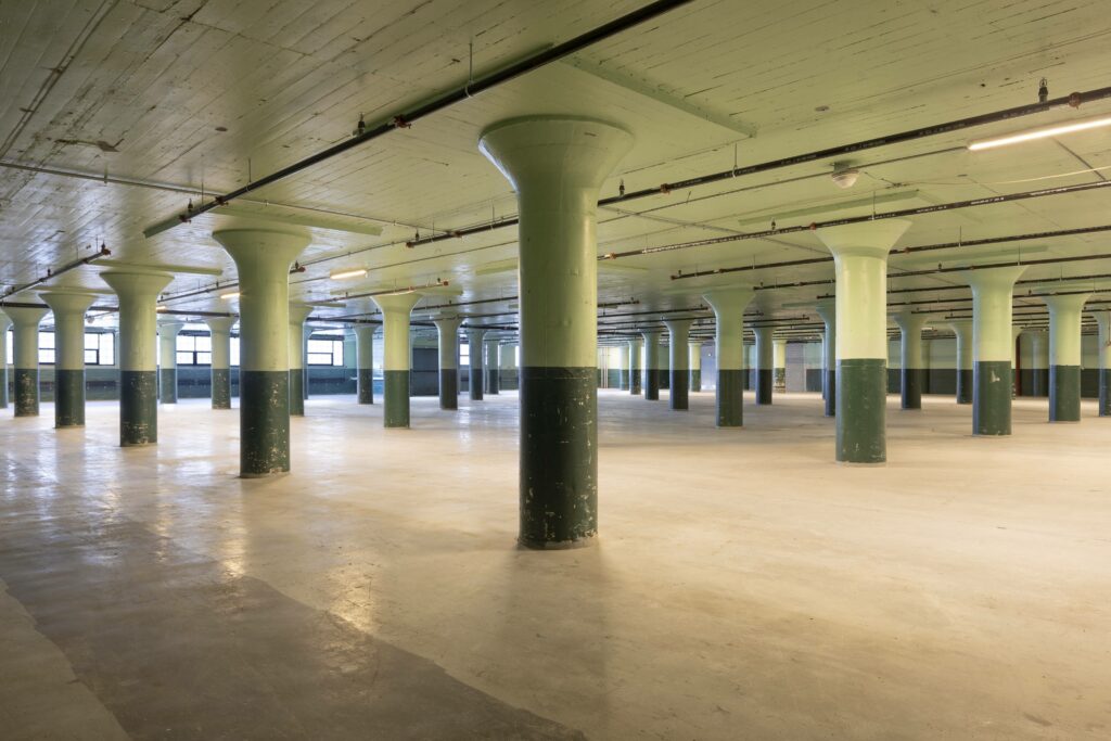
The space near the windows was made to be an informal meeting point where students could leave their focus spot and breathe for a bit. In the middle of the conference space, the team decided to leave huge green columns untouched, keeping the building’s industrial history alive. Throughout the interior, yellow floor stripes establish a hierarchical circulation pattern, making organisation and energy flow simple.
Bouchard
The Bouchard office space was renovated with modernization and change in mind. The brand knew that times change and that work flow follows, so creating a new office where employees can enjoy spending their day and work efficiently was a must.
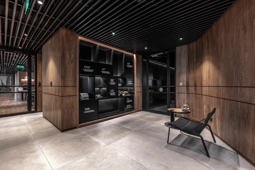
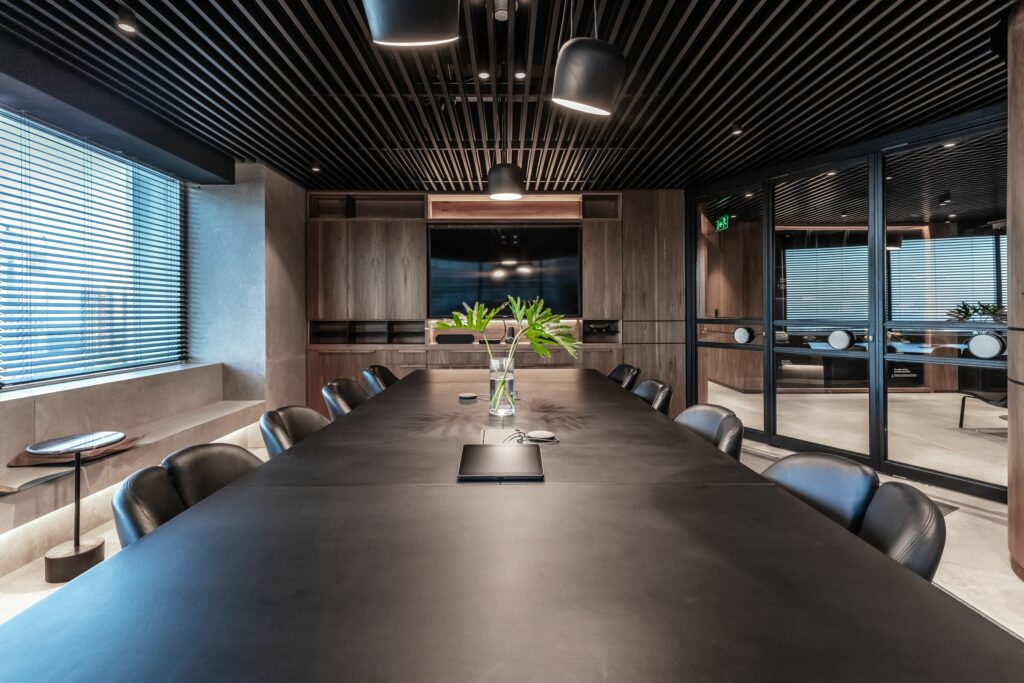
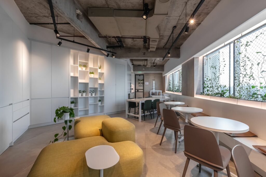
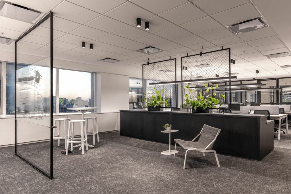
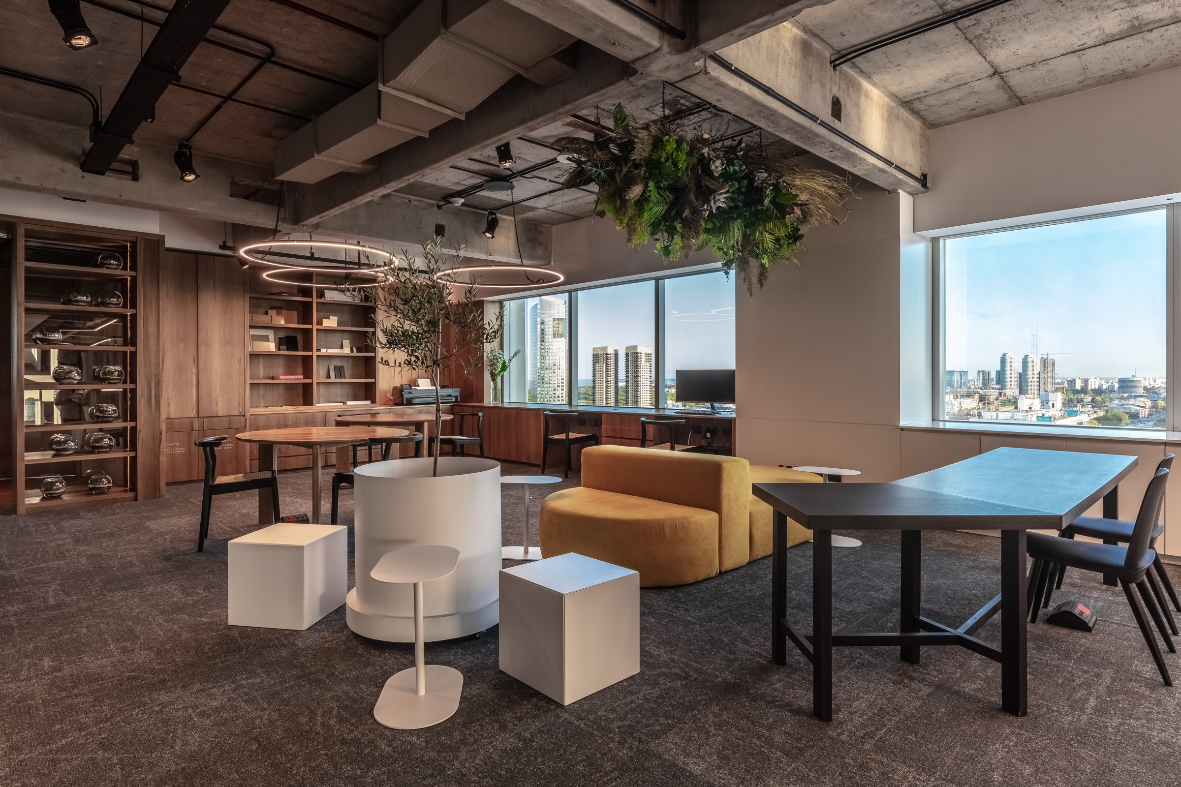
The new office, designed by Paolini Arquitectos, is people-centric, promotes collaboration, was designed with sustainability at heart, and is transparent. These characteristics are possible due to the flexibility of the space, as it is able to be open enough to allow for multidisciplinary collaboration while also allowing each employee to have their own privacy.
As the company separates departments through minerals, the designers decided to use such an interesting concept in the design. The lead designer, Francisco Paolini, is able to open up a dialogue between the materials used throughout the building with the employees and the clients, an incredible display of knowledge of how design works. The different minerals are reflected in the flooring, finishing touches, and on the ceilings.
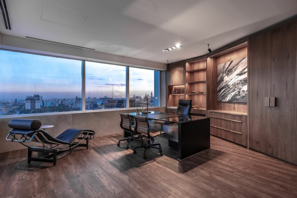
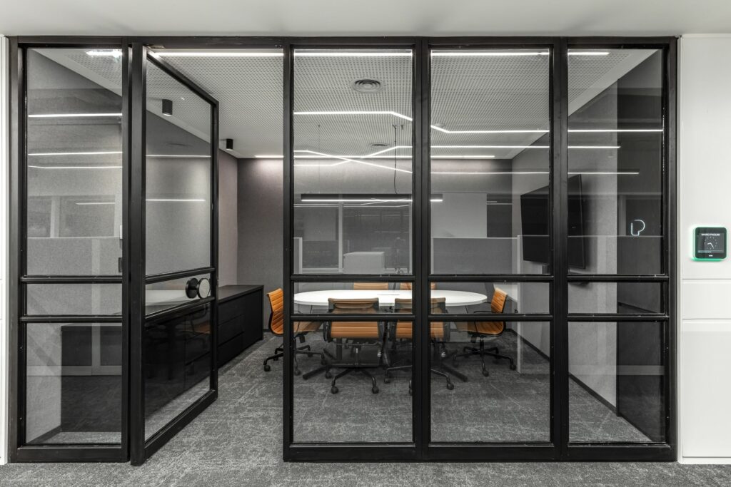
The flexible workspace allows for its smooth use. The office is divided into departments, work areas, and also leisure zones, allowing socialisation to play a big role in the company’s culture. The office houses a multi-use space for training, private telephone booths, board rooms, individual workstations, and relaxation spaces.
The designers made sure that natural light was present all throughout the building, going even further when it comes to sustainability by adding water and energy-saving devices to the building, as well as waste separation centres and bicycle storage spaces.
