Header: Dmitriy Suvorov
In the world of beverages, PIMS is known for its unique approach to developing tea and coffee. Their care for creating the perfect recipe and finding the best ingredients can be felt in the taste, drinking their products is a whole experience. Dubai can be considered similar to PIMS in its own way since it has grown so much in the last century by always investing in innovative projects. In the end, this grand city in the desert met PIMS when the brand decided to open its flagship store in the Dubai Mall with the help of designers from Kidz Studio.
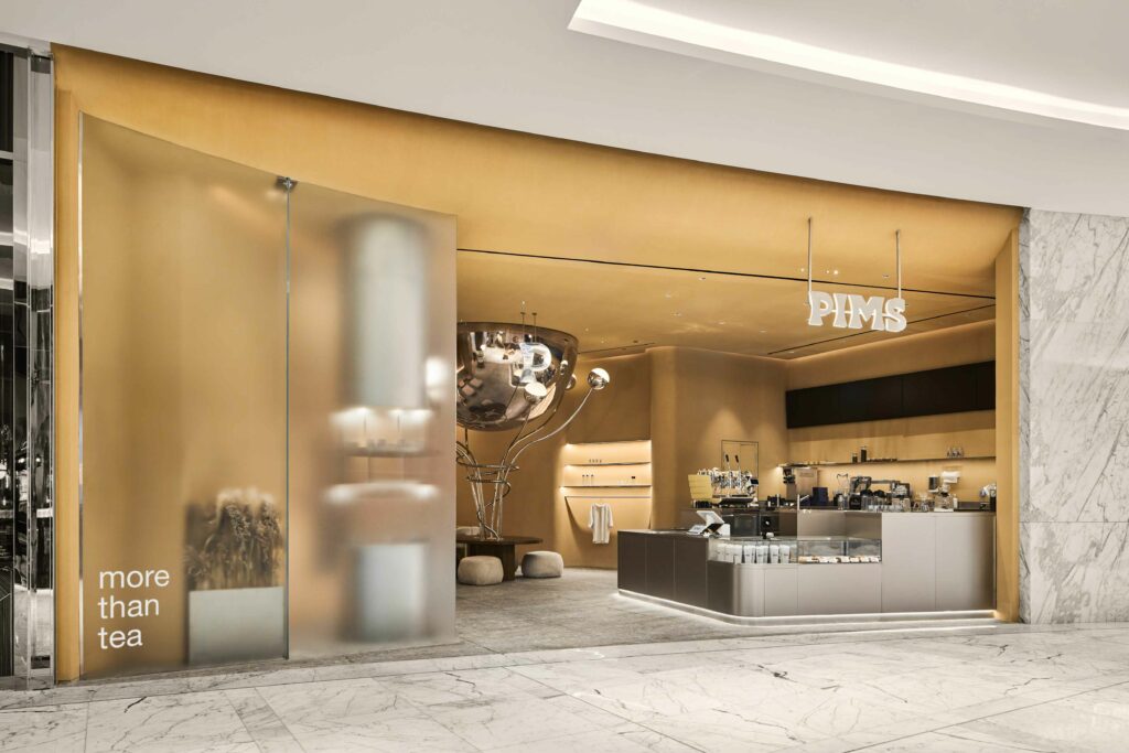
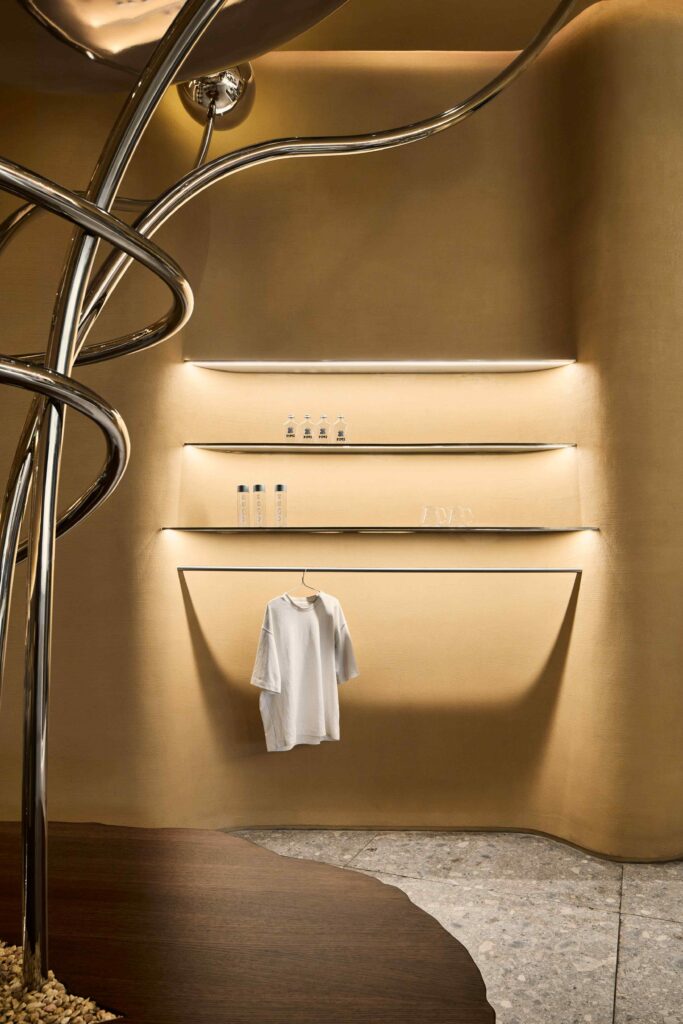
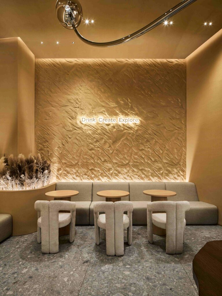
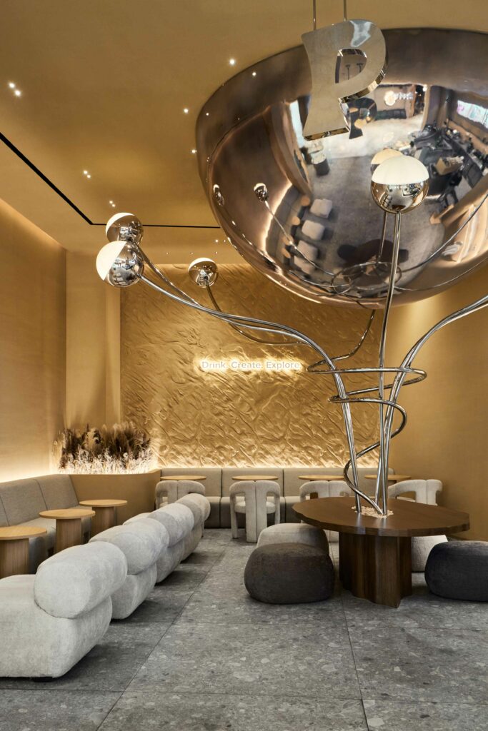
The new store was set in beige and soft edges, as there are no corners and everything seems to flow together in complete sync. These choices go back to the very characteristics of Dubai, as it is a city where modernity and the Emirati desert heritage seem to mix seemingly with no difficulty. The colours, shapes, and textures chosen for the story are, therefore, reminiscent of the tones and fluid lines of the desert landscape—even the surface of the walls is decorated with horizontal furrows, similar to the stripes left by the wind on a dune.
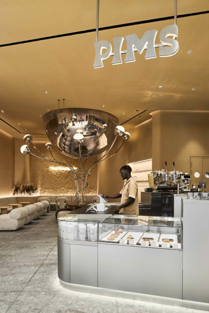
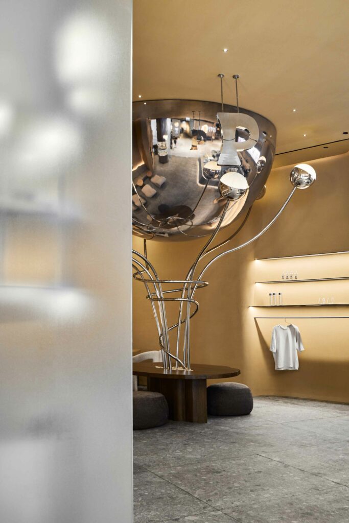
In the middle of the store, a huge silver half-sphere appears from the ceiling, surrounded by metallic flowers sprouting from underneath it that seem to be going towards it. This silver sculpture symbolises the contrast between the brand’s technology and the flowy nature of the desert. The flower stems and buds are made of polished stainless steel, and the half-sphere is covered in metallic paint, allowing them to reflect the entire store and, more importantly, the visitors. The brand takes great care of its customers and how they identify themselves with the brand. That’s why having what is essentially a giant mirror right in the middle of the store is so important: the customer becomes as much a part of the interior as all the other elements.
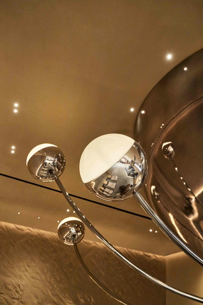
The brief for the seating options and lighting design revolved around “cosy,” “comfortable,” and “custom-made.” As PIMS cares so much about its customers and their experience with the brand, its flagship store also serves food and desserts alongside drinks, so the designers developed two different sitting areas: a semi-lounge and a classic restaurant. The different areas differ in the height of the tables and the chair types since the customer’ comfort is of the utmost importance. The central table is, however, lower, and the chairs that surround it are puffs. This design choice comes from the region’s traditional seating of the tea ceremony when everyone sits on cushions on the floor and watches the rituals of the tea master.
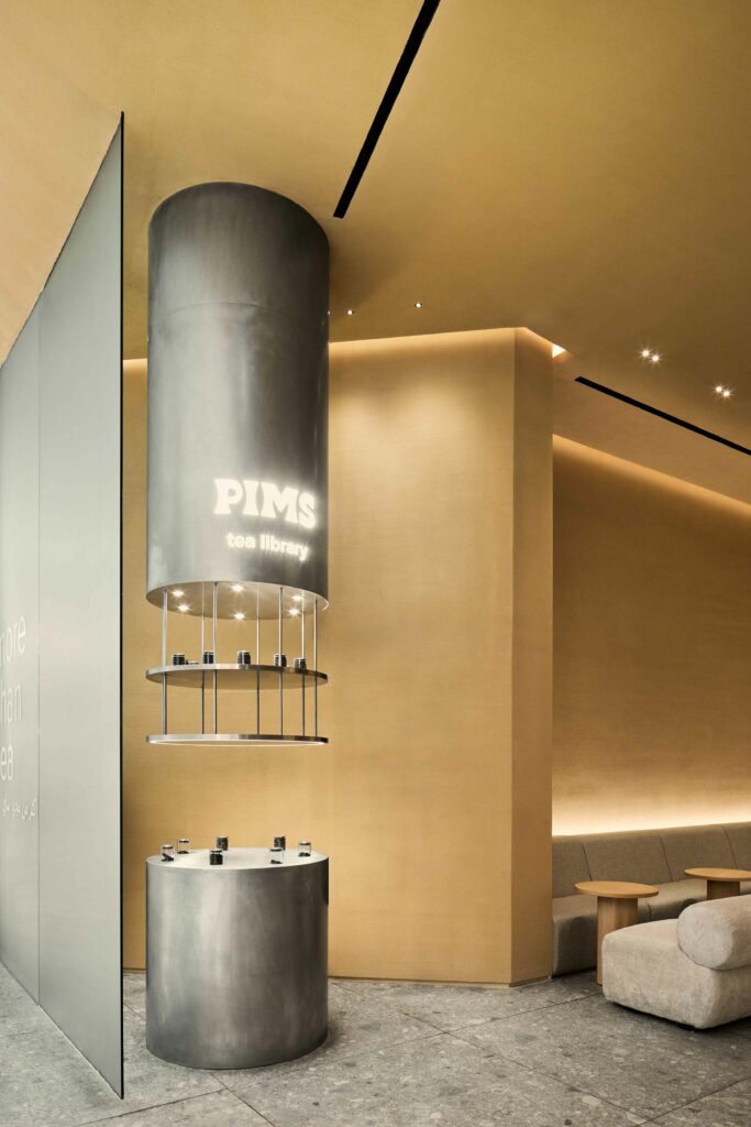
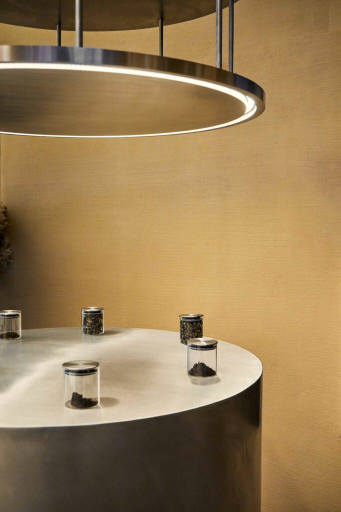
To showcase PRIMS products, the store has a merchandise area, a tea station, and a huge interactive screen where guests are invited to learn more about the brand and its products. This layout not only produces a visual effect but also allows guests to delve deeper into the topic of tea. Each guest can not only try a new drink but also learn how and from what it is made, buy tea leaves to learn how to brew it at home, and even buy a stylish glass thermos to have the complete experience no matter where they drink the tea at.
