“Encourage innovation. Change is our lifeblood, stagnation our death knell.” – David Ogilvy
Ogilvy is an agency on the move. After several acquisitions and an identity change, the group wanted to make some organizational improvements. It considered relocating but ultimately decided that optimizing its existing offices was the best move. Located in a neighbourhood whose character gives the agency a strategic edge, securing an adjacent space made it possible to proceed with the project.

Photo credit: Stephane Brügger
Innovative and classic notes in balance
The firm has always excelled at creating original ideas. Using that fact as a starting point, the project focused on highlighting Ogilvy’s identity and history to support the company’s talented people.
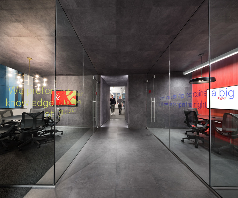
The concept for the new spaces was built on two distinctive elements: the leitmotif is the founder, David Ogilvy; the red background, the brand’s signature color, is integrated into a sleek environment underscored by a simple palette of contrasting black and white. The goal of the planning process was to create connections and provide a platform for different kinds of teams to embrace the space in ways that fit their needs.

Photo credit: Stephane Brügger
Creating a hybrid public and private space
The space is a multifunctional hub, sensitive to human needs and fertile for discussions. The design brief was to develop a public space for hosting and collaboration, as well as keeping private workspaces with different levels of privacy.
The reception desk and its boutique hotel-style quartz countertop are positioned to be more open to the outside. Visitors and clients are welcomed with a glance, a smile, and a coffee. The reception area does double duty as a lounge for discussion and collaboration, both formal and informal. It is a place where clients, employees from different departments, and partners interact daily.
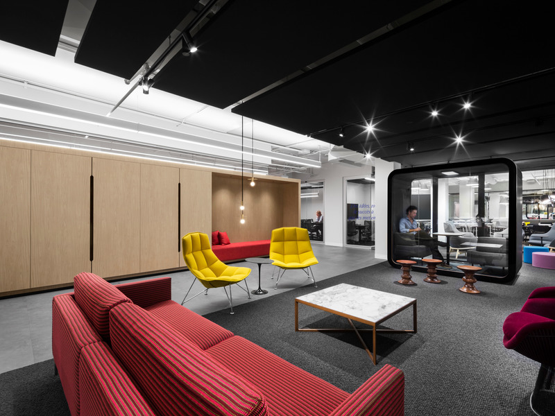
This lounge, featuring classic 1950s furnishings, is a place for creative encounters where the improbable can become inevitable. There is classic furniture by Knoll and Herman Miller, under a custom-made black acoustic ceiling punctuated by accent lighting that provides a sense of intimacy. The finishing touch is Mohawk rugs, which dampen sound in the open space.

Photo credit: Stephane Bruggere
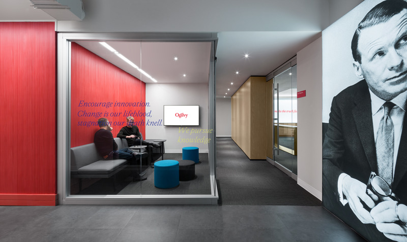
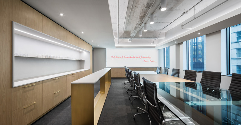
As we follow the directional element (the red core) the space is divided into progressively more private zones. These successive spaces are for formal meetings, creative work, and presentations – their capacity ranges from two to 20 people. Turning the corner into a hallway, we see a portrait of David Ogilvy. A source of inspiration and encouragement, his presence remains personified in his quotations, which are applied to the glass surfaces. The new third-floor design, which includes a 50% increase in floor space, was modified to host collaborative work and to be suitable for receptions and all-hands meetings where the firm’s milestones are celebrated.
Ogilvy’s Montreal offices span two floors. Because the fourth floor will remain operational for the medium-term, the rethinking of this space was done on an ad hoc basis, with the main focus being put on the third floor. This choice helped highlight the firm’s values and made it possible to meet its needs, while also optimizing both the use of the space and its visual impact. The production and creative teams have retained their existing dynamic in their upstairs work units and they have gained spaces for collaboration and interaction on the third floor.
The bottom line on this project is that it strikes a fine balance between opposites: a vibrant and intense space that’s also comfortable, streamlined, and intimate.

Photo credit: Stephane Brügger
Source: v2com newswire


