Creating a stunning exhibition space design is an art in itself, requiring attention to detail and understanding the unique needs of each art exhibition. While some museums focus on arranging artifacts neatly, others aim for immersive experiences with interactive elements. Creating a stunning exhibition space design is an art in itself, requiring attention to detail and understanding the unique needs of each art exhibition. While some museums focus on arranging artifacts neatly, others aim for immersive experiences with interactive elements. Intertwining these elements and creating a good exhibition space design requires time, effort, and a great eye. In this story, we would explore how this process works and how each element contributes to achieving this goal. What is more, we’re going to explore some examples that have become winners at the BLT awards and surely must be visited.
Layout
One of the things to consider when designing art exhibitions with interactive elements is the layout. You certainly wouldn’t want people crammed in one place when there is more than enough in other parts of the building in which the event is taking place. Planning the flow of visitors is really important because that would allow for the even distribution of people across the whole exhibition and ensure that each and single product is seen and noticed.
Lighting
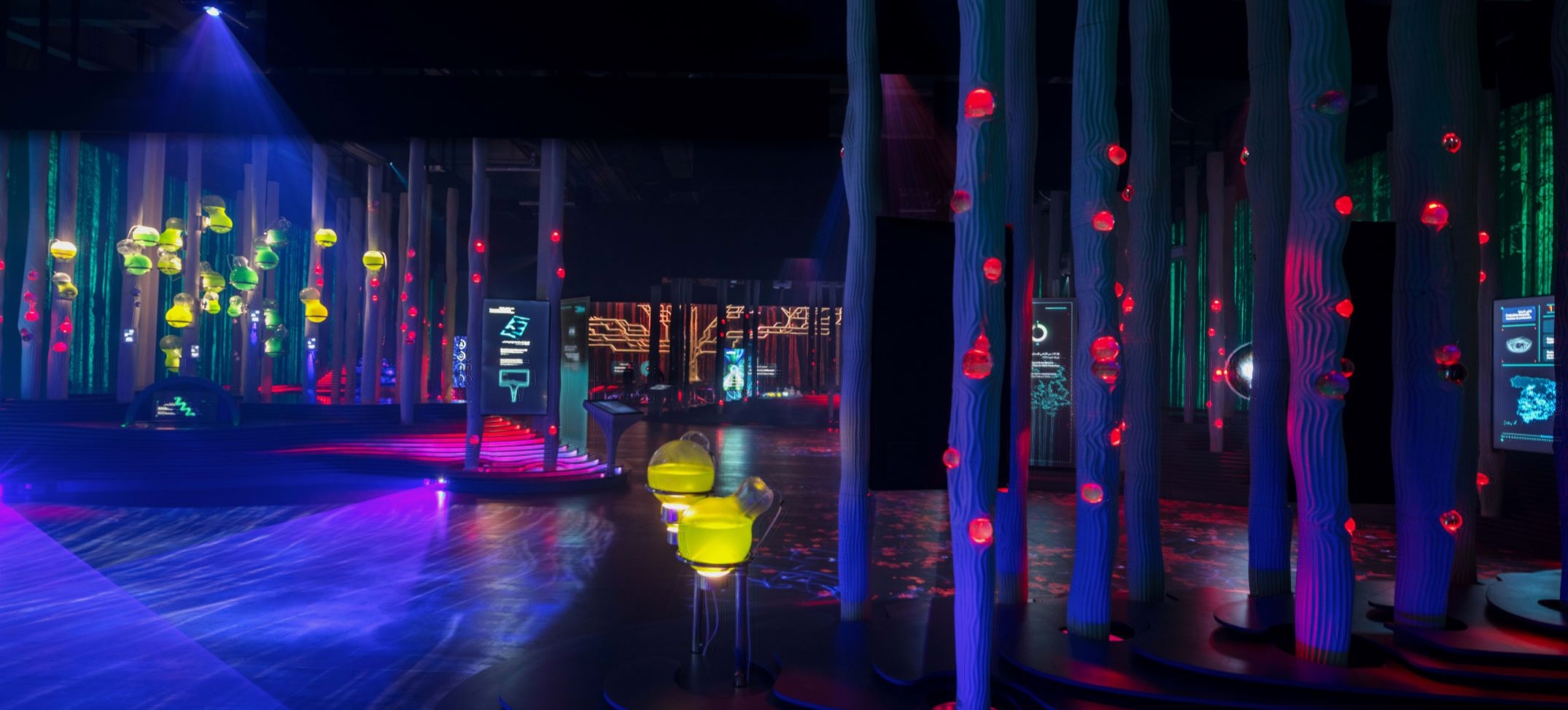
The second key element is the lighting because it can set the mood and the expectations of your visitors. Dark and light would definitely play a role in the tone of the exhibit. In addition, when there are immersive elements such as screens and colorful lights around that would move in a certain way, having a dark space would most likely create a better environment for enjoying the art.
Color and texture
And while lighting plays a major role in setting the exhibition, color, and texture contribute to establishing the general mood. Without them, it would be extremely difficult to create a cohesive theme and mood. Applying a specific color palette tells a story to the visitor. It creates and expectation that hopefully will be fulfilled by the exhibition. Moreover, color is very important for any immersive experience because our eyes are one of the senses that comprehend first, and therefore colors have to be aesthetically pleasing.
Signage and Graphics
How signage and graphics interact with the rest of the factors just gives more information for the visitors to dive in and enhances their experience. In order to fully immerse in the mood of the exhibitions all of the above-mentioned facets need to complement each other in order to build upon each other.
Examples
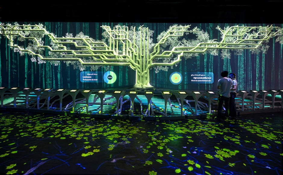
In theory that may sound a bit complicated, but these three examples of art exhibitions would exemplify perfectly how to combine all different elements. First is the Spanish Pavilion Exhibition by Carmelo Zappulla which centers on the relationship between sustainability and collective intelligence. This exhibition comprises some of the most relevant contributions of Spanish culture to the World and highlights its relationship with Arab culture. In the end, visitors would find themselves in a techno-forest that is seen as a laboratory of the future intertwined. The trees are 3D printed with bioplastic polymer mixed with a natural mineral compound that has the property of capturing and mineralizing some of the main gases of the greenhouse effect and pollutants.
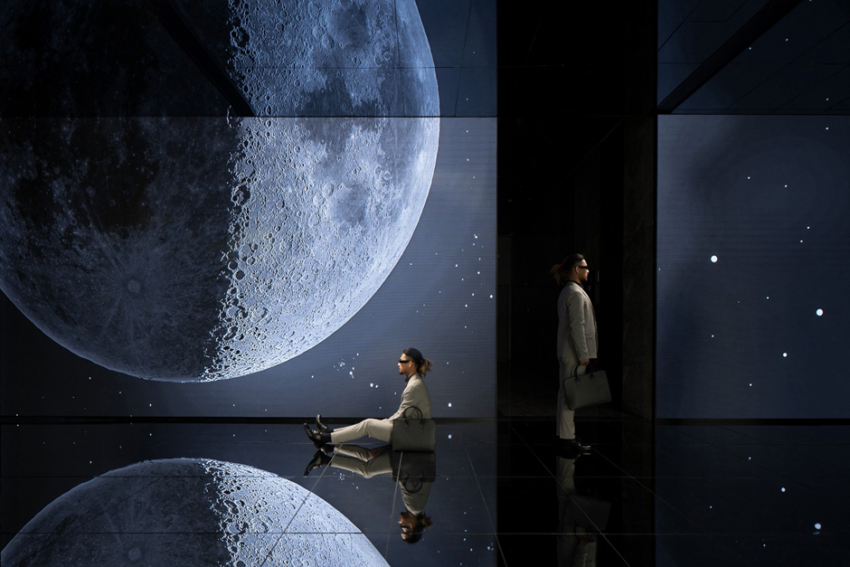
The second example that illustrates an impeccable combination of immersive experiences and interactive elements is the Tiger Wings Cloud Factory Digital Centre by Yajing Li. This exposition shows how technology can blur the boundaries between space and our desire for the unknown. The design team incorporated technology and art design for a better cosmic effect. The project has a space area of 1 700 square meters and attracts visitors with changing vision on the moon display screen.
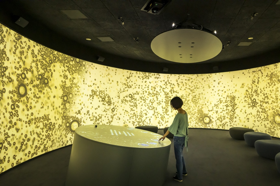
Last but not least is the Pressoria, located in Aÿ-Champagne, France. It is a sensory, poetic, and engaging visitor experience that tells the story of how champagne is produced in the region of France. The designers decided to create an experience in which with every dip, the visitors would enjoy an exciting mixture of elemental ingredients, geological forces, and cultural practices. The installations express the basis of champagne: a textured, scented piece of chalk, displayed like an icon, communicates the geology of Champagne. The majority of the visitor experience is the interactive, walk-in cinema, celebrating ‘bubbles’ as a joyful expression of the essence of champagne.
Conclusion
By considering and combining layout, lighting, and interactive elements exhibition space designers have the ability to create an outstanding art installation. In this way, the space designers could create spaces that complement and elevate the works that are displayed. And as technology evolves it is extremely likely that exhibition space design is going to incorporate more immersive and interactive facets. They give the chance of visitors to fully immerse themselves in the environment they are in and have an experience on a different level than just passively consuming.


