‘Paris 1924: Sport, Art and the Body’ is the new exhibition at The Fitzwilliam Museum, Cambridge, featuring exhibition and graphic design by architects and exhibition designers Nissen Richards Studio. The show, which opened on 19 July and runs until November, revisits the Paris Olympics of 1924, a seminal moment in terms of changes to the way the sport was represented – and coinciding with the city hosting the summer games one hundred years later, with the Paris Olympics 2024 opening on 26 July.
Background:
Paris 1924 was the first truly international games, hosted in a multicultural city defined by art, jazz and fashion. The meeting of Paris’s modern styles with the Olympics’ classical inheritance created striking images and cultural impact for the event. At a moment in time, in the wake of World War One, attitudes to the body and physical fitness, gender, nationalism, race and class were changing as quickly as attitudes to art and music. The mass dissemination of print media, the rise of consumerism and the advent of commercial cinema turned medal-winners into marketable celebrities of the day.
This exhibition, which has been overseen and created for The Fitzwilliam Museum by two Cambridge University curators, also underlines the connection between the university and the 1924 Olympics. Of the thirty-four medals secured by the British team in 1924, nine were awarded to Cambridge students, including sprinter Harold Abrahams, later immortalised in the film ‘Chariots of Fire’.
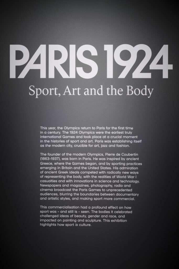
Nissen Richards Studio was commissioned for the design of the exhibition after winning a competitive pitch, having also worked with The Fitzwilliam Museum previously on two exhibition projects, including 2021/22’s critically acclaimed Gold of the Great Steppe.
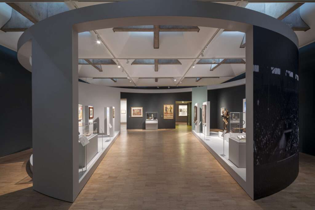
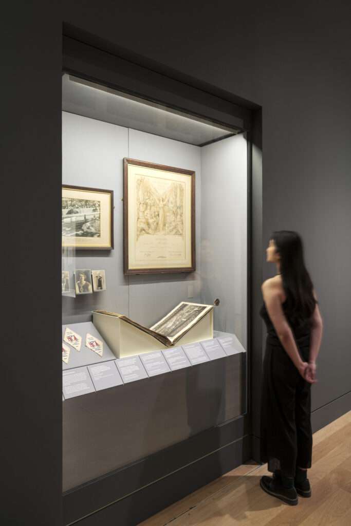
The brief for ‘Paris 1924: Sport, Art and the Body’ was that the exhibition’s designs should locate the audience firmly in Paris in the 1920s, via an approach including images of the 1924 games themselves and, crucially, of the competitors, as well as allusions to iconic Paris landmarks and the purpose-built architecture for the Olympics, including the state-of-the-art stadium in Colombes, which featured on entry tickets and stamps.
The design for the six-section exhibition, each of which stresses a particular aspect of the games in its societal and cultural context, needed to enable moments of encounter with individual works and stories that would provoke emotional responses and require contemplative space – from the recorded voice of Harold Abrahams, looking back to 1924 and recounting his triumph in the 100m sprint, through Black athlete DeHart Hubbard’s letter full of resolve written to his mother as he was about to set sail for Paris, his extraordinary achievement yet to take place, to the unexpected triumph of the Uruguayan football side, who had travelled all the way from south America in steerage, going on to mesmerise Europe with their skill on the pitch and winning gold.
Design Approach:
‘Our design approach was to create a spatial narrative that would immerse the audience, inviting them to participate and not be mere spectators’, Pippa Nissen, Director of Nissen Richards Studio commented. ‘We used various design theatrical techniques of scale, vista, display and film to bring the exhibition to life, creating a strong sense of place and time and communicating spectacle and drama, so that visitors would become involved in the stories of great human endeavour the Olympics always delivers.’
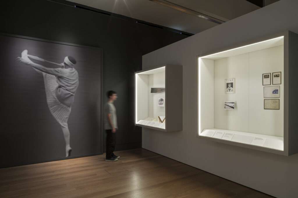
The team’s designs sought to celebrate the human body in motion via 3D interventions that are dynamic and rhythmic – and always implying movement. The colour palette references the original graphics and visual representations of Paris 1924, whilst the graphic scope includes banners and wallpaper; exhibition and section introductions; showcase backdrops and object labels featuring bespoke typography.
Design Walk-Through
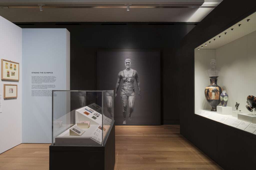
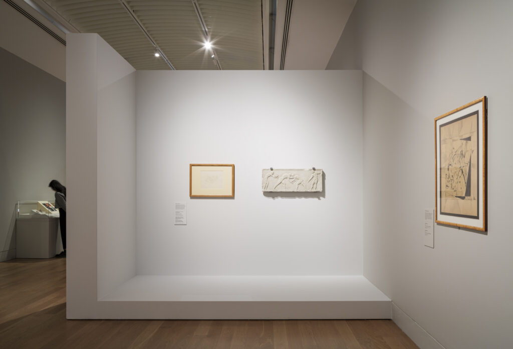
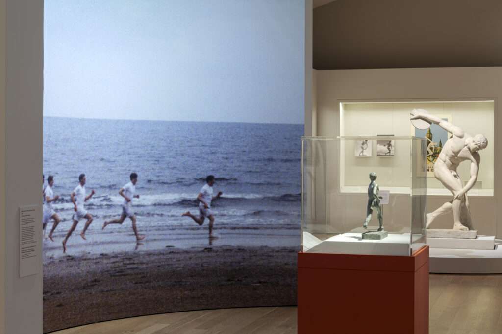
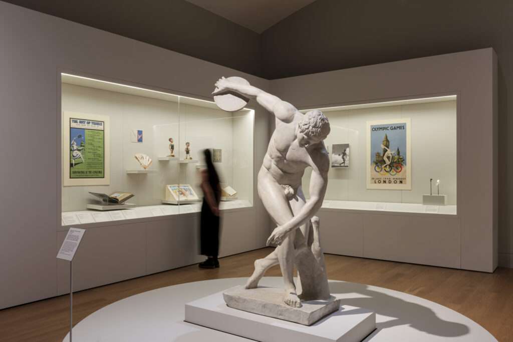
Section one of the exhibition considers 1924 in contrast with the early Olympics in an ancient and modern sense. The centre-points are two Greek sculpture plaster casts, including ‘Hercules wrestling with Antaeuss’, to illustrate early Olympic ideals, whilst films of the 1924 opening ceremony play. We also see an ancient gold medal winner’s amphora (porcelain vase), whilst modern-day objects, sourced far and wide for the exhibition, include graphic collateral from 1924, ranging from posters and postcards to entrance tickets.
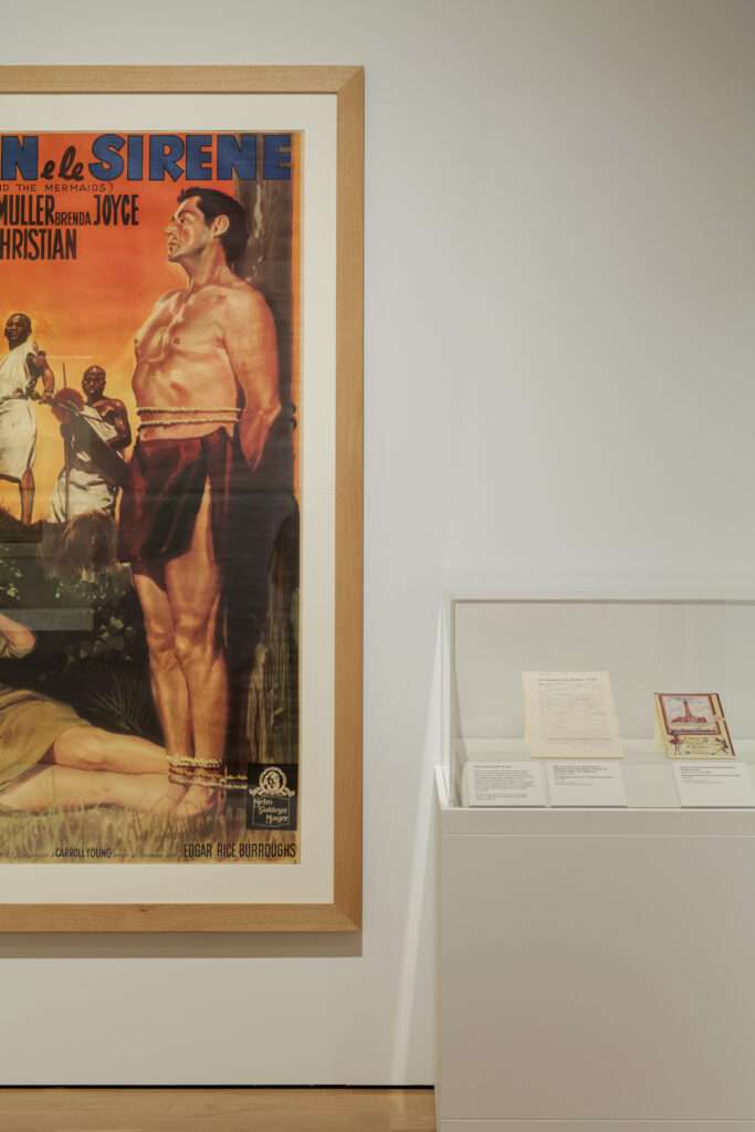
The second section is called ‘Whose Sport?’ and focuses on examples of athletes who took part in the Great Britain team, with Cambridge athletes of special interest to a local audience, including Harold Abrahams, Eric Liddell and Douglas Lowe. Other focus areas include British women at Paris 1924, including winning swimmer Lucy Morton, who was unusual for the period in hailing from a working-class background. International athletes also feature, with the section’s focus on who was represented in this era, from the Yale Rowing team to the Uruguayan football team and Black American high-jumper William DeHart Hubbard, whose letter home to his mother offers a great sense of emotional connection. American swimmer Johnny Weissmuller, later to find movie fame as Tarzan, is another focus personality, beginning his five gold medal haul at Paris 1924.
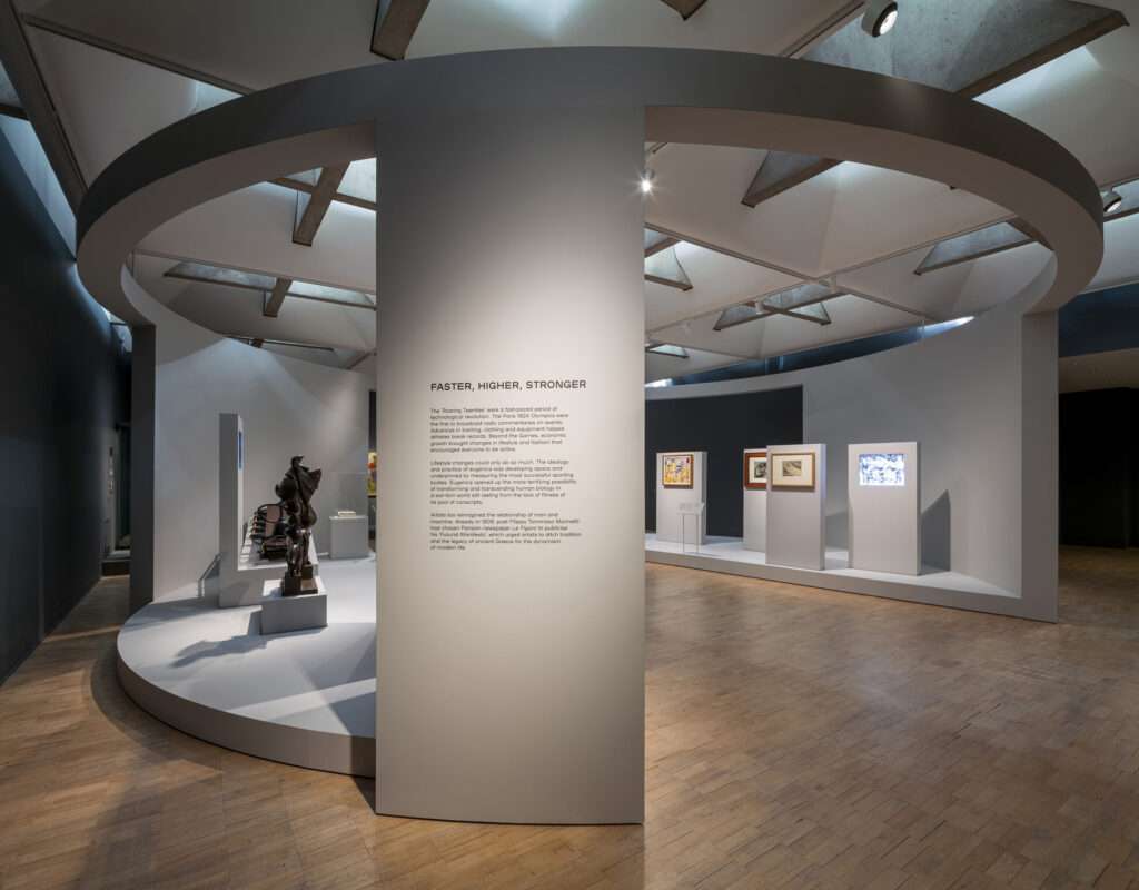
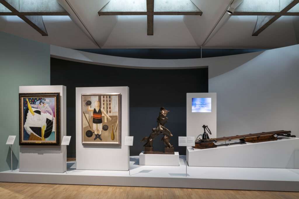
Section three is a large room set with a central circular section. Called ‘Faster Higher Stronger’, this area considers the games in the context of the art and design of the times, as well as technology and the beginning of a more industrial culture. The curved walls house films of the bobsleigh team and bike racing. A major artwork here is Boccioni’s Striding Man, on loan from the Tate. In art, we see how the moment marks a change in style to new ways of representation, including Futurism and Cubism, portraying movement like never before. More advanced theories of architecture, generated for example by Le Corbusier, are shown in parallel.
The fourth section is ‘Sport as Art’, and has a gentler feel, away from the constant sense of movement and action in earlier sections. Here, the exhibition examines the former Art Olympics, a part of the modern Olympics until 1948, until the professional nature of artists and the amateur standing of athletes at that juncture were deemed to be in conflict. Audio and images also show what was happening in the theatre at the time, including the ground-breaking ballet ‘Le Train Bleu’, for example.
Section five considers ‘Sex and Sport’, considering how athletes’ bodies were documented or depicted at the time. We see paintings of wrestlers, relaxing rather than fighting and becoming more overtly sensually portrayed, including in a lithograph print by Picasso. A wall feature shows how women of the period were becoming increasingly androgynous. The representation of female athletes in objects such as a cameo brooch or cigarette box completes the theme.
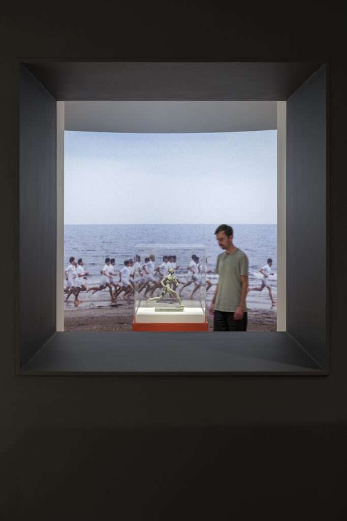
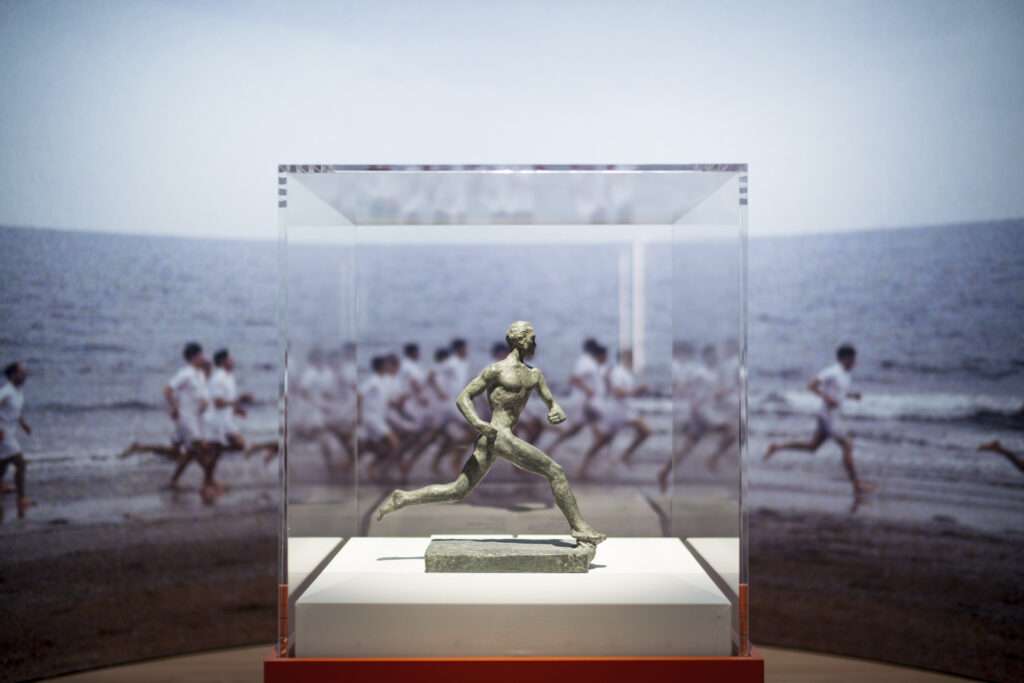
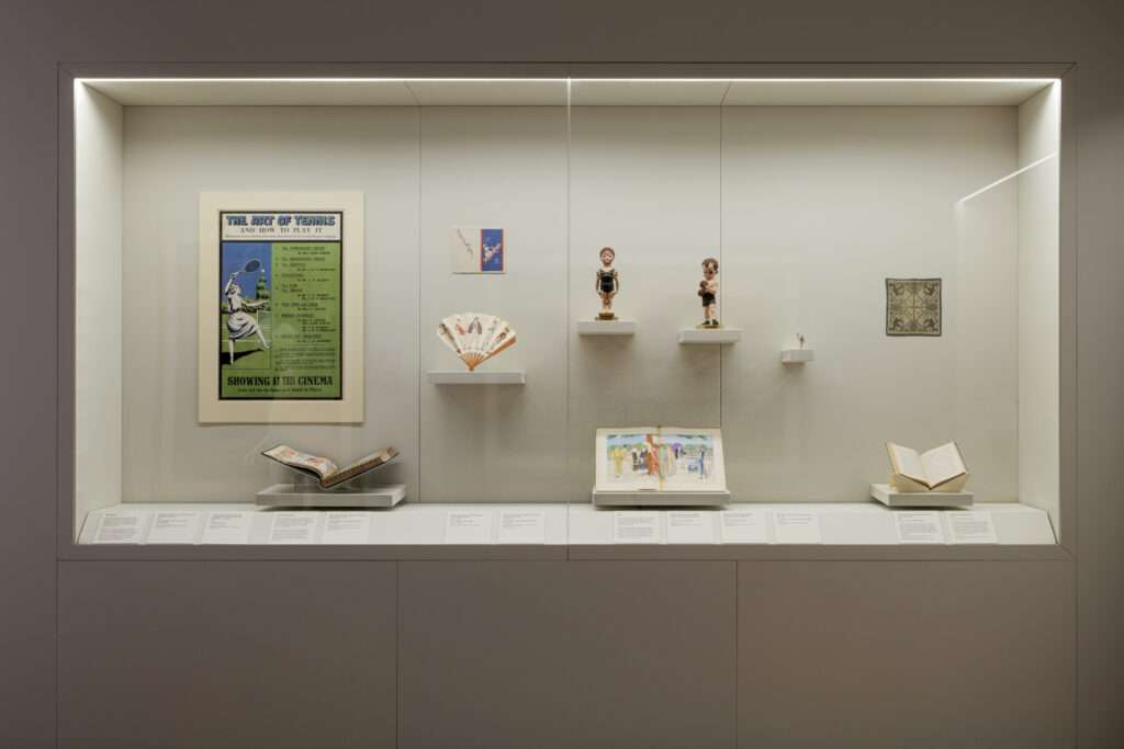
Finally, in the ‘Sport Sells’ section, the exhibition considers sports marketing and considers how money is made from sport. A 3m-high centrepiece arena section is comprised of a semi-circle and two-quarter circles, creating a window looking back into section two and connecting the two themes with the backdrop of ‘Chariots of Fire’. Stories told here include Johnny Weissmuller being used for swimsuit promotion, whilst Olympic gold medal winner Lucy Morton takes on a contract with Blackpool Circus, leading a natation class. Caricatured figurines of a swimmer and runner are seen, with memorabilia on show both official and unlicensed, along with film excerpts and advertising posters.
Images by Gareth Gardner


