Header: Alex Upton
When visiting London, one is involved in centuries of history, if not thousands, and its streets and buildings portray a kind of elegance unique to a truly international city. A myriad of hotels, restaurants, and bars help convey London’s energy to its visitors and residents, some are even great examples of how design can provide more than just a pretty setting.
Design is known for its ability to craft emotions and light up spaces, and some projects do even more than this as they can make one feel like they are in a different country or historical era. Restaurants and bars in London come and go since the city’s energy is a bubbly one that fuels imagination and creativity, but the LIV Hospitality Design Awards recently recognised some of the best bar and restaurant designs, keeping them alive for posterity.
The Cavita
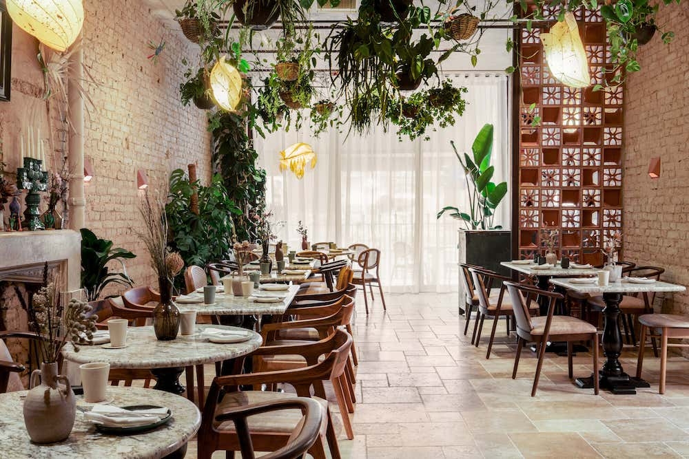
The Cavita is a restaurant that looks like you are dining in an old Mexican grandma’s backyard, a unique setting that sets it apart from other restaurants and transports visitors across the ocean. The design looks welcoming and lived-in, dressed-down to convey the intimacy of a food-loving family. This unique vibe was based on a specific brief given by the client, and, although already possessing its own kind of sophistication, it’s complemented by the location of the restaurant in Central London, which gives it an extra high-end feel.
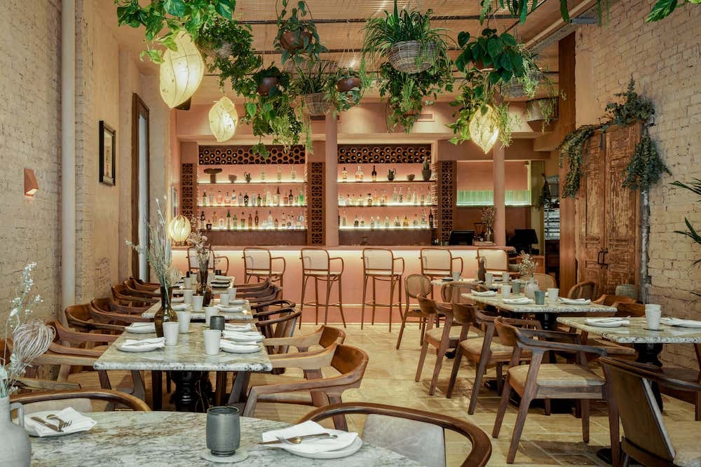
The choice of materials was of the utmost importance in this project since they would make or break the vibe the client was looking for. The design studio responsible for the project, Cor London, which means “colour” in Portuguese, did an extensive search for suitable materials and suppliers that checked all of the right boxes: sustainable and high-quality.
Cor London managed to get over 30 items sourced from vintage and bespoke suppliers that helped put a spotlight on the beauty of natural materials, further enhancing this idea of dining at a Mexican grandma’s backyard. The hand-carved sinks and Indian bricks are some of the many stars of this project, and KA Iluminacion’s lamps don’t fall behind either.
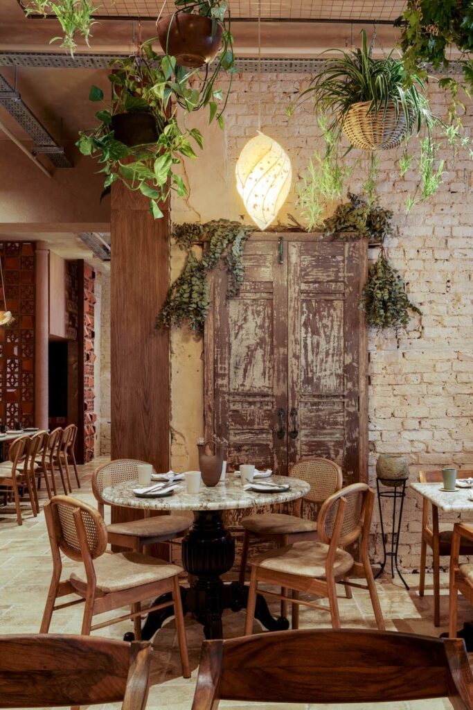
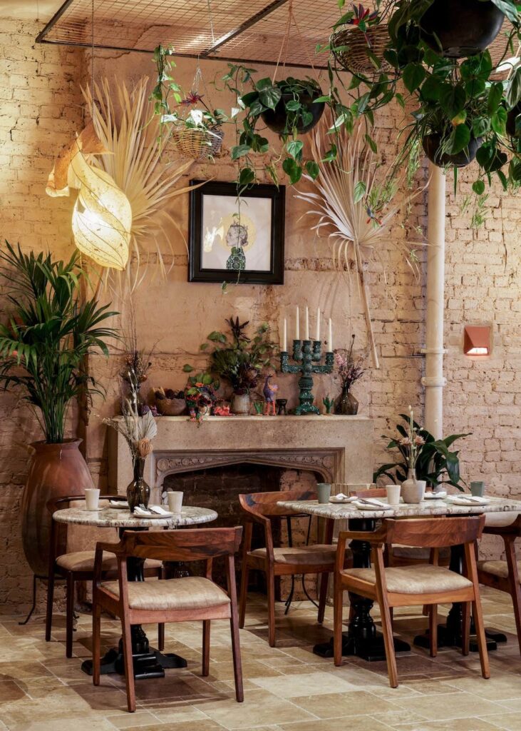
Camila Rodrigues, the project’s lead designer, commissioned KA Iluminación eight lamps that represent some of the chef’s most personal characteristics, such as her arm’s heart tattoo and her love for cocoa fruit. Since the studio responsible for the lamps is based in Oaxaca, in southern Mexico, the client’s original little Mexican world of a brief was given a boost. These little details truly helped set the vibe in place.
Further bringing about Mexican culture to the heart of London, an Altar de Los Muertos was placed over the old stone fireplace, which gave the space a mysterious and involving atmosphere that can make every visitor think, “Am I really still in the UK?”
But the surprises don’t end here, as Cor London decided that the Cavita had much more to offer. In the secret lower GF Mezcal Erica vaults, the “Mayahuel Bar” calmly brings a bit of masculine energy to the whole project, quietly contrasting with the warmer and more feminine Cavita above.
The Paradise Green
Paradise Green is the venue of everyone’s dreams, as it holds a restaurant, a bar, and a unique space that promotes art and artists by displaying their creations. Visitors are therefore given a little extra awe-moment while having dinner, which adds value to Paradise Green in the London restaurant scene, known for being highly competitive.
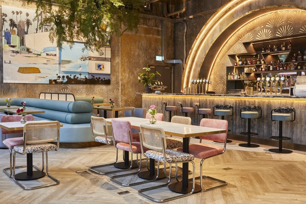
“Sunrise” and “Sunset” are the two bars of this venue, each with their own unique personalities, entrances, and ambiences. The venue pays homage to Surfers Paradise, a city in Australia, making Green Paradise another spot in the city that allows you to visit another country without needing to renew your passport.
“Sunrise” is filled with golden morning vibes when one wakes up and hits the beach, watching the dark wash-out from the sky and the blue of the water get brighter, all while feeling warmth increase all around you. To portray this cosy and Australian-cool feeling, the studio responsible for the project, Run For The Hills, decided to fill up the space with hints of sun-drenched Deco-gold, giving the space a somewhat simple-luxury feeling that makes each visitor want to make a run for the beach.
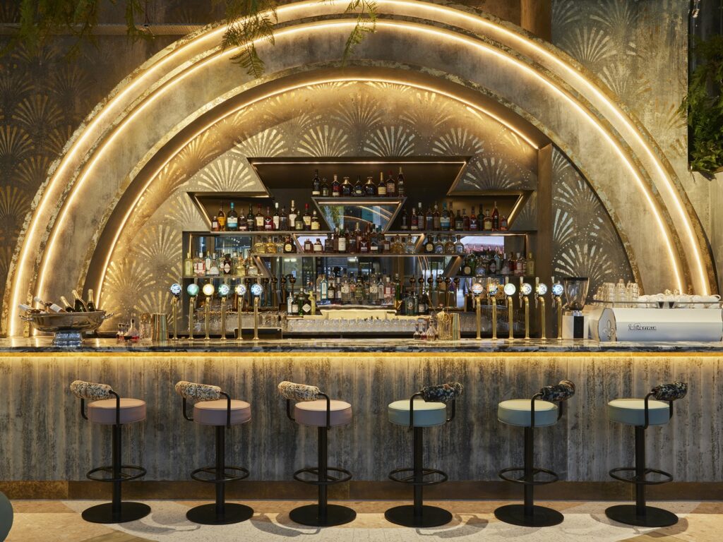
“Sunset“, on the other hand, takes inspiration from the magical moment when the sun starts to set and the sky seems to want to give people a last show before lighting up with countless dots of white light. As the ocean starts to calm down and red, pink, and orange fill your eyes, one can’t stop clapping and thanking the sun for another day. To convey this feeling, lead designer Anna Burles decided to channel electric sundown vibes from the 1980s, a bold choice that not only brings you to another country but also to another time.
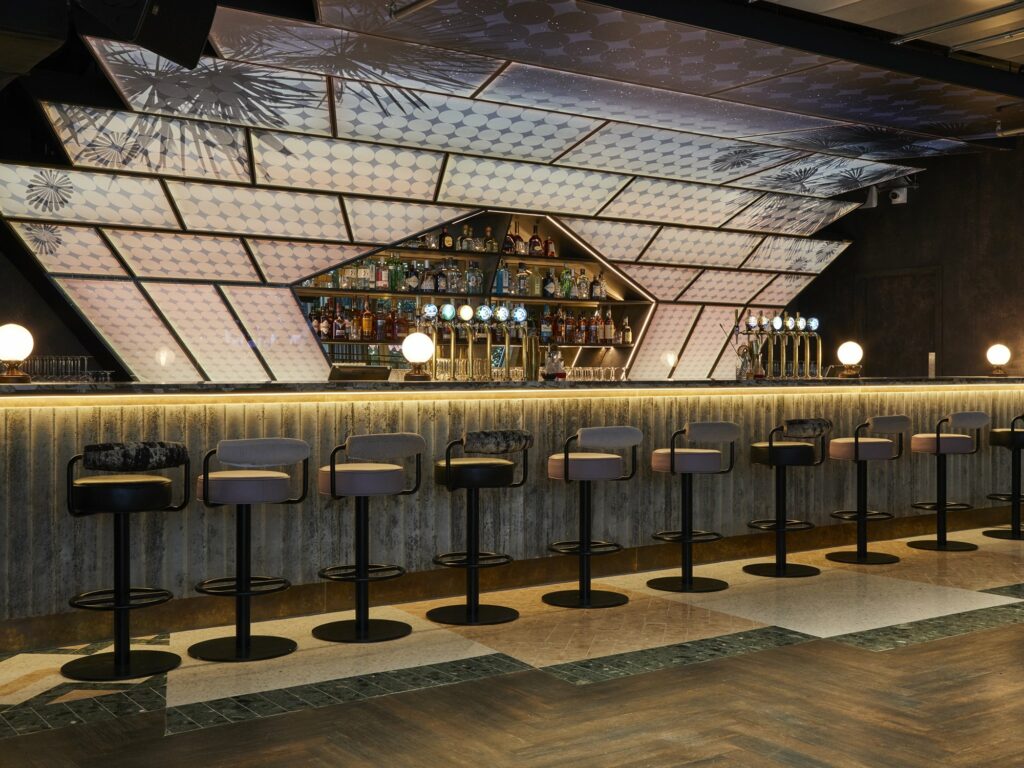
Connecting these two bars, an artistic 3,000-square-foot “bridge” was created as a point of transition. Here, a vibrant kitchen, an exclusive private bar, and a private dining room can be found, all within a Bank Heist art installation by Lucy Sparrow. This installation adds to the narrative depth of the space, helping visitors engage with one another through this shared experience.
The Velvet
Continuing with the hospitality side of “experiences while in a bar”, the Velvet bar at the Corinthia London just had to be mentioned. Corinthia joined forces with famed mixologist Salvatore Calabresa to offer visitors the very best of the cocktail world. With such a good base, the bar was only missing a good design team.
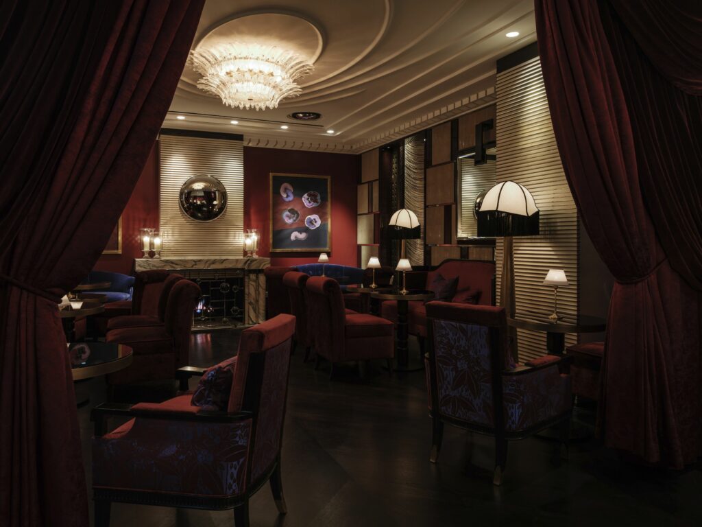
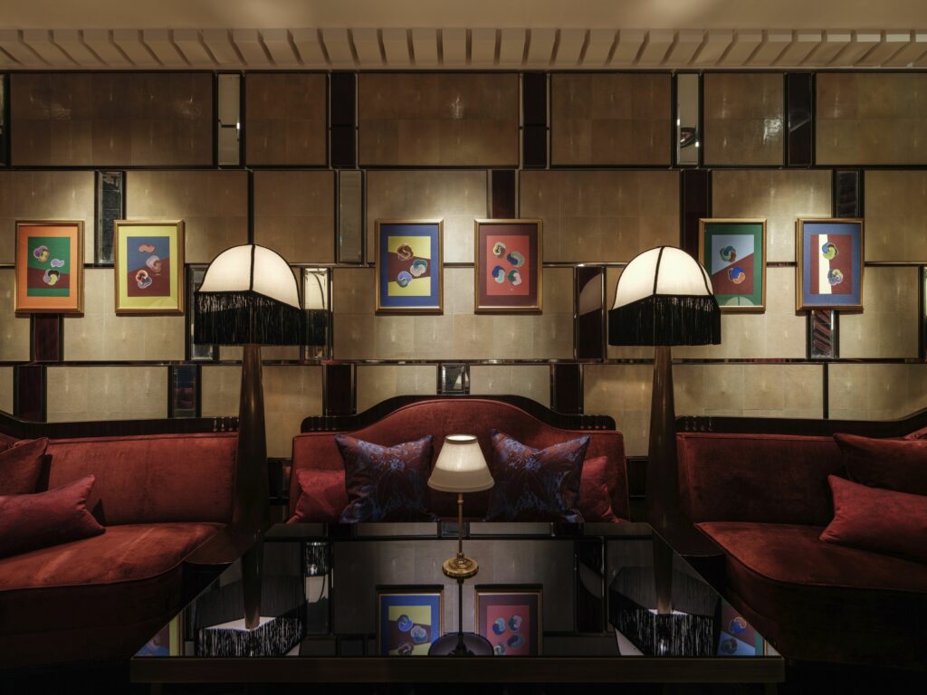
David Collins Studio was tasked with crafting the ambience, ending up creating a space that resembles the chic bars of the 1920s. The bar is the glue of the entire space, connecting both the entire design of the space and the people. Its layout, lighting fixtures, and decorative music-inspired details give visitors the sense of being surrounded by lavish old-school parties dedicated to hearing the latest hits that are sure to shake society up, all while sipping on great cocktails.
Velvet’s colour palette is deep and intimate. All throughout the bar, pops of rouge, electric blue, and ultraviolet mingle carelessly with dark-stained timber and gold accents. In the entrance, a bespoke hand-painted sign in 23K gilding gives the final touch to the design. The result? A fancy, music-inspired, old-school-loving bar where people are sure to feel something they normally wouldn’t in another London bar.
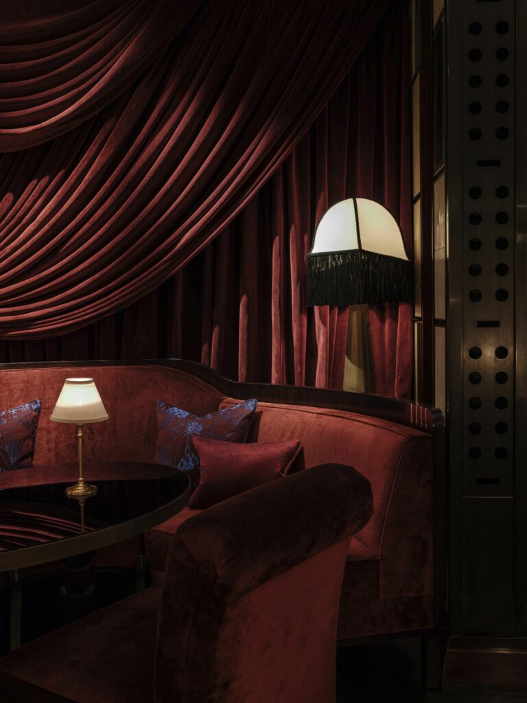
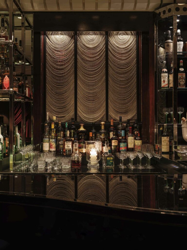
To accommodate people, David Collins Studio went for a seating area by the bar and some tables scattered around the space. The bar has a mixture of curved banquettes, arm chairs, and stools, all with dark-timber frames and polished brazz and nickel detailing. This not only makes them fit perfectly with the overall design of the bar, but the mix-and-match of stools and chairs further conveys the musical vibe of the bar. The studio didn’t stop here, upholstering the seats in rouge and royal blue velvet and a deep red and ultraviolet floral satin.
The tables have dark-stained timber pedestal bases, similar to other elements of the bar, and circular tops in either gold or royal blue mirror. A brass cable lamp lays on top of each table, creating an intimate area at each table. Throughout the space, metal cone-based lamps with custom domed lampshades in white silk with black fringe and ribbon trim help create the ambience, giving an extra fancy touch to the design.
