Header: QPRO/Marika Volkova
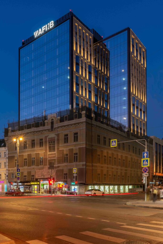
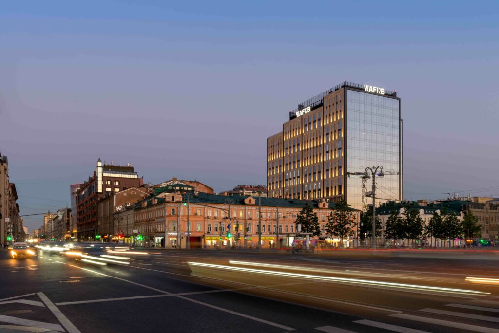
The Business Center AFI2B Class A+, the only A+ class business centre in the centre of Moscow, was designed to be the flagship office of AFI Development, a development company known for building five-star hotels and buildings in Europe, the USA, and Israel.
The new building was designed by architecture firms AECOM and METROPOLIS, both of which put their utmost care into checking out all the requirements of the green building standard. The entire project can be described as an agglomeration of modern design elements, environmentally friendly materials, and energy-efficient solutions. Due to this, the AFI2B was awarded the BREEAM Excellent International Certificate (with more than 70% compliance) and is certified according to the WELL standard.
Stone, glass, and luminaries
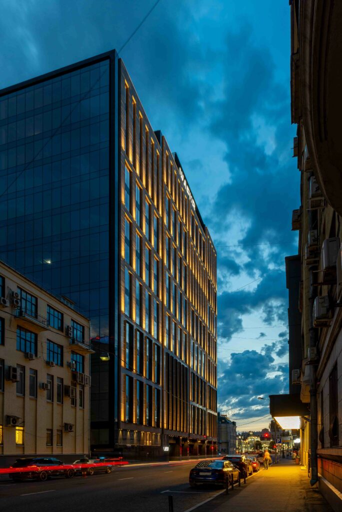
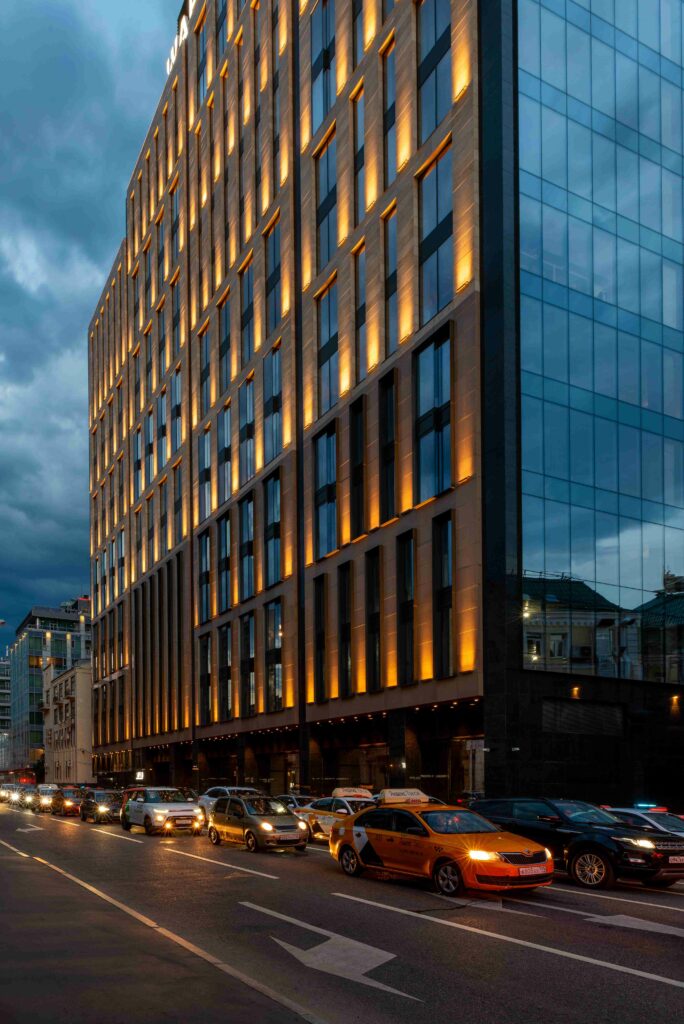
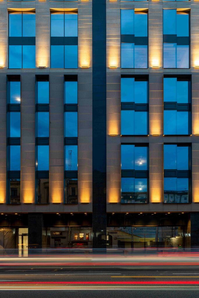
The building’s façades are comprised of a combination of glass and natural stone finishes, giving it, on the one hand, a modern appearance and, on the other hand, a timeless vibe that allows it to merge into the historical buildings all around it.
According to the architect’s idea, the glass facades are oriented to the south, some offering views of the historical part of Moscow and some facing the streets. The architectural lighting design was curated to reflect the unique character of the façade, emphasising its three-dimensional composition.
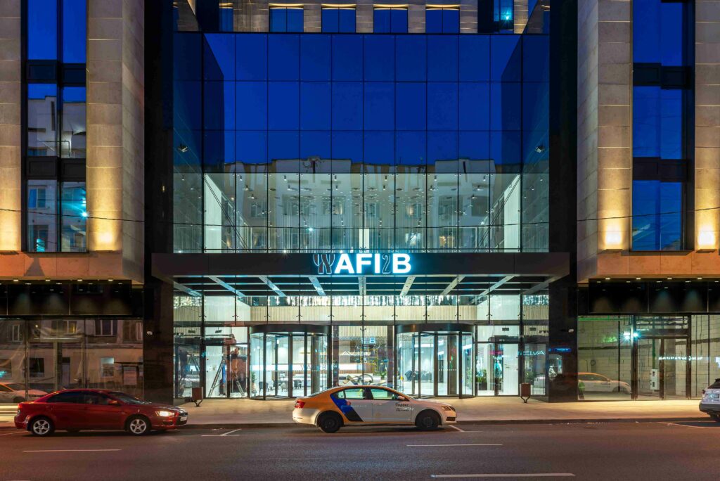
Luminaries were mounted directly on the stone-lined façades so as not to disturb the architectural rhythm of the windows. The glass façades, however, have no luminaries, allowing the interior light to serenely flow outside when it’s dark. On the other hand, the lack of luminaries outside the glass façade means people can enjoy the view of the city lights at night from inside.
The lighting design studio, QPRO, gave a bit to Moscow by providing the area of the Belorussky railway station and the surrounding historical and modern buildings with functional lighting, making it possible to fit the building into the existing light environment. The lighting design is more than just functional and aesthetically appealing, as it also helps the building maintain its recognisable appearance at night.
The concept of 3 “Bs”
The name of the building is comprised of three “Bs”, reflecting the unique concept of the project.
- The first “B” is “Business”. The building houses an office and a business space, perfect for a neighbourhood with a large number of residents of high social-economic status. The functional side of the building is combined with thoughtful design solutions and complimented by beautiful views.
- The second “B” is “Belorusskaya”. The new building is set in the historical part of Moscow where the centre of the business cluster is located, making the neighbourhood rich in restaurants, shops, and transport points.
- The third “B” is “Brestskaya”. Due to it being the business centre of Moscow, the building is well served by efficient public transportation. From the building, it’s also possible to quickly access the international airport Sheremetyevo through a direct road, perfect for either driving or catching the Aeroexpress from the Belorusskaya underground station.