


Header: Veerle Evens
Somehow, 2025 is already wrapping up, and 2026 is slowly making its way in, which always feels like the right moment to look back at what actually caught our eye this year. We’ve had 12 very full months: eclectic colours, moody rooms, beige minimalism still going strong, vintage pieces continued making a comeback, and tiles pretty much everywhere. It wasn’t exactly a quiet year, but it was definitely interesting to watch.
I won’t pretend to know what next year will look like, so it’s much easier to look at what we’ve just lived through and pick out a few interiors that say, “This was 2025”. So that’s what this is: five styles that sum up the past twelve months, from classic blue tiles and darker, more detailed colour palettes to 70s groove, the kind of minimalism everyone seems comfortable with, and a soft cabin-chic atmosphere.
High-quality materials and minimalist aesthetics
Holzrausch’s Paris project opens the list, and we only need to go through a gated courtyard in the 11th arrondissement to be welcomed in. The Munich studio was asked to design an interior with no noise at all, visual or otherwise, which meant no art, no decorative layers, and nothing that might break the sense of calm. The family had looked into the studio’s work and trusted that their focus on material quality aligned with theirs, so everything in the design leans on that. The project earned its place in this round-up because it reflects one of the moods of the year: spaces that aim for stillness without falling into a kind of minimalism that feels staged.
The house is shaped by four materials: oak, plaster, stone, and stainless steel. Built-in furniture keeps things practical, appliances are hidden behind timber fronts, and recessed lighting helps keep the ceilings clean. The original concrete floors were kept to balance out the more refined finishes added later. As the building only opens onto its courtyard, a new façade and skylights were introduced to pull daylight in, which in turn led to the project’s defining feature: a sculptural oak staircase that runs across all four levels, drawing light down into the basement.
Narratives and moody colours
Studio WYZE usually works between London and Dubai, but this year it joined our little list for its interiors at Tattu’s first location outside the UK, at Ciel Tower in Dubai Marina. The client asked for a restaurant, a bar, a sky lounge, and an infinity pool within a tower that rises 365 metres, so the brief was always going to be ambitious. The studio gave each floor its own atmosphere inspired by a set of old legends: the dragon, the carp, and the phoenix, all within a rich, luxurious, and moody colour palette. It felt right to include this project because storytelling has been a strong theme in hospitality this year, as what is better than a well-told story to make guests connect with a space on a deeper level?
Across the three levels, each area has its own palette and style. The restaurant floor leans into contrast, moving from the darker tones of the Black Dragon dining room to the lighter atmosphere of the White Dragon lounge. Carved ceilings, shaped columns, lacquered timber, and marble are all used to support this aesthetic, giving guests the impression of having entered a fantastic world somewhere above the clouds. Higher up, the carp styles the world’s highest infinity pool, using and abusing aqua shades, glazed ceramics, rattan, and soft fabrics to create a quieter, more relaxed mood. At the top, the phoenix brings in a more energetic vibe, with a ceiling formed like a rising birdcage and a bar in backlit pink onyx. A wraparound terrace completes the design, opening the interior to the skyline with wide, uninterrupted views of the city.
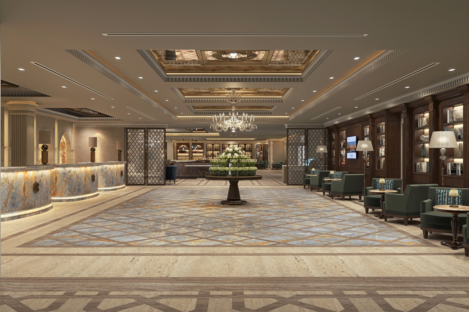
Renovations and old-school styles
Kimpton Los Monteros in Marbella has reopened in style, with new interiors by Barcelona-based studio EL EQUIPO CREATIVO, who had already worked with the brand on their first Spanish Kimpton. This time, the brief was to bring new life to a classic hotel while staying close to Andalusian traditions and the building’s original 1970s architecture. The design clearly takes cues from the region’s landscapes and artistic heritage, using colour, form, and craft to tie the hotel back to its setting. It felt natural to add this project to the list because it tells a story we’ve seen a lot this year: old is a kind of quiet luxury, as there’s a certain je ne sais quoi about renovating an ancient building. Add a respect for heritage and the ’70s, and it’s sure to end up on any list of mine.
The main features can be seen in the lobby, lounges, patio, pool, bars, and restaurant, which is to say almost everywhere you look. Each area has its own palette, but everything stays connected through Mediterranean materials and 70s references. Public spaces have white backdrops as a base and are warmed up with timber, colourful furniture, and hand-painted murals. The Andalusian patio was simplified and replanted and now has a sculptural fountain that points back to the style’s Arabian roots. Around the pool, warm whites, turquoise water, and retro forms create a holiday feel, while the Costa Club Pool Bar introduces traditional terracotta tiles and lattice-work. Azul Bar keeps the artistic thread going with three-dimensional ceramics and large blue murals, and Jara Restaurant uses green and patterned tiles to set up an indoor garden feel. The rooftop, Escondido, finishes the design with stepped levels, a 70s-inspired bar, and a panoramic pool lined in retro tiles.
Colour drenching and tiles
Pastéis de Belém has opened a new café in Lisbon, right next door to its original 1837 shop, having entrusted the design to Viterbo. The idea was to create a space that could support the historic bakery without losing the character that has defined it for nearly two centuries. Gracinha Viterbo and her team leaned on Portuguese traditions and a contemporary layout to keep the atmosphere rooted in the brand’s heritage while still making sure the space works for today. It felt natural to add this project to the list because it speaks to one of the clearest themes of the year: tiles, tiles, and more tiles.
The interior is filled with light oak and handmade tiles, but mainly with blue tiles. These fan favourites cover both floors and walls, bringing in colour and pattern without tipping the room over the edge (or maybe pushing it just far enough). Natural and artificial lighting highlight the texture in the finishes, brass accents complement the blues and whites, small crafted details give character, and custom counters appear filled with the traditional custard tarts.
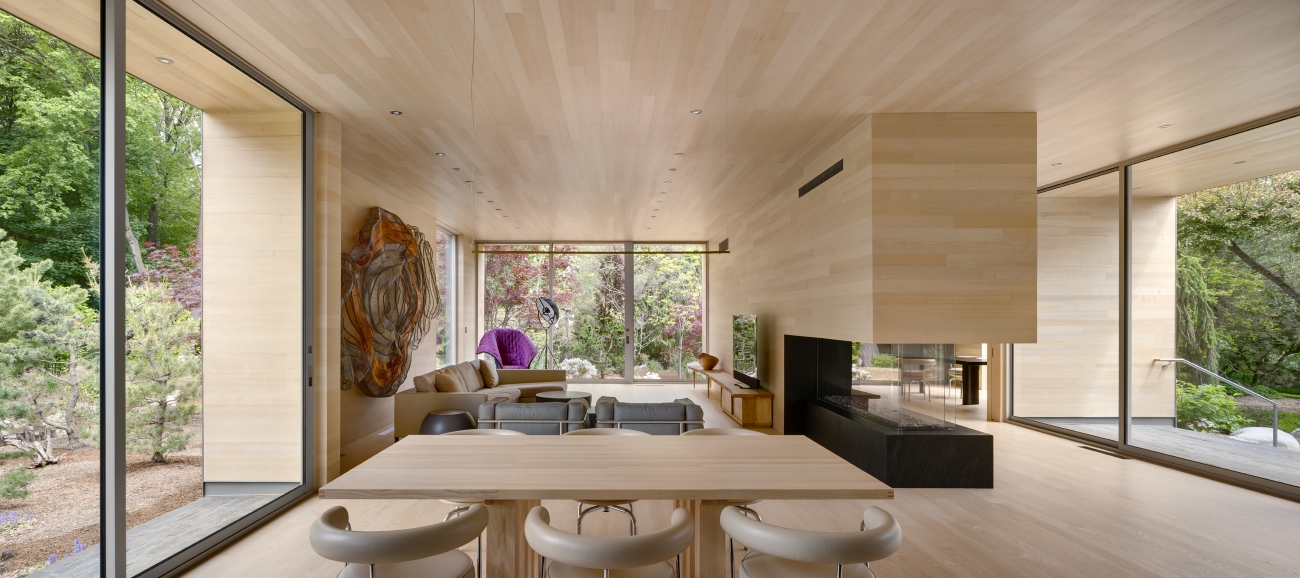
Wood interiors and getting lost in nature
Designed by Dubbeldam Architecture + Design, this cottage is located on a quiet peninsula along Long Lake in Ontario and was designed as a place the family can keep for generations. The clients, an urban couple drawn to Ontario’s wilderness, spent a year camping in the area before committing to a weekend home they could use year-round, both for relaxing holidays and for having friends and family over. Surrounded by trees and partially tucked beneath exposed bedrock, the house uses two levels to make the most of the lake and forest views. It earned its place here because it taps into a mood we’ve seen everywhere this year: the desire to disappear into nature, especially when it comes with wood-based, rustic minimalism interior design.
The lower level is mostly hidden from view and holds the bedrooms, each with full-height windows and direct access to the forest. It’s a simple move, but it gives the rooms real privacy and keeps the landscape close from the moment you wake up to the moment you climb back into bed. Upstairs is where the main living spaces are located, and the wraparound windows and sliding doors make it feel like you’re hovering above the trees, with a generous deck extending that feeling outdoors. Inside, the plan is open and practical, organised around a concrete hearth, a large dining table, and a long built-in window bench. White oak millwork covers the kitchen, softened by a western hemlock ceiling, while outdoor life is split between two decks: one higher and expansive, the other set into the bedrock below. Timber is seen in different tonalities: darker and weathered colours outside transform into lighter and warmer ones within. The latter feature is but a tiny detail that helps connect the house to the lake and forest rather than seal the residents off from it.
Every year seems to attempt to perfect whatever was already trending the year before, and I don’t think 2026 will be any different. Still, there’s always room for something new, which is why I like keeping my eyes open for the ideas, materials, and small novelties that start popping up when you least expect them. With 2025 now behind us, there’s really just one question left: which style are you bringing with you into 2026, and what should we definitely leave behind?