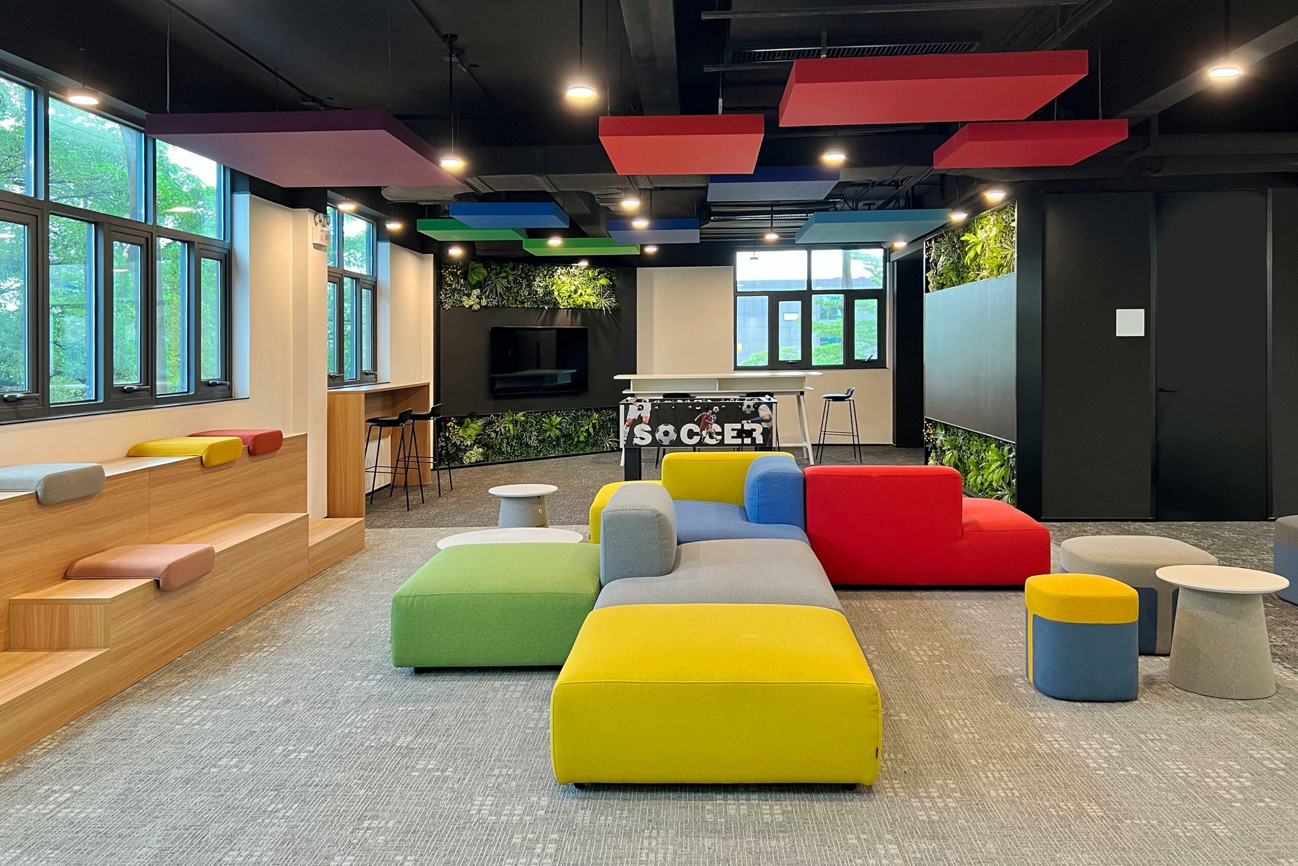
Lapis Bureau is a design firm that recently finished working on the interior design at the Bosch Headquarters in Shenzhen. At the core of the project was Bosch’s commitment to innovation and excellence, making this design not just a project but a message.
The studio aligned itself with Bosch’s latest brand guidelines, which were released in 2023 and included updated visuals, logos, patterns, and colour schemes. By paying close attention to these changes, Lapis Bureau ensured that the design reflected Bosch’s evolving identity while providing a comfortable working environment with a modern and appealing look.
Reviving the space
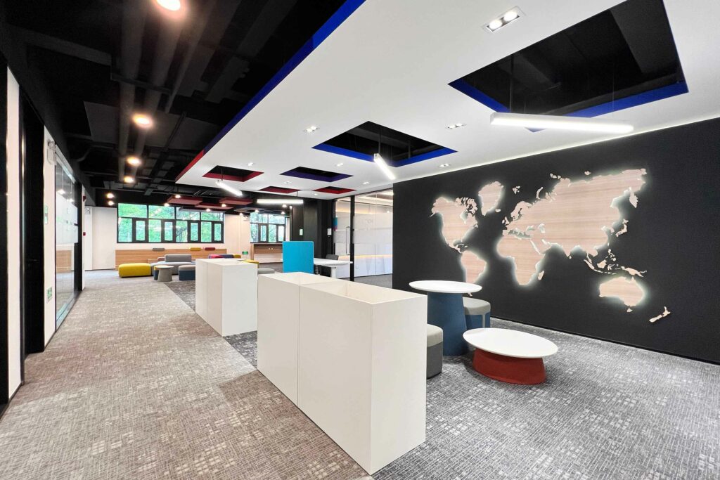
The renovation of the entire building was a comprehensive endeavour, beginning with the exterior facelift and extending to three entirely renovated floors of interior spaces. On the third floor, which houses the new headquarters offices, the design aims to foster a sense of unity, creativity, and productivity.
Open spaces for collaboration and relaxation
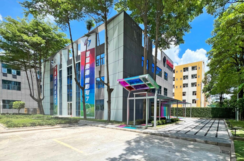
The core concept for the third floor revolves around an open office layout. Here, casual meeting areas and relaxation zones effortlessly intertwine, promoting a dynamic and collaborative work environment. Visual separation between these areas is artfully achieved with patterns on grey-toned carpet tiles and a variegation of ceiling treatments according to functions.
Ceiling innovation
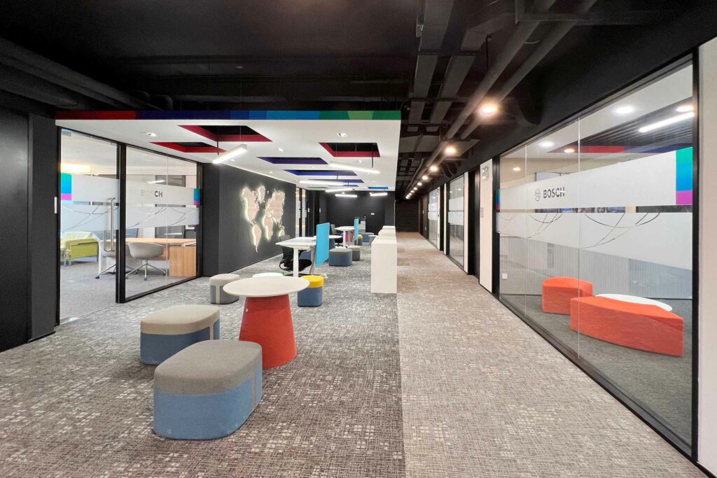
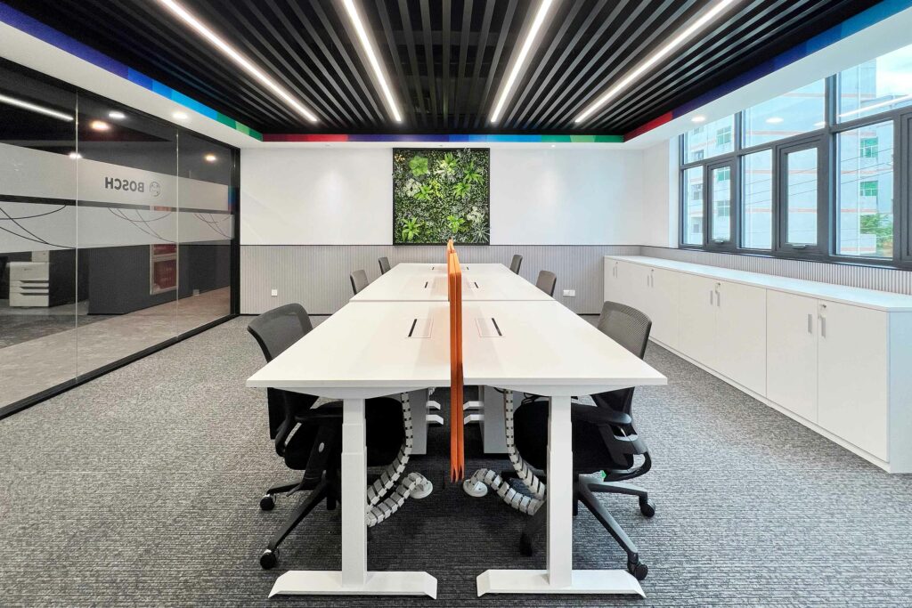
The ceiling design plays a pivotal role in creating an engaging atmosphere. A raw black ceiling conceals cables and equipment, maintaining a sleek and clutter-free aesthetic. In some areas, the designers introduced an extra layer of metal slabs or acoustic panel stripes to create a faux ceiling, such as in offices and meeting spaces.
A lowered, suspended white ceiling adorned with squared holes in the open workspace area serves dual purposes, allowing for hanging lamps and housing air conditioning systems. Each hole’s edge is tastefully painted in one of the colours from Bosch’s corporate identity gradient palette.
Visual continuity and fractal fluency
The distinctive pattern of geometries suspended in the ceiling subtly extends to the entrance wall and is resembled on a microscale as a pattern in the carpet tile design. Inspired by nature’s fractals, this “fractal fluency” pattern reduces physiological stress levels. It engages observers’ eye movements while walking through spaces, mirroring the calming effect of staring at nature.
Transparency and collaboration
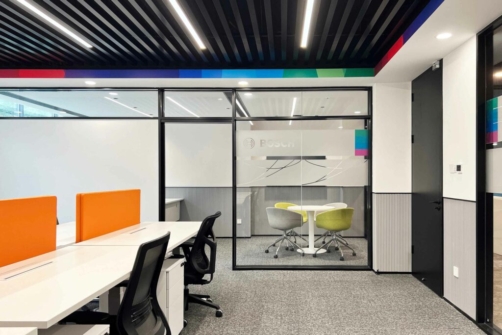
Even in enclosed spaces, such as the director’s offices and HR and financial departments, transparency remains a key theme. Glass walls offer visual connectivity throughout the office, emphasising the ethos of open collaboration and transparency. Custom patterns applied as stickers on the glass partitions as well as the signage and intuitive infographics without text allow easy navigation throughout the building, somehow enhancing the inclusivity aspects considering the multi-faceted nationalities and spoken language of different employees.

Vertical wall surfaces
The vertical wall surfaces are thoughtfully articulated to enhance both aesthetics and functionality. In circulation areas, a plain white paint finish promotes a sense of openness. Within the offices and meeting rooms, the designers employed white-patterned wallpaper and matte PVC surfaces. The textured finishes elevate the materiality of the space, while the PVC also provides practicality. The matte PVC surfaces double as whiteboards and magnetic walls, facilitating extensive interactivity and collaboration among employees in different areas, from the meeting rooms and closed offices to the open areas and communal zones.
The foyer showcases the Bosch corporate colourful gradient pattern as a backdrop to a set of magnetic panels, creating a versatile communication board for all staff. This very same gradient, in its grayscale version, graces the walls of the two director offices, adding an intriguing yet sophisticated corporate visual to the space.
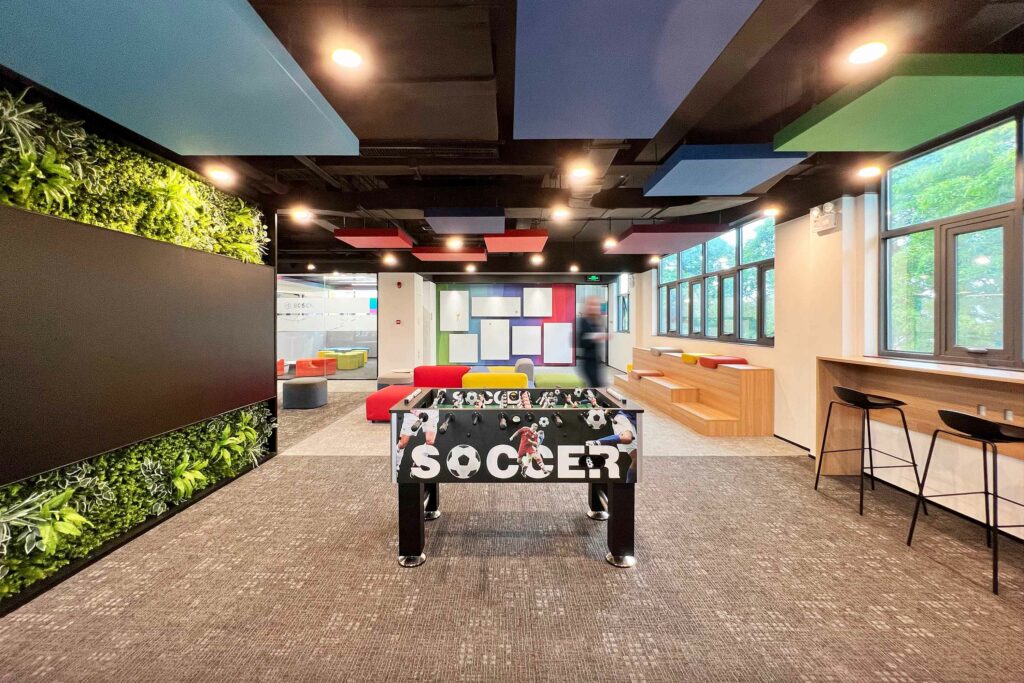
In areas where staff can casually meet, extensive green walls for wellness provide more than just aesthetics. They offer a positive atmosphere, transmitting positive emotions and enhancing acoustic performance, contributing to a healthier and more productive workspace.
Colour palette and brand identity
Lapis Bureau intentionally selected a neutral colour palette for envelope surfaces, with dark ceilings, white walls, and grey-toned flooring creating a calming backdrop. Vibrant accents are introduced through furniture and decorative elements, such as the crown edge of faux ceilings and the vertical surfaces of communal areas, which boast Bosch’s corporate gradient pattern. This not only adds a refreshing pop of colour but also establishes a visual identity that is uniquely Bosch.


