


In 2025, interior design is boldly moving away from safe neutrals, embracing an era of dynamic, conscious color choices. Leading this revolution is the trend of color blocking, which has evolved from a simple contrast technique into a sophisticated art form for creating immersive, personalized spaces. The days of playing it safe are over; design in 2025 is all about fearless expression. In place of all-white or monochrome schemes that dominated past years, bold palettes are taking over homes and commercial spaces. Top designers agree that sterile all-white interiors have become “a thing of the past,” as homeowners now want spaces that feel alive and personal, filled with “history, character, and personality” instead of blank sameness. This shift marks a departure from the pursuit of picture-perfect interiors in favor of spaces rich with expression and depth.
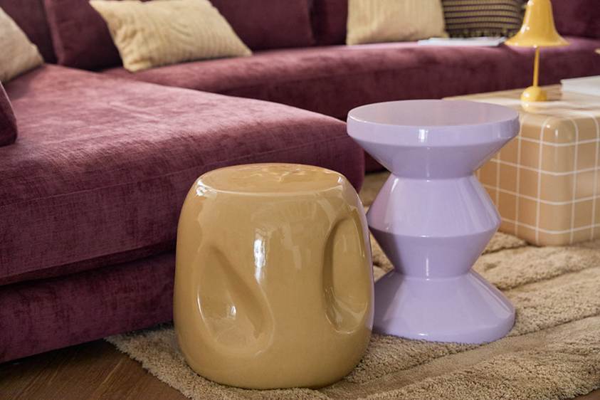
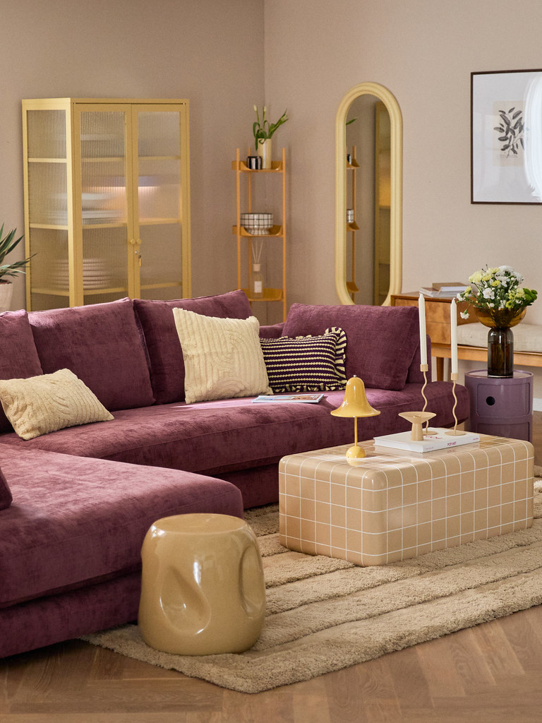
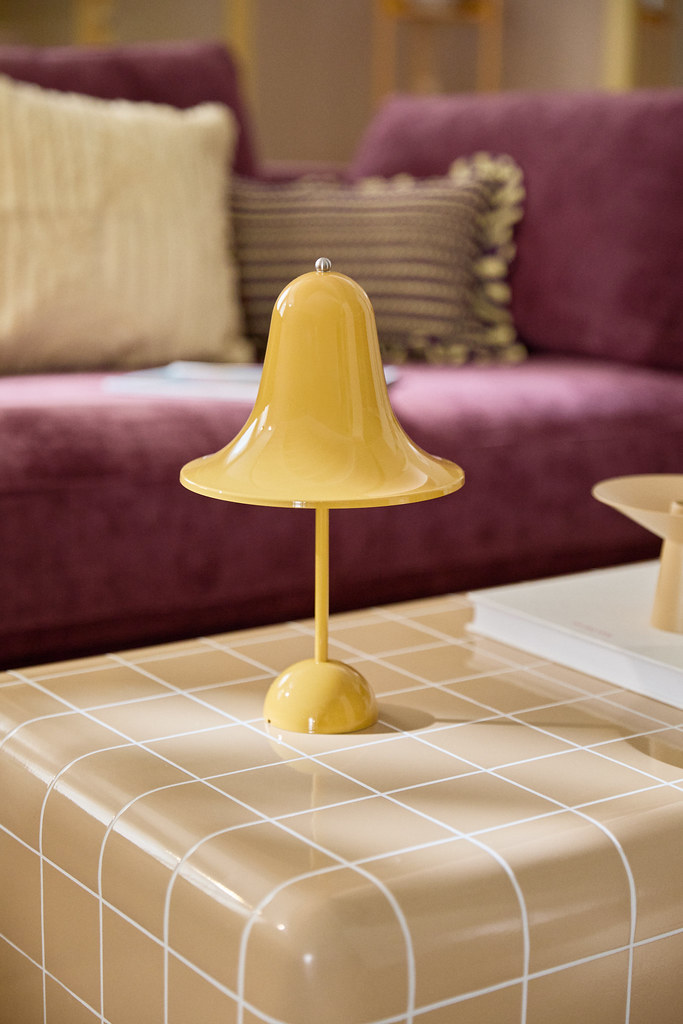
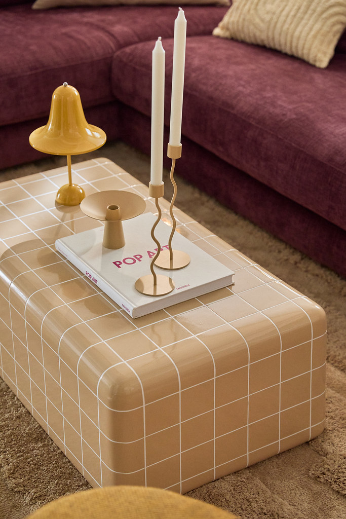
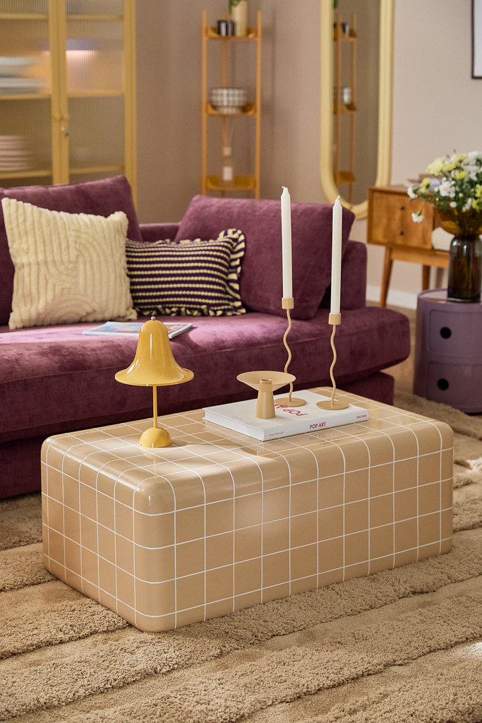
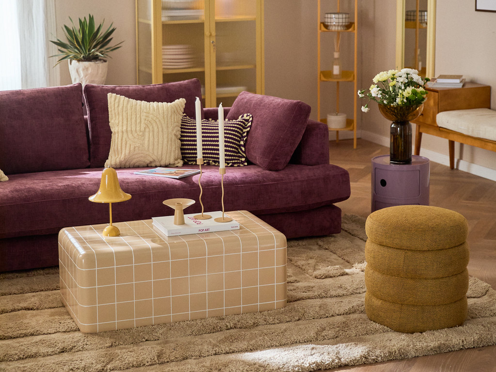
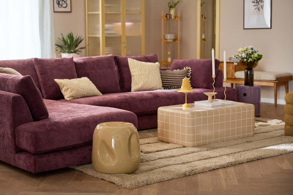
A contemporary living space strikes a balance between a neutral foundation and bold color accents and geometric patterns, reflecting the 2025 trend of infusing personality and vibrancy into home interiors. Design retailers like Westwing curate such scenes to inspire design lovers toward more expressive, individualistic décor.
From Safe Neutrals to Dynamic Hues
For much of the past decade, neutral tones such as whites, beiges, and grays have been the go-to backdrop for modern interiors. That is changing dramatically in 2025 as designers around the globe are swapping out safe neutrals for statement hues – and doing so with intention. Rich jewel tones, earthy terracottas, lush greens, and fiery mustards are energizing living spaces, replacing the once ubiquitous greige with a more exciting identity. The goal is not just visual impact for its own sake, but to create interiors that reflect the distinct personalities and stories of their occupants. Even minimalist homes are getting a colorful twist, such as a backdrop of charcoal or deep olive replacing plain white, or a single statement wall painted in a saturated hue to animate an otherwise simple room. The emerging mantra is clear: 2025 is the year to forget bland safety and embrace color with purpose and passion.
This embrace of color goes hand in hand with a philosophy of authenticity over perfection. Rather than obsessing over matching every element or achieving a magazine-ready neutrality, people are opting for palettes that evoke a sense of emotion. Designers report that clients want spaces that are comforting, inspiring, and truly personal, even if that means incorporating unconventional color pairings or eclectic decor pieces. The result is interiors that burst with character. For example, a once-all-beige living room might now feature a vibrant cobalt blue sofa against a backdrop of sage green, or a burnt-orange accent wall that brings warmth and depth to a formerly cold space. These daring choices, when done thoughtfully, can energize a space and turn an ordinary room into a reflection of its owner’s spirit.
Color Blocking as Storytelling and Mood
Color blocking – the deliberate use of solid blocks of color in design – has matured beyond its fashion origins and early interior examples into a sophisticated tool for storytelling. In 2025, it’s being used in ever more considered and expressive ways. No longer a gimmicky clash of random brights, today’s color-blocked interiors are carefully composed to set a mood and tell a story within a space. Designers speak of creating intentional focal points with color blocking, using bold contrasts, or harmonizing hues to anchor a room and give it personality and focus.
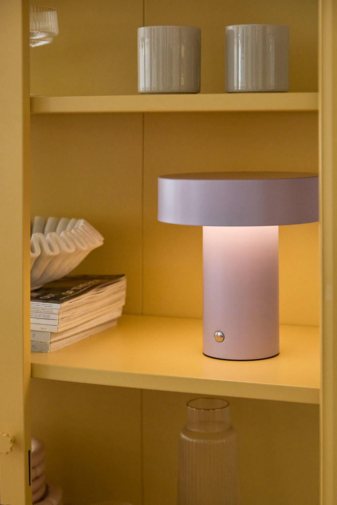
Moreover, color blocking is being applied beyond just walls. Furnishings, cabinetry, even ceilings and floors are getting a bold color treatment. A kitchen island might be painted in a contrasting hue from the cabinets to delineate space and spark joy, or a bookshelf could be backed with panels of different colors to create an artful mosaic out of a storage piece. These interventions transform functional elements into emotional centerpieces.
Notably, this approach treats color as a full-fledged design element on par with furniture or layout. It acknowledges that colors carry psychological weight and cultural meaning. A consciously chosen palette can make a space feel playful, optimistic, sophisticated, or grounded – and often a mix of all of these. Homeowners in 2025 are increasingly aware of these effects and opting to infuse their decor with shades that resonate with them (think of nostalgic retro hues or favorite colors from nature). One could say color blocking in interiors has become a form of personal expression and communication. Every bold section of paint or brightly upholstered chair is a statement saying, “this is what I love, this is what inspires me.” By weaving stories and moods through color, people are forging deeper emotional connections with their homes.
Texture: Adding Depth to Color and Inviting Interaction
In this new design era, color alone is only part of the equation as texture is the powerful companion that completes the sensory experience. Designers are focusing on layering a variety of textures (velvets, woven fabrics, polished surfaces, and more) to enhance the perception of those bold colors and to invite actual physical interaction with the space. The reasoning is intuitive: how a color is experienced can be amplified or softened by the material it’s on. A matte-painted wall versus a high-gloss lacquered wall in the same color, for example, will feel very different. This focus on touch and feel represents a shift toward sensory design.
- Lush fabrics like velvet: Velvets have surged in popularity as the go-to texture in 2025, often replacing the coarse, nubby textiles of previous years. A velvet sofa or curtain in a rich jewel tone not only delivers a bold splash of color, but also a luxurious softness that begs to be felt. Velvet’s soft sheen gently catches light, giving depth to colors like emerald green or royal blue and making them appear even more vibrant and immersive. Running your hand along a velvet upholstered chair, you experience the color through a subtle change in sheen and the comfort of the material – an interaction that creates a subconscious emotional lift.
- Structured carpets and woven rugs: The trend of bold design doesn’t stop at eye level – floors are also getting the color and texture treatment. Thick-pile rugs, graphic patterned carpets, and layered area rugs introduce structure underfoot that complements color-blocked walls or furniture. For instance, a sculpted wool rug with cut-and-loop pile in varying heights can cast tiny shadows and highlights on its surface, making a solid color like terracotta or mustard feel dynamic and alive. In 2025, textured carpets often feature geometric patterns or multidirectional weaves, which not only add visual interest but also provide your feet with something to discover. This kind of tactile flooring anchors a colorful room by adding another layer of design – quite literally grounding the space – and invites people to kick off their shoes and engage with the room more intimately. It’s the decor that you experience physically, not just observe.
- Smooth and reflective surfaces: On the other end of the texture spectrum, sleek materials like glass, polished metal, and high-gloss lacquer are being used to activate colors through reflection and shine. Designers are combining smooth surfaces with matte and fabric finishes to play with light and perception. A glossy colored cabinet door or a mirrored table not only provides a visual pop, but it also mirrors bits of the room back at you, doubling the impact of nearby colors. The contrast between a smooth, shiny surface and a soft textile nearby (such as a chrome lamp on a rough wooden sideboard) also highlights the qualities of each. In essence, thoughtful texture contrasts make the colors in a room sing. They prevent a bold palette from feeling flat or one-note by introducing both visual and tactile variation.
By layering textures alongside color, interiors become multi-sensory landscapes. You’re not only seeing a beautiful composition of hues; you’re invited to feel the velvet cushions, to notice the nubby weave of a blanket, or to hear the soft footfall on a thick rug. These sensory cues subtly encourage comfort and interaction: a velvet pillow practically calls out to be squeezed, and a cool stone countertop invites a soothing touch. The home thus becomes not just a visual showpiece but a lived experience.
Personal Well-Being at Home: Creativity with Purpose
Underpinning all these bold choices in color and texture is a deeper movement towards conscious and human-centric design. Our homes have become true sanctuaries – places of work, rest, and personal expression – and interior design is increasingly focused on how spaces affect our emotions and feelings. The vibrant color blocking and rich textures of 2025 are not about trend for trend’s sake; they are about creating environments that promote happiness, comfort, and wellness. Psychological research and design practice alike have long noted that colors can affect mood and energy; now, homeowners are actively harnessing that knowledge. From calming blues that reduce stress to energizing yellows that spark creativity, every shade introduced into a home in 2025 tends to have a purpose or meaning behind it. Nothing is random in this conscious approach – it’s a manifestation of creativity guided by intention.
Interior designers describe their clients’ desire for spaces that support mental and emotional well-being. This means designing rooms that foster positive emotions and a sense of safety. Bold colors, when aligned with an inhabitant’s taste and memories, can provide joy and inspiration; layered textures provide coziness and a tactile sense of grounding. Many 2025 design elements echo principles of sensory therapy: soft lighting that can be dimmed in the evenings, diffused natural scents, acoustics that soften noise, and, of course, carefully chosen color palettes that soothe or excite as needed. It’s a far cry from the one-size-fits-all interiors of the past. This is designed to promote self-care, tailoring our environments to enhance quality of life.
Crucially, this trend is about individuality as much as well-being. By prioritizing personal expression (through color, art, and sentimental objects) over rigid perfection, people are finding their homes more enjoyable and meaningful. There’s a growing appreciation for the idea that a home should reflect the people who live in it, not resemble a catalog. We see this in the embrace of quirky art, handmade decor, vintage finds, and, of course, bold color combos that might break old design “rules” but feel authentic. Even mismatched or imperfect elements – a weathered leather armchair in a brightly painted room, or a reclaimed wood table against a backdrop of sleek, colorful cabinets – can contribute to that sense of depth and story that makes a space welcoming. This departure from over-curated perfection means embracing creativity fearlessly. Homeowners are becoming, in a sense, co-designers, curating their own spaces with a mix of colors and textures that tell their story, whether that’s playful and artistic or calm and contemplative.
The industry has taken note of this shift toward expressive, wellness-oriented interiors. Major home décor brands and retailers are highlighting bolder palettes and sensory-rich designs in their 2025 collections to meet the growing demand. For instance, Westwing – Europe’s #1 e-commerce destination for beautiful living – has enthusiastically embraced the move toward dynamic colors and textures in the home. This platform, known for inspiring design lovers, now prominently features vibrant color-blocked rooms and layered material mixes in its lookbooks and online inspiration sections. According to the company’s mission, they aim to “excite people to create homes that unlock the full beauty of life” – a sentiment perfectly aligned with the 2025 ethos of personal, life-enhancing design. By offering products and design services that encourage customers to experiment with daring color pairings, sumptuous velvets, patterned rugs, and more, Westwing and peers are effectively empowering individuals to transform their homes into personalized works of art.
In summary, interior design in 2025 is celebratory and intentional. It celebrates color in a way that’s deeply entwined with personal identity and emotional well-being. It welcomes texture as a vital design layer, making our homes feel alive and inviting to all the senses. It favors creativity and character over immaculate but impersonal style. Stepping into a 2025-inspired interior, one immediately senses this difference: these are spaces with soul. Every bold hue on the wall, every plush textile, and every artful contrast play a role in crafting an environment that feels both engaging and comforting at once. Such spaces are dynamic and ever-evolving, much like the people living in them. By moving beyond safe neutrals and embracing conscious color blocking and texture, designers and homeowners are together transforming houses into homes, sanctuaries that are visually striking, emotionally uplifting, and uniquely their own.
All Photos Courtesy of Westwing // Westwing.hr.


