Photo credit: Ivo Tavares Studio
Walk With Me is a project whose primary goal is to establish a unique identity through the interpretation of the brand’s name. At the same time, it is the inaugural space for a new retail footwear brand that aims to market its product line and target a specific audience.
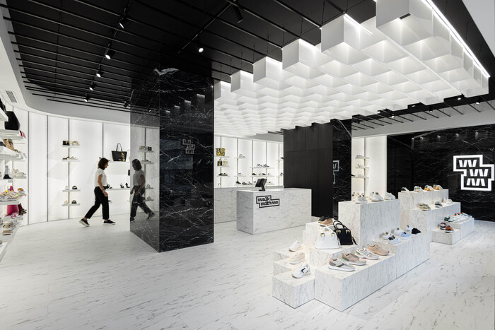
The name of this project, Walk With Me, inspired REM’A to delve into the composition of what underlies the act of walking. The flooring has become the most important part of the aesthetic-spatial concept. Romeu Ribeiro & José Pedro Marques started from this premise, then examined the stereotomy of the flooring, searching for a metric that would give rise to the products on display. Therefore, these elements serve as a foundation for product presentation and their representations of the different dimensions of each flooring piece. In this way, the studio took the chance to create a variety of compositions that depended on the quantity of products to be exhibited and new collections to be added.

The chromatic and material definition of the space is suggested by the brand’s logo. REM’A explores black and white stone materials, using the textures of Calacatta and Marquina marble. This duality allows the products to stand out naturally in the space. White is consistently associated with the products, while black is linked to the “sterile” zones of the store.
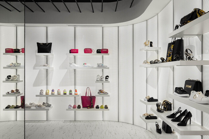
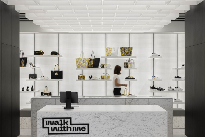
The criteria to develop the wall display involves a system that allows for multiple compositions and provides illumination of the products. To achieve this, the designers proposed backlit panels composed of white opaline acrylic and perforated metal sheets. Two types of shelves were defined for this system, “single” and “triple,” offering multiple combinations in the triple configurations and product highlights in the single shelves.

The area for trying on shoes is at the rear of the service counter. It provides both privacy and direct interaction with the staff if the customer needs any help. The intention to conceal structural elements presented an opportunity to centralize the service counter, encouraging a perimeter-circulation layout within the store. The goal of this design is to create a smooth and sequential shopping experience for the customers.
Studio REM’A incorporated identity-defining acrylic boxes into the ceiling of the public space, which boasts a rectangular layout oriented along the longer side facing the street. Furthermore, these boxes harken back to the metrics of the existing flooring’s stereotomy, which establishes a connection to the exterior and gives special prominence to the core of the store, namely the service counter.


