Photo credit: Luis Young
Banderas Bay Market and Neighbourhood Park has won the BLT Built Design Award for Architectural Design in the category of Bridges and Public Infrastructure. Designed by Studio KEN, this public space is a testament to community potential and a symbol of urban transformation.
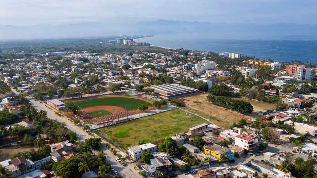
Barrio C Park, located in Bahía de Banderas, Nayarit, Mexico has an approximate area of 30,205 m2. The land was confined by a perimeter fence, inside which there were three fields – a baseball field, a basketball court, and a soccer field. While the three playgrounds we improvised and were in a state of despair. the rest of the land was vacant. The location of the soccer field blocked the free passage from one of the streets that lead to the land, in addition to this, the perimeter fence prevented the community from appropriating this public space. The Studio’s innovative approach aimed to open up the park and revitalize harmoniously the sports facilities.

Studio KEN’s proposal consisted of recovering and making this public space more accessible and inclusive. Therefore, they demolished the perimeter fence to create an accessible space with open walkways, accompanied by the vegetation of the site and pedestrian lighting. In addition to this, the design team arranged the courts in such a way that it recovered the openness of the streets. As a result, a sports area was consolidated to the north of the polygon. It consists of a soccer field, a basketball court, and a baseball field. The baseball fields are complemented by a pavilion that houses the facilities of a baseball school called “probéis”.
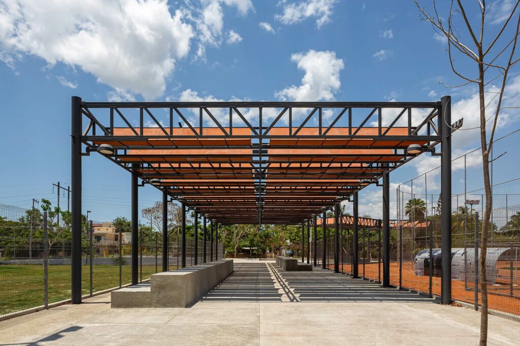
Between the courts, Matías Martínez and his team proposed a pedestrian walkway that not only connects with the streets reaching the polygon from the north but also acts as a space to enjoy and watch the sports events. This is also the reason why bleachers and pergolas were built on this walkway.

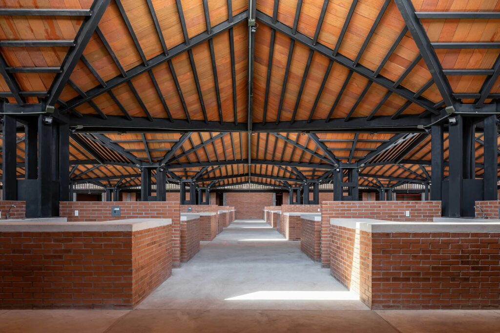
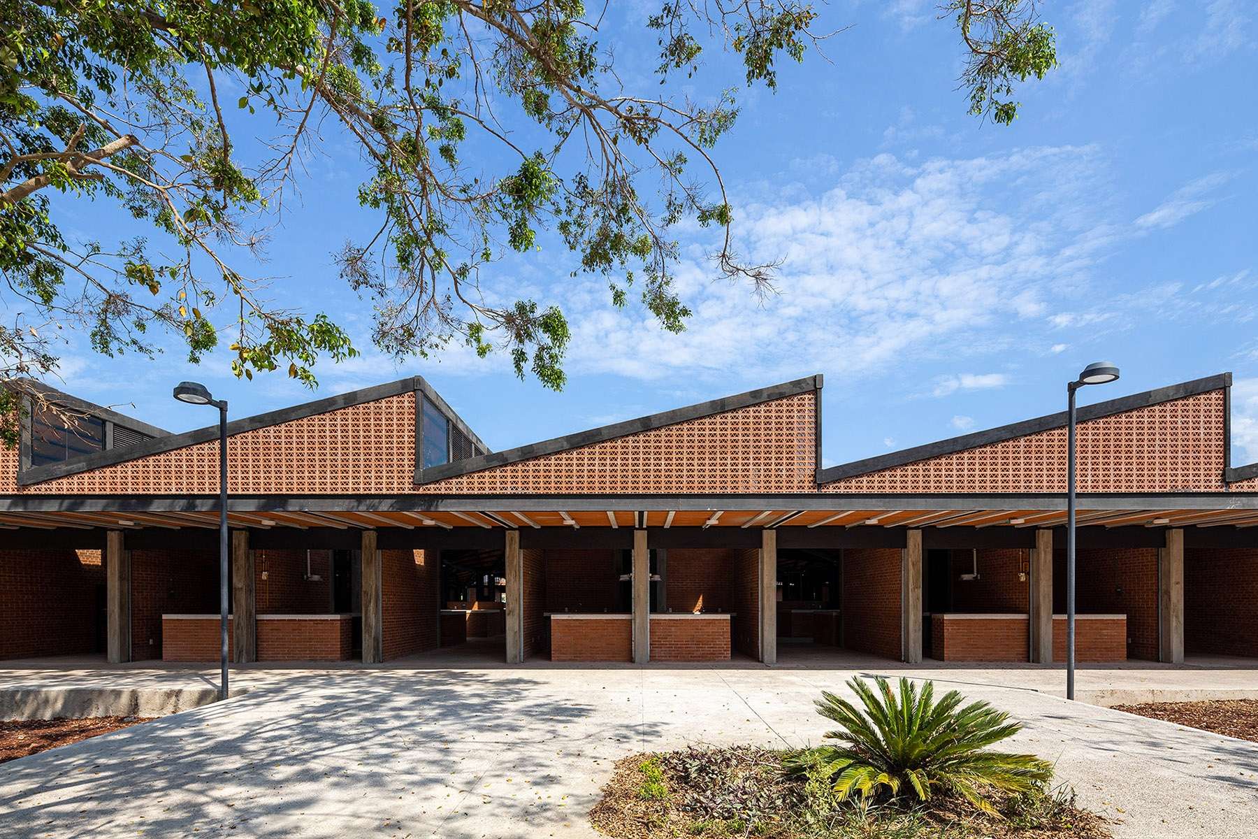
The market has a surface area of 3,425 m2. It houses 120 stores, 30 of which are located on the outside. The stalls in the market are grouped in sets of four. The “umbrella structures” are configured asymmetrically and are lower on one side. In this way, they are providing passive lighting and natural ventilation systems. All materials were left in their natural condition to allow the building to age in a dignified manner.
The use of clay in this project has different purposes. For example, it has been used in hollow partition walls, lattices, and paneling. The designers aimed to create a homogeneous, warm atmosphere with ochre-colored lighting qualities.

To conclude, the transformation of the market and the public space developed by Studio KEN stands as an example of urban renewal. The designers have shown now again that design can transcend beyond the physical and excel in different ways. The metamorphosis of the park is not just a redesign, it is a testament to the potential of collaborative efforts in creating spaces that enrich the daily lives of people.


