

Header: Building Narratives
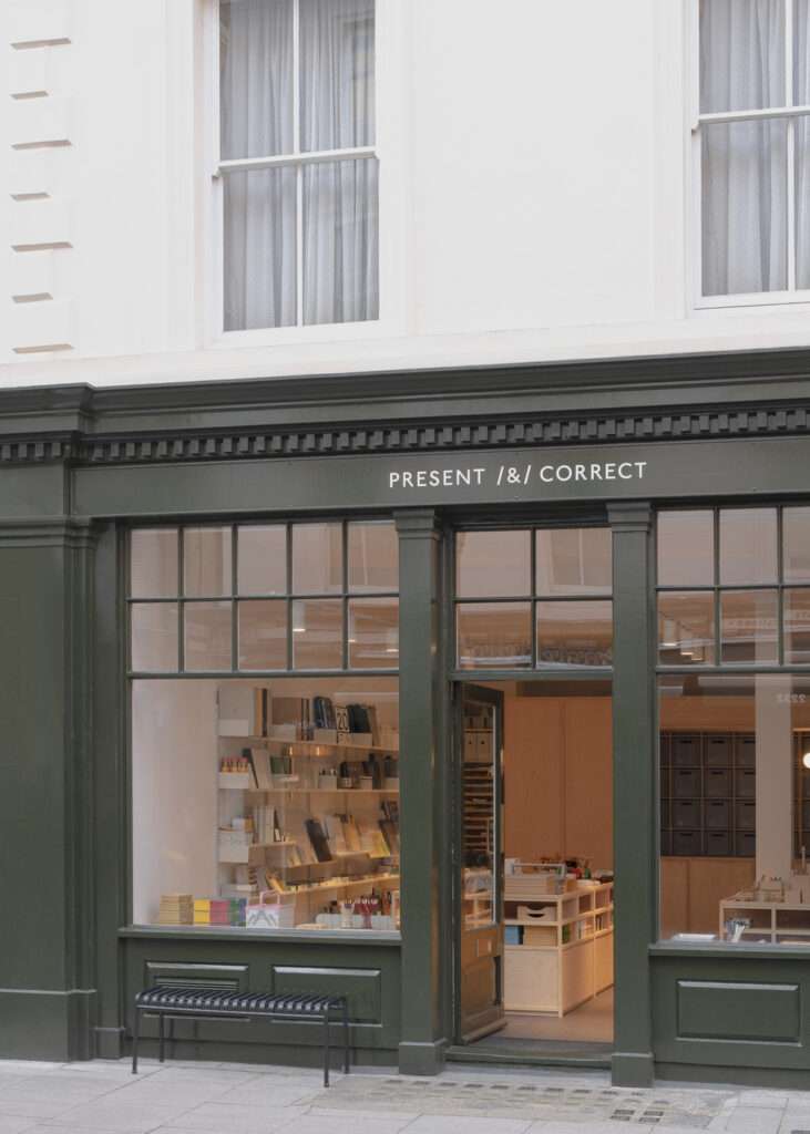
Located in a historic retail space in Bloomsbury, a charming part of London known for its literary legacy, stylish boutiques, and sophisticated restaurants, the newly designed Present & Correct shop offers a perfect balance of thoughtful design and practicality. Created by Architecture for London, in collaboration with AFL Build, the space transforms how stationery is showcased, appreciated, and enjoyed. This project pays tribute to the art of order and creativity.
The project extends beyond the location
Understanding the transient nature of retail spaces, the design brief called for a demountable interior. This innovative approach ensures that the bespoke joinery and storage solutions can be easily relocated or adapted for future use. The practicality of the design extends the lifespan of the project far beyond the lease of the current location, setting a great example for sustainable interior design.
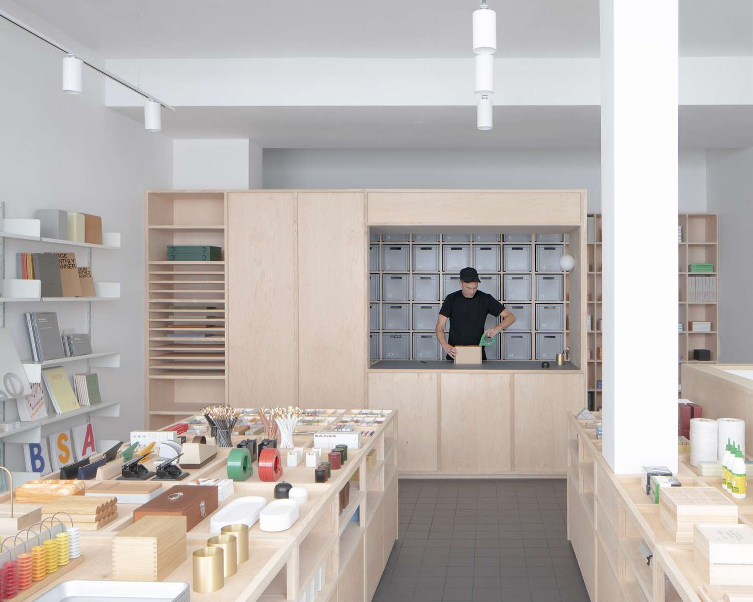
Most of the joinery was constructed offsite, with careful consideration given to modularity and portability. Cabinets were designed to fit through standard door widths, while adjustable feet concealed within recessed plinths ensure stability on the shop’s uneven floors. This meticulous attention to detail balances aesthetics and functionality, creating a space that is as adaptable as it is visually striking.
A neutral palette with subtle elegance
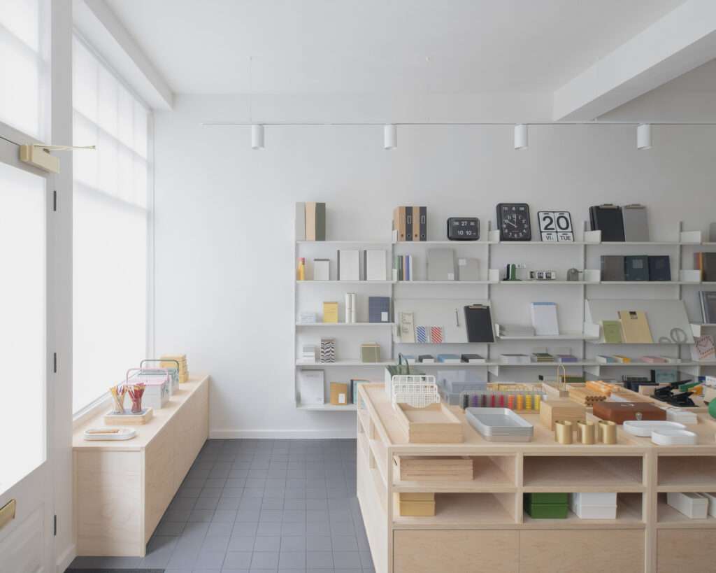
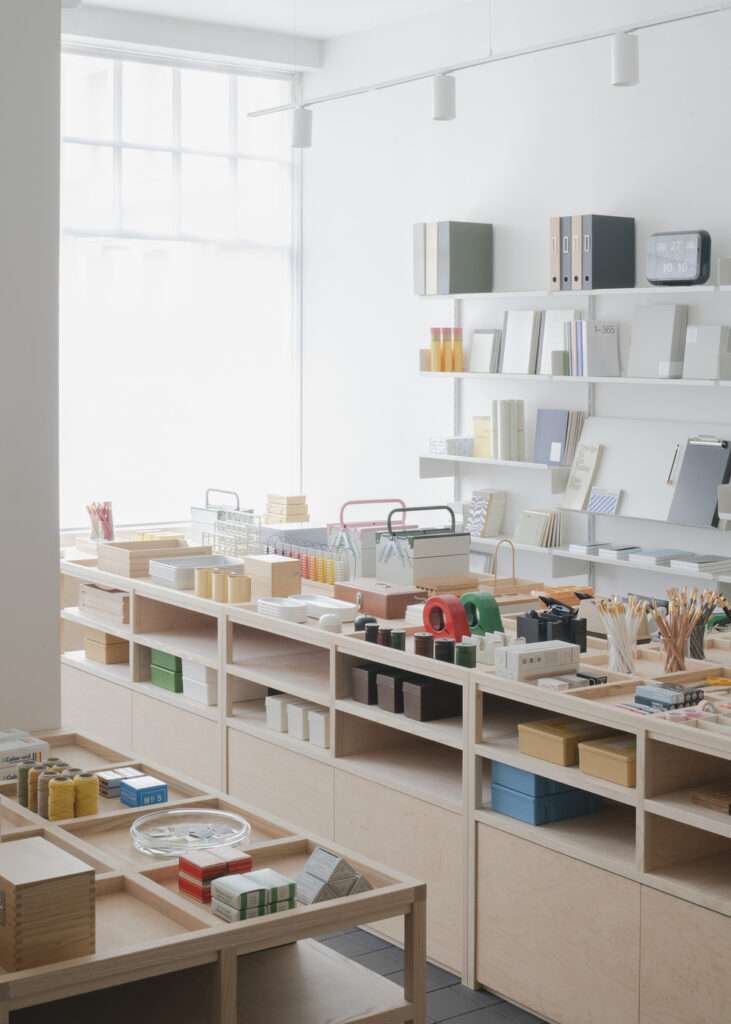
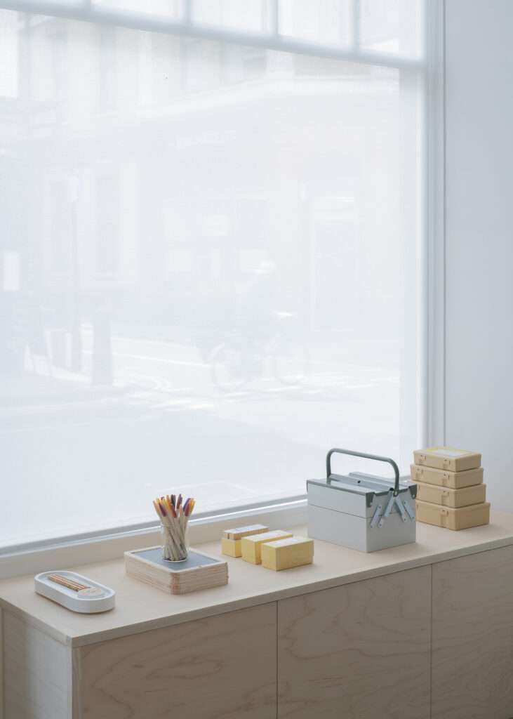
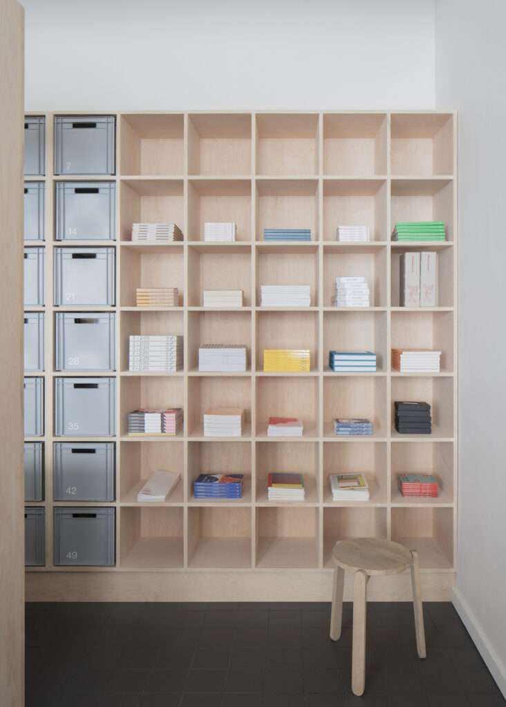
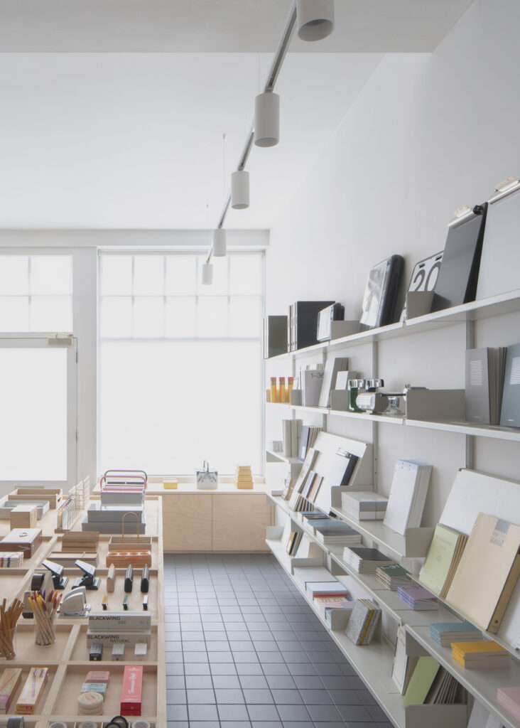
The materials chosen for the shop interior reflect a commitment to durability and timelessness. To create a serene and cohesive environment, maple plywood and British ash are paired with a tiled floor, Vitsœ shelving, and discreet LED lighting. The maple plywood’s smooth, imperfection-free grain exudes a calm elegance. At the same time, edges finished with 25-millimeter ash enhance durability, making the joinery robust enough to withstand the demands of a bustling retail space.
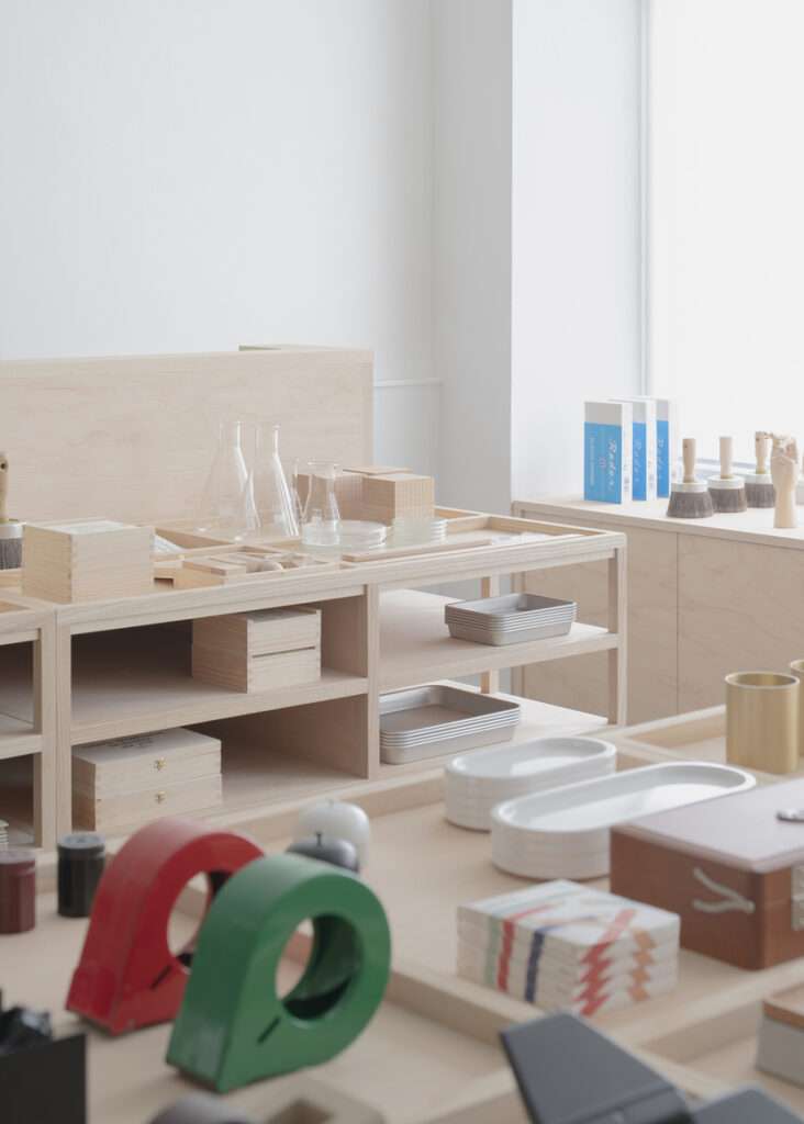
The ‘wunderkammer’ effect
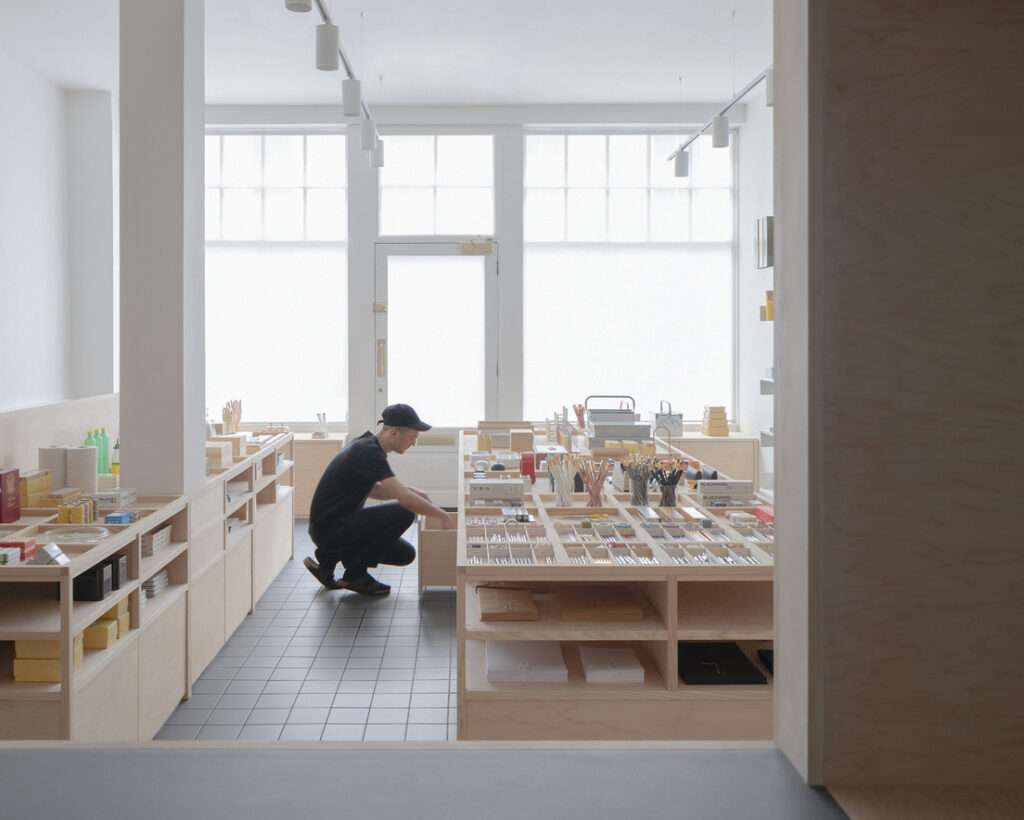
Drawing inspiration from the neighboring British Museum, the shop cabinets evoke the spirit of a ‘wunderkammer’ – a cabinet of curiosities. Here, everyday stationery items are elevated to objects of desire, displayed with an order and elegance that transforms the mundane into the extraordinary. Hundreds of pens, pencils, and rubbers are artfully presented alongside larger items like toolboxes and trays, creating a visual feast that invites exploration.
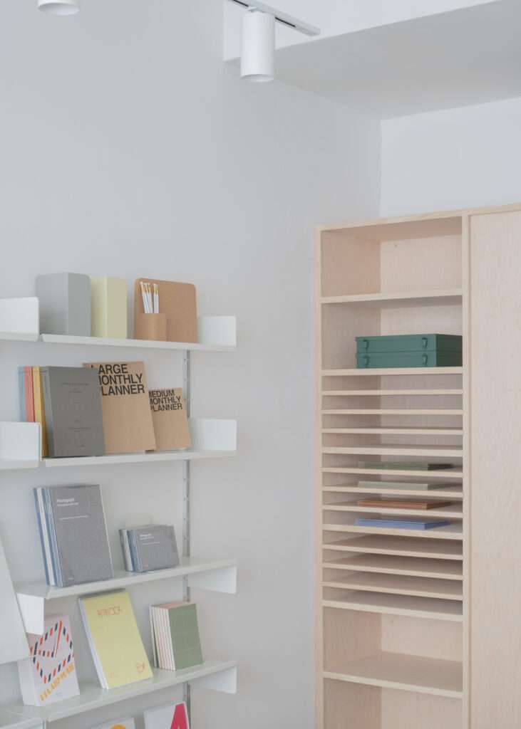
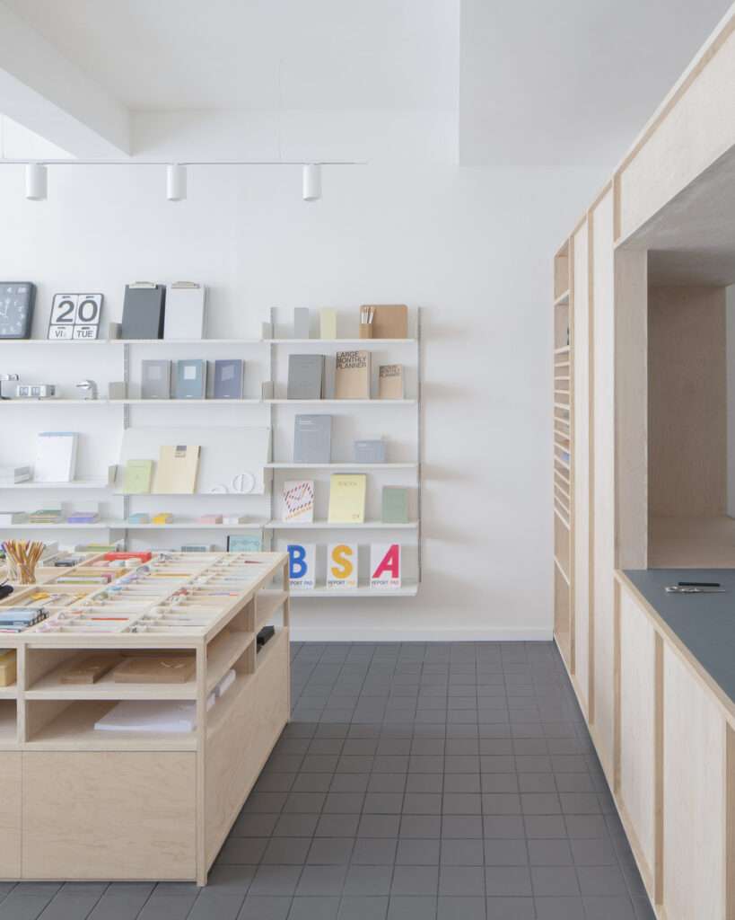
A grid that tells a story
At the heart of the shop’s identity is a grid system inspired by the ISO 216 A chart – a reference to the framework that underpins nearly all European printed materials. This grid informs the layout of the joinery, progressively shrinking as visitors move through the space. The result is a sense of scale and order that perfectly complements Present & Correct’s eclectic offerings.

Letting the products shine
Present & Correct, established in 2009 and previously located in Clerkenwell, has always been known for its curated selection of stationery sourced from over 18 countries. From vintage finds to contemporary designs, their collection sparks nostalgia, joy, and a renewed appreciation for the everyday. It was essential that the shop’s design didn’t overshadow the products but rather provided a neutral canvas for them to shine.
Architecture for London achieved this by opting for a minimalist palette and design. While early concepts included playful elements like pencil-shaped columns, the shopkeeper’s deep understanding of the brand led to a more understated approach.

Project info
Completion date: 2023
Architects: Architecture for London
Interior Designers: Architecture for London
Main contractor: AFL Build
Photography & video: Building Narratives
Client: Present & Correct