People who have a good sense of taste in food appear to be becoming increasingly interested in architecture that makes sense. In this article, we share some of the winning restaurant designs of the LIV Hospitality Design Awards.
Restaurants have a certain duality in terms of functionality. They must be able to strike a unique balance between privacy and social amenity. Dining, which was previously associated with home life, has seen a significant shift into the public realm due to the ever-increasing dynamics of work life.
This simply means that contemporary restaurant spaces and buildings have had to respond to the modern-day impetus to provide unique retreats from hectic city life for longer hours and for a significantly greater variety of occasions.
Winner in Interior Design Restaurant – Casual
Boqueria Chicago by Studio Razavi Architecture
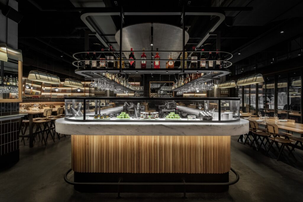
Photo credit: Studio Razavi Architecture
Growth presents an interesting challenge for architects once a design has contributed to defining a brand. How does one maintain a brand’s established identity and familiarity while avoiding copying and pasting previous designs into a new location?
In Chicago, Boqueria is located in the West Loop, in the gentrifying Fulton-Randolf District, a former industrial and meatpacking neighbourhood. The majority of new and old buildings have kept their industrial look, with large open floor plates and columns. Because the proportions of these spaces are predominantly horizontal, we chose to layer the information so that the overall design clearly understands how it is organized.
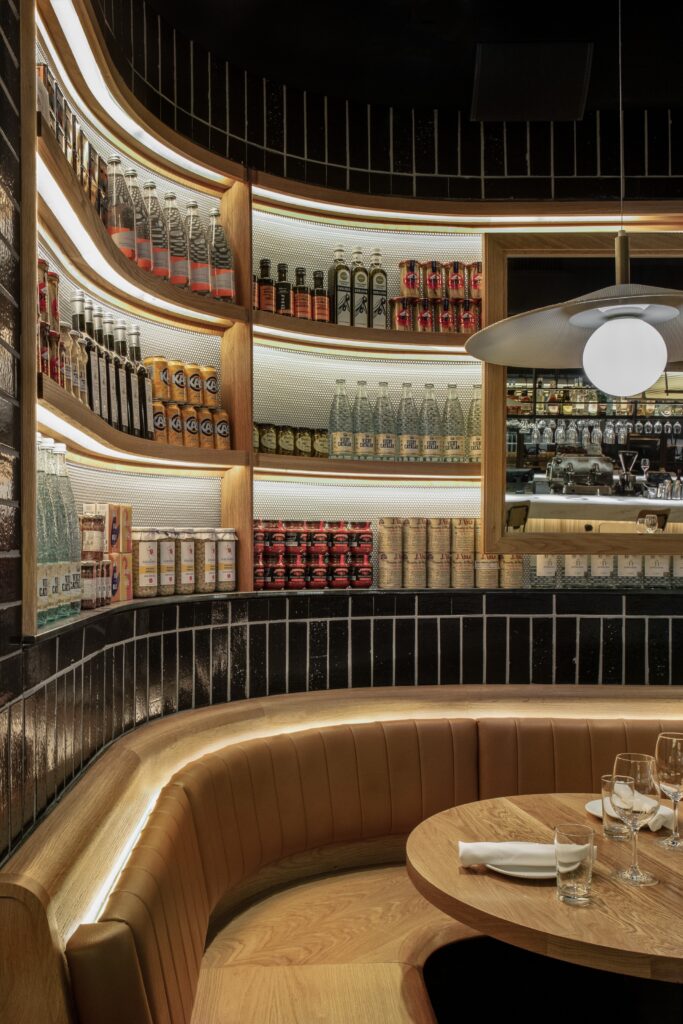
Photo credit: Studio Razavi Architecture
Wood and black tiles are the most common materials because they are reminiscent of the original Boqueria and because of the feelings they evoke. One develops a lovely patina over time, while the other provides a sense of permanence and security throughout the space.
All of the light fixtures were custom-designed to create a variety of lighting atmospheres while also serving as a reminder of Boqueria’s eclecticism.
Winner in Interior Design Cocktail Bar
Bondi Green by Run For The Hills
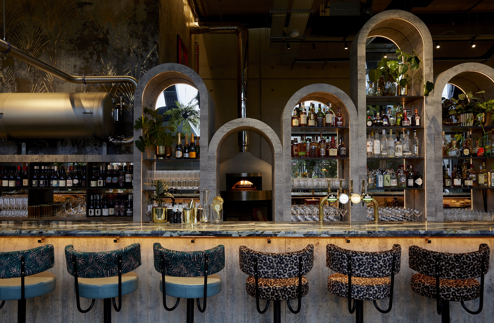
Photo credit: Studio Razavi Architecture
Bondi Green, a new all-day bar, restaurant, and alfresco café/bakery beside the peaceful waters of the Grand Union Canal in West London, needed a colourful but still pared-back, industrial-luxe design scheme. Let your imagination run wild with a Miami-inspired palette in an unadulterated celebration of tone and texture, experimenting with pattern clash and wow factor specialist surface finishes.
Creating zones and nooks in such a large, light-filled space with super-high ceilings was one of our design challenges. The design of the venue’s massive hero bar, which had to include not one, but two cocktail stations, a dedicated tank beer zone, a wine-tasting section, a working and live bakery, and a dedicated pizza oven was also a major scale challenge.
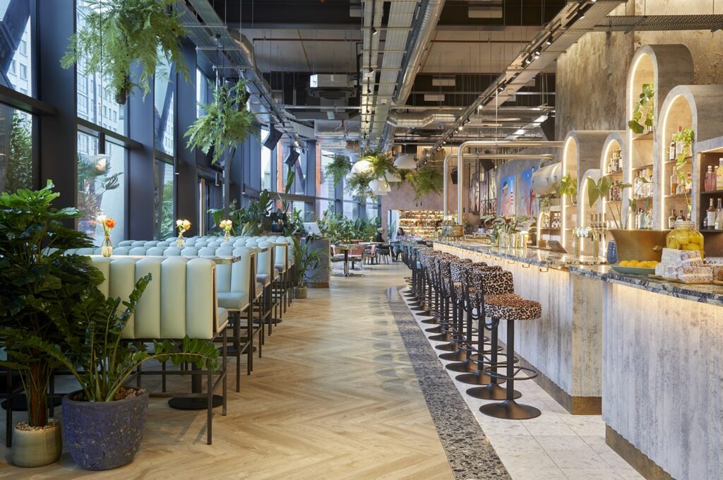
Photo credit: Studio Razavi Architecture
The end result is a design that puts colourful glamour front and centre, with massive art and dramatic arches lit in an atmospheric way. Extrovert botanical and animal print fabrics make furniture pop. Planting and highly textured metallic specialist wall finish help to divide the large space, which sparkles day and night with a perfectly placed ‘opening’ in the bar’s centre, straight down the pizza oven’s barrel.
Winner in Interior Design Brand New
Follower Restaurant & Bar by YODEZEEN
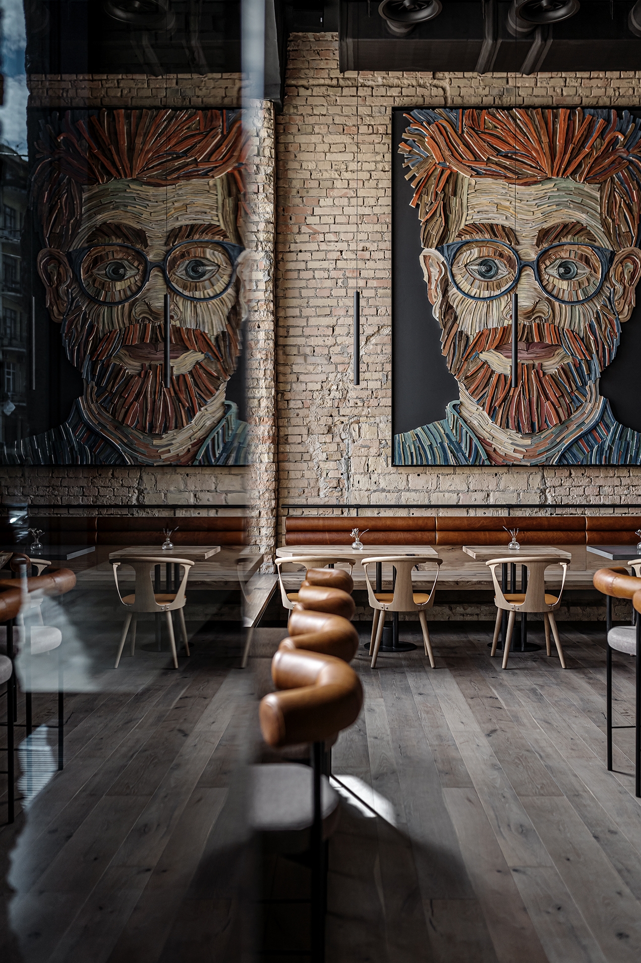
Photo credit: YODEZEEN
The Soviet building is transformed into an Instagrammable restaurant by YODEZEEN. The Follower restaurant, one of Kyiv’s newest hospitality establishments, is envisioned as an eclectic, eccentric, and modern hangout for millennials who are obsessed with social media but never forget the benefits of social interaction.
YODEZEEN was tasked with two important tasks as designers: maximum preservation of the building’s historical past while also creating a restaurant space where visitors’ offline and online presence is strongly intertwined, a space that leaves no opportunity not to post it on social media.
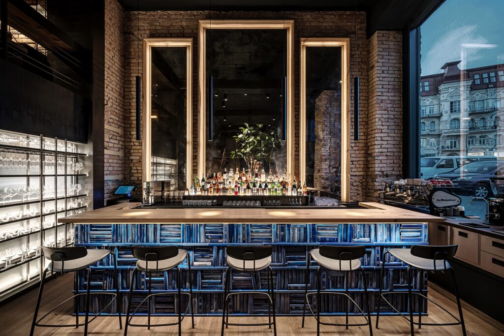
Photo credit: YODEZEEN
«Business owners increasingly recognize the impact of social media on their businesses in the current Internet era. So, in a commercial project like Follower, where we were trying to meet the needs of local businesses and create a space that perfectly suits Generation Y, the design-for-Insta strategy is becoming increasingly important. The ultimate goal, of course, was to create a more appealing environment for customers», says Lead Architect Artem Zverev.
Winner in Architectural Design Historic & Heritage
Citizen Public Market by NCA Studio, Inc.
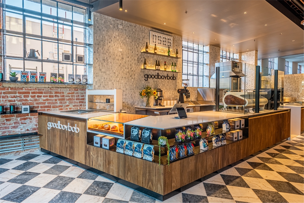
Photo credit: NCA Studio, Inc.
The food hall design evolved from the building’s rich history as the Citizen Publishing Company (1929), and it fosters an eclectic dining and entertainment atmosphere. The design team began developing the building’s design and designing tenant stalls in 2018, guiding the space into its next life.
The design concept incorporated existing Art Deco and Beaux-Arts architectural elements, elevating their level of craftsmanship and beauty. While working with all tenants to ensure the quality, craftsmanship, and honesty of materials to create an inviting atmosphere, the design team continued these nuanced motifs. To complement a variety of cuisines, wood grains, marbled stone, and hand-crafted tiles were carefully chosen.
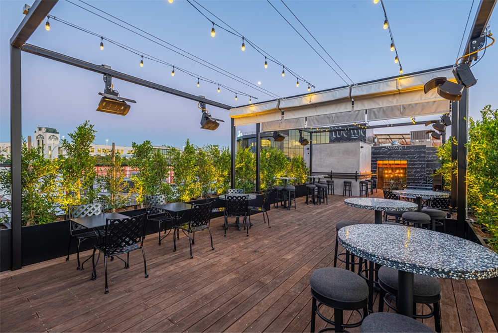
Photo credit: NCA Studio, Inc.
The project required highly specialized knowledge to navigate the city’s requirements and preserve its historical discourse within the local context. The team successfully navigated the complexities of a historic, unreinforced masonry building and the necessary permits required to operate a food hall that occupied two municipalities within Los Angeles County, all while maintaining the design integrity.
Winner in Architectural Design Restaurant – Theme
La Coquina cervecería by Doyle Collection Co. Ltd.
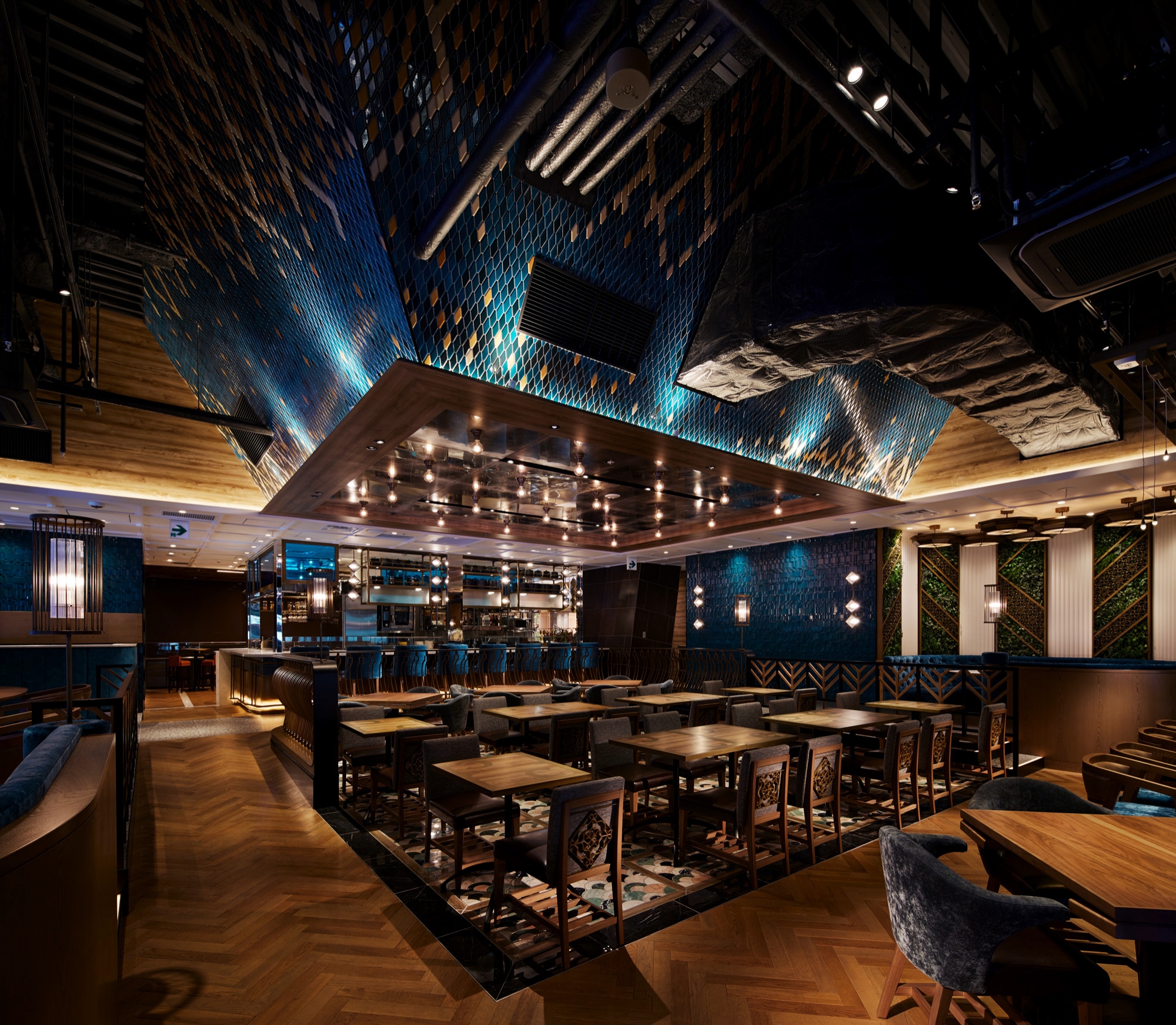
Photo credit: Doyle Collection Co. Ltd.
Shellfish dishes are the main menu at this Spanish restaurant. It is on the second floor of a newly constructed commercial building in Shibuya, Japan.
The Shellfish inspired the restaurant’s design identity. We translated this image into materials, patterns, and forms based on this inspiration. What’s more, by enhancing Catalun’s details? We have created an extraordinary atmosphere, a so-called trinity of Shellfish, Spain, and the Sea.
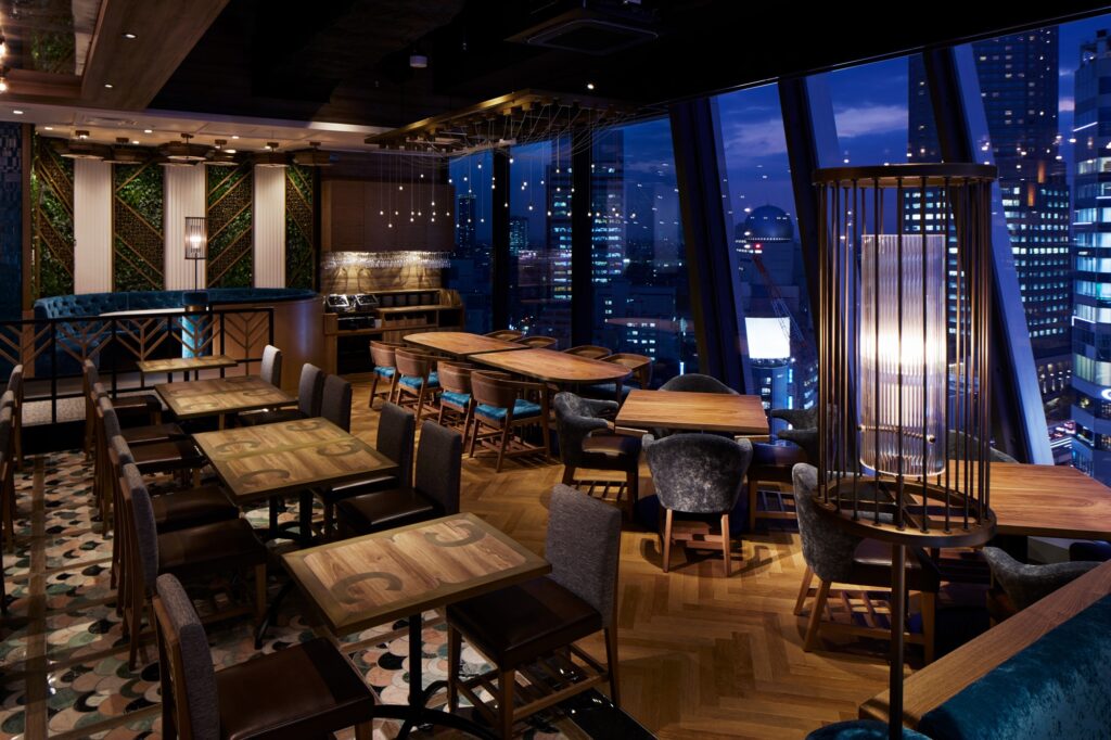
Photo credit: Doyle Collection Co. Ltd.
No two shellfish are alike here, as evidenced by the keyword Shellfish, and by focusing on how they appear when accumulated, we have also designed from the visual appearance side as well as from the perspective of what it would be like to be a shellfish. Our ceiling design is a good example. We tried to capture the calming atmosphere by using lustrous tiles, patterns, and mirrors to depict the wavering water surface and light refraction seen when looking up from the ocean floor where the shellfish live. We used mosaic mirrors and sea anemones that resembled lighting to complement the scenery outside the restaurant.


