Ekho Studio has completed its first student accommodation project, as the interior consultancy enters the PBSA (Purpose-built Student Accommodation) market for the first time. The project is a new-build scheme called Enso, located in the heart of Colchester and just minutes from the University of Essex campus. The joint clients on the project were UK real estate fund manager Moorfield, with whom Ekho Studio Founding Partner Rachel Withey had already worked on several occasions at previous agencies, plus project developer Melberry. The Ekho Studio design team also liaised throughout with operator CRM Students.
The brief for the interior was first to create a bright, airy and light-filled student amenity space on the building’s ground floor, incorporating thoughtfully designed communal spaces aimed at encouraging social interaction. The amenities needed to promote relaxation and wellbeing and also offer a sense of balance to residents, with co-working spaces for individual study and team collaboration, lounge and seating areas and a gaming area and gym. The second part of the brief was to create the look and feel for the scheme’s 282 student rooms, devising a colour palette that would tie in harmoniously with the amenity concept. The overall design was also to be environmentally low-impact, prioritising materials with strong recycled or recyclable credentials and low-energy manufacture and use.
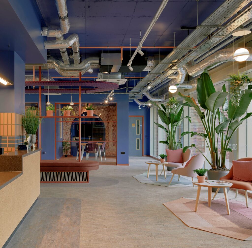
Design Concept:
For the project concept, Rachel Withey and the Ekho Studio team took primary inspiration from a sense of place, focusing particularly on Colchester’s rich historic past. The city was known as ‘Camulodunum’ – translated as the ‘Fortress of the War God Camulos’ – during Roman times and was immortalised by Pliny the Elder as Britain’s first recorded settlement and, later, as Britain’s first city and capital. Certain forms and elements from that period remain intact, standing out as a common thread through the city’s history and architecture, from Roman arches to the town’s layered brick walls.
Ekho Studio took these key visual and architectural elements and used them to formulate a consistent design language for the scheme that translates right across the interior spaces. Simple forms, particularly the ‘arch’ motif, were used horizontally and vertically to create interest, whilst a series of layered vistas add a sense of depth, with repeat patterns, sometimes with a woven form or fringed edge, suggesting the reveal of layers in the old city.
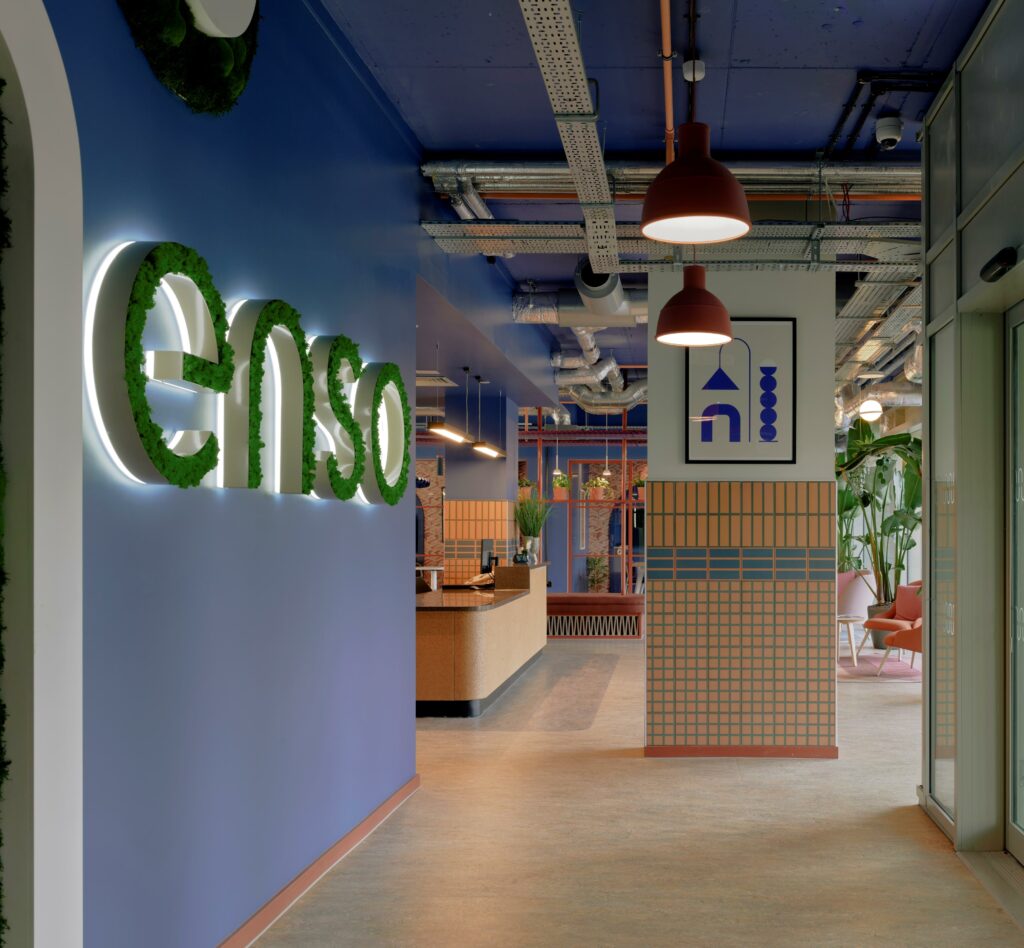
A second thread is nature, with Colchester and the surrounding countryside full of strong textures and dramatic forms and colours. The colour palette fuses Roman-era references with local natural colours, celebrating earthy and warm tones.
“By using these tones as ‘block’ colours, we created a vibrant, bold colour palette which works well with the forms but also has a softer feel” Rachel Withey commented. “We emphasised the toasty burnt oranges and varying shades of pink that cloud and streak the traditional earthenware material of terracotta and complimented this with the natural greens/blues that reflect Colchester’s surrounding countryside.”
Ekho Studio collaborated with branding agency J2 on the scheme, with the latter creating the project’s unique Enso branding, mining a direction inspired by the interior design narrative. The lowercase ‘enso’ of the brand features an ‘n’ that alludes to the simple form of the arch, for example, with the ‘n’ additionally used by Ekho Studio within the scheme as a playful standalone marque/art feature, filled with planting, in both small and large iterations.
Rachel Withey selected all the art on the scheme, adding a graphic layer to the concept by choosing semi-abstracted forms or outlines that echo the shape of arches and Roman pottery, whilst fitting seamlessly with the colour scheme. Rachel also personally selected all the project’s planting, choosing mostly large and dramatic plants to add a sculptural element as well as natural punctuation to the space.
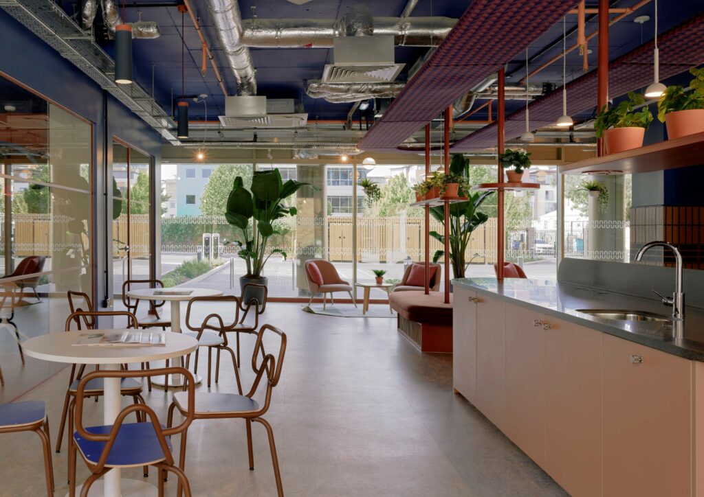
The Space Plan:
As Ekho Studio was involved in the project before construction, the team was able to request minor alterations to the space plan from the point of view of flow, including, for example, more external doors into the courtyard. Other changes included moving the reception further away from the arrival doors and swapping the internal ply laminate doors to blue for the amenity space, whilst they’re in light oak elsewhere. Ekho Studio also proposed locating additional gym equipment outside in the courtyard space, in addition to the ample internal gym located internally at the rear of the games area.
‘Courtyards are lovely to look at and great sources of natural light but are often under-used and passive in nature’ Rachel Withey commented. ‘By locating part of the gym outside in the healthy fresh air, we also made it into a more active space, with the added benefit of liberating indoor space for other uses.’
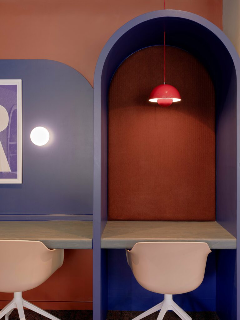
The amenity space features two distinct areas: a social space at the top of the plan with a games area, including a pool table, and access to the gym, with this potentially noisier area located the furthest from ground-floor student residences. At the bottom of the plan are the reception, teapoint, lounges, study room and smaller enclosed study room. The ground-floor bedrooms are located beyond to the study spaces to ensure the quietest possible adjacency.
Sustainability Story:
From recycled and sustainably sourced materials to natural design features and landscaped gardens that bring the outside world in, every corner of Enso has been designed to celebrate and help protect its environment.
Sustainable materials used in the scheme include recycled wallpapers throughout; water-based paint finishes with no chemical emissions; cork as a sustainable material for joinery and feature walls; biophilic interiors with air-filtering plants at low levels; living walls made from moss; terracotta tiles, joinery and light fittings made from 100% natural recyclable material and manufactured with energy efficiency; durable and sustainable Marmoleum natural flooring throughout; ceiling tiles and plasterboard with ACTIVair technology to improve air quality; recycled-content furniture with FSC® timber accreditation – plus fabrics made from hemp and nettle.
Design Walk Through:
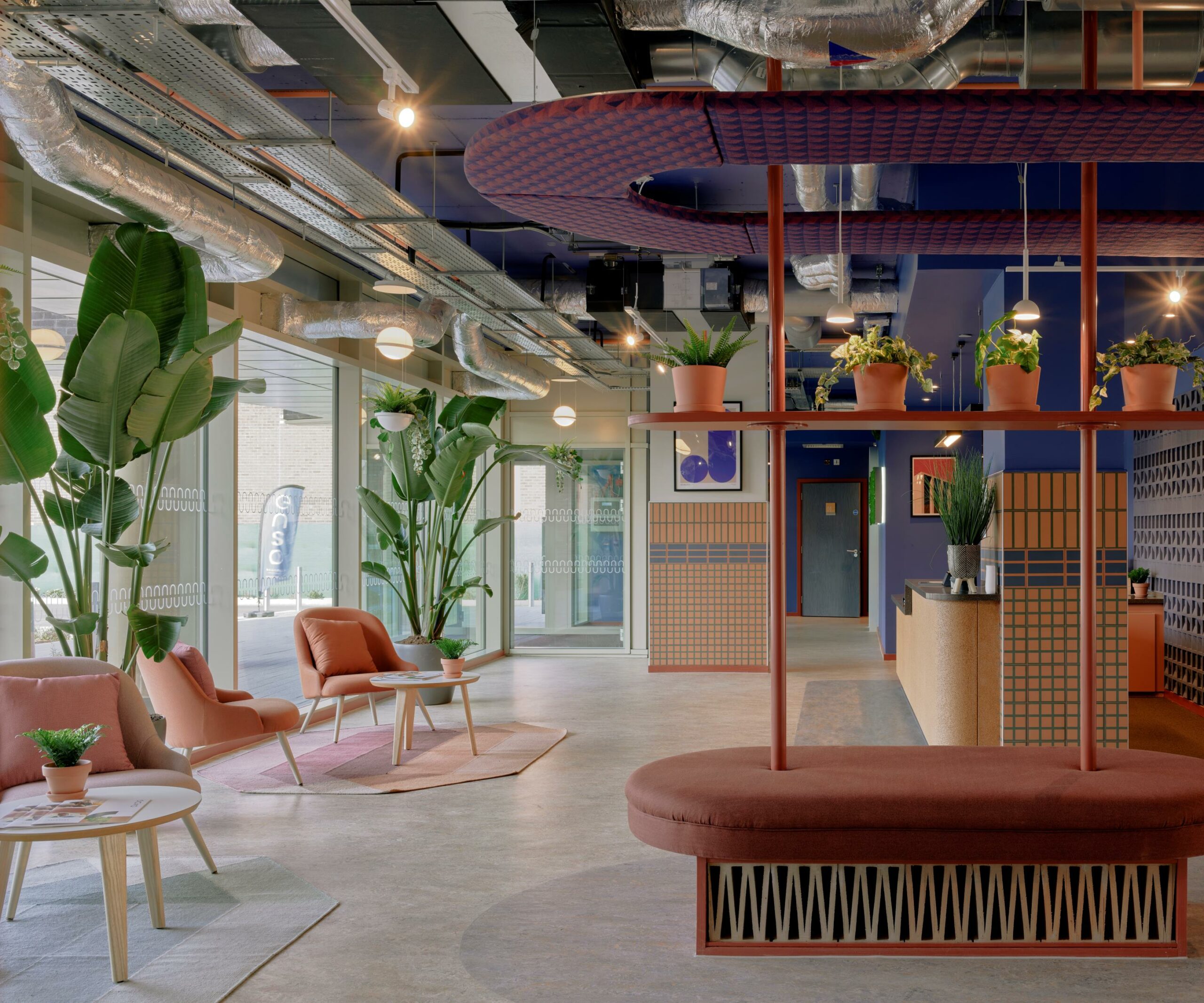
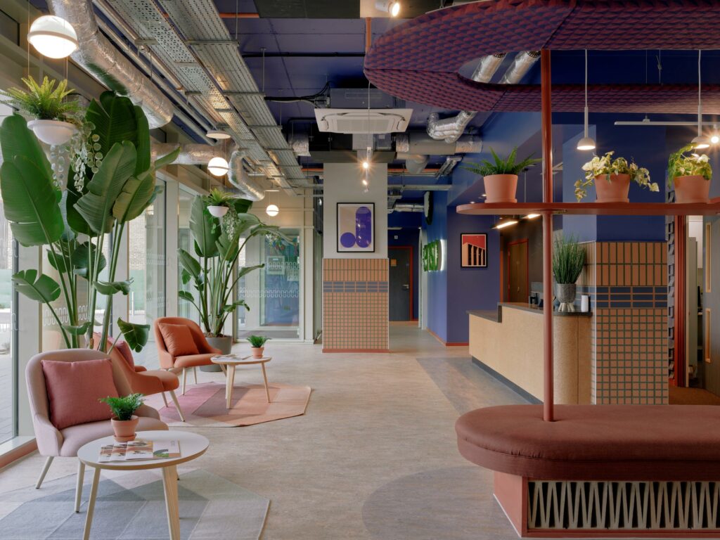
When students and their visitors enter the ground floor amenity space, they are immediately greeted by the site-specific Enso branding on the wall opposite, backlit and in lower case, with the four letters in-filled with planting to establish an immediate outside-in biophilic connection. The two dominant concept colours – blue and terracotta – are also immediately introduced in the form of a blue-painted wall with terracotta skirting at its base. The playful take on the arch shape of Enso’s letter ‘n’ also has its first iteration here as a wall decoration, both super-sized as a large arch and as a smaller, inverted ‘n’, with the bottom of the shape aligned to the top of the wall. Both are edge-lit and either infilled or surrounded with reindeer moss. The flooring here and throughout is in Marmoleum tiling in varying patterns and colours, whilst the ceiling is exposed to create maximum height, with white-coloured track lighting throughout.
As students or visitors approach reception, they see the space’s first structural column, treated decoratively and clad in a pattern of terracotta and blue tiles from Quintessenza Ceramiche in Italy, with a feature green grout. Above the tiling is the scheme’s first artwork, incorporating both an arch and a pottery shape. The bespoke reception desk to the left features a Hanex top and a cork frontage, whilst two pendant lights above are the Cortina / Big Pendant Lamp from Dam-Green. Behind the desk is a bespoke 3D wall finish in blue, incorporating the project’s geometric and ‘hidden depth’ themes, with a sense of depth that creates a surprising double-take view at various points in the space.
A back-of-house office and kitchenette located behind the main reception are glazed, with views across the majority of the amenity area across the courtyard, so that staff are always aware of how the space is being used. A reception waiting area features furniture arranged on two different rugs – a Diamond Blue-Green and Ndbele Red pattern from Gan Rugs – tying in with the scheme’s blue/green and terracotta colour palette, with the first large-scale plants here adding drama and scale.
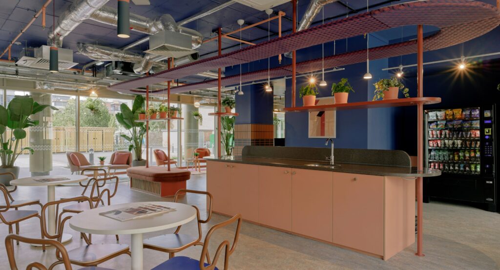
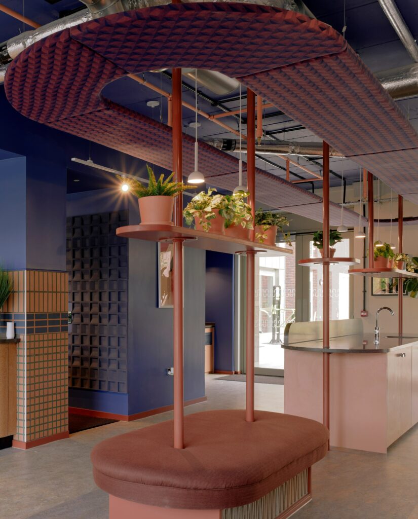
As the space opens up, a teapoint follows round to the left, with laminate cladding to the front in a terracotta tone, though the focal point in this area is undoubtedly a bespoke joinery seating lozenge. This features at its base a zigzag brick pattern, with deceptive depth, with the same material and pattern also used on the back wall of the teapoint and later in the scheme for the screens that lead to the games area. Above the banquette seat – and extending over the whole teapoint area – are three inbuilt display shelves for planting, with a single lozenge-shaped raft at the top featuring on its underside a geometric patterned textile in blue and terracotta from Textile Mania, who supplied all the fabrics in the scheme.
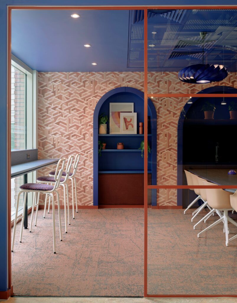
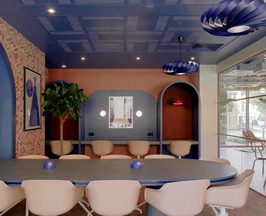
The teapoint is lit by four Blush Pendant Lights in white from Northern. Opposite are two sets of 4-person table seating arrangements and then, behind these, a long, glazed wall announcing the large co-working and the smaller quiet study spaces. These include chairs in complimentary colours and a variety of worktops and booths, with a large central table the main focus point of the co-working area. This bespoke blue table with a triple edge with a central inset layer is in the shape of the arch motif, playfully inset into a wall arch, as if it has just been leveraged out. The booth areas feature a fabric backing from Textile Mania, whilst the acoustic ceiling grid in the space has been painted blue and arranged at angles in an on-theme geometric styling. Two feature pendant lamps in blue by Tom Rossau are made of bent ply. A graphic wallpaper by Rebel Walls incorporates a ‘city wall’ pattern in shades of terracotta and, once again, offers a playful sense of depth. Pendant lights in the booth in a deep terracotta colour are Flowerpot VPI Pendant Lights from &Tradition. The co-working space also includes a large-scale potted plant / small tree and artworks featuring simple shapes that suggest pottery vessels.
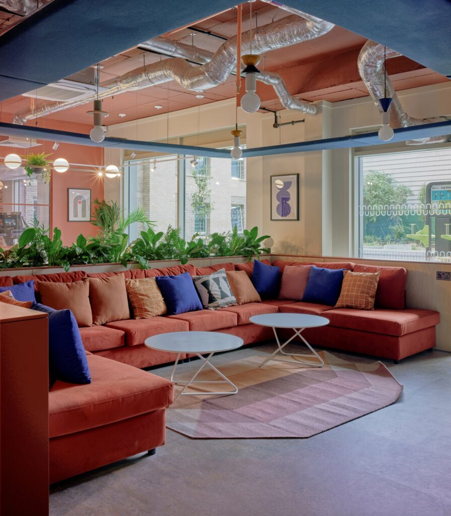
In the gaming area of the ground floor amenity space, the use of terracotta and blue is flipped for subtle differentiation, with the walls and ceiling in terracotta rather than blue. A U-shaped, large sofa in dark terracotta is dressed with a variety of plain and patterned cushions that fit with the colour palette, whilst two white incidental tables sit on a rug from Gan Rugs. The feeling of a new zone is aided by a square suspended ceiling raft in blue over the sofa area, enclosing four feature pendant lights – Junit Lamps from Schneid Studio.
Behind the sofa, a large-scale, laminate-clad planter with a terracotta top edge creates a zonal screen, with a pool table located directly behind. The adjoining wall here also features the same large arch and small inverted arch as used on the entrance wall. A rectangular track light demarcates the pool table area, whilst feature lighting directly above is the Palma 3736 Pendant Light with Planter Vibia. Artworks adorn the walls and four small white stools are lined up against the planter. The split gym area sits both behind the pool table, on specialist durable rubber floor tiles, and also directly outside the glazing in this area – with the glazing here and throughout featuring a manifestation based on the arch motif.
Heiko Figge, Head of Operational Asset Management at Moorfield Group commented on the scheme: “We are delighted to have worked with Ekho Studio on Enso and several other projects within our portfolio. Ekho Studio were responsible for the interior design, look, and feel of the development and we are delighted with the outcome, which captures a stylish and contemporary character while respecting the heritage and architecture of the local area. Ekho Studio understand our brand standards, design brief and budget, and were always willing to go above and beyond what is expected. The team are creative, deliver inspiring concepts and designs, and pay attention to detail. We highly recommend them.”
Photographer: Gunner Gu


