Header: Stephen Kent Johnson
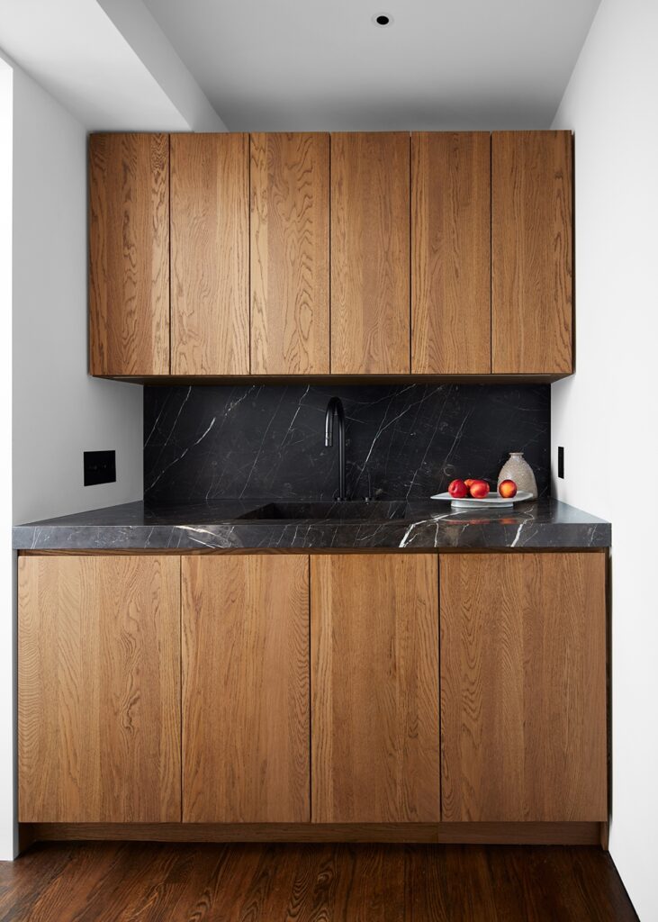
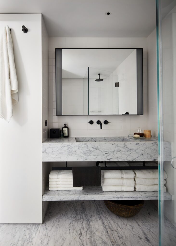
In New York, space is considered a premium commodity, that’s why it’s always a pleasant surprise to see how interior designers work around this problem. The Horatio Street Apartment by Messana O’Rorke demonstrates that a small space can be as functional as it can be visually appealing.

This project, which won recognition in the Apartment Interior Design category at this year’s SIT Furniture Design Awards, is a transformation of a tiny New York City pied-à-terre, located in a 1931 Bing & Bing building, into a practical environment that suits the client’s lifestyle, which does not include cooking or entertaining.
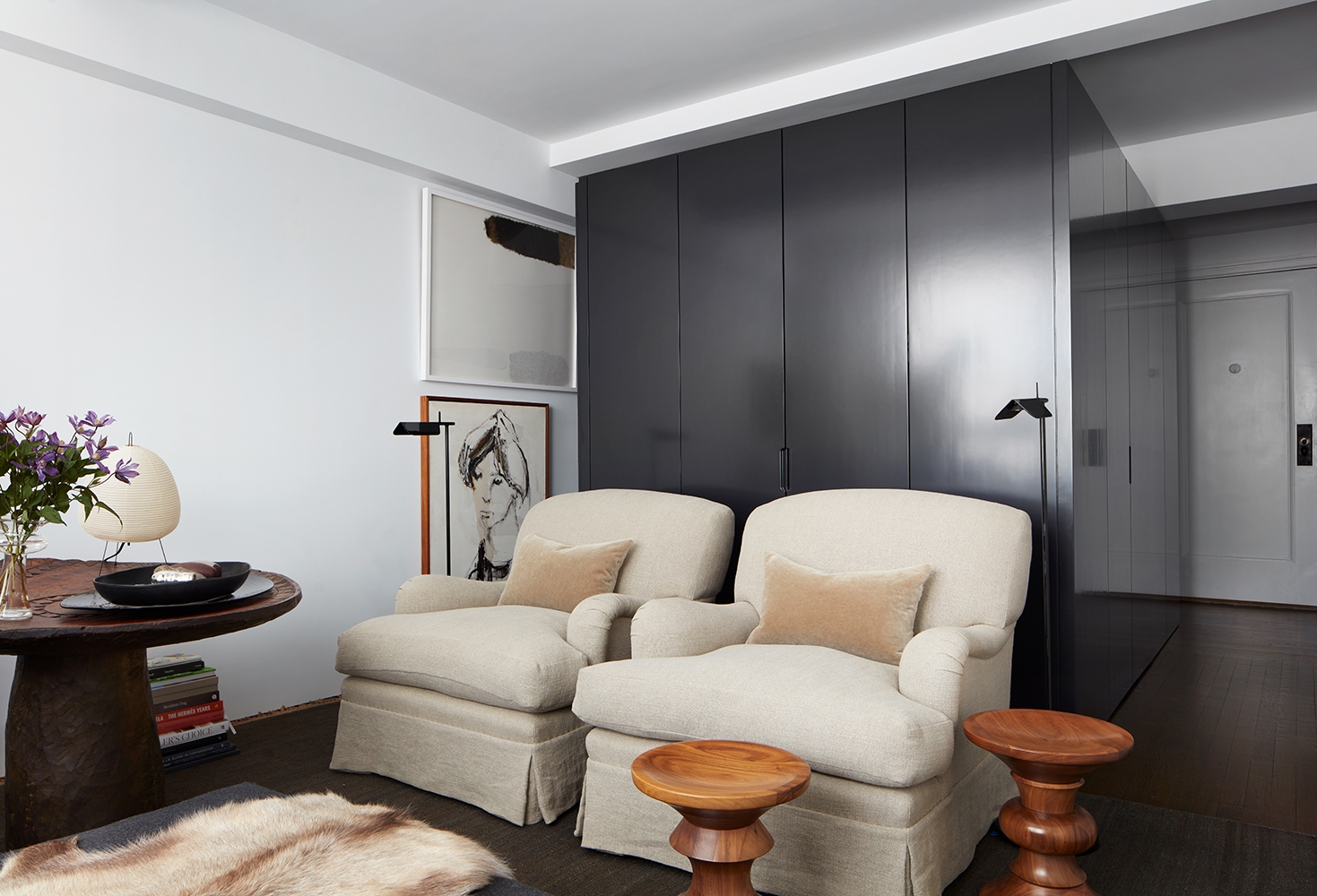
The design takes on a bit from Messana O’Rorke’s earlier jewel box studio apartment, where the bed chamber was designed as an independent volume within an open space. In the Horatio Street Apartment, a freestanding sleep pavilion opens to the apartment on three sides and serves as the central feature, boasting a modern look with its exterior finishes in matte-grey lacquer.


The minimalist design does not compromise on comfort, as the interior of the pavilion, lined with soft grey felt, cradles a cosy atmosphere while contrasting with the structure’s sleek exterior. This minimalist structure contrasts with the apartment’s original oak floors and traditional panelled walls, which were installed to conceal storage and provide a practical solution for the compact space.
Every aspect of the Horatio Street Apartment is carefully considered, making sure that the limited space is used efficiently. The design gives residents a sense of calm and privacy, a sort of retreat from the chaotic city that surrounds them. By embracing the apartment’s small footprint and focusing on creating a functional, well-organised space, the designers showed us their version of how to thoughtfully use space.


