In the ever-evolving world of retail, businesses face an ongoing challenge, namely how to captivate their customers, not only with the products they offer but also with the essence of their brand. From the entrance that welcomes you inside to the well-placed products capturing your attention, every little detail tells a story.
In this story, we are going to explore the intricate and enchanting world of how retailers leverage interior design to narrate their stories.
RuirUirul Flagship Store
- Location: Shenzhen, China
- Company: WE DESIGN
- Lead Designer: Simon Cheng
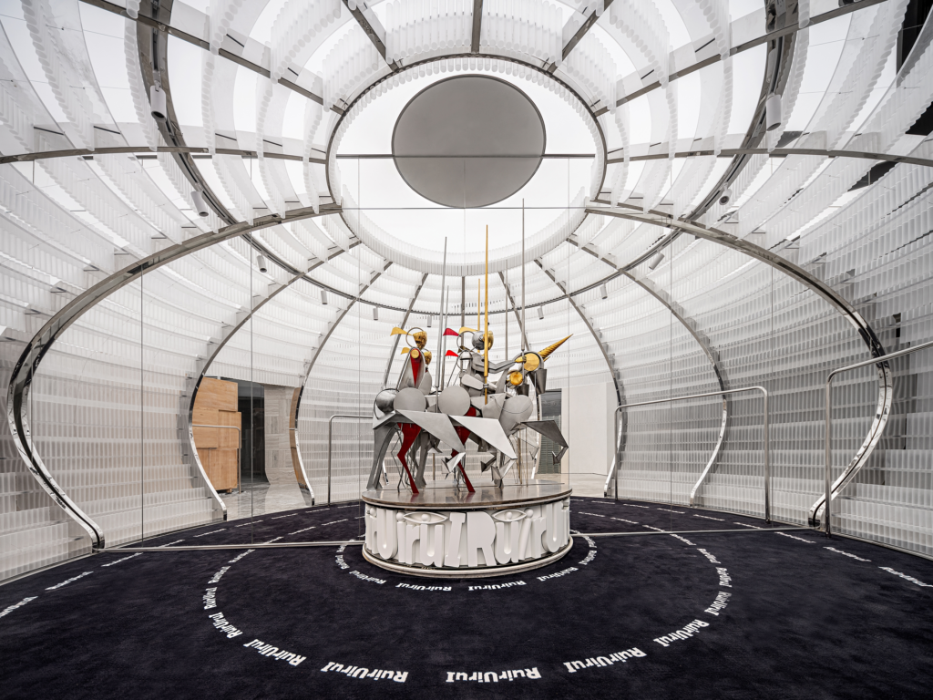
WE DESIGN has been inspired by “The Procession of the Magi” by Benozzo Gozzoli in order to create this breathtaking design. They have extracted four elements: the Castle Theatre, the Knights, the Flexible Armor, and the Rugged Mountain into RuirUiruI, to transform this space into a unique experience. These motifs reflect the brand’s DNA focusing on genderless, ageless, and classless culture.
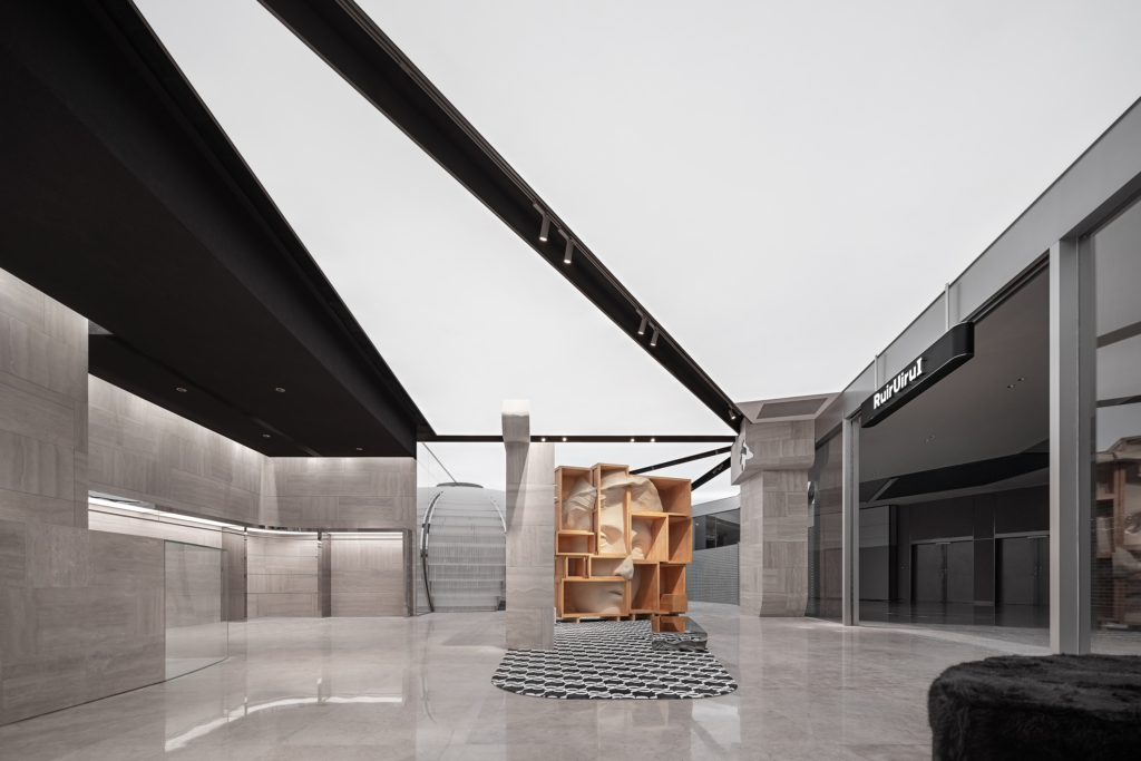
While the round castle exudes a secret theatrical spirit, the sculpture and incomplete stone walls display a piece of Renaissance humanism. The goal of WE DESIGN with this project has been to build a theatre experience rather than chase trends. They have achieved this by tapping into medieval culture and allowing the exploration of different scenes. Moreover, the studio created a metallic arc as a strong visual sensation. The irregular ‘mountain’ scenery is carved with the original mottled material pattern, colliding with art and reality.
Marrow Fine
- Location: San Diego, the USA
- Company: Bells + Whistles
- Lead Designer: Barbara Rourke
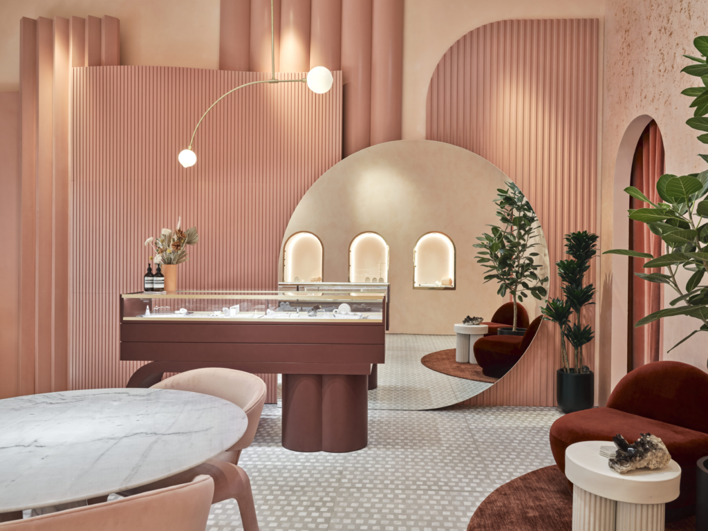
Marrow Fine Boutique has brought to life the feeling of being in the Jewelry Box, making the customer feel like one of the jewels themselves. A breathtaking ambiance unfolds with rich hues of rose and gold, featuring a burgundy display case inspired by Memphis Milano, a circular floor mirror, and a rouge tambour. Local San Diego decorative artist Sasha Seyb applied a handcrafted plaster and mica emulsion treatment to the walls, infusing the space with depth and warmth.
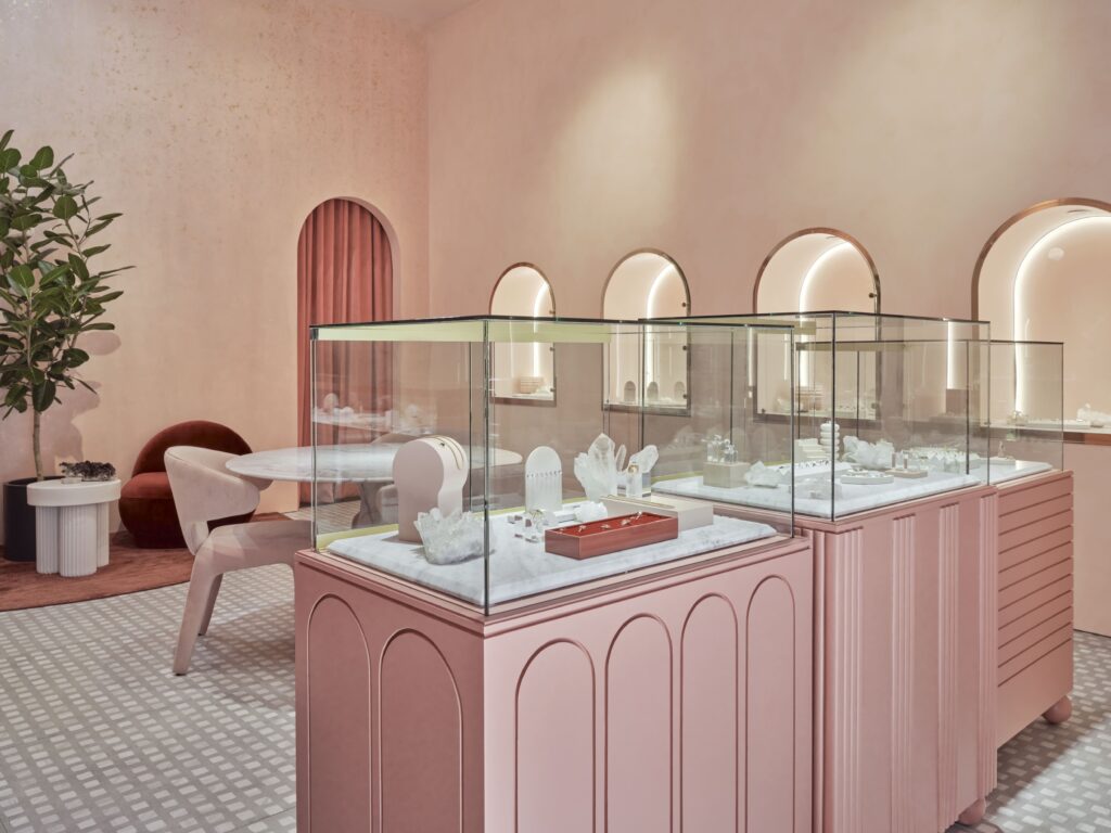
The mica infusion imparts a subtle, glistening effect on the walls when illuminated by the sun. Moving towards the back of the store, we find the “Babe Cave,” an intimate and exclusive salon area that has been treated to a royal makeover with an Art Deco influence. Within this space, a custom velvet couch gracefully embraces the pink gem fractal walls, designed to celebrate the store’s clients and their newfound treasures.
BURTON IN99 Flagship
- Location: IN99 Chengdu, China
- Company: Sa & Boo Studio
- Lead Designer: Lisa Liu
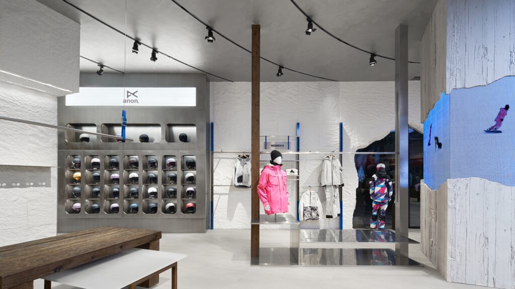
One of the things of utmost importance for the brand is to build a visually significant flagship store and improve the shopping experience. Recently, BURTON has been becoming popular in China and they have been trying to convey the message “People, planet, sports”. The design team who worked on the project took into account sustainability but also launched a city landmark. In order to honor the legacy of Jake Burton, the visionary behind BURTON and a driving force in the world of snowboarding, the team has recreated his original workshop.
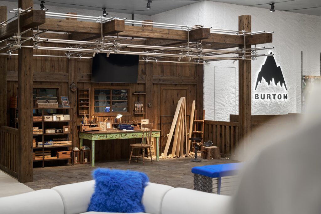
This revival seamlessly blends the time-honored Chinese mortise-tenon construction technique with contemporary industrial materials. The fusion of wood and metal forms the workshop’s architectural framework, symbolically encapsulating the delicate balance between nature and industry, tradition and innovation, and the bridge between the past and the future.
ACRMTSM KANAZAWA
- Location: Ishikawa, Japan
- Company: Seitaro Design, Inc.
- Lead Designer: Satoshi Miyakawa
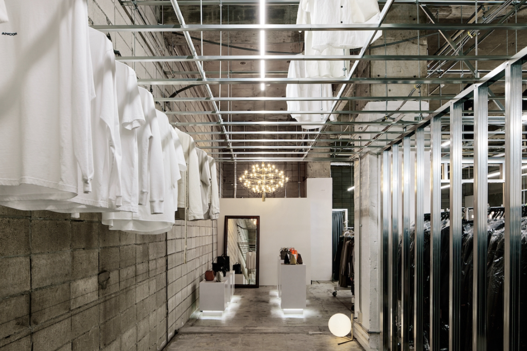
This project is a relocation project for a clothing shop. The property that was chosen had been in a skeleton state from the outset and as a consequence, there had been tension in the space. The walls of the building were constructed based on the concept of slightly varying the pitch of the studs so that the range of view changes depending on the angle of view.
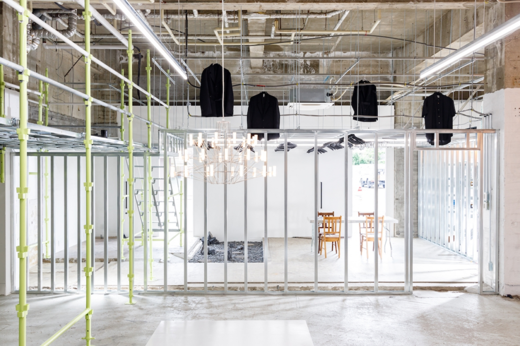
Furthermore, due to the extremely high ceiling, scaffolding was installed as a mezzanine floor and the space above the ceiling was also used as a display for clothes. By incorporating scaffolding, which had previously only been used as a temporary construction material, the ruggedness of the space stands out and is now recognized as a new material for the interior. The newly created space has a high affinity with the image of the apparel brand and highlights the specificity of the brand and products in a creative way.
Marktkauf Ratingen
- Location: Düsseldorf, Ratingen, Germany
- Company: Kinzel Architecture
- Lead Designer: Valentina Kinzel
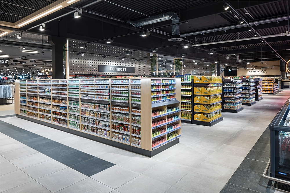
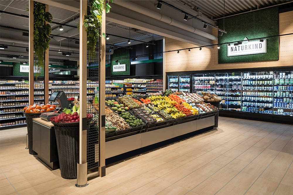
Earlier this year, the Marktkauft opened its doors to the public and offered more than 60,000 products of around 8,000 m2. The former Real supermarket has been renovated and has undergone an impressive makeover. Currently, the market shines in a new splendor inside and out. Its modern design skilfully stages the selection of products. Inside the market, there are material combinations of wood, concrete, stainless steel, and urban greenery, which give the large hall a clean and at the same time atmospheric effect. Targeted light accents create further highlights and provide a unique shopping experience through the sophisticated implementation.
Conclusive thoughts…
In the grand tapestry of retail, where the marketplace is both dynamic and fiercely competitive, interior design has proven to be an indispensable brushstroke in the canvas of branding. Retailers have adeptly recognized that their spaces are not just showcases for merchandise but theaters for narratives, where every element, from color palettes to architectural details, plays a role in telling their unique story.
In the digital age, where convenience can often overshadow the tactile pleasures of in-store shopping, retailers who excel in the art of interior design have discovered the alchemy of turning a mere transaction into an experience. These designers are the architects of ambiance, crafting environments that evoke emotions, stir memories, and awaken desires. Through the careful selection of materials, lighting, and layout, they breathe life into the very essence of a brand, transcending the boundaries of commerce to create genuine connections with customers.


