




Header: Courtesy of the European Central Bank
The European Central Bank (ECB) has shared the ten shortlisted designs for the next series of euro banknotes and has also opened a public survey that allows everyone in Europe to provide feedback on the ten options. Each of the designs follows one of the two themes decided ahead of the competition, “European Culture” and “Rivers and Birds”, each with its own set of motifs chosen to illustrate them. It is the first complete redesign of the euro banknotes since they entered circulation in 2002.
“Euro banknotes are more than a means of payment, they are one of the most tangible expressions of Europe. Through designs that combine beauty and meaning, they will reinforce our shared identity.”
Christine Lagarde, President of the ECB
A European design contest
The shortlist came out of a design contest in which more than 1,200 graphic designers applied, with 25 having then been invited to design proposals for one or both themes. Afterwards, a jury of 21 experts cut those down to ten, a euro area national central bank has nominated each member.
Two unifying themes
Both themes were chosen by the ECB’s Governing Council before the contest opened, along with the motifs illustrating each of them. The choice was based on suggestions from two multidisciplinary advisory groups from across the euro area and on the preferences of more than 365,000 Europeans, gathered through focus groups between December 2021 and March 2022 and public surveys in the summer of 2023.
“We are excited to present these real-life motifs that reflect our commitment to Europe and celebrate its cultural heritage and natural environment. The new banknotes will symbolise our shared European identity and the diversity that makes us strong.”
Christine Lagarde, ECB President
European Culture
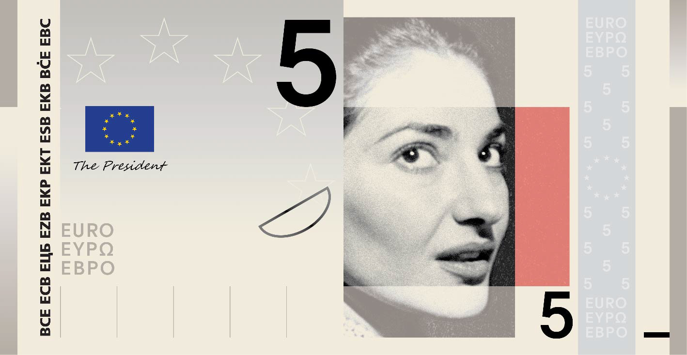
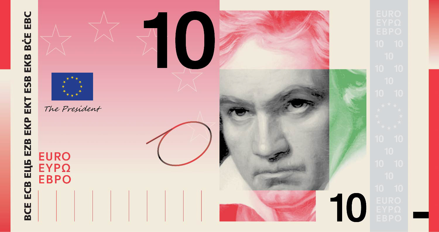
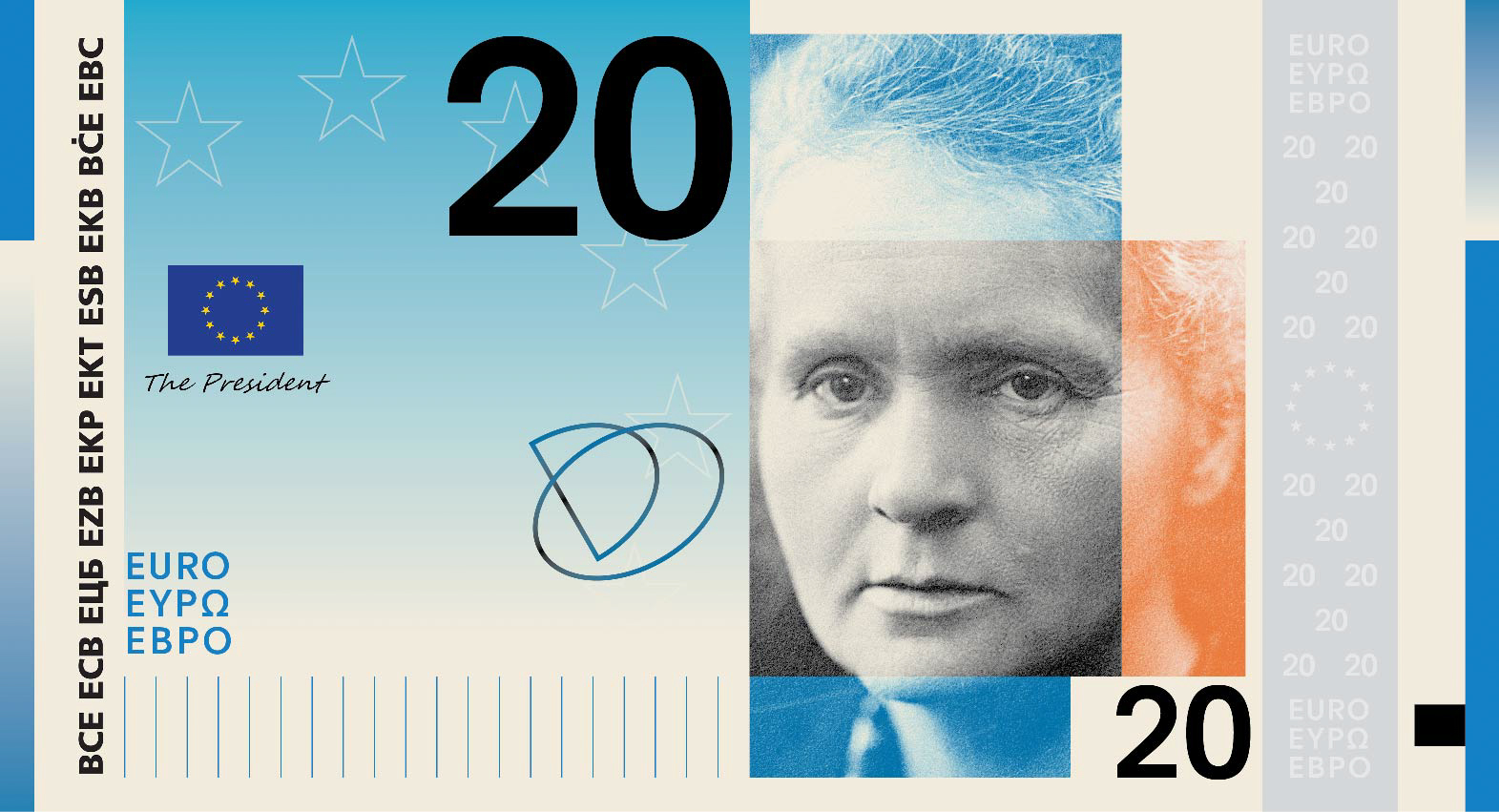
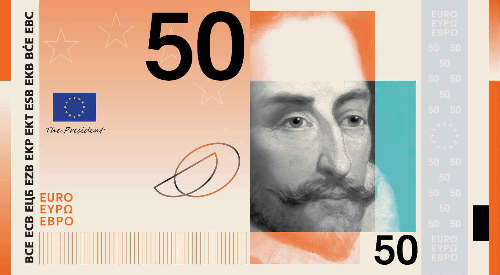
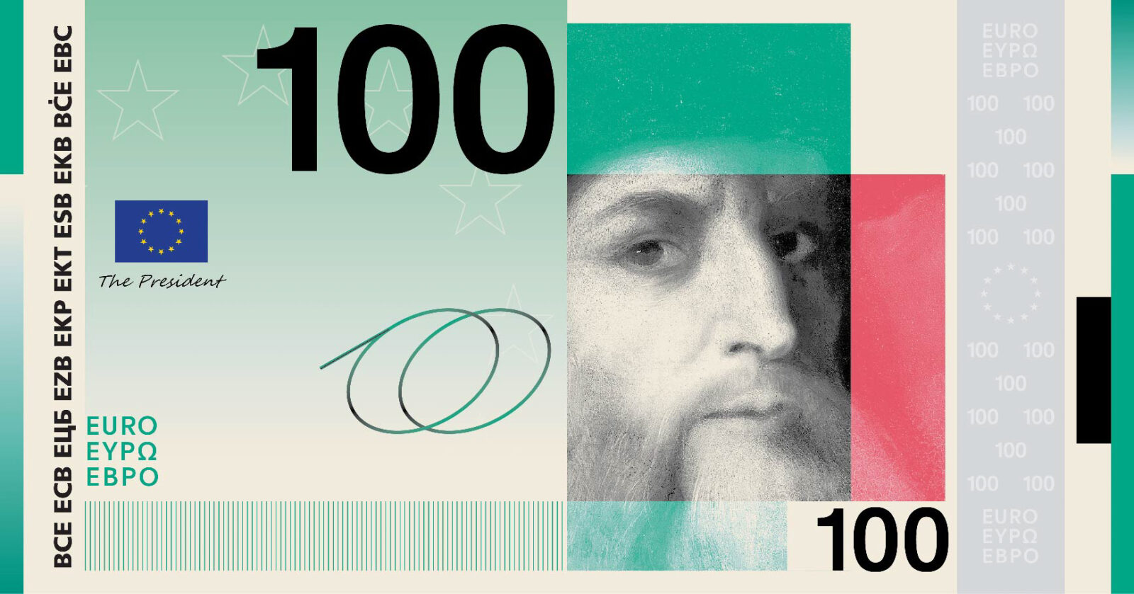
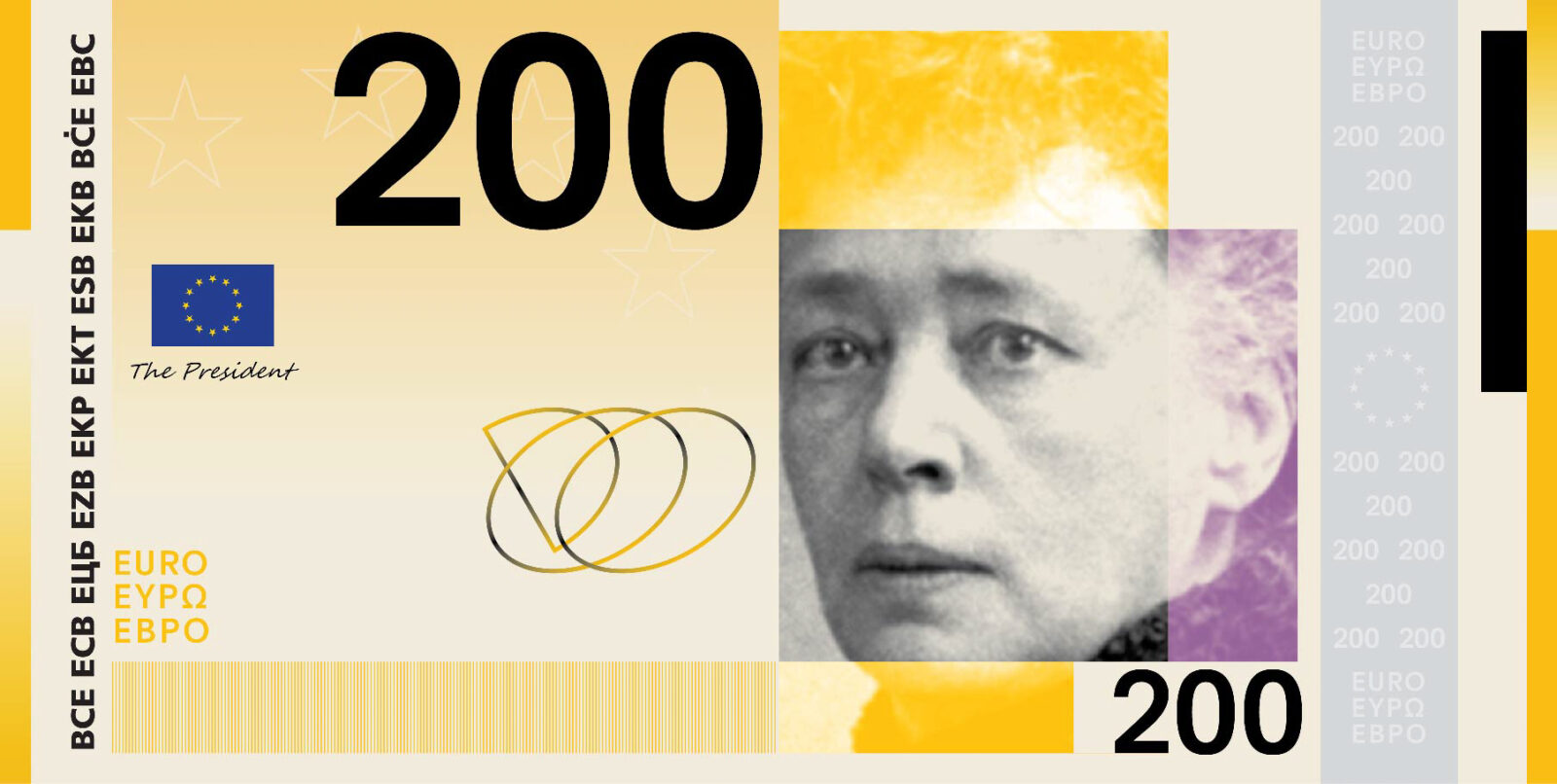
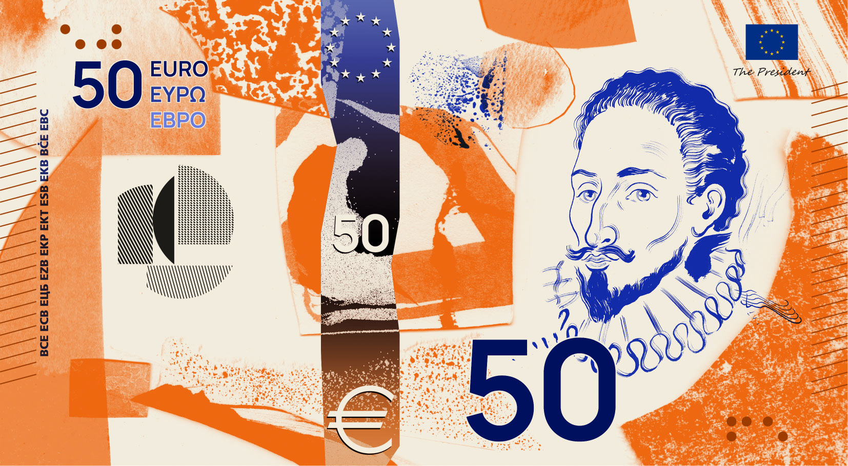
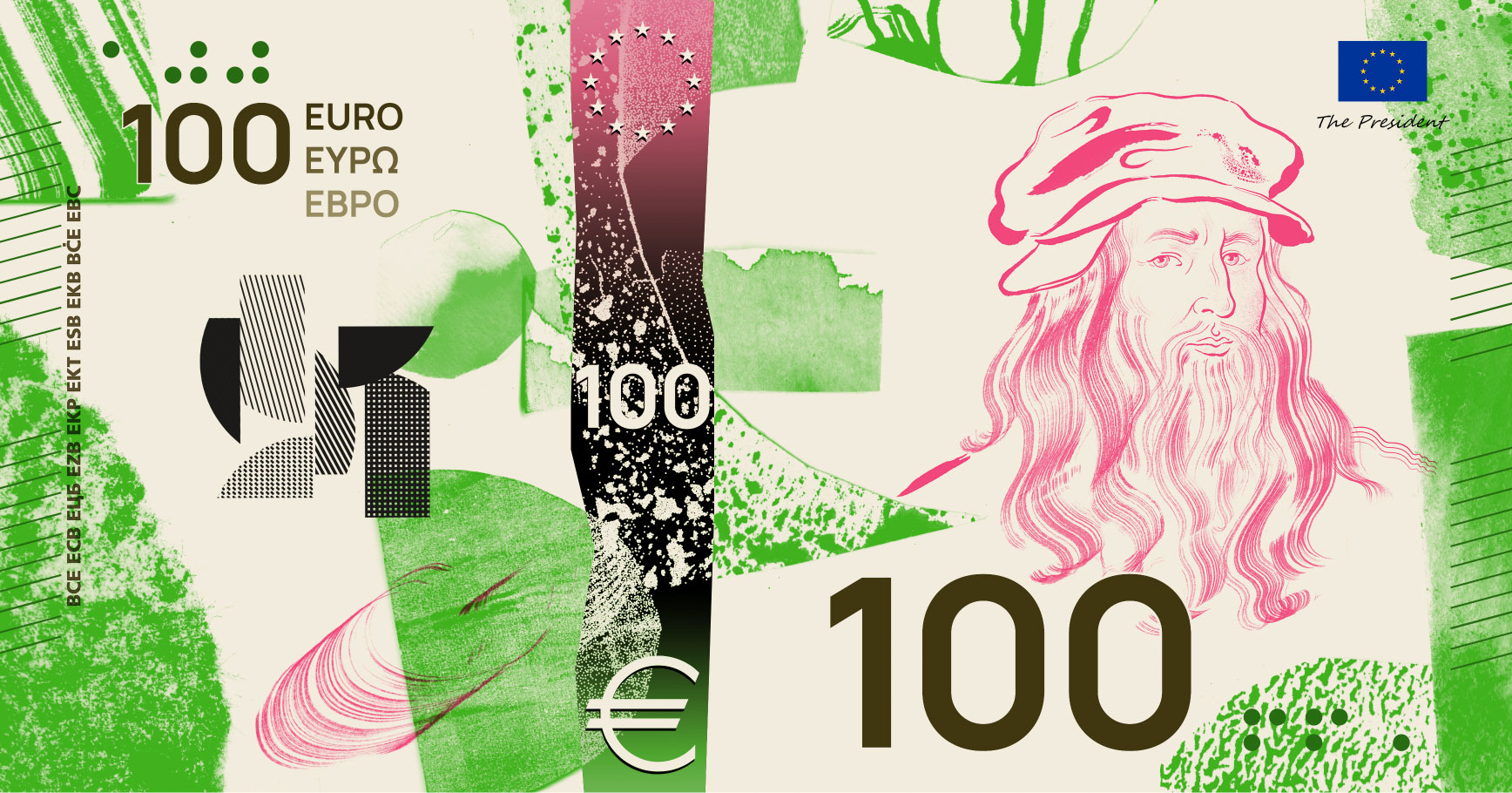
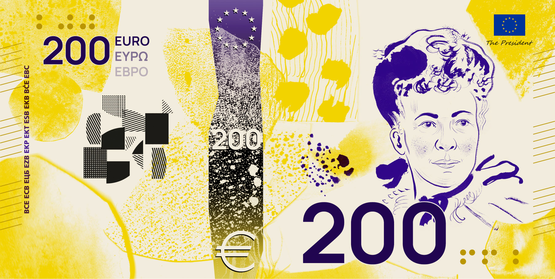
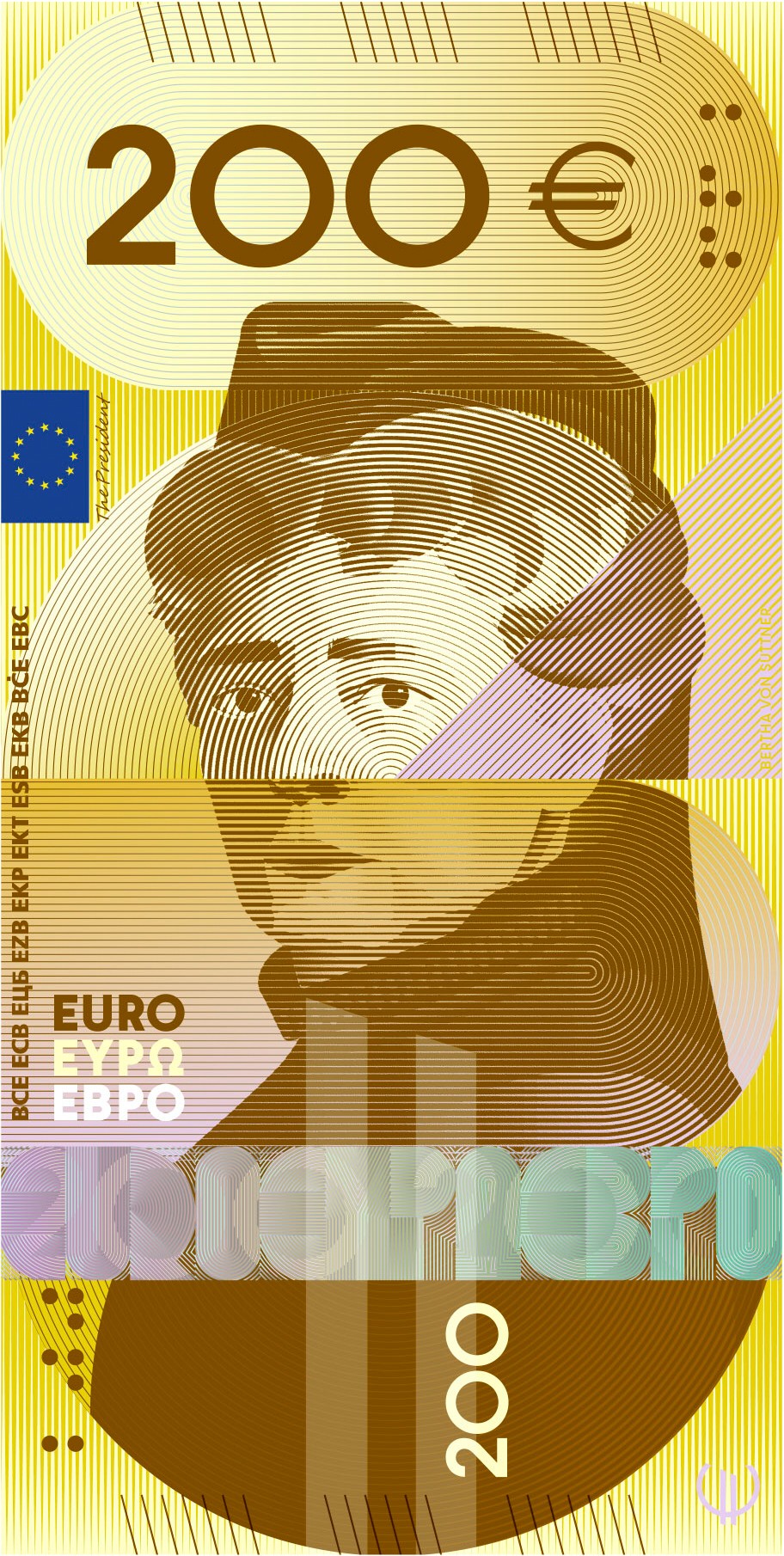
“European Culture” includes the shared spaces that shaped European identity and the people who worked in them across six centuries. Maria Callas appears on the 5€ note, Ludwig van Beethoven on the 10€ and Marie Curie on the 20€. Miguel de Cervantes takes the 50€, Leonardo da Vinci the 100€ and Bertha von Suttner the 200€.
The reverse of each note turns to everyday scenes: street performers playing to passers-by on the 5€, a choir of children and young adults at a song festival on the 10€, and a classroom on the 20€ where a teacher works with young students among notebooks and books. The 50€ shows a library, with adults reading in print and on screens while two children reach for a book on a shelf. The 100€ has adults and children looking at street art and contemporary work, and the 200€ a tree-covered square where people talk, walk and play.
Rivers and Birds
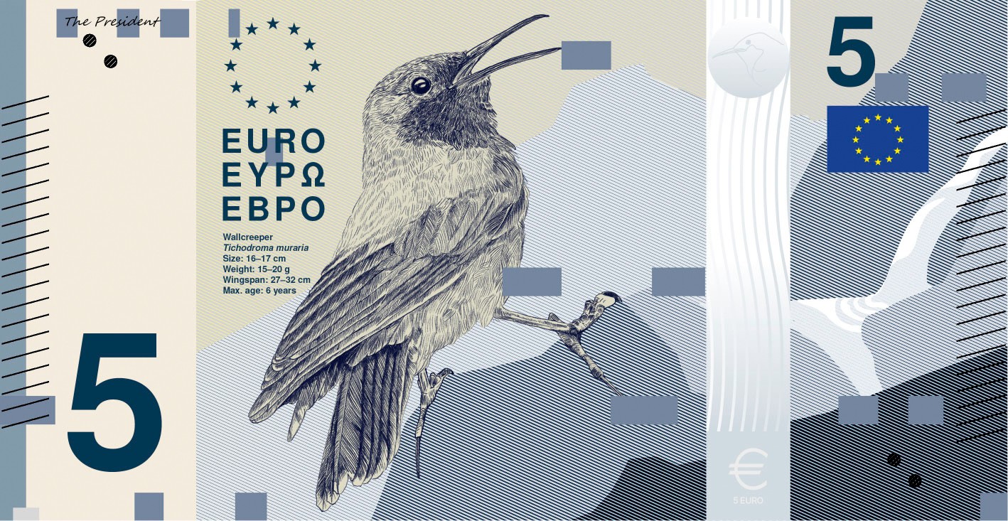
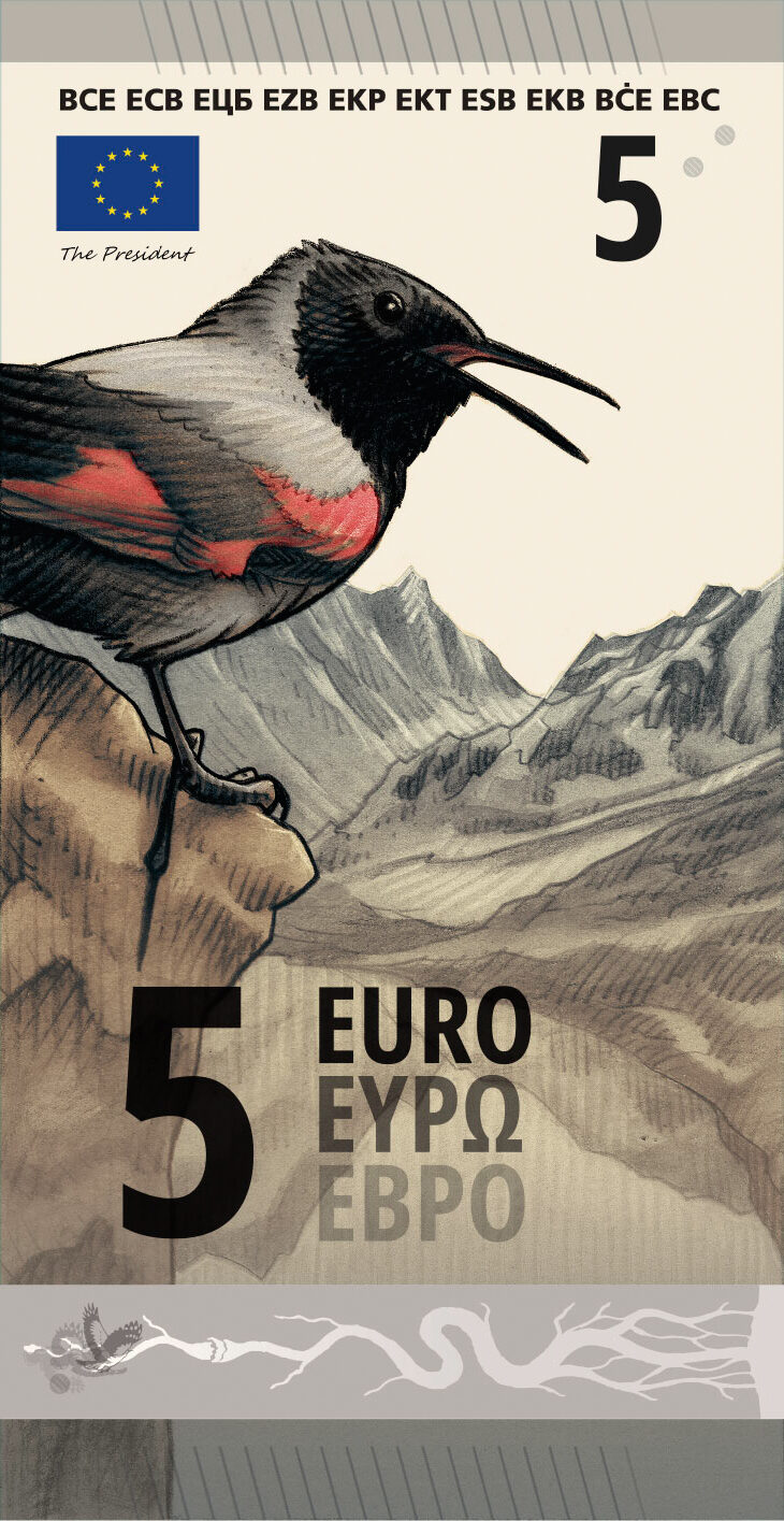
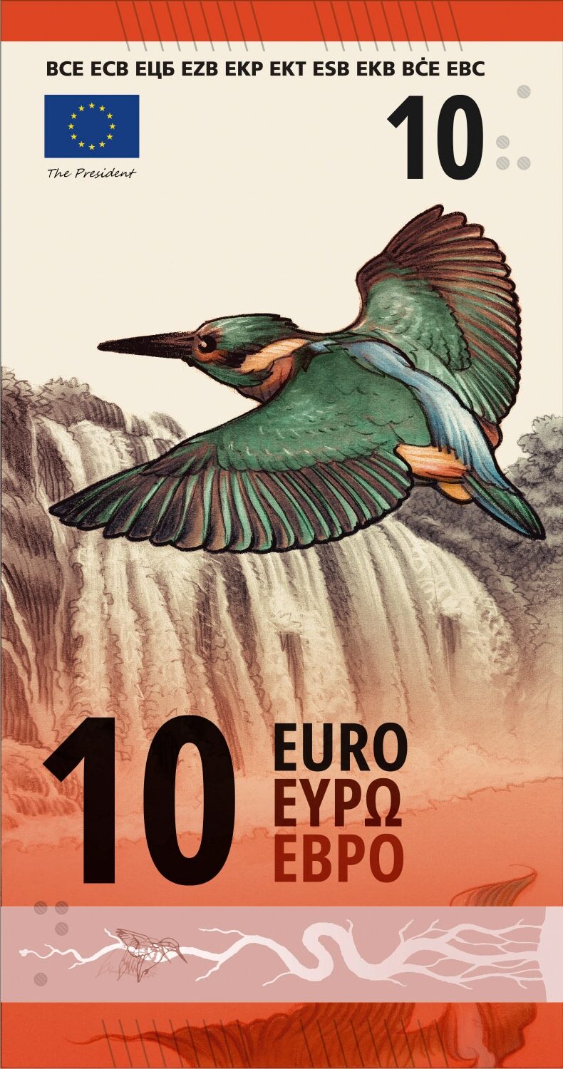
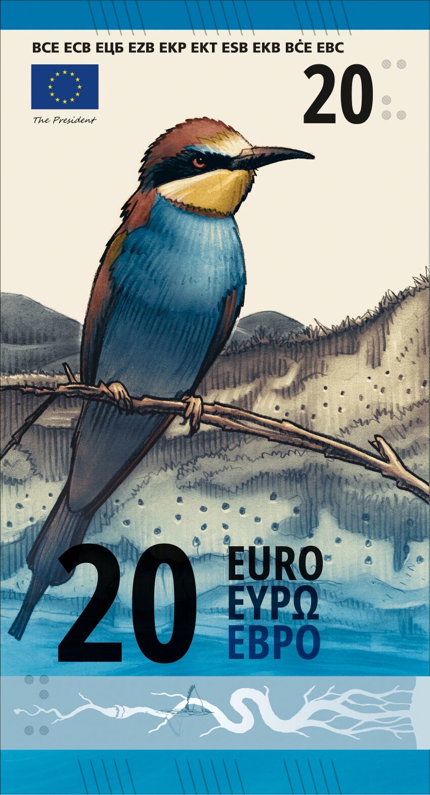
In “Rivers and Birds”, the front is decorated with a bird paired with the water it lives on, following it downstream as the denominations rise, and the back with a European institution. A wallcreeper stands against a mountain on the 5€ note, with the European Parliament behind it. The 10€ has a kingfisher at a waterfall pool and the European Commission, and the 20€ a bee-eater colony nesting in a sand wall along a river valley, with the European Central Bank.
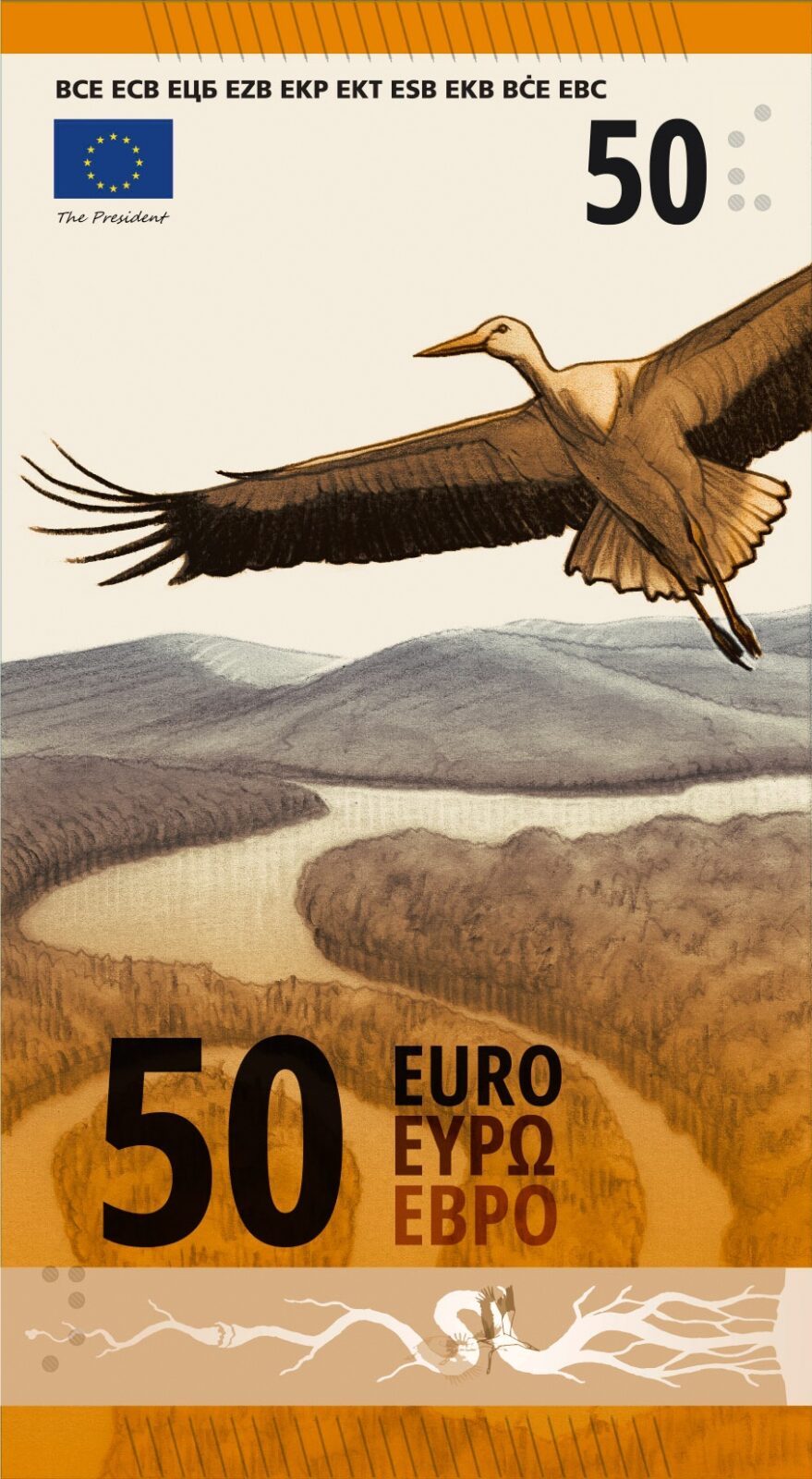
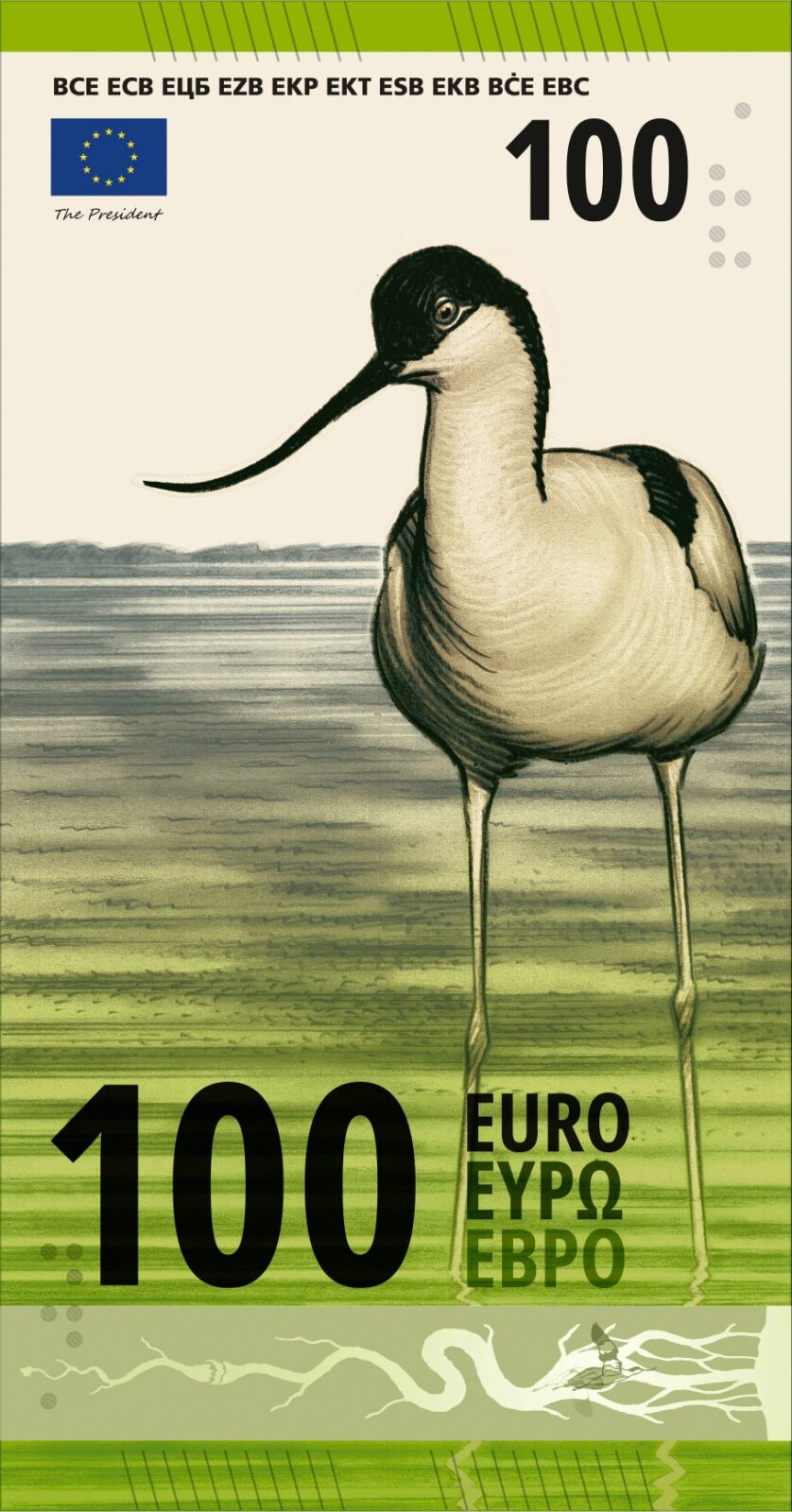
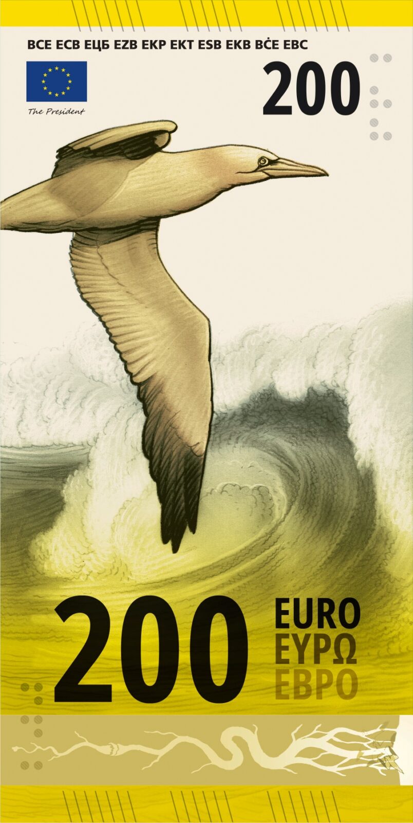
A white stork flies over a meandering river in an open valley on the 50€ note, backed by the Court of Justice of the European Union. The 100€ has an avocet sweeping across a mudflat with the European Council and the Council of the European Union, and the 200€ a northern gannet over ocean waves with the European Court of Auditors, where the river finally reaches the sea.
The theme celebrates the resilience and diversity of Europe’s ecosystems, with the institutions on the reverse standing for the values of the European project – environmental protection among them.
The ten shortlisted designs
Five proposals were chosen from each theme, running from A to J. The descriptions of each design were provided by the designers themselves, having been shortened here for brevity. Each depiction of the banknotes was provided by the European Central Bank.
Design A, Studio Joost Grootens. The portraits were cropped down to a pair of eyes and a mouth, each representing something. The eyes stand for observing, sensing and reflecting, while the mouth stands for expression and exchange, moving the figures past individual identity towards a shared capacity for making culture. On the reverse, contemporary cultural spaces show people of different backgrounds and ages meeting one another.
Design B, PunktFormStrich. Each note has a bird species alongside its habitat, with short data notes on the front placing the species in context. Horizontal bars transcribe the sound of each bird, while a vertical scale marks its flight speed. The reverse sets EU buildings against a map of Europe.
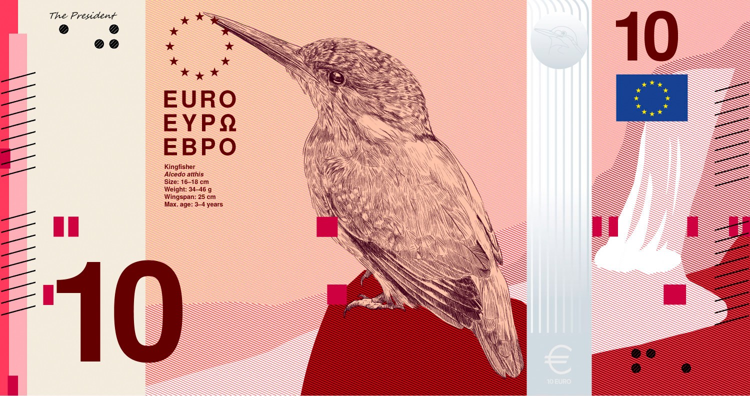

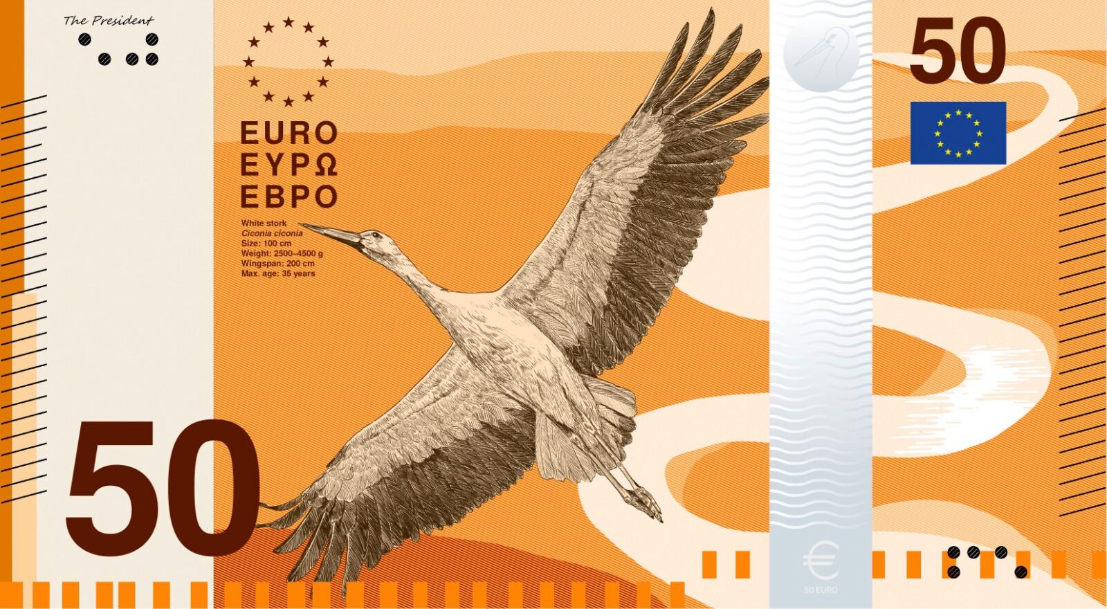
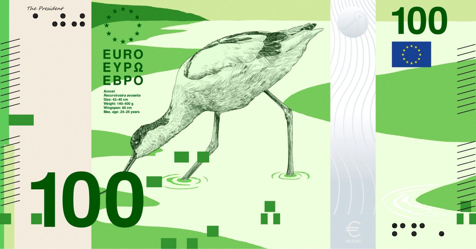
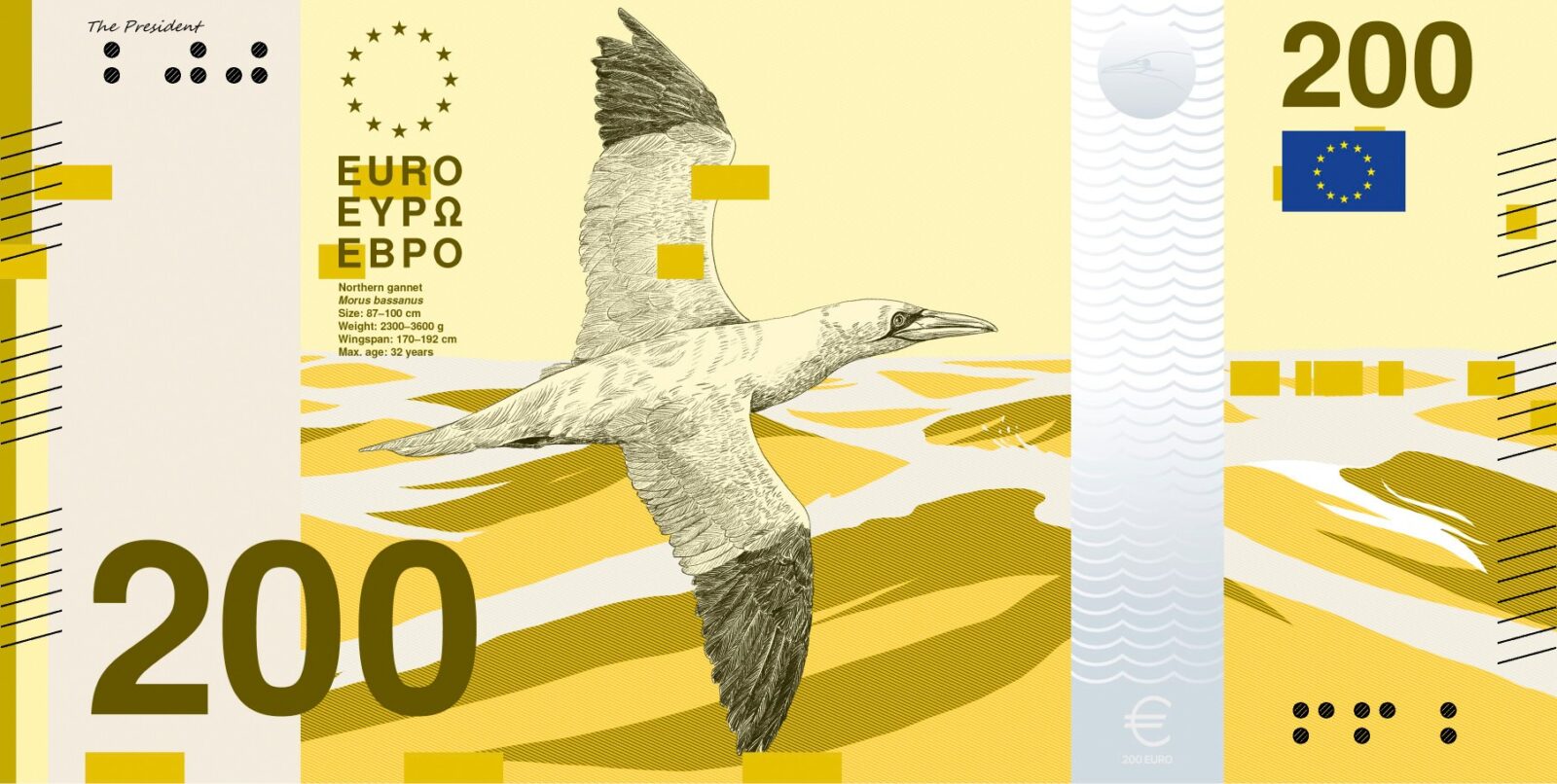
Design C, Neue Gestaltung GmbH. Each note is identifiable by one dominant colour and its own central motif, a personality whose life and work connect Europeans across centuries. The reverse pairs a map of Europe, lightly overlaid with the constellations that once guided travellers, with a present-day scene of the cultural space the note represents. People are drawn without specific features so that anyone can recognise themselves in them.
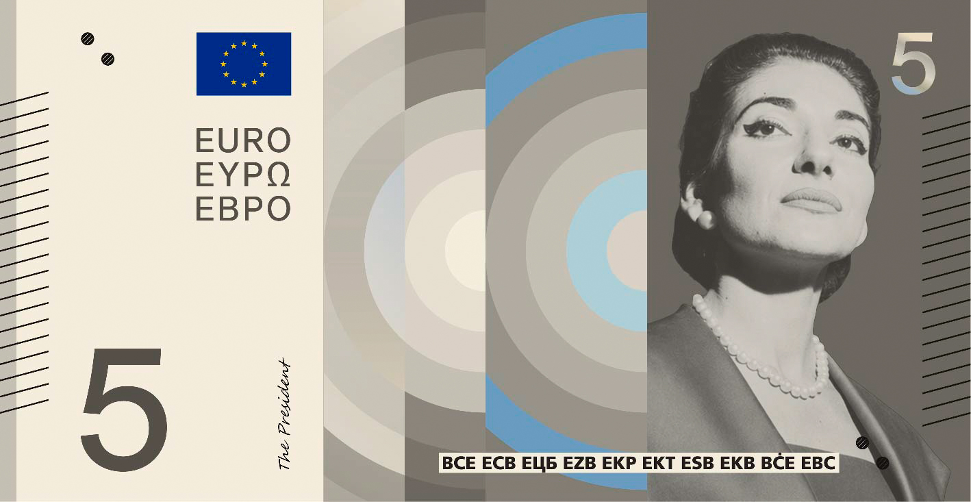
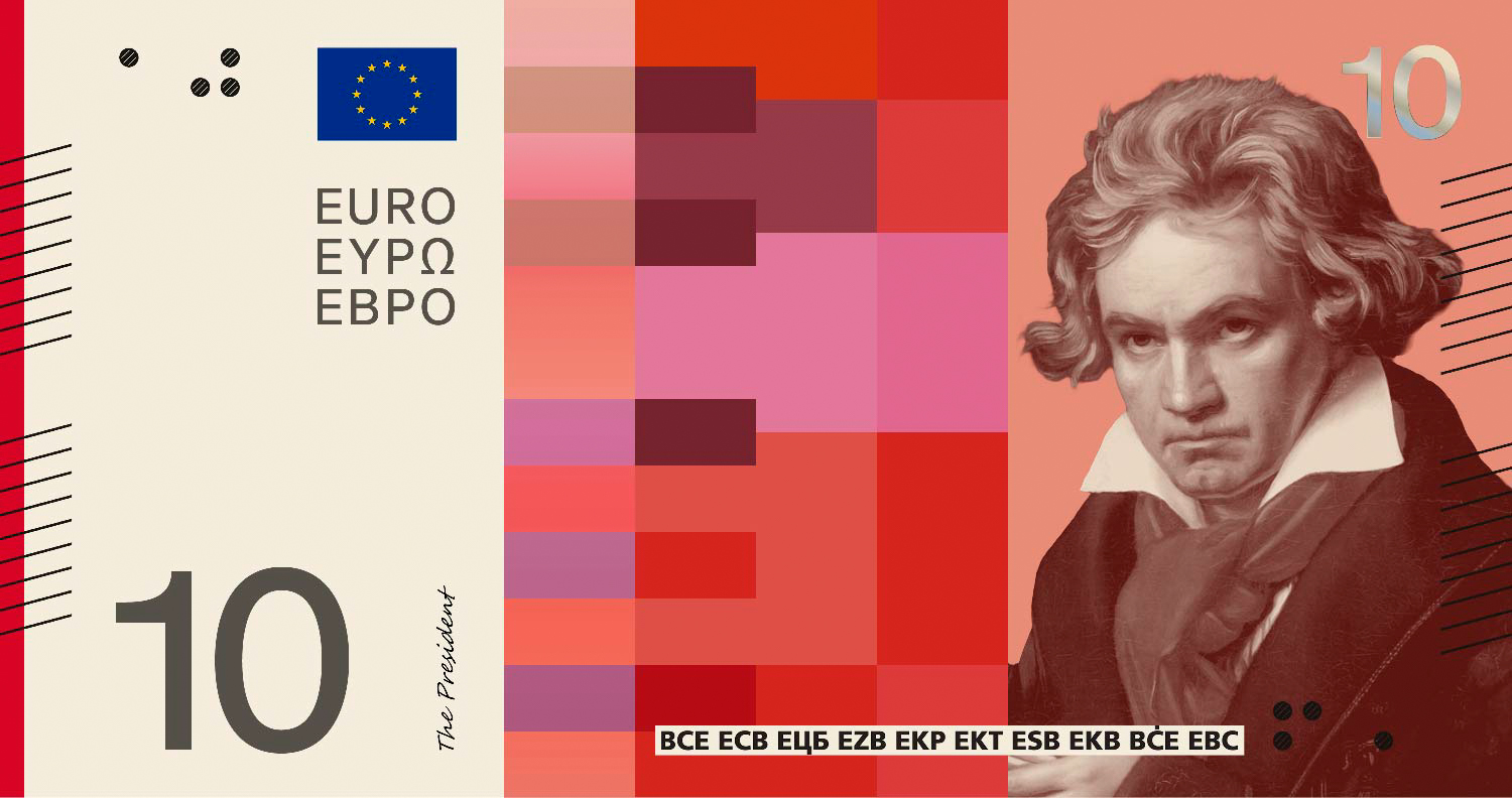
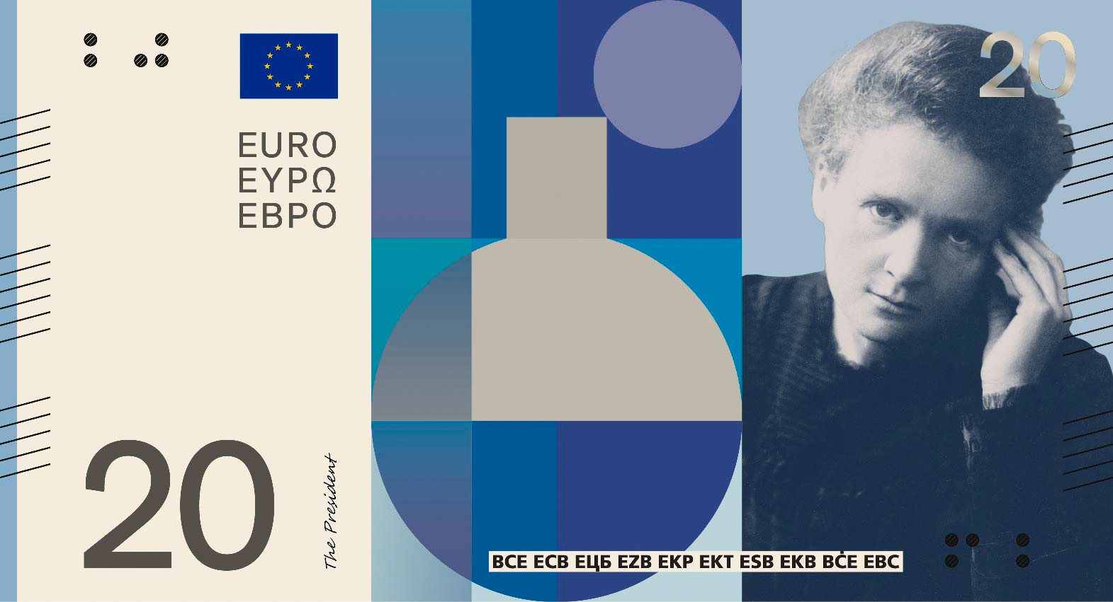
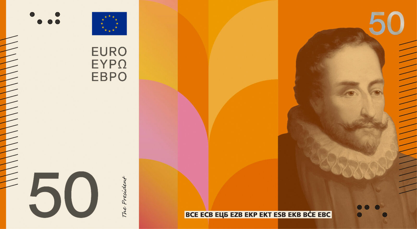
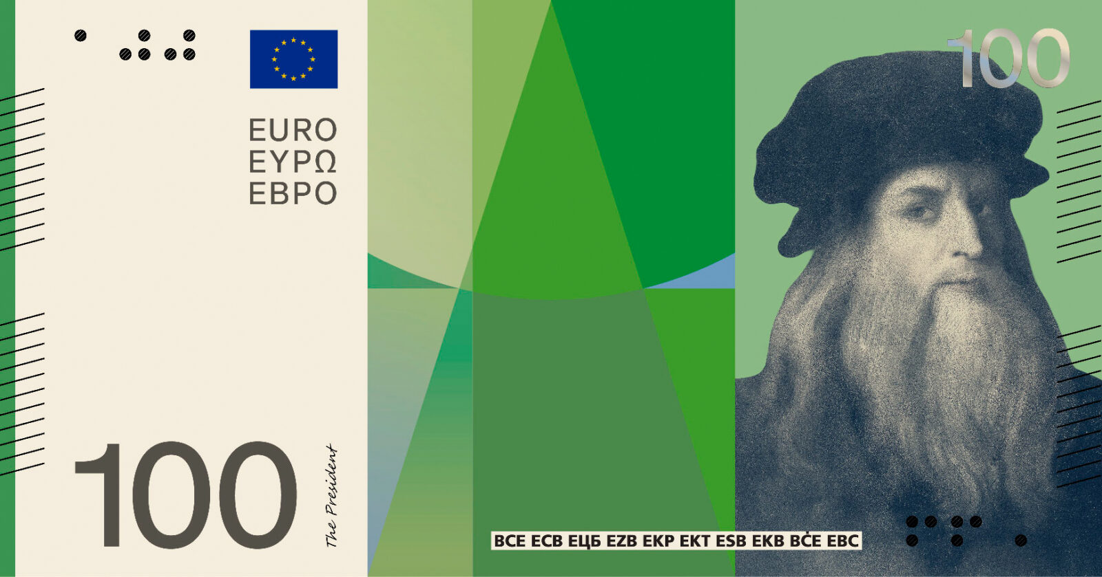
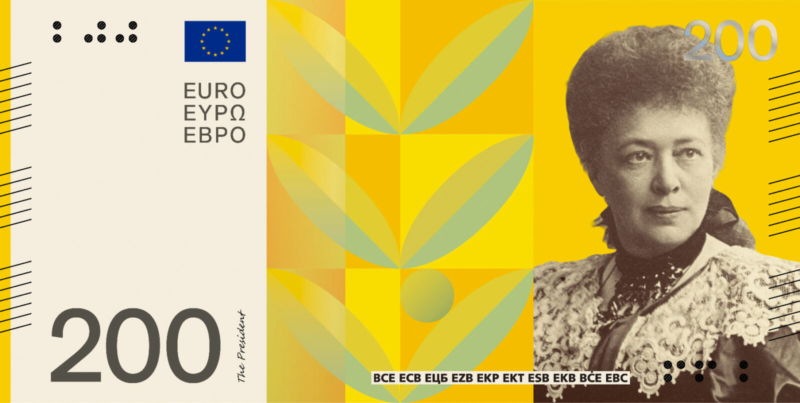
Design D, Rudy Guedj and François Girard-Meunier. Six birds are drawn against abstracted landscapes, linked by a river that runs from a mountain source to a stormy sea. Light travels with it, going from a soft presence into something sharper and more powerful. The scenes reward close inspection, putting the viewer in the position of a birdwatcher gathering traces of each species. On the reverse, EU institutions are drawn as human gestures over a fabric-like mesh.
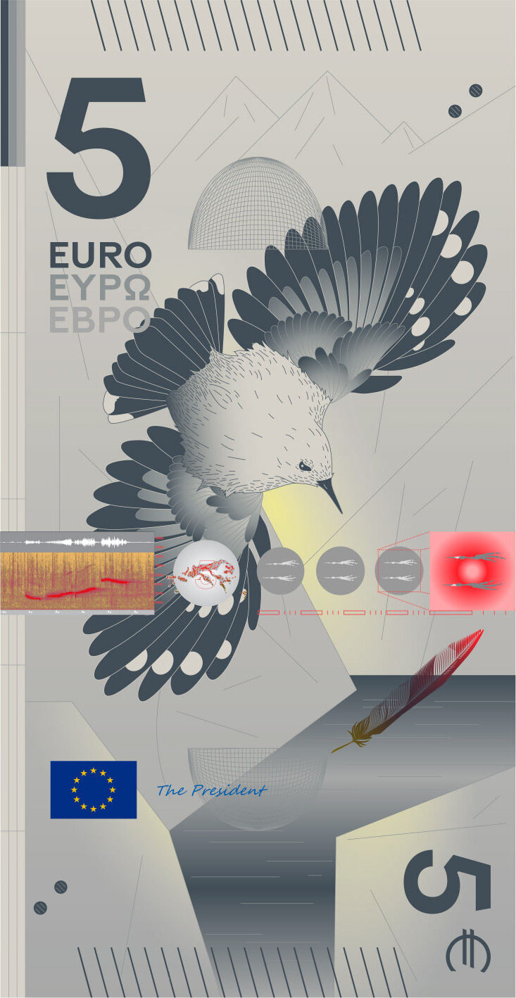
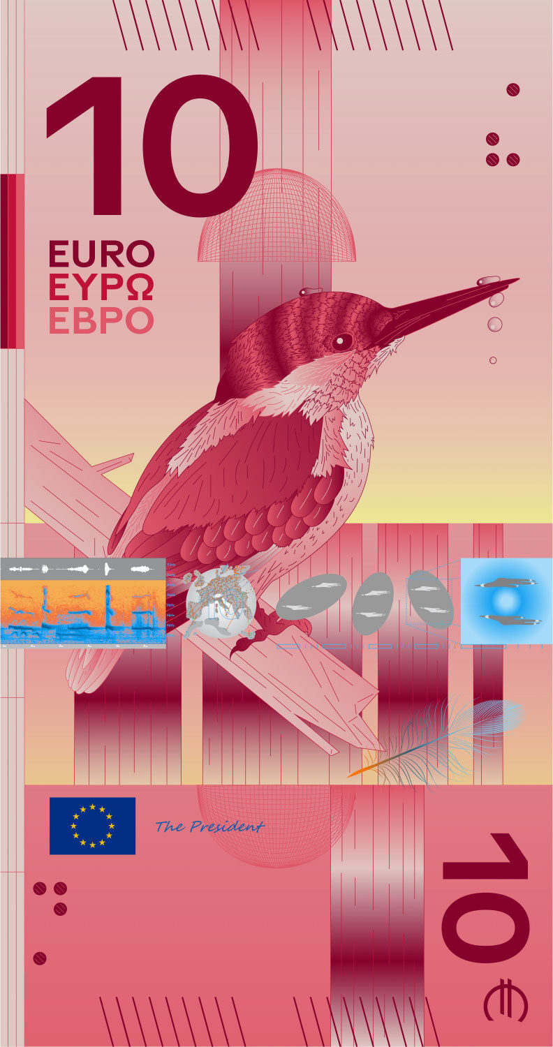
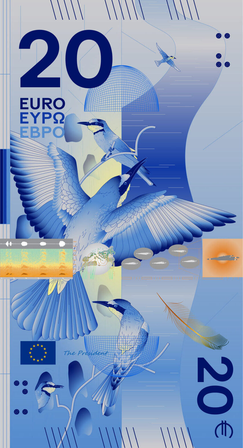
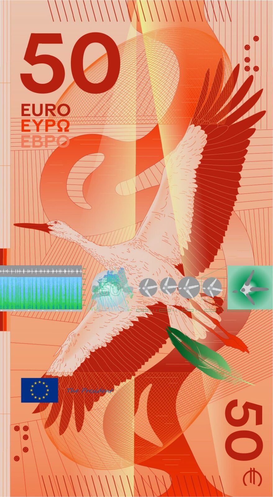
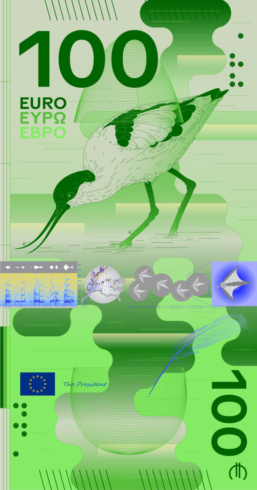
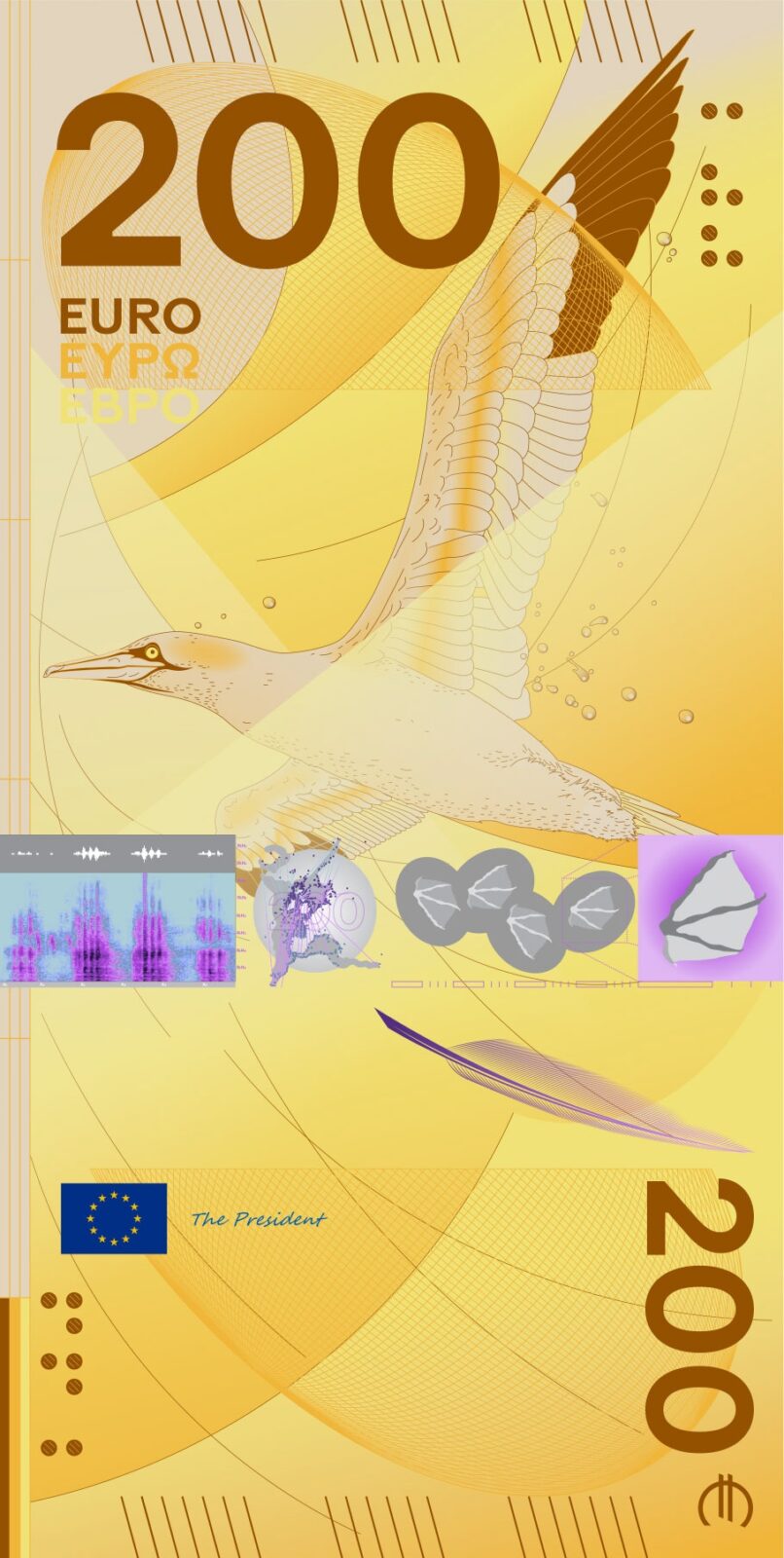
Design E, Myrsini Vardopoulou. The weight falls on each person’s work, not their personality. A circle and a set of symbols mark out an intellectual space, familiar at first glance, with smaller symbolic details left for a closer reading. The proposal holds that for all the differences between these individuals, their contribution amounts to one shared source of inspiration.

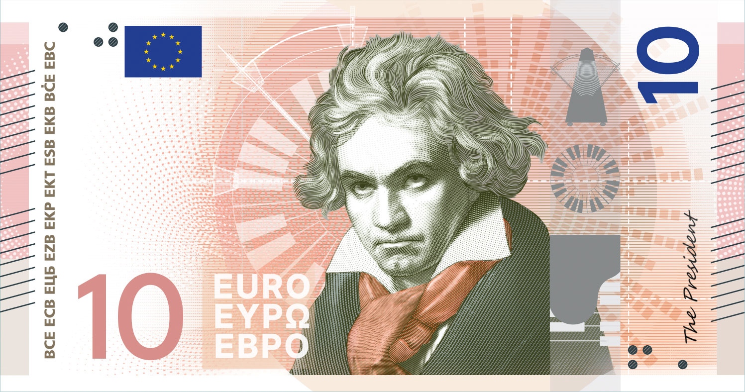
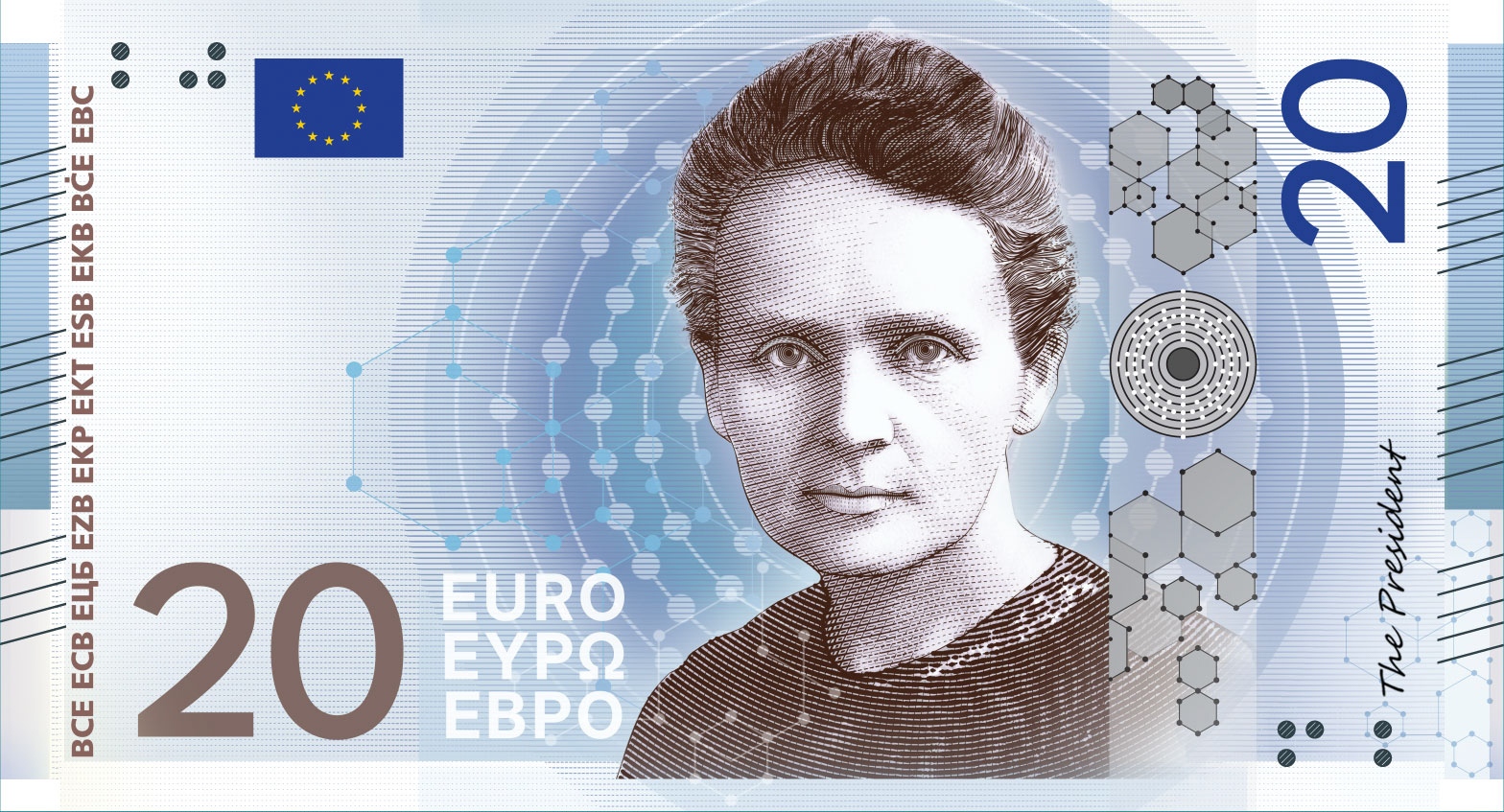
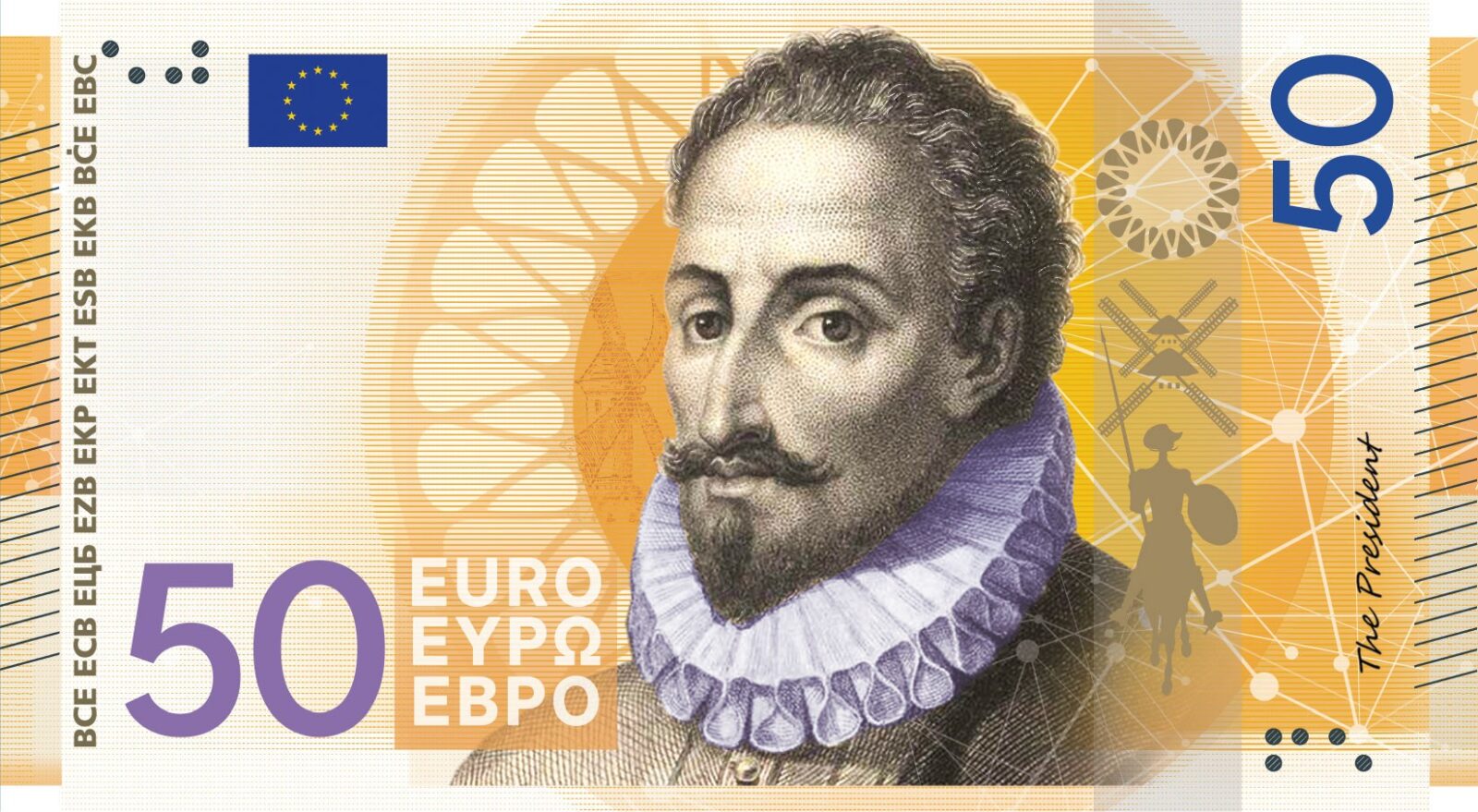
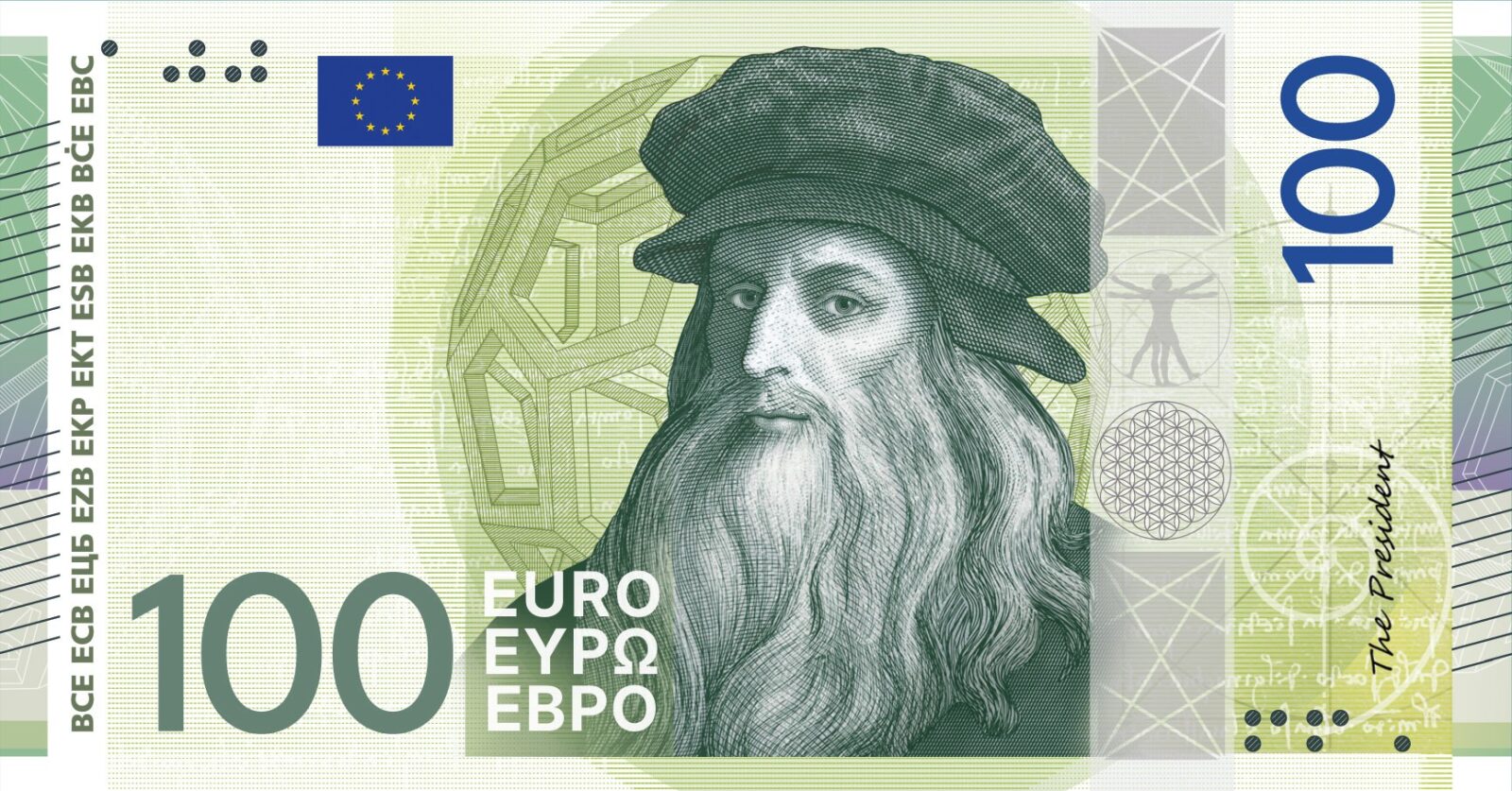
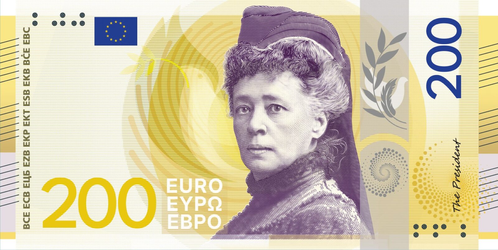
Design F, Jan Robert Dünnweller. The design sets out to illustrate the EU motto, “United in diversity”. Hand-drawn portraits of well-known European figures and depictions of shared cultural spaces sit over a collage background, built from a multitude of forms and textures that combine into a new whole. The collage carries the argument: a shared history and set of values, strengthened by the range of identities within it.
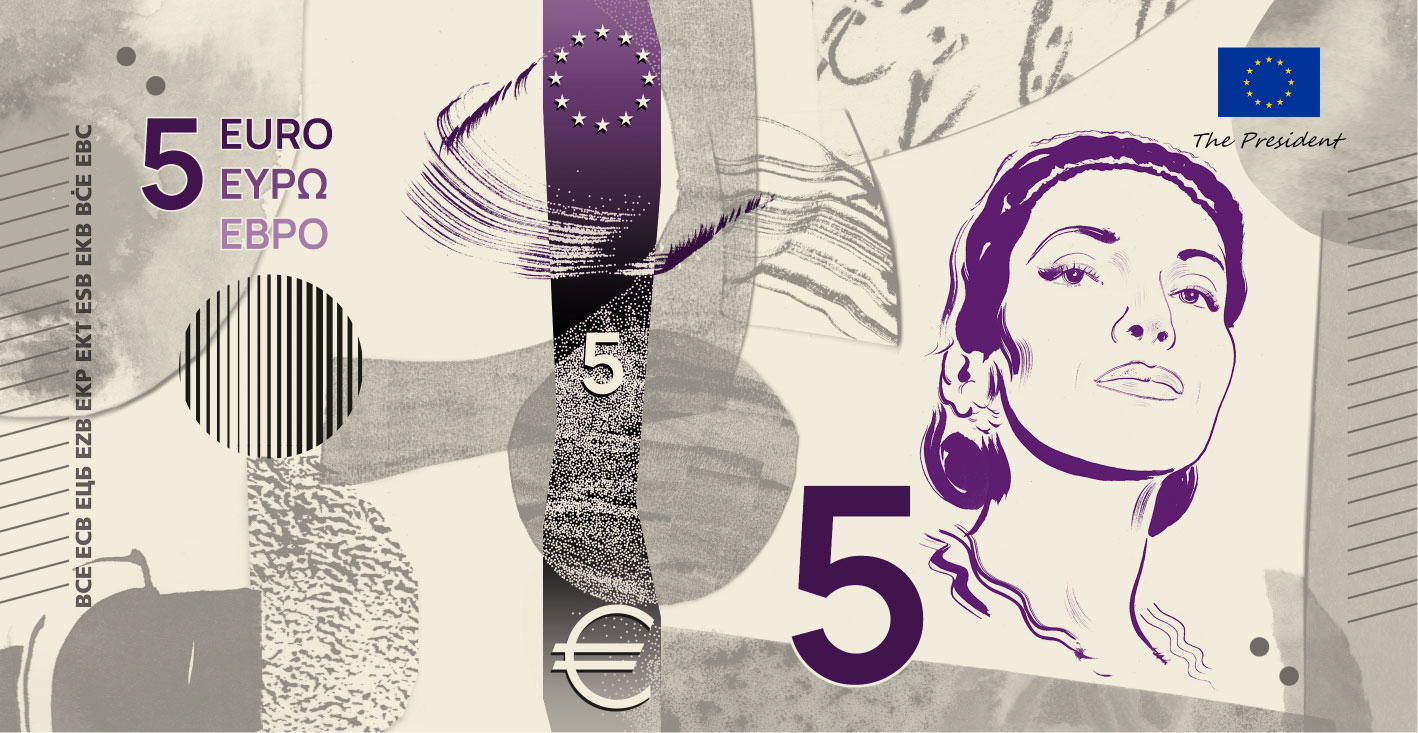
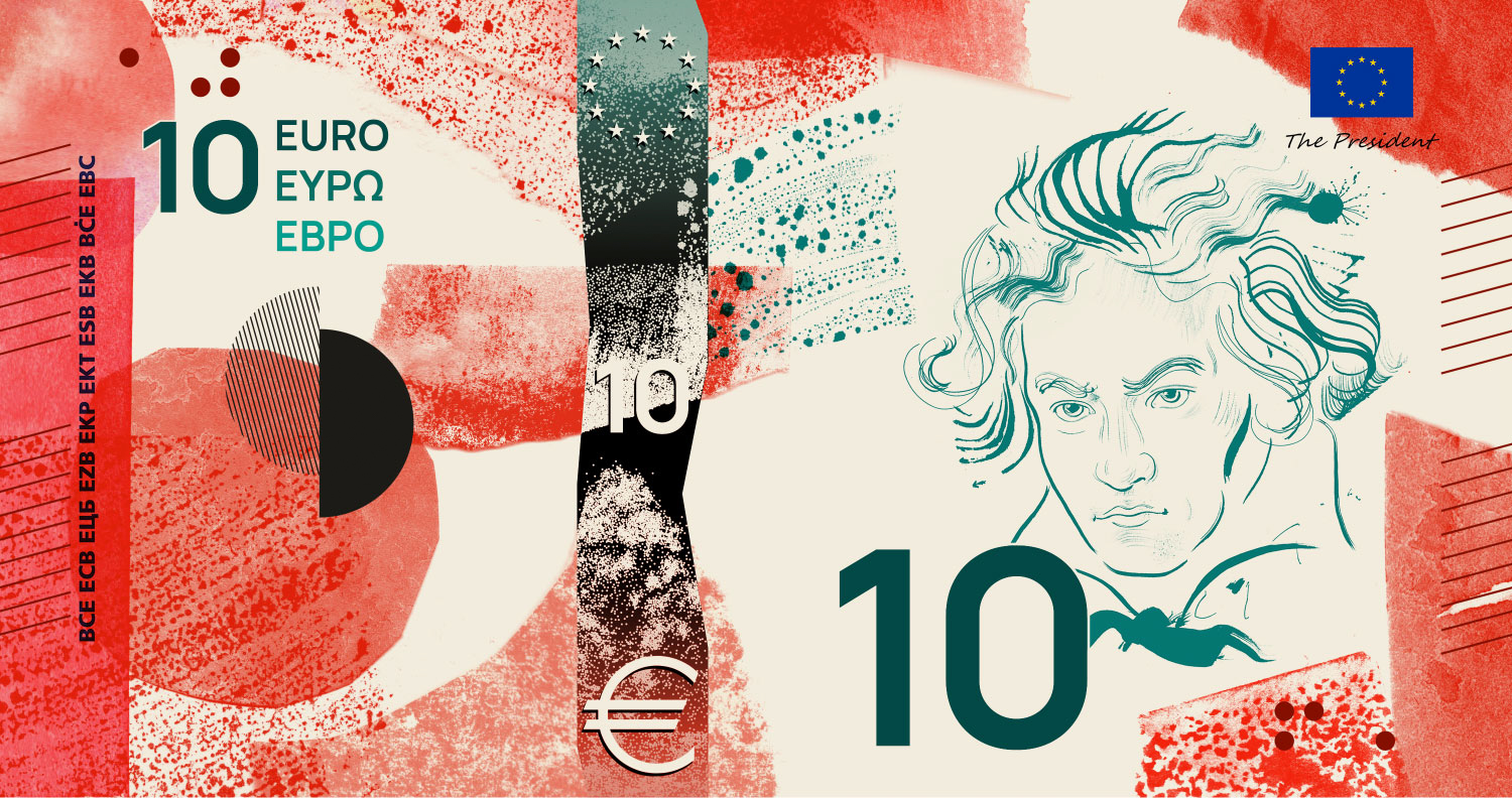
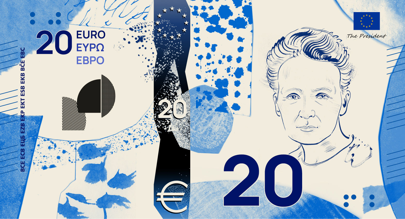
Design G, Rubio & del Amo and Cruz más Cruz. A gaze meets the viewer from the centre of each note, connecting those who shaped Europe’s cultural identity with those keeping that spirit in daily use. A single dominant colour meets a linear pattern that gives the series a shared texture, held together by a consistent structure. Turned horizontally, the notes resolve into four vertical blocks, each drawn from a letter: E, U, R and O.
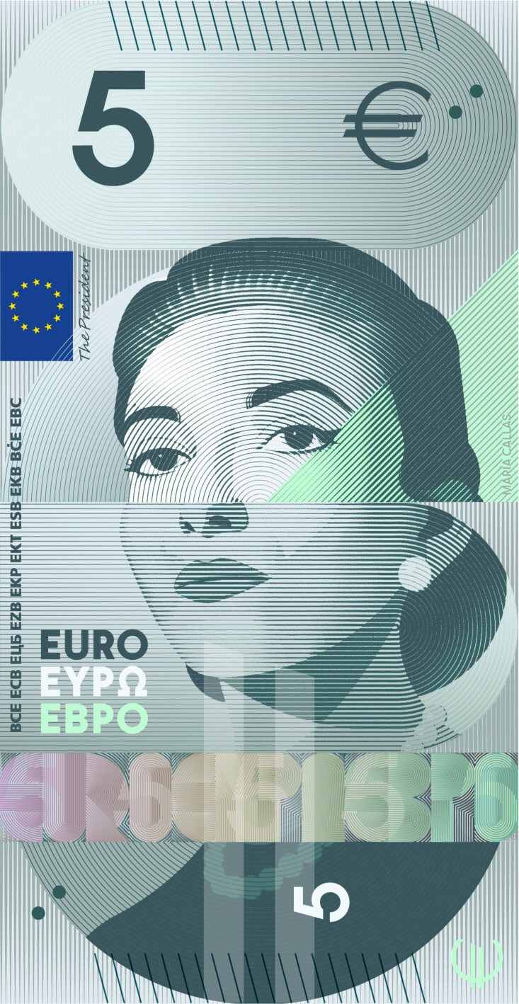
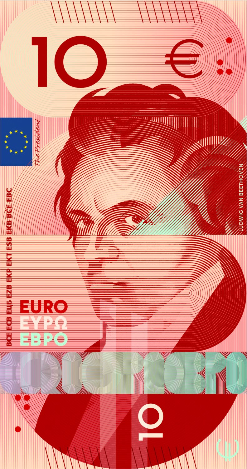
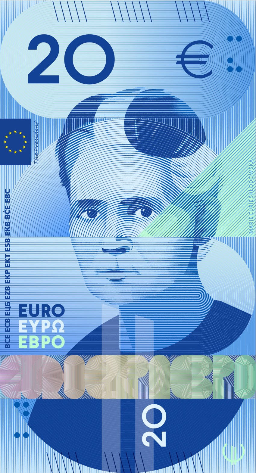
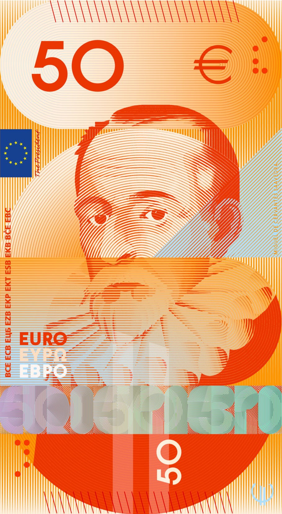
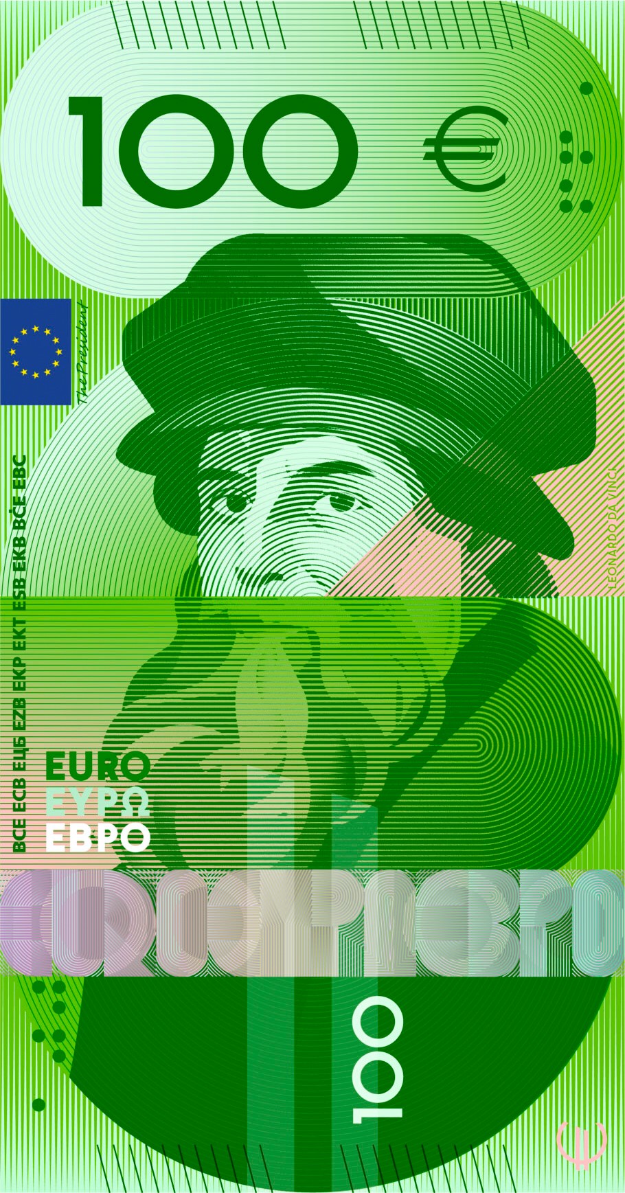
Design H, Atelier Goppel-Toperngpong. Water is the organising idea, the foundation for life and the maker of the habitats in which the birds appear. Its qualities, balance and consistency among them, are used as analogies for the EU institutions and their functions. A single drop is negligible, though over centuries a stream will carve a mountain range, much as millions of people working towards one goal become difficult to move.
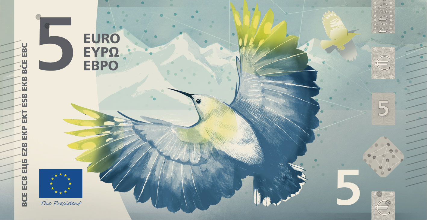
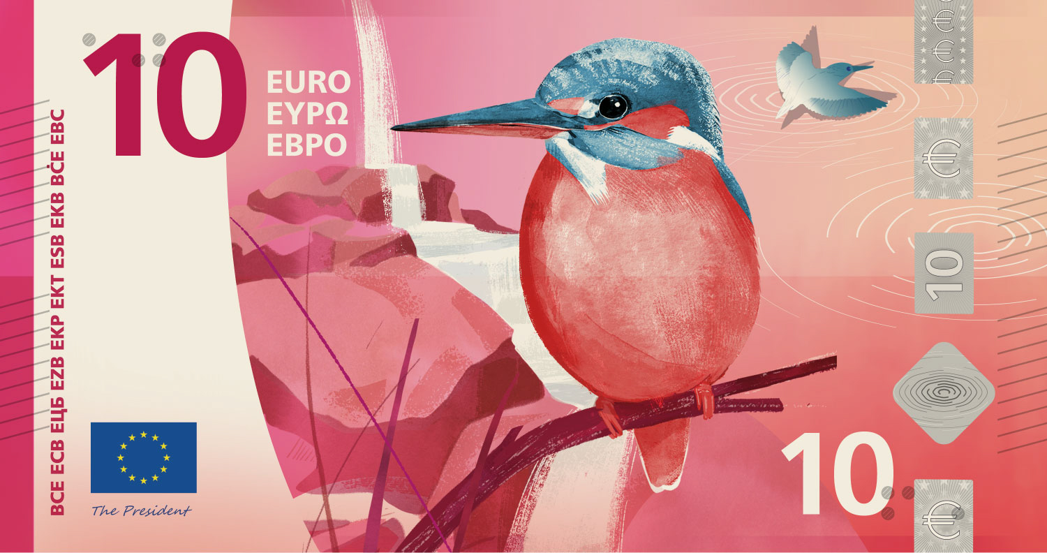
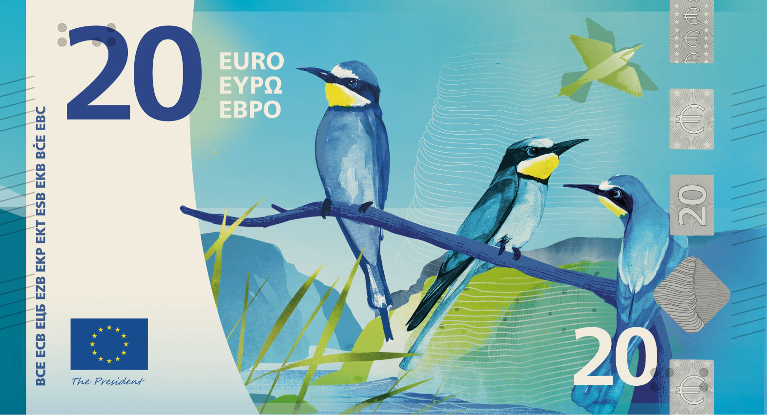
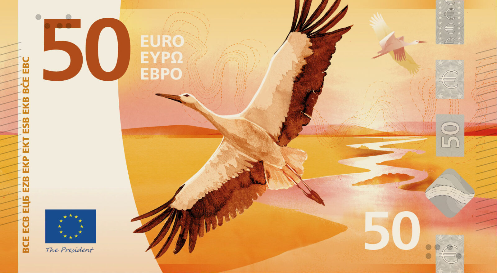
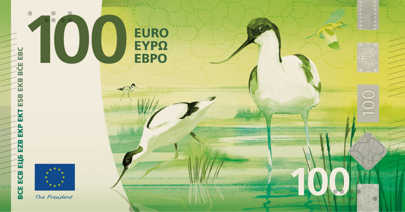
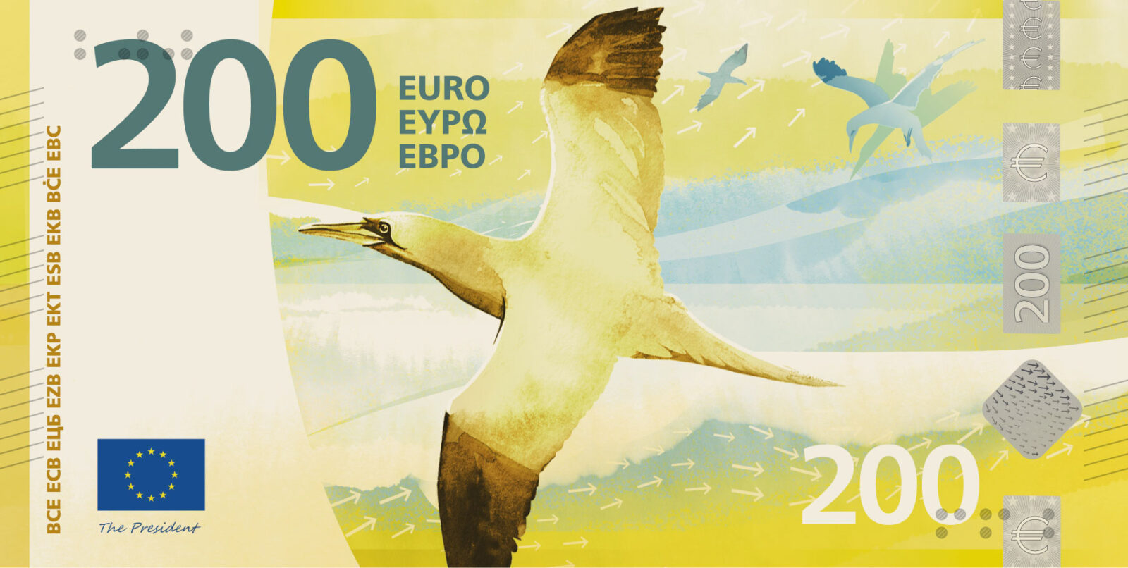
Design I, Isabelle Daëron. Movement runs through the proposal, from the beat of a wing to the flow of a river. The bird appears alone on the front and as a group on the back, standing for the exchange and interdependence between societies and nature. From source to ocean, its flight reveals the landscape below through two interwoven patterns, one hand-drawn in a felt-tip pen and the other vector-based.
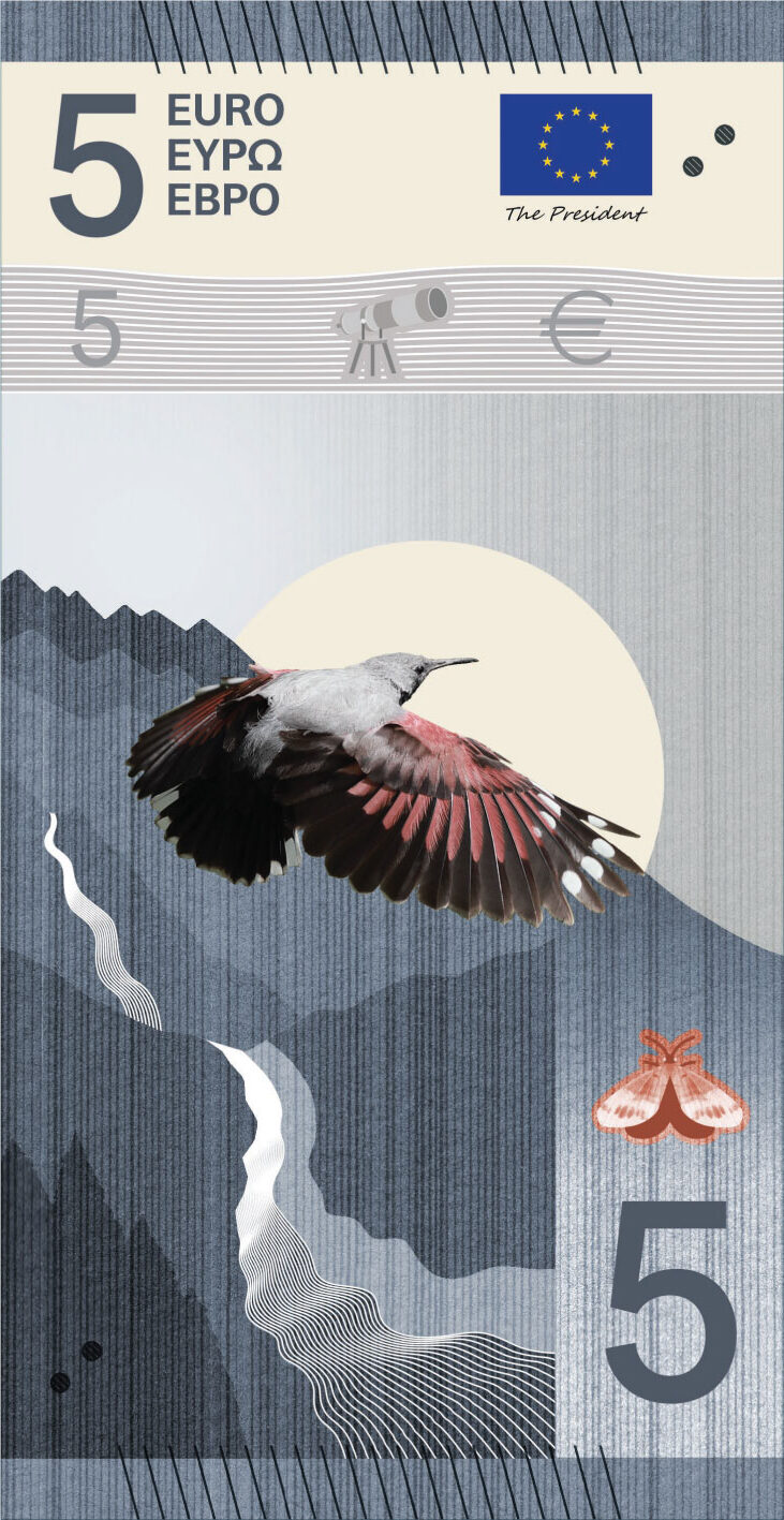
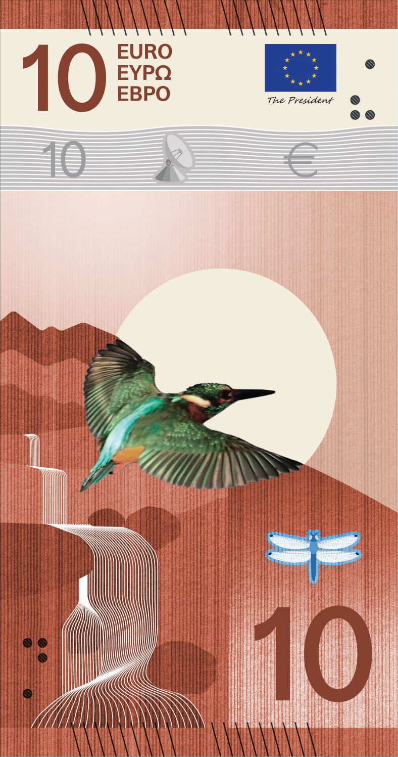
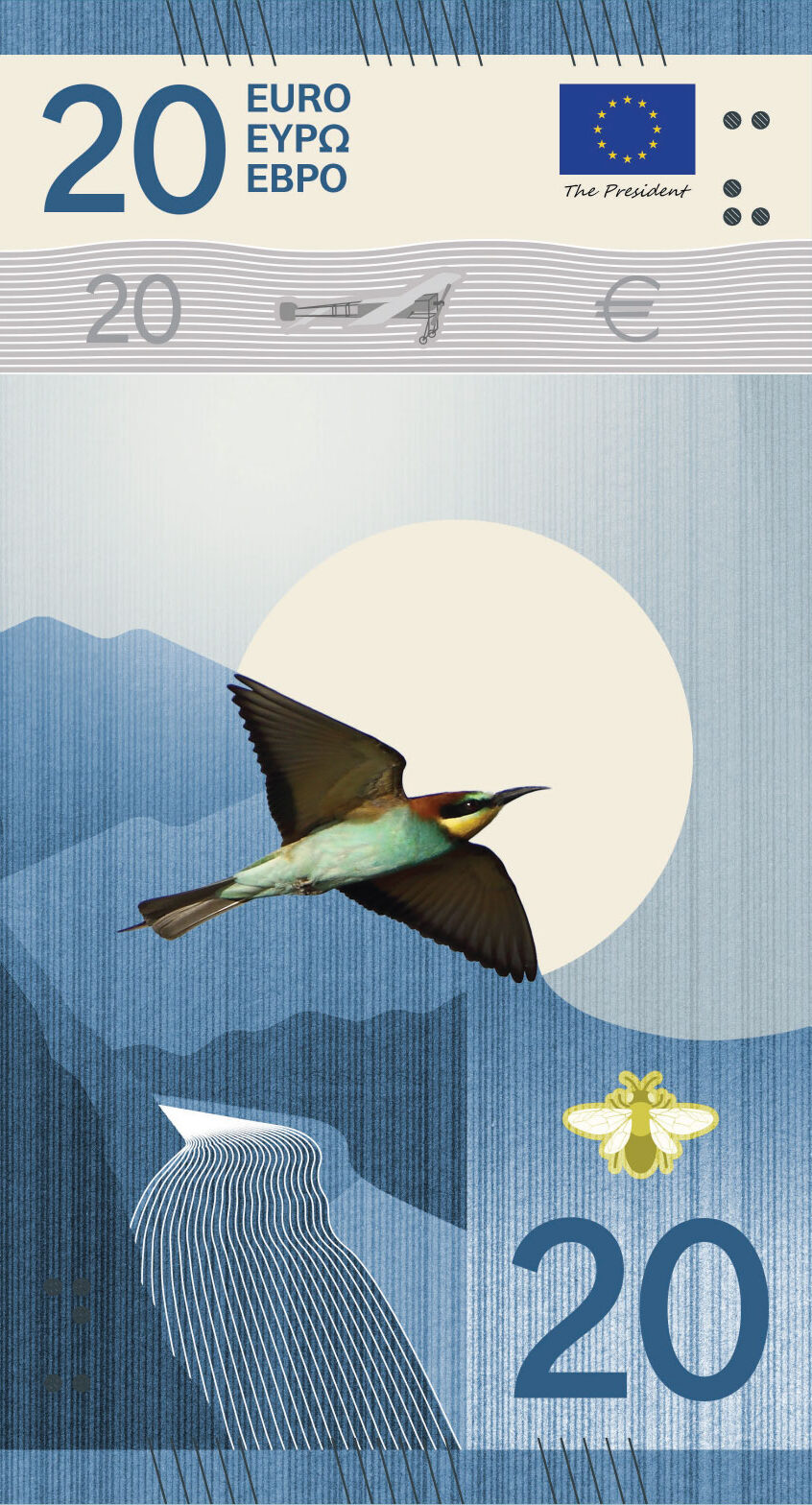
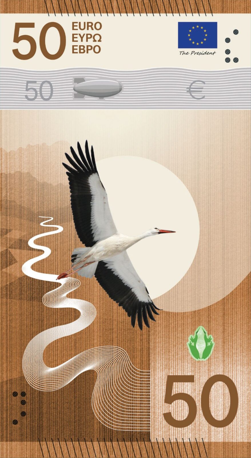
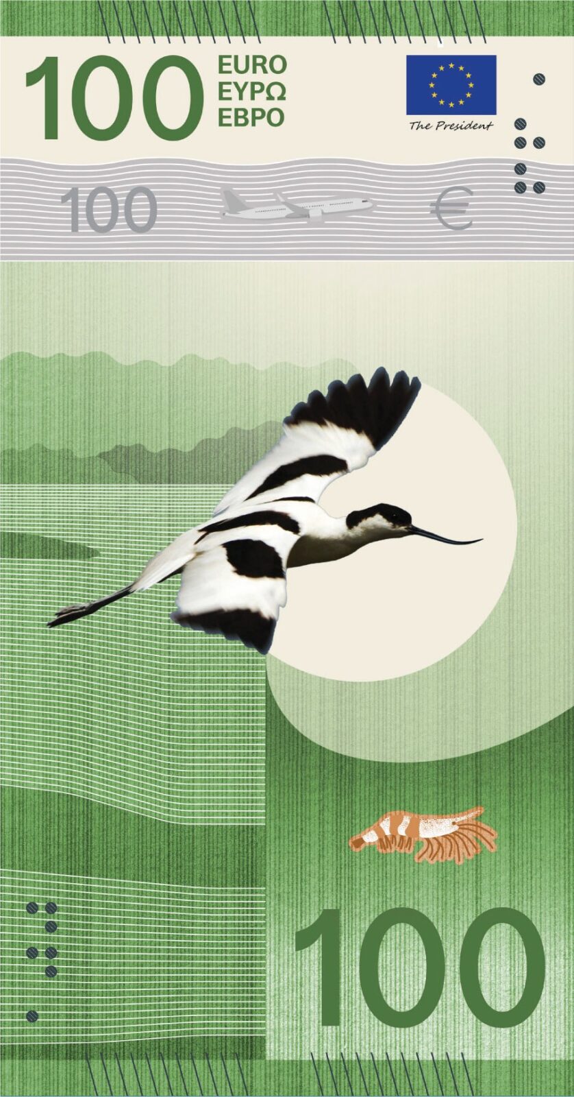
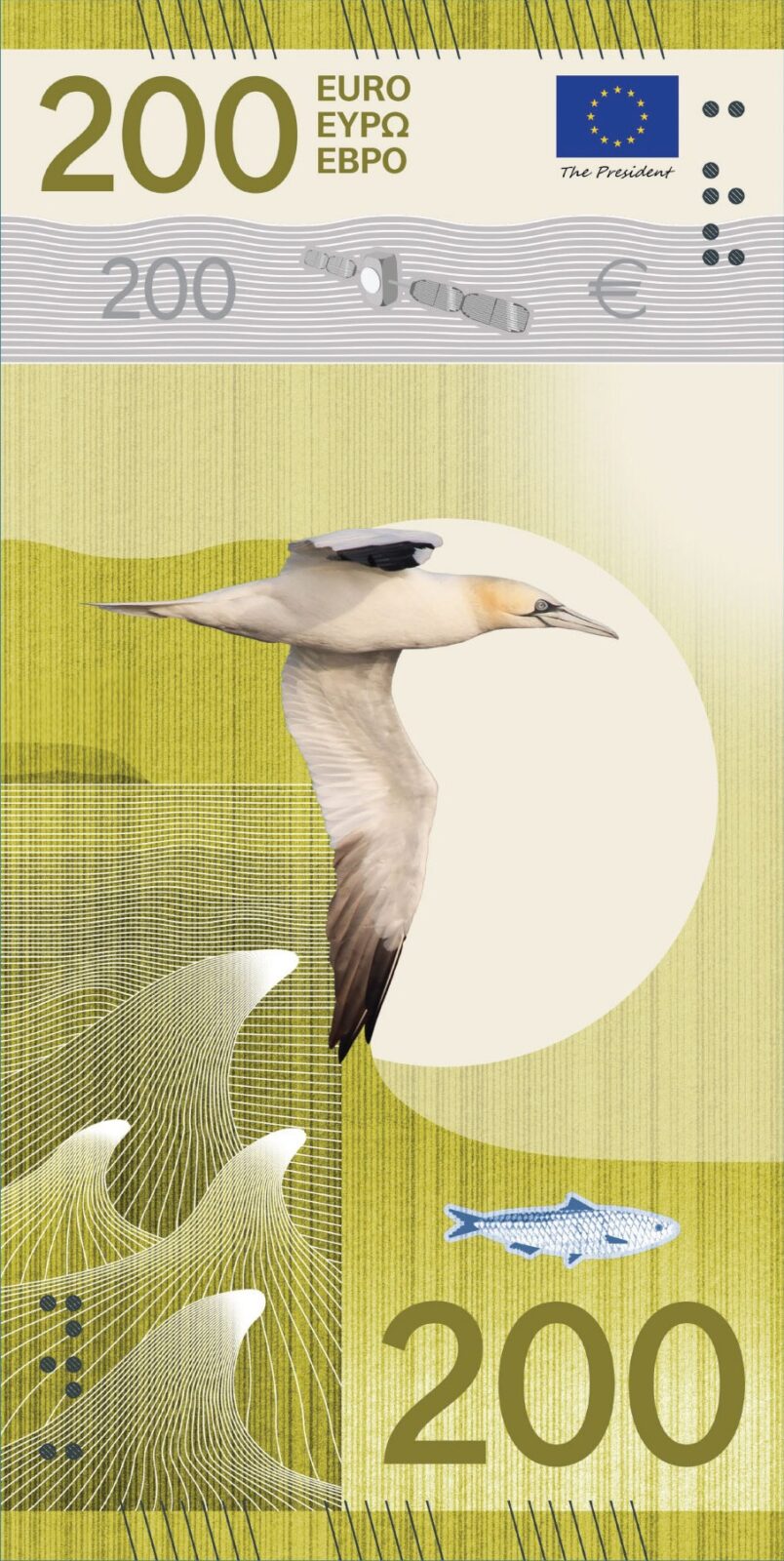
Design J, Ville Tietäväinen. The series follows European rivers from mountain springs to the point where they meet the sea, with birds as the main characters in their habitats. The security foils each show one phase of a river with its associated bird, working as an infographic that introduces the idea running through the set, while the EU buildings on the reverse merge with the wings of the birds on the front.
Making a decision
Two surveys are running at the same time: the same questions were put to anyone in Europe and to a representative sample of euro area citizens, with the latter led by an independent research company. The Governing Council is expected to decide by the end of the year, weighing the jury’s conclusions, a technical assessment and the results of the two surveys. The ECB will then publish a report on both once the final design has been selected.
Advances in “banknote tech”
The new notes will be designed with improved security features, meant to make them easier to authenticate and more accessible to people with impaired vision. Issuing a new series periodically lets the Eurosystem take up advances in technology and stay ahead of counterfeiters. The ECB is also working to lower the environmental footprint of the notes through greater durability, more sustainable materials and changes to how they are produced.
“The redesign of the euro banknotes is part of a long-term effort by the Eurosystem to ensure that cash remains a secure, efficient and relatable means of payment, preserving citizens’ access to public money and their freedom to choose how to pay.”
Piero Cipollone, ECB Executive Board.
The chosen design will go through further development and testing before production begins, and notes from the new series are expected to reach circulation in the years that follow. Banknotes from the current series will keep their value and will continue to circulate alongside the new ones.
The ten shortlisted proposals can be viewed at the European Central Bank website, and the public survey is open until the 21st of September, 2026.


