Header: Enric Badrinas
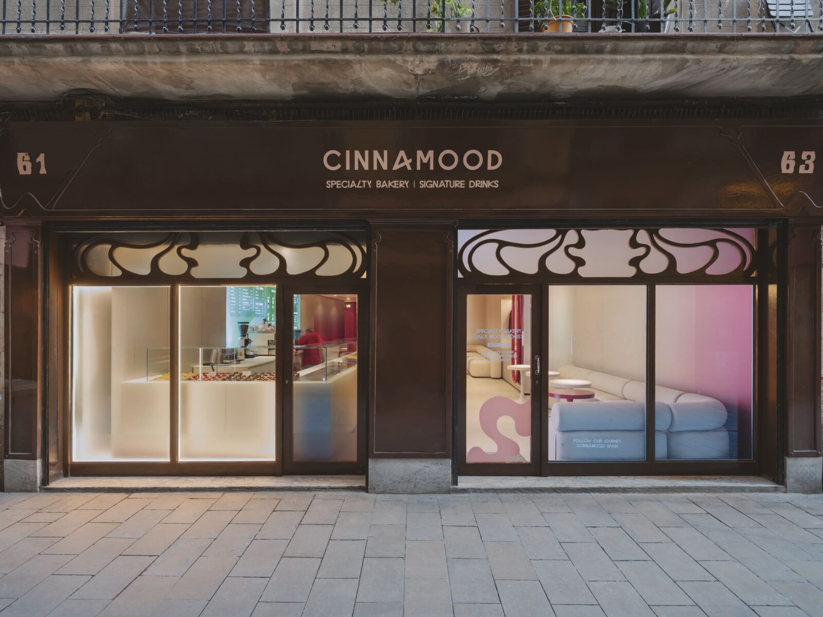
The historic streets of El Born are famous for their medieval stone and narrow alleys, but a new arrival at Carrer de l’Argenteria, 61 is shaking things up with a look that feels miles away from the past. Cinnamood, the international chain famous for its cinnamon rolls and specialty coffee, has opened a nearly 90-square-metre space that brings a bright, futuristic energy to one of Barcelona’s oldest neighbourhoods.
Designed by the team at Kidz, the project is a lesson in how to take a strong brand identity and make it work inside a building from the first half of the 20th century. Instead of fighting against the old structure, the designers used the existing layout to guide the new look.
Using architecture as an anchor
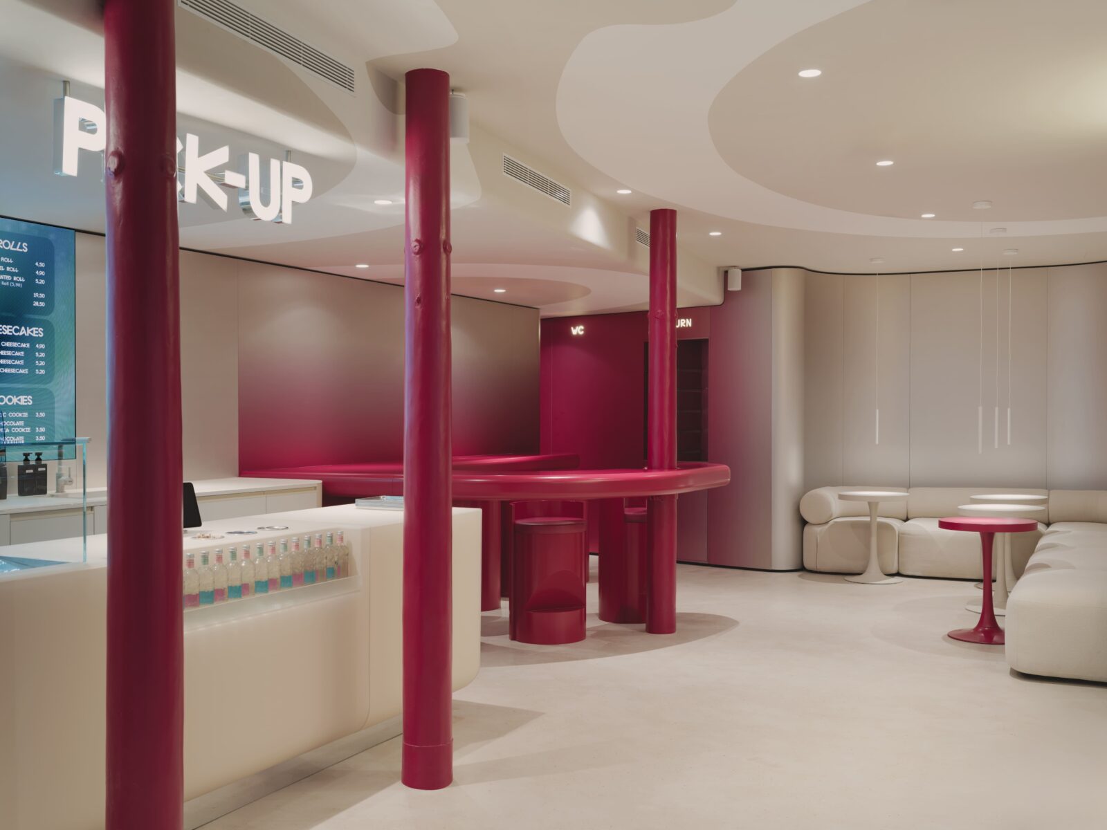
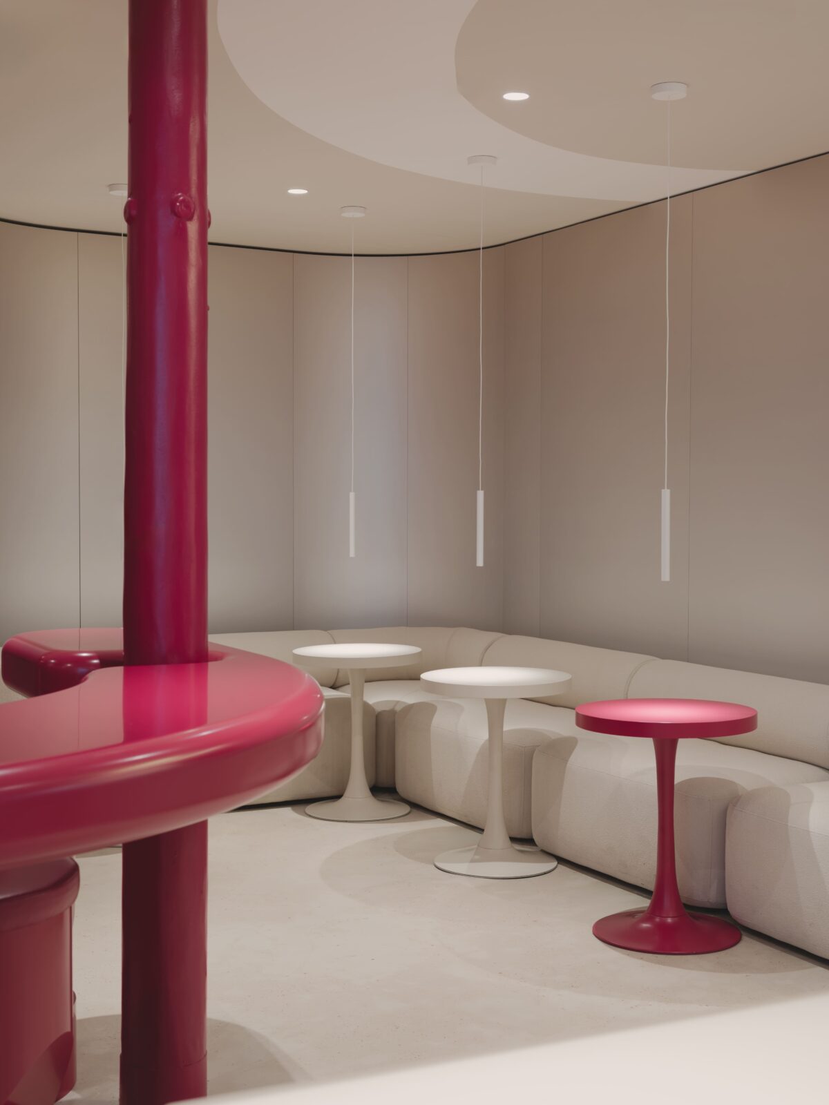
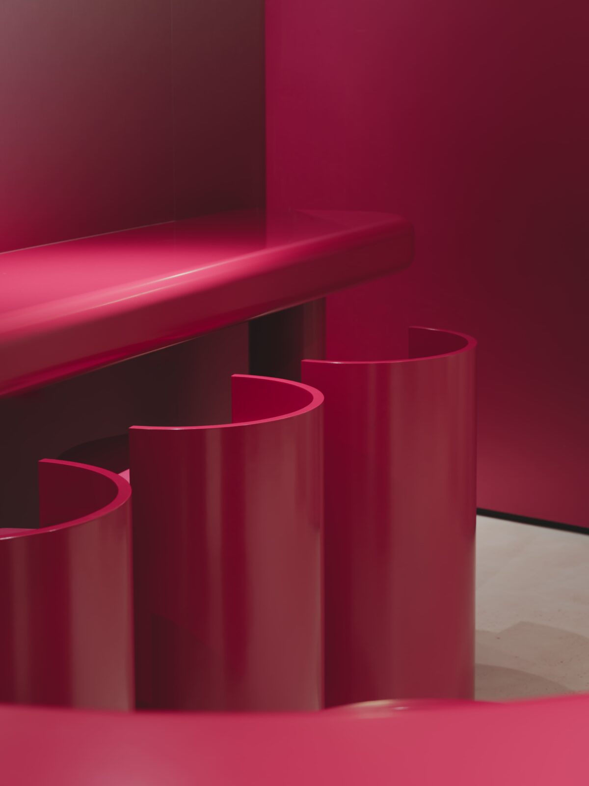
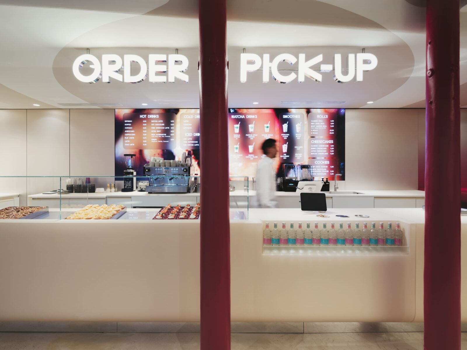
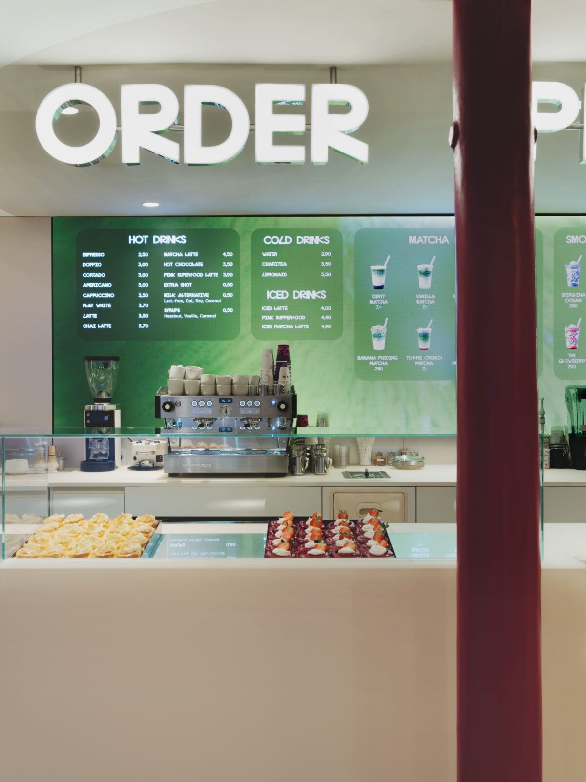
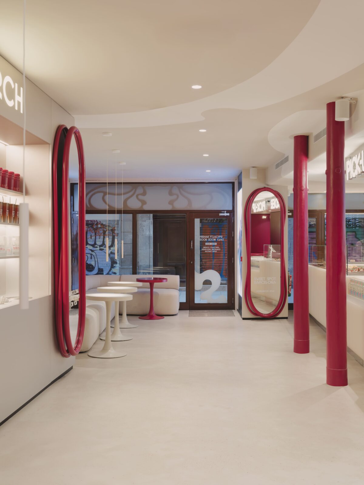
The interior layout was largely dictated by the structural columns found inside. Rather than trying to hide these pillars behind walls, the designers made them the stars of the room. The main service counter wraps around these columns, making them feel like they were always meant to be there. Above, the ceiling features a graphic pattern that seems to ripple out from these pillars, tying the whole room together into one clear system.
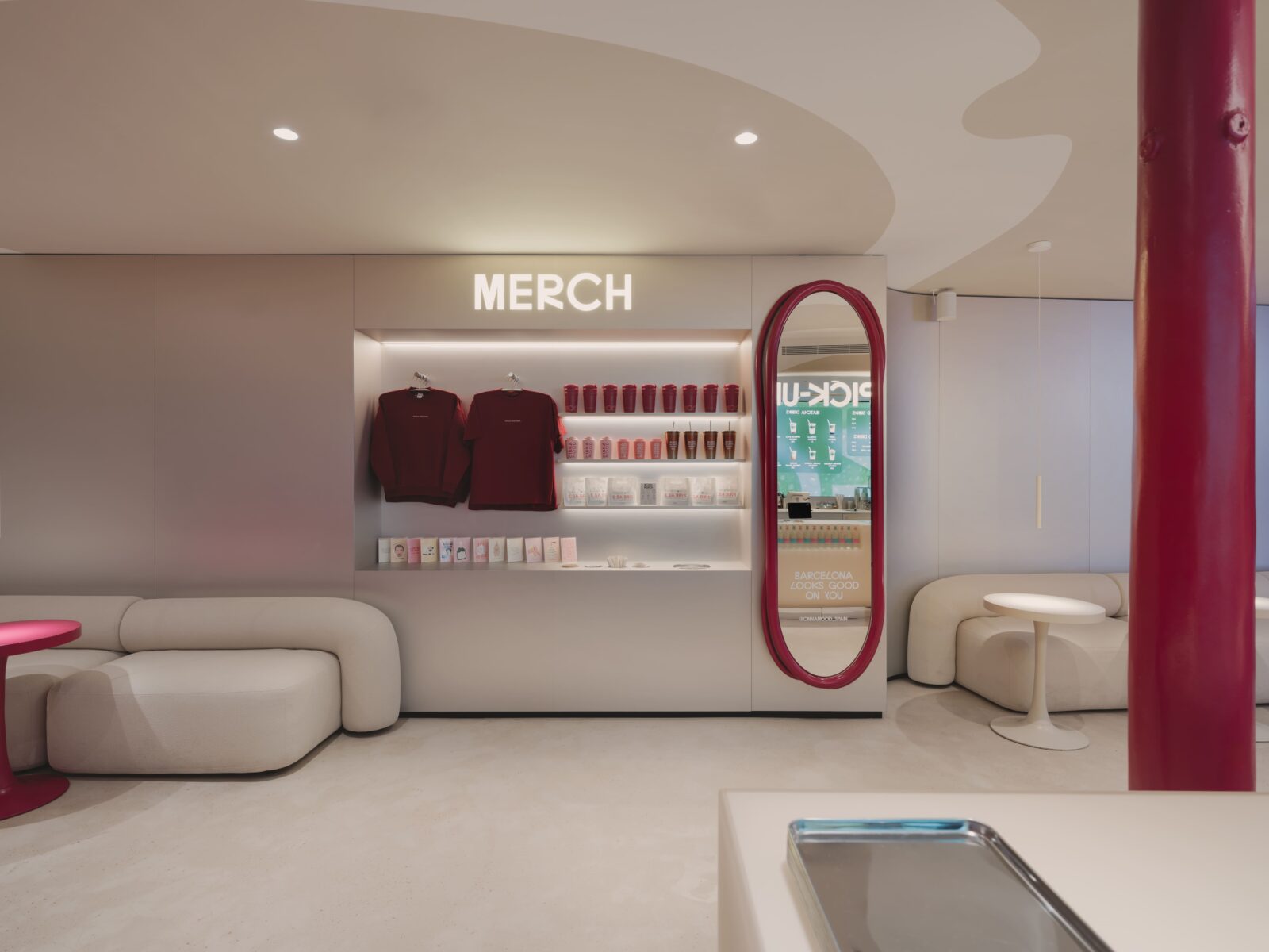
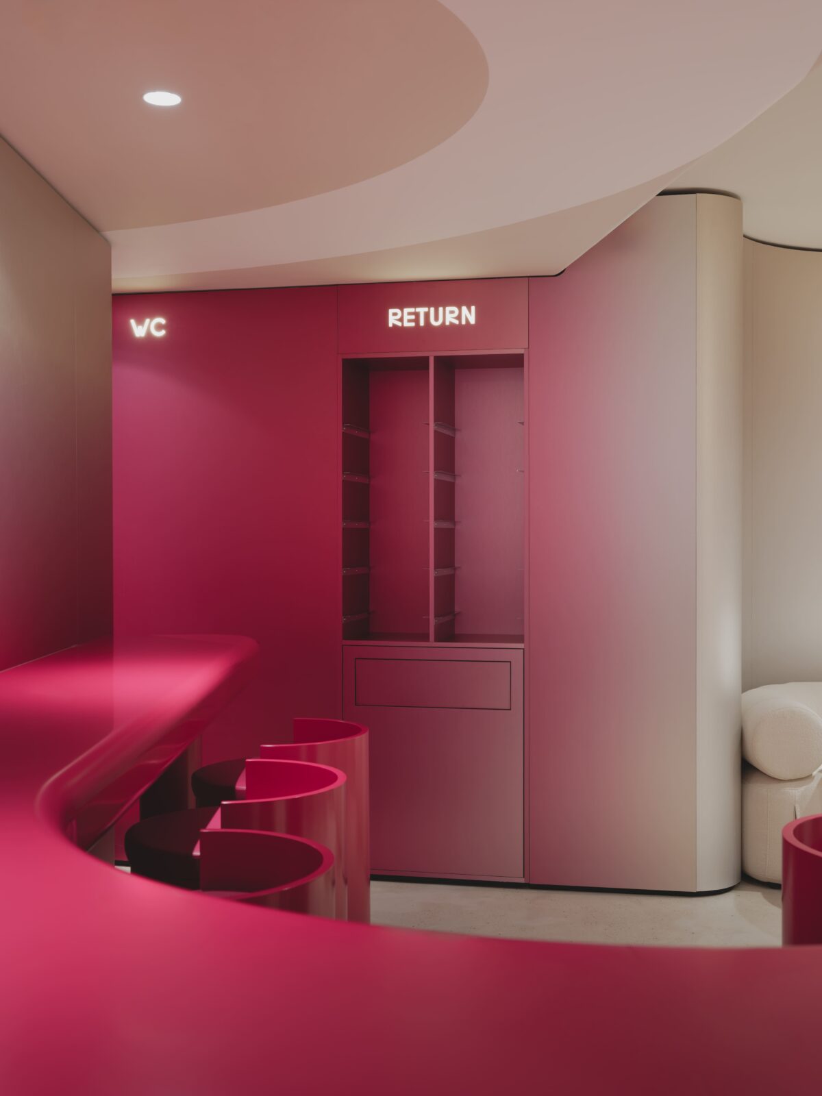
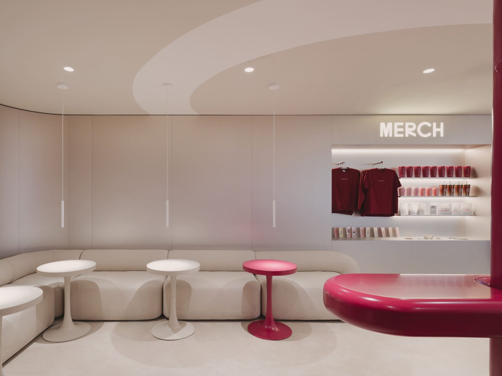
By focusing on the columns, the team created a natural flow for customers. The shop is split so that people waiting for their rolls and coffee don’t get in the way of those sitting down. Merchandise is tucked into the areas where queues form, keeping the seating areas quiet and free from clutter.
Soft shapes and bright gradients
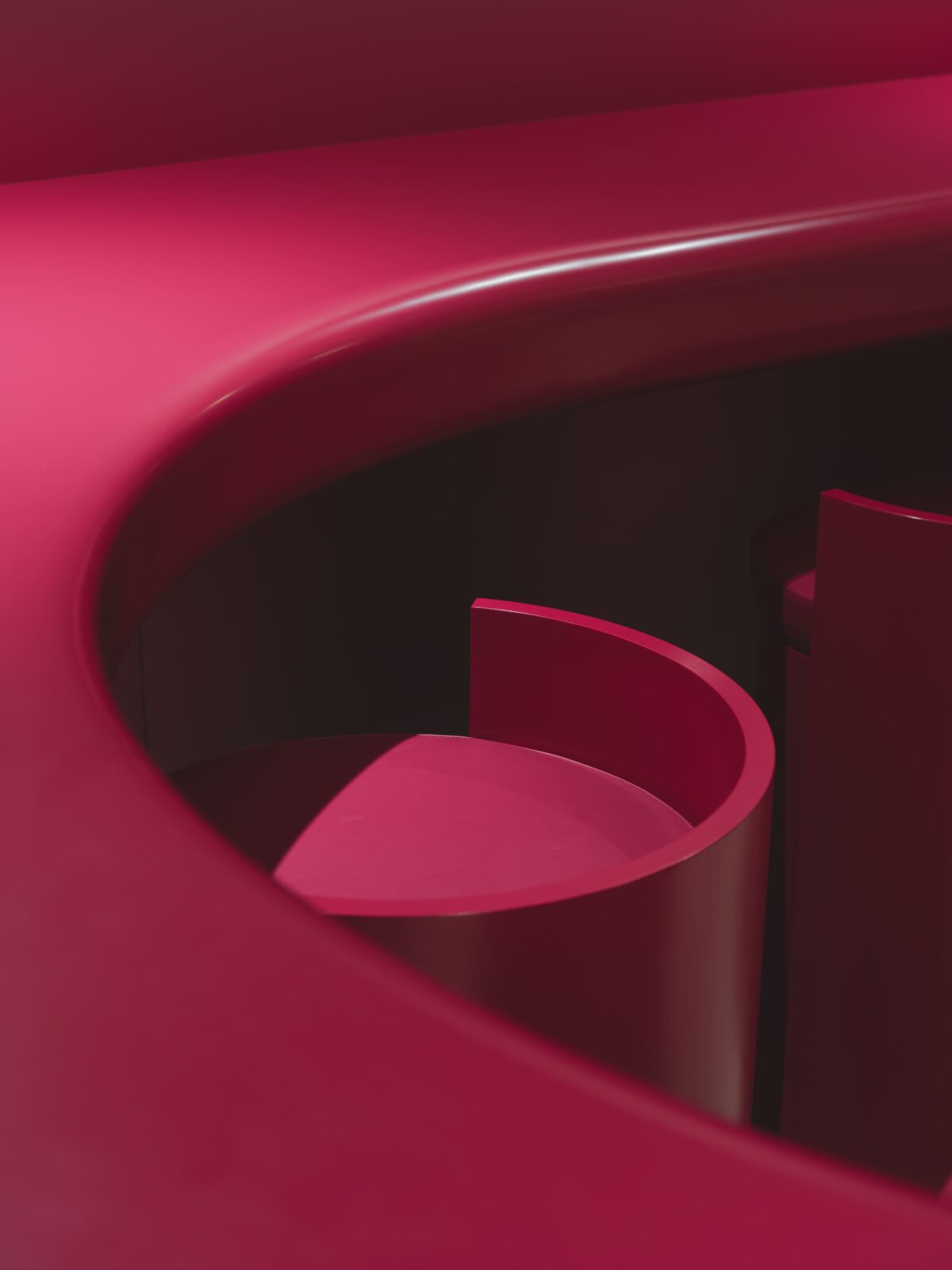
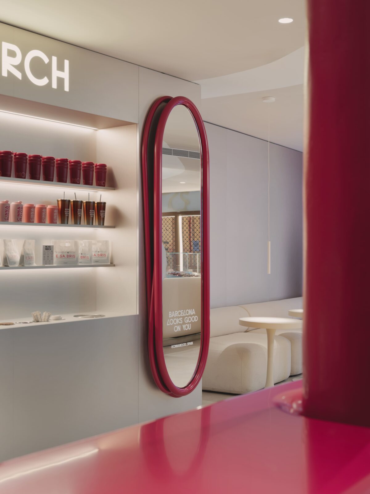
While the brand is known for its loud, vibrant colours, the Barcelona shop balances this with a clean, neutral base. Most of the seating uses quiet tones, which lets the more colourful parts of the shop really stand out. The walls and built-in furniture are where the real personality shows through, featuring metal panels with gradient finishes. These panels show a smooth change from raw metal into bright, saturated colour, giving the walls a soft look despite the hard materials.
You won’t find many sharp corners here. The designers chose rounded forms for the acrylic stone counters and furniture, creating a space that feels like it wraps around you. This soft geometry makes the room feel approachable and easy to move through, even when it’s busy.
Tech built into the walls
The technology in the shop doesn’t feel like an afterthought. Instead of hanging TVs on the walls, the team used digital screens that are flush with the wall surfaces. These screens handle the menus and entry information, appearing as part of the building’s skin. This keeps the lines of the shop clean and focuses the eye on the pastries and the architecture.
Durability was also a big factor, as the shop is right next to the Basilica of Santa Maria del Mar and expects heavy foot traffic. The choice of acrylic stone, metal, and high-quality painted surfaces means the shop can handle the daily rush while keeping its polished, airy look.
The Cinnamood project shows that you can bring a very modern, tech-heavy brand into an old city without losing the spirit of either. The designers have created a spot that feels fresh and confident, where the rolls are the focus, the tech is hidden in plain sight, and the colour does all the talking.