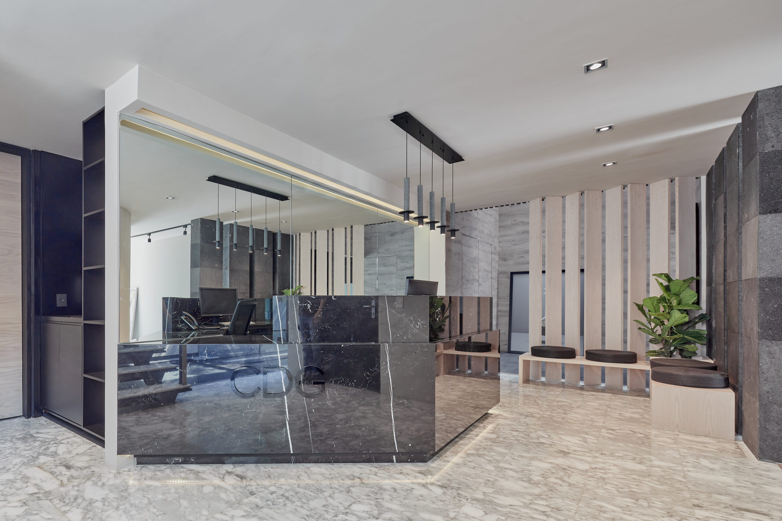
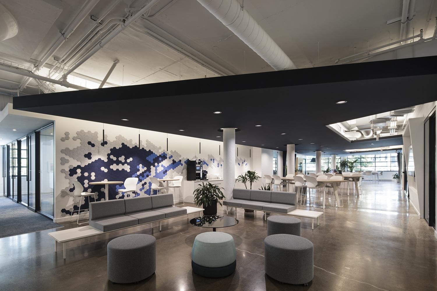
The fundamental premise of the Corporativo CDG project was to establish an environment of trust, modernity, and vitality in this law firm, located in a house built in the 1950s, situated in the heart of the Polanco neighborhood, one of the most important and relevant areas of Mexico City. The design concept consisted of rescuing functionalist architectural elements and fusing them with modern details to achieve a contemporary aesthetic.
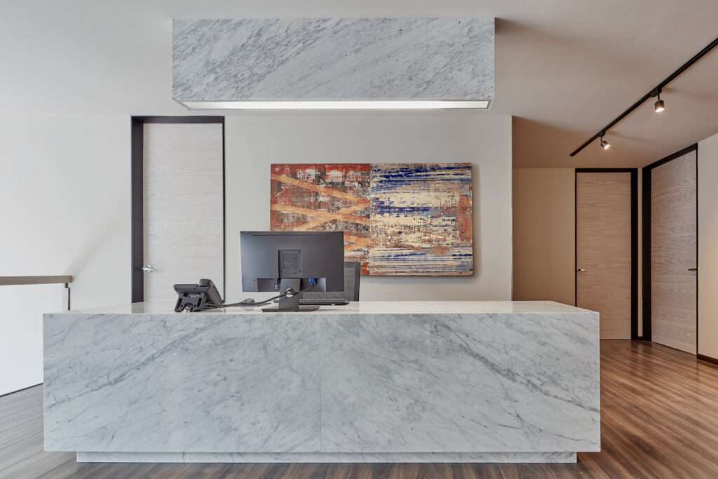
The selection of the material palette leans towards the dominant stone type recinto, used both in the facade and interiors, highlighting the solidity of the construction and the identity of the firm. This choice is complemented by the strategic use of the light oak wood present in carpentry such as doors and acoustic panels, creating a warm contrast with the visual coldness of the stone gray.
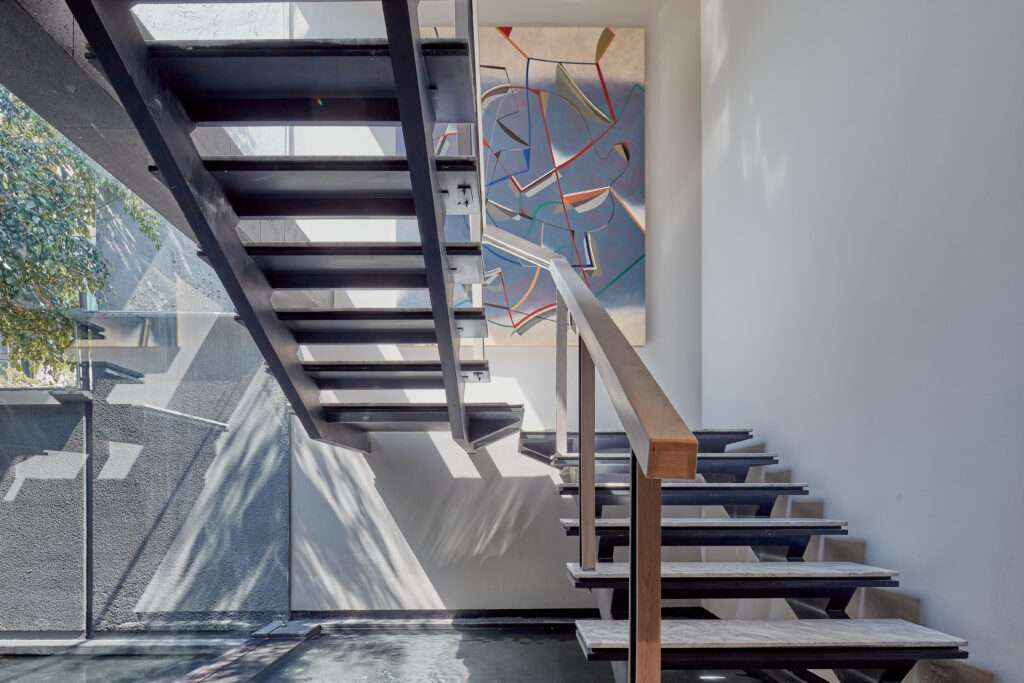
Natural lighting plays a leading role by illuminating both floors through a strategically placed window that embraces the staircase. The east and west facades have retained the floor-to-ceiling window openings, preserving the integrity of the original architecture. On the west facade, facing Goldsmith Street in Polanco, a lattice with solid Tzalam wood planks was designed. This lattice not only seeks to alter the residential appearance, giving it a more corporate air but also acts as a privacy element for the offices.
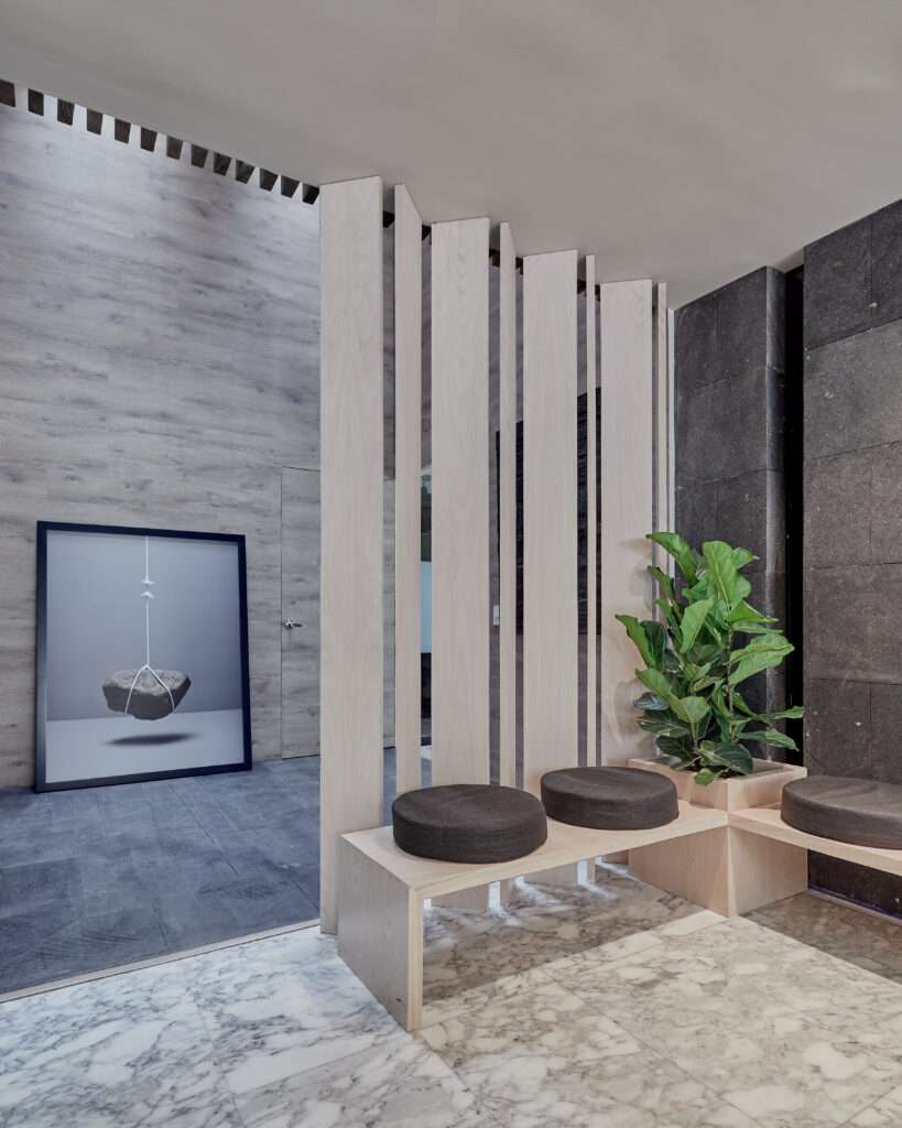
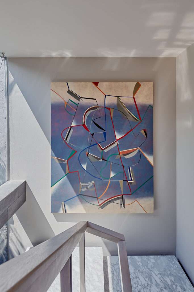
Throughout the journey from the entrance to the reception, a series of natural elements have been arranged, including varied vegetation and a water mirror that enters the house and flows under the staircase, crowned with artwork curated by the firm. The reception, crafted in black marble with white veins, establishes a visual counterpoint with the original white marble floor of the house and culminates with a wall covered in mirrors, creating a sense of spaciousness and an elegant aesthetic worthy of a law firm. Working in these spaces not only provides status but also generates aspirations.
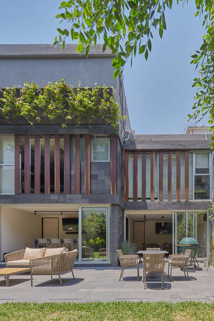
In response to the client’s request, the east facade on the ground floor was completely opened towards the garden, requiring the opening of all floor-to-ceiling window openings to achieve this. On both the upper and ground floors, the spaces facing the garden and terrace, including the meeting rooms and kitchen, open completely. The importance of having this outdoor space was key for the client due to organizational considerations and the need for a social area.
Particular emphasis was placed on enhancing the original architecture of the house, respecting its functionalist lines, and eliminating elements that had been inappropriately added over time. The process began with cleaning and removing damaged finishes, preserving elements that could be recovered, and adding value to the new project. The decision to clad the walls with recinto stone was motivated by the discovery of volcanic stone in the entrance landscaping, an element incorporated into the interior design to establish a coherent connection with the surroundings.
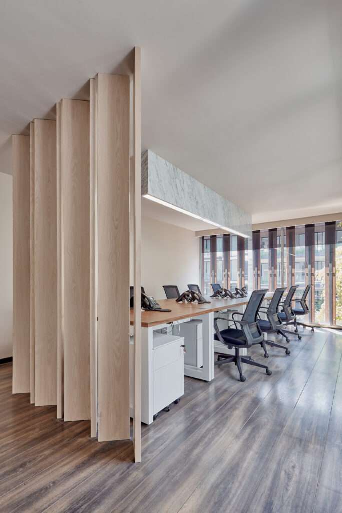
On the upper floor, the horizontal circulation and the white lattice that merges with the materiality of the War Room walls divide the offices on each side. It is so generous that on the ground floor is the reception desk, while on the upper floor is the secretary’s desk. The architectural program was initially proposed to accommodate 20 people, with the option to expand to 40 in the future. To this end, some spaces such as the Relax Room were left, which can be conditioned to offer more work areas. Additionally, on the third floor, there is an empty warehouse that, in case of future growth, will be adapted to provide more office space.
The presence of natural lighting and ventilation, green views, and access to the terrace and garden provide a unique sense of well-being when entering to work every day, in contrast to the confinement in a conventional building. Experiencing a well-designed space with carefully selected art and high-quality materials, along with a coherent visual justification, generates harmony that positively influences mood.
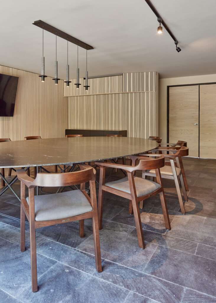
The furniture, mostly designed by Branco Estudio, stands out for its contemporary and timeless elegance. The art curation by Marcela Cauduro, with works by Saúl Kaminer, Ricardo Pinto, and Héctor de Anda, adds additional layers of sophistication and uniqueness to the space.
CDG not only stands out for its aesthetics and functionality. The careful choice of materials, the integration of natural elements, and the respectful adaptation of the original architecture contribute to the timelessness and durability of the design. This integral approach, encompassing architecture, interior design, and art, creates a contemporary, solid, and high-level environment, fully meeting the client’s expectations.


