Header: Fernando Schapochnik
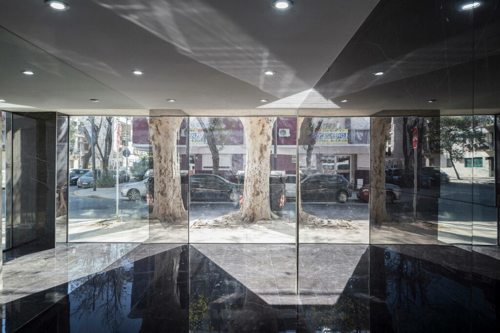
Located in Villa Urquiza, Buenos Aires, Urban Style 2 is a four-story housing building that consists of six two-room apartments. The neighbourhood, which gives off a residential character with low and medium-density fabric, is in the process of transformation and growth due to the development of the new Donado-Holmberg linear park.
The architects at F2M Arquitectos cleverly designed the corner building to appear less bulky by working around local zoning laws (R2B1) that usually apply to this kind of property. By adding outdoor spaces that don’t count towards the building’s total occupancy limit, they were able to maximise the height of the building. On the other hand, these outdoor areas also help bring in natural light and offer nice views from the rooms. This thoughtful approach allowed the designers to use the entire permitted space to make the most out of the living units.
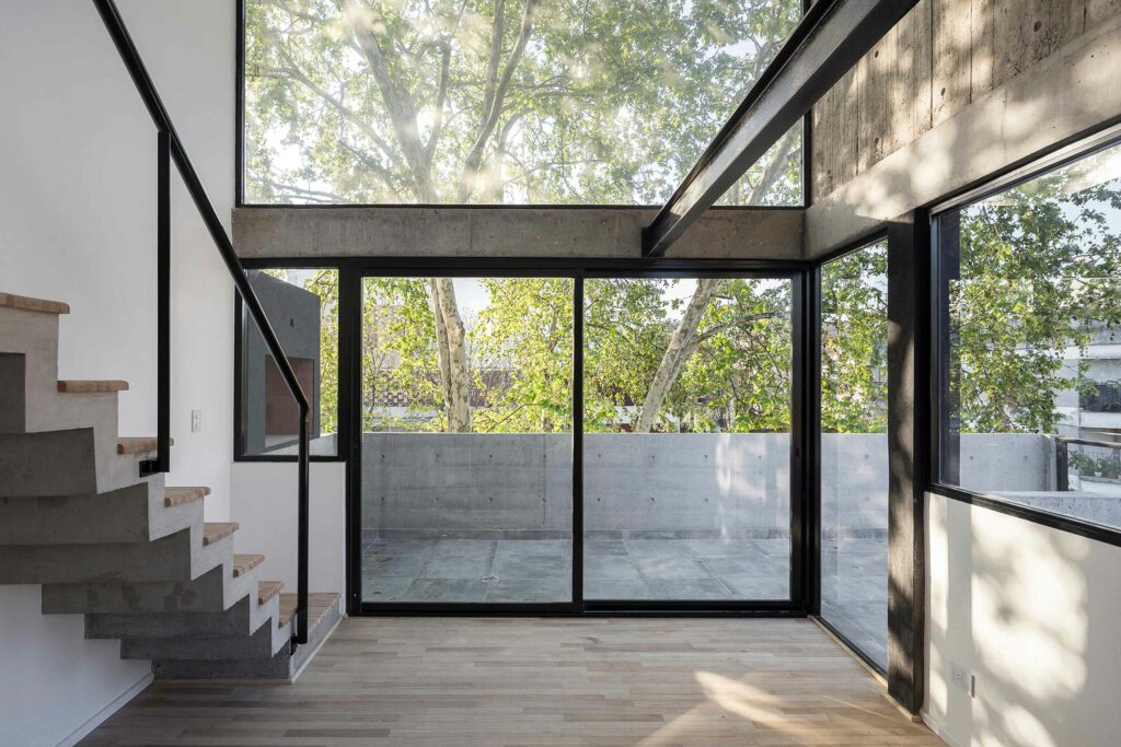
In the first levels, the designers introduced L-shaped housing typologies, which, when combined, stacked, and mirrored, can generate a series of exterior spaces that can be used by the apartments’ residents. On the upper levels, the units are designed as duplexes connected through the double height of the space. In addition to this, a 2-metre-wide open area spatially connects the terraces of the building. Viewing the building from the outside, a “concrete box” is elevated 4 metres above the pavement, greatly emphasising the entrance.
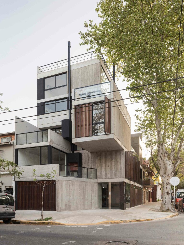
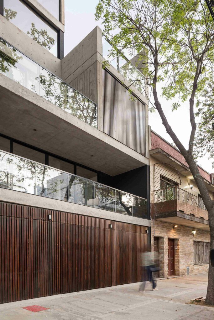
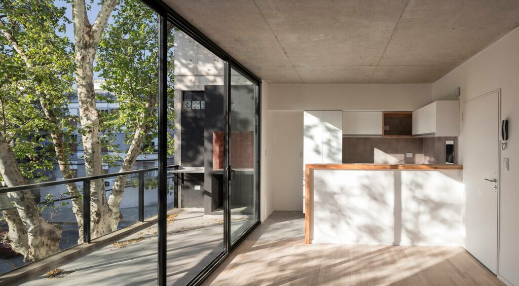
Regarding the façade design, three essential materials were used: concrete, wood, and glass. The concrete walls combine both rough and smooth textures, providing structure to the construction while also giving it an interesting aesthetic. A series of folding wooden panels were added to filter natural lighting and provide privacy in the bedrooms. The interior-exterior limits were designed with fusion in mind, as large floor-to-ceiling sliding glass panels link the living room areas with the terraces.
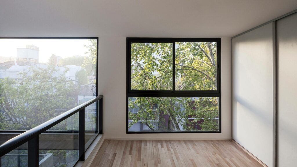
Placed right next to the treetops, patios bring residents closer to nature. To further enhance this sense of connection, the interiors were designed as wide and neutral spaces where natural light stands out through the use of white walls and kitchen cabinets. Light wood floors help bring clarity, especially by contrasting with the concrete ceilings and walls.
