Photo credit: David Gilbert, Katherine Marks
Historic buildings are often structured differently from what we’re used to nowadays. They often have many small and dark rooms, uncomfortable spaces, and other parts that need adjustment to the modern lifestyle. Amy Shakespeare and Mark Gordon, the principals of Shakespeare Gordon Studio, were aware of this when they purchased the Ditmas House in the historic neighborhood. What they also knew was that they were undertaking a challenging task.
The place where the designers started the revitalization of the house was the attic. Generally, this is the most underutilized place in a traditional home. It is located up; it has challenging architecture, and it is often used for storage. Moreover, an attic is usually the last place to receive a makeover in a home. Yet, Ditmas House, was the project that changed things for Amy and Mark. They embarked on a journey to transform this dreary lace into a light-filled suite for themselves.
They established a new visual language for their later renovations of the home’s two main floors. Amy and Mark’s reorganization of space upended the conventional turn-of-the-century layout and informed playful design choices throughout Ditmas House.
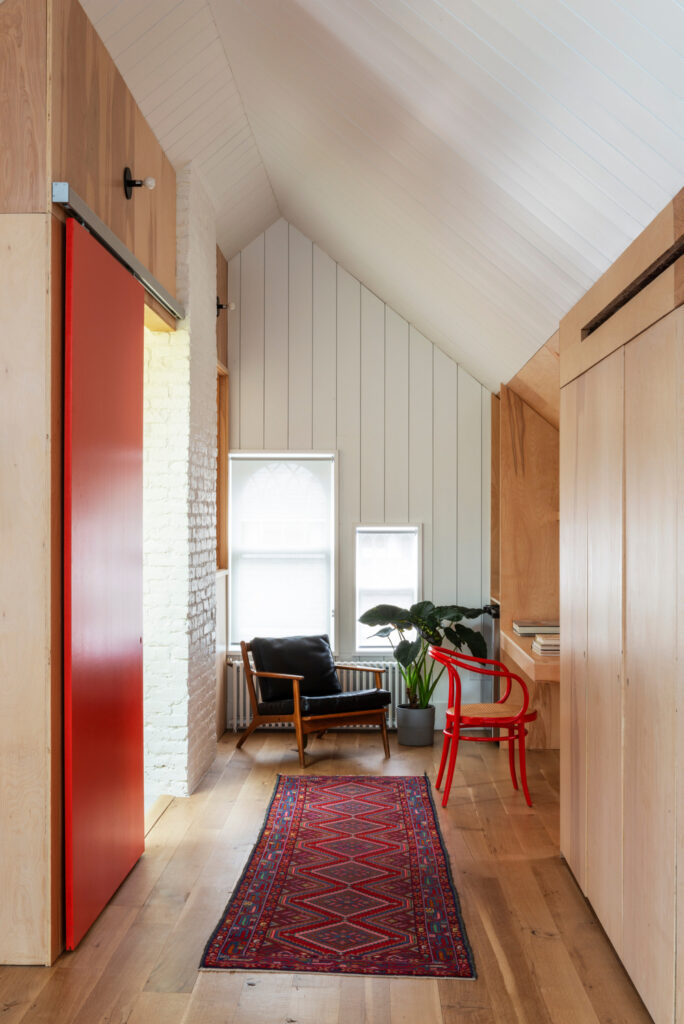
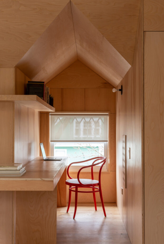
The primary bedroom suite in the attic serves as a case study of the choices that characterize the design logic of this project. It is a cohesive, flexible backdrop punctuated by bursts of color and definition that reinforce function. The main part of the attic, which spans the width of the house, is clad in a mix of white shiplap and ends of the roofs. Solar-controlled operable skylights introduce natural light and air into spaces that had previously been very dark. Exposed natural plywood panels blanket the balance of the walls and dormers. They are also used to create custom storage closets, a dresser, bookshelves, and a desk for Mark’s home office. These interventions create a light, airy space that is elegantly malleable, with a range of subtle built-ins.
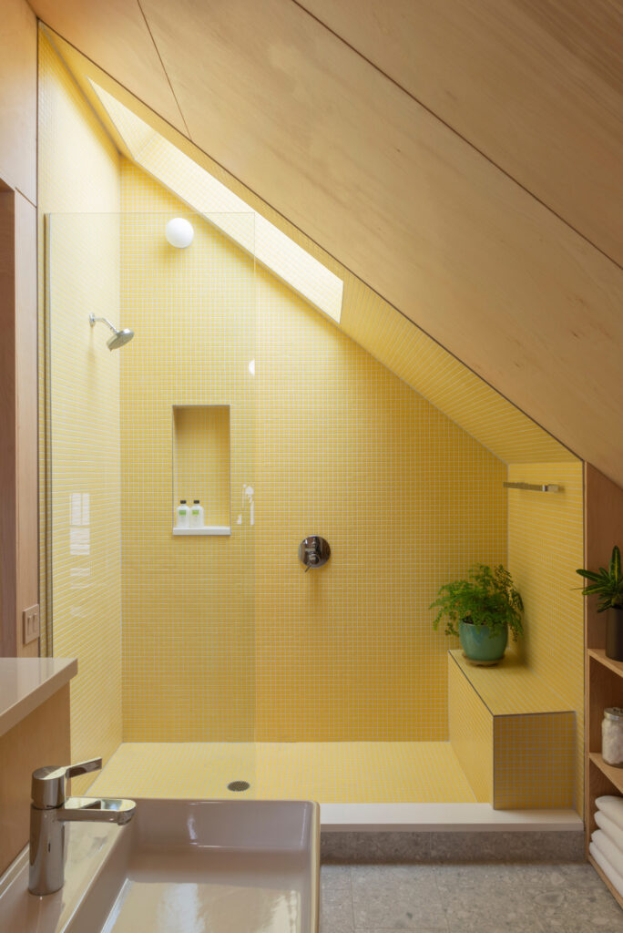
Meanwhile, two large sliding panels in different shades of red define the room, with one marking its entrance and the other serving as the door to its ensuite bathroom. The primary bathroom embodies the flip side of Amy and Mark’s design philosophy for the house. They focused on eye-catching colors and materials that draw attention to specific elements, highlighting the specific functionality of this different kind of room. This concept is epitomized by the walk-in shower and a triangular prism tucked under the roofline.
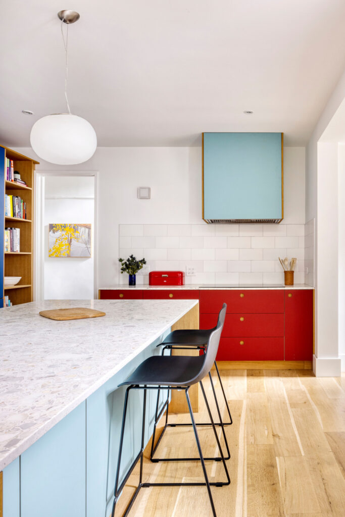
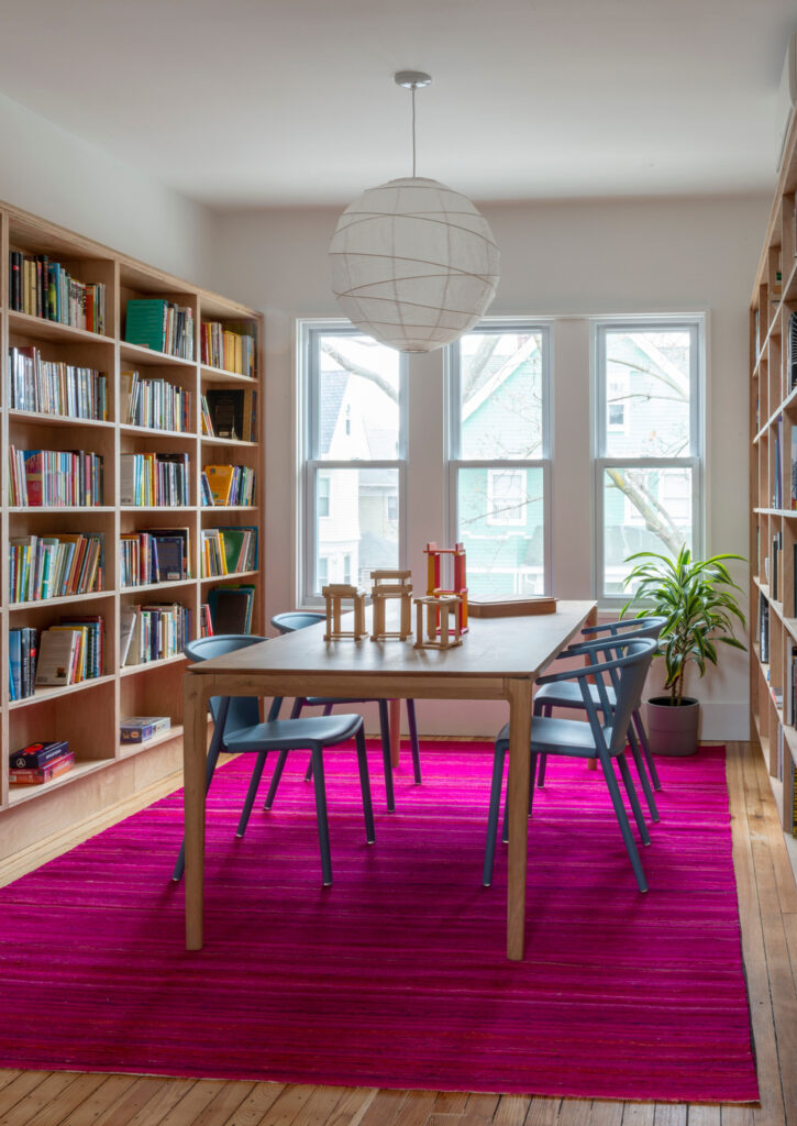
Elsewhere in the home, the high-contrast color palette continues to differentiate elements and functions, while at the same time materials such as wood blend flexible built-ins into the house’s existing structure.
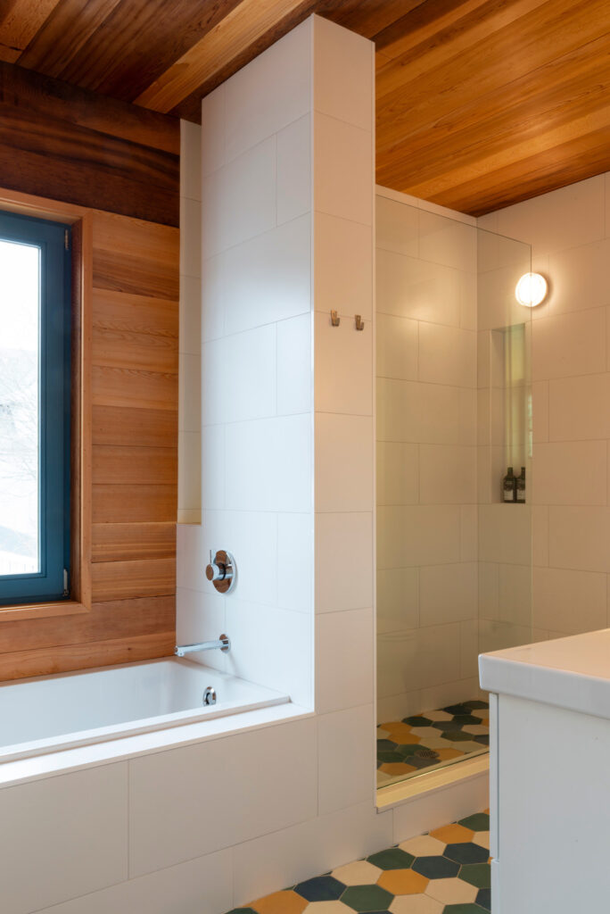
In the kitchen, the architects worked with Reform to select cladding for their IKEA cabinets. Solid character-grade oak runs through many of the renovated areas of the house, and oak panels climb up the sides of the terrazzo kitchen countertops and encase a built-in bookshelf and a structural column. These elements reappear in the second-floor bathroom, where cedar lines the walls, and ceilings, and multi-colored hexagonal tiles can be found underfoot.
From the sunlit suite at the top of the home to the easy-going elegance of the first floor, Ditmas House’s synergistic blend of natural light, bold colors, and expressive materials reanimate this historic home.
This project not only revitalized the property but also redefined the chances of modern living in historic buildings. The journey of the designers is proof of their modern vision and design ingenuity. In other words, Ditmas House is a case study of the transformative power of thoughtful design in which innovation and tradition blend in seamlessly.
Source: v2com


