Header: INDRA WIRAS
Some people think of shopping as some sort of art, or even a science, as a lot is going on behind the scenes. To attract interest and admiration, one of the methods adopted by retail shops is to use light to enhance their products and space, which at times ends up creating magical shopping paradises. In this article, we’ll discover five unique lighting designs that put a spotlight on the merchandise and on the clients’ experience, all of which accolades of the prestigious LIT Lighting Design Awards.
A spotlight on light itself
Think about entering a shop for a moment, what comes to mind? Perhaps the fashionable mannequins, or how the prettiest and most expensive items are placed first, or even how items seem to look better in the store than in your closet. Well, there’s a detail that goes a bit unnoticed, however, it makes a big difference in the customer’s shopping experience: light.
Light can completely transform a space as it can induce emotions in people and create dynamic atmospheres just by the adjustment of tonality, brightness, and distribution. A warm and diffused light can create a comforting and intimate space, inviting people to enter and purchase items just to achieve that same feeling in their homes. On another hand, a stark and cold light can make the space feel somewhat menacing, inviting you to come in, choose quickly, and go on with your day.
“We Are Honestree” by ERRELUCE
Located in Indonesia, a team led by Ryan Salim, from studio ERRELUCE, developed the lighting design for the Kayu Lapis store. In the words of the studio, “the design tells the story of how nature can inspire the form of architectural space through the abstraction of human experience in nature in the composition of layers“.
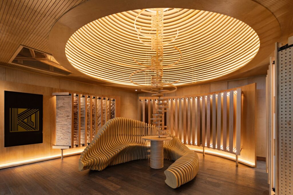
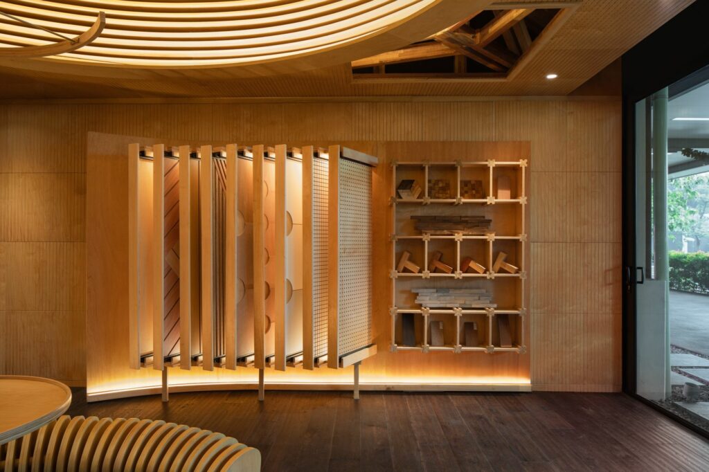
The store’s design is reminiscent of a forest, as the walls and floors are made out of wood and everything is illuminated with diffused lighting strips with warm tones. In the centre, a bench rests bellow a bent wood structure resembling a tree, each plywood piece illuminated by its own lighting strip. The samples of different wood pieces are showcased, allowing the client to rest under the protection of the canopy and enjoy the store’s products calmly.
On the main element of the show, the tree in the centre, ERRELUCE applied a round membrane with indirect light that frequently changes intensity, resembling the changes in sunlight throughout the day. The project’s light not only shows the true colours of wood but also enhances the objects displayed throughout the space, its beauty adding more value to the merchandise.
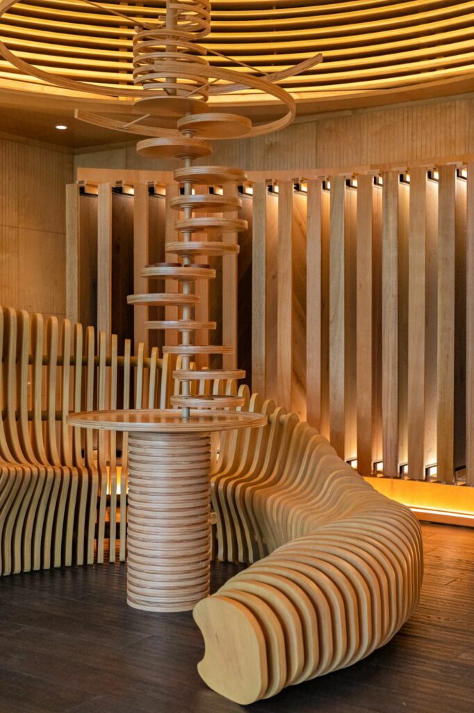
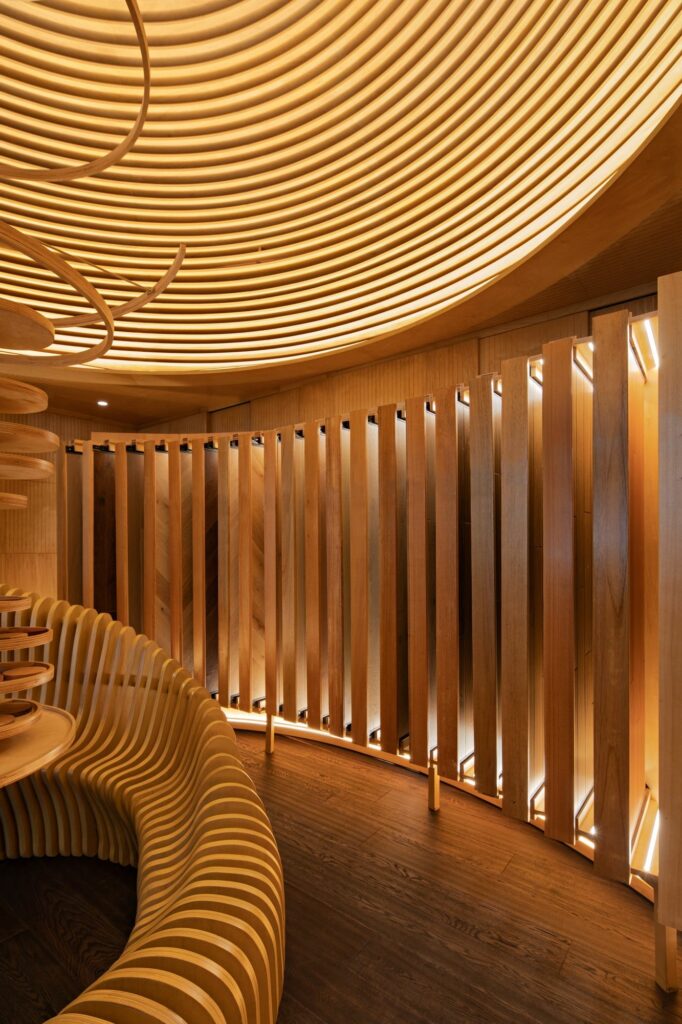
The store felt like only selling sustainable products wasn’t enough, so the materials used in the design were also carefully chosen to further respect the brand’s values. To ensure that the customers make a conscious choice when purchasing the products, the store’s first showroom refers to the brand’s goals and ethics, hopefully inspiring visitors to make a change in their habits. On another hand, adjusting light as if it were sunlight increases energy efficiency, made possible by a dimming system always making sure that light is used when needed – which also enhances the overall ambience of the space.
“JOHN HARDY Kapal Bamboo Boutique at Mambal” by Studio Nimmersatt
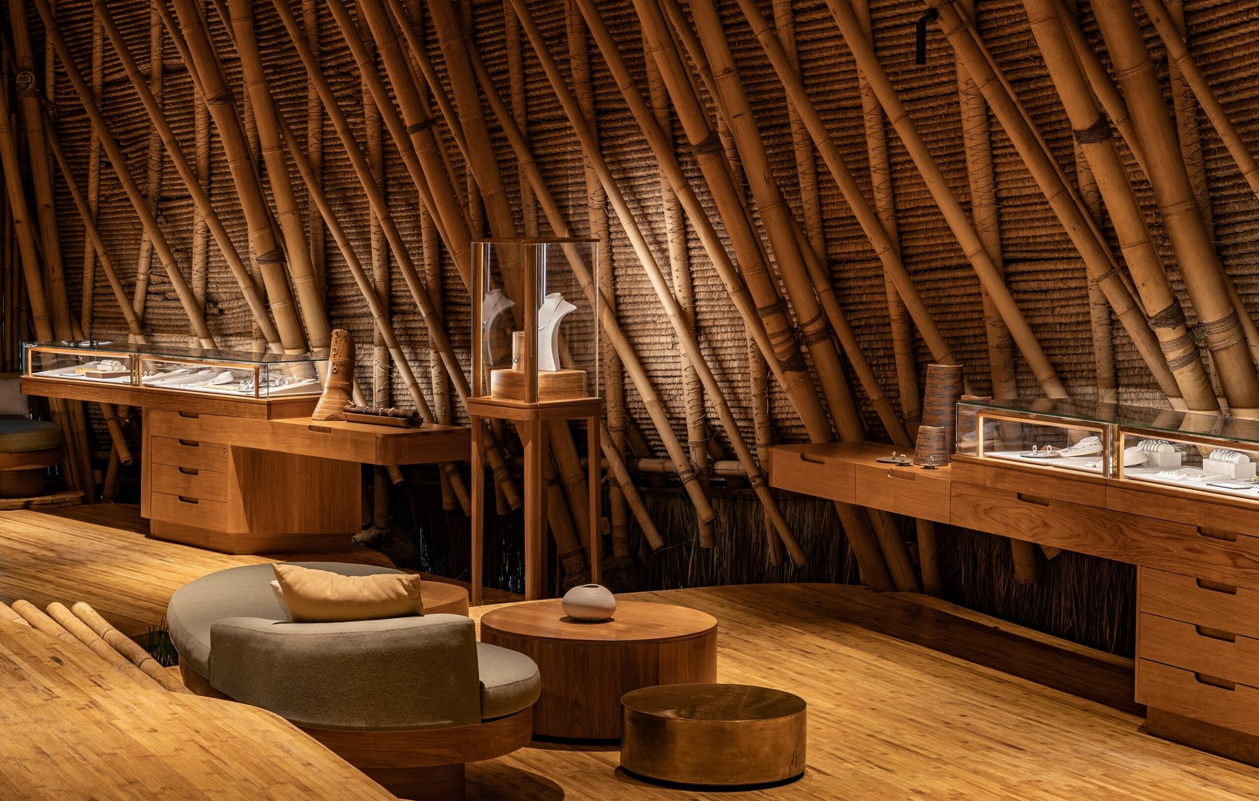
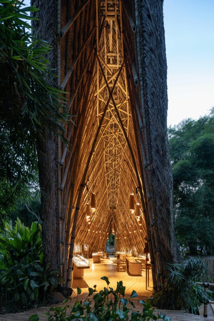
In the John Hardy Mambal retail store, in Bali, light illuminates three things: jewelery, architecture, and tradition. As the studio says: “a celebration of lighting and iconic Bamboo architecture.”
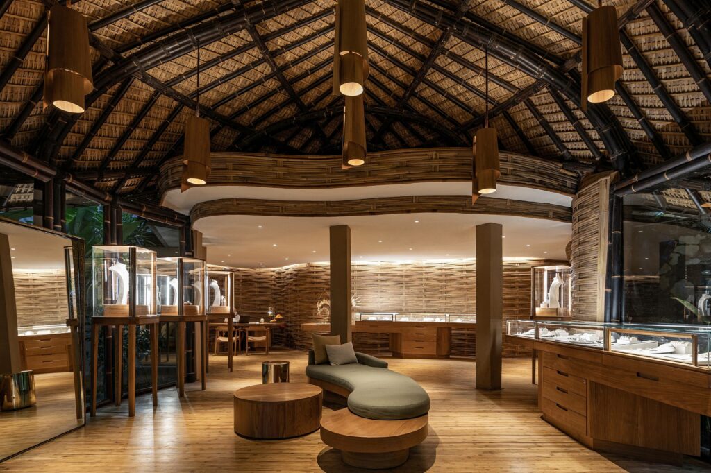
The store is located in a cathedral-like bamboo structure, vernacular to the location, that is enhanced by warm pendant lights. By allowing the light to rain onto the space from a central point, shadow and light play with each other to create a stark contrast in the walls, intensifying the bamboo structure.
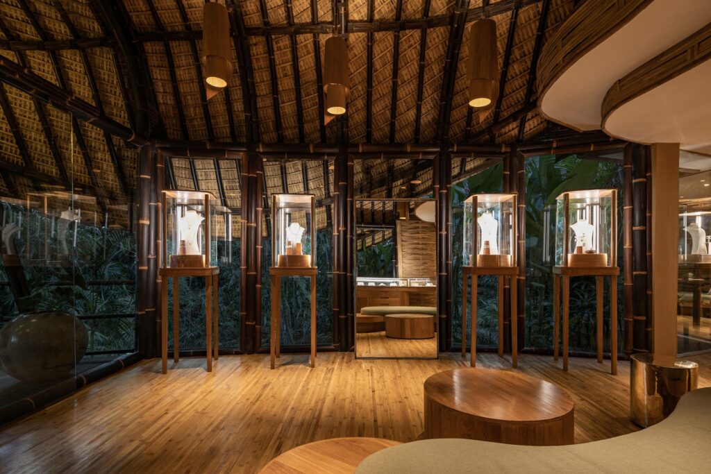
The studio responsible for the lighting design, Studio Nimmersatt, led by Rina Pradnya Pusthika, decided to combine two light tonalities to give each element of the store its own deserved spotlight. As warm white light was chosen to create an ambience from the bamboo, cold white light was used to bring out the qualities of the jewellery pieces showcased throughout the store.
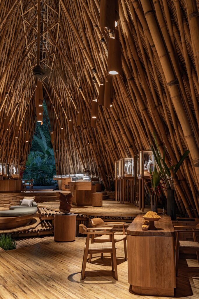
Different from the ambience light, the cold light was added with downlight arrangements throughout the ceiling of the store with an incorporated high Color Rendering Index (CRI) lighting, ensuring that the jewellery’s true colours always come through. This concept is meant to resemble a starry sky, bringing out the sparkly nature of the jewellery and drafting a magical environment for the clients.
To control the lighting system and ensure maximum energy efficiency, the store uses a Bluetooth lighting control system. With this wireless approach, the bamboo structure is free of wires flowing around and through it, reducing the environmental impact of the project by a lot.
“Natural is Best Flagship” by LIGHTORIGIN STUDIO
In Hong Kong, the food retailer Natural is Best has recently opened its flagship store, heavily basing the design on the Chinese Opera and the Xiqu Centre theatre. LIGHTORIGIN STUDIO, led by Eugenia Cheng, was tasked with the lighting design of the store, creating a design “that positioned lighting as a marriage between soft and spotlighting effects.”
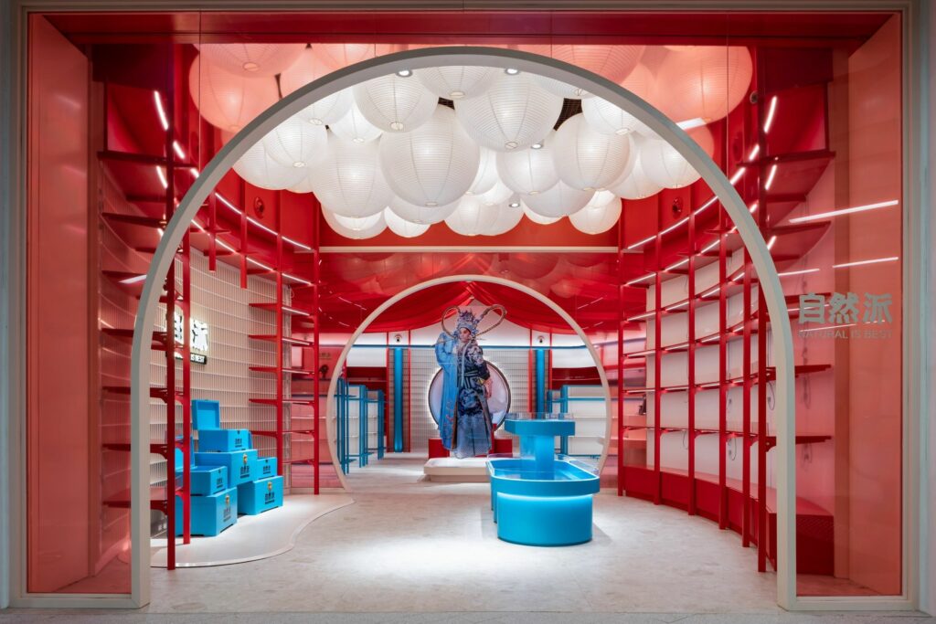
Through different approaches to lighting design, the studio tried to use light as part of the narrative while still respecting the needs of the retail space. The entrance, with its two moon gates, is illuminated by a sea of lanterns that serenely invite clients over. When inside, the different shopping areas are separated and highlighted with narrow spotlights surrounded by deep-red fabric that resembles stage curtains. A black-painted ceiling gives depth to the space, boldly contrasting with the red sky of curtains.
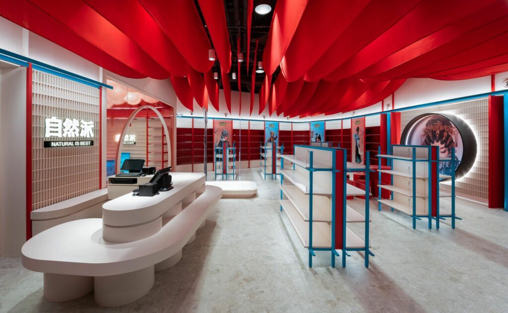
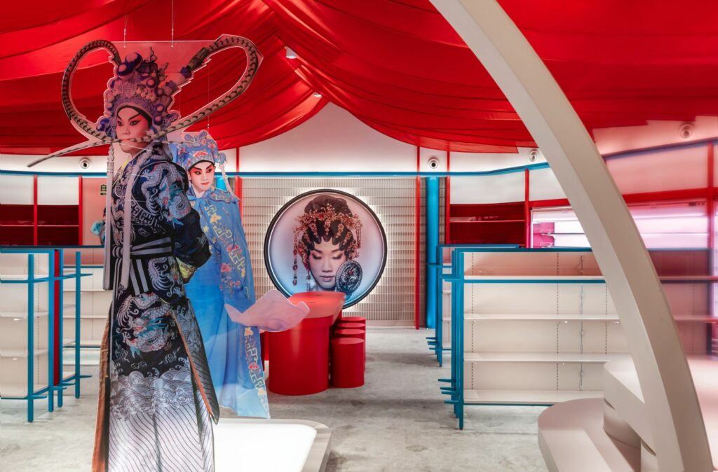
In the middle of the shop, translucent statues of Chinese opera characters rest on top of illuminated platforms. In the back, the artwork of the Chinese Opera artist King Fa Lui is framed and illuminated in a black oculus.
As each part of the store’s design was carefully illuminated, the technical aspects were thoughtfully chosen. The lighting fixtures, for example, were locally sourced, minimizing the environmental impact of the project. LED lights, user-friendly downlights, and calculated illumination levels all contribute to a sustainable, yet appealing, design.
“NEOBIO” by FangFang Studio and Hangzhou Donghao Lighting Engineering Co.
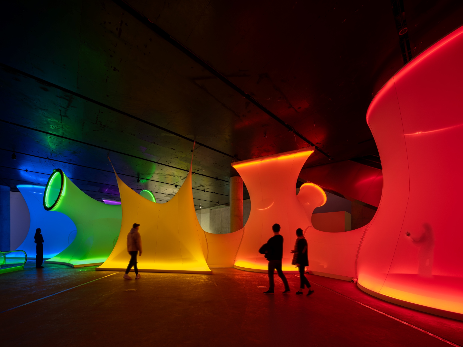
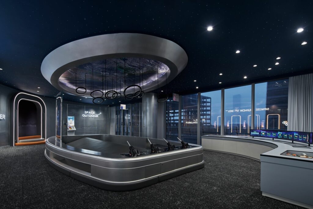
NEOBIO is a reimagined children’s playground with two continuous themes: space and great lighting. The collaboration between FangFang Studio and Hangzhou Donghao Lighting Engineering Co. resulted in an area where light not only is in perfect harmony with the interior design but also makes children deeply enjoy their fun time.
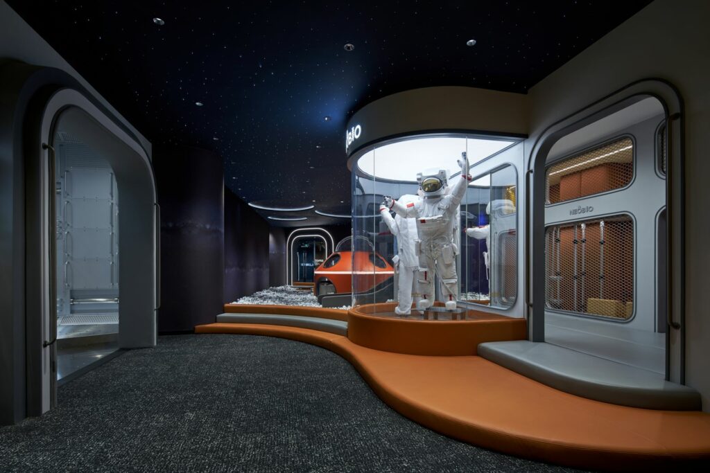
As a science and technology museum, the decoration is futuristic, the colours bold, and the possibilities endless. To go hand-in-hand with the overall tone, the studios set the colour temperature of the lighting fixtures at 4000k, fostering a continuous flow from zone to zone. These lighting fixtures were all set at a high level, evenly distributing light throughout the space, which ensures the children’s safety while playing and heightens their excitement state.
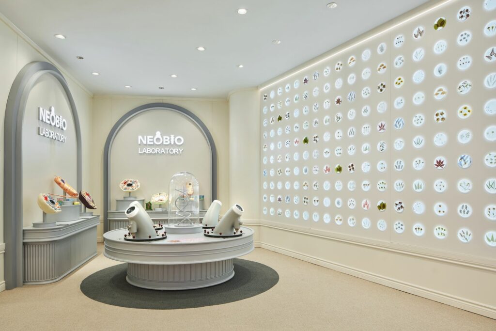
Some areas, however, got special treatment. The multifunction dining area, on the second floor, was given several lamps divided into circuits that can host any type of situation or setting. The space area, also on the second floor, has angled lamps that give depth to the room as they don’t reflect their light on the walls. Each room was given a key lighting element and light strips, giving a futuristic vibe to the spaces.
Because the future must be sustainable, this curated lighting design was carefully planned out. In-depth illumination calculations and standards were crafted for future reference and all lighting fixtures are of normal specifications, reducing future maintenance costs and, therefore, reducing environmental impact.
“Dior Femme” by MMLD
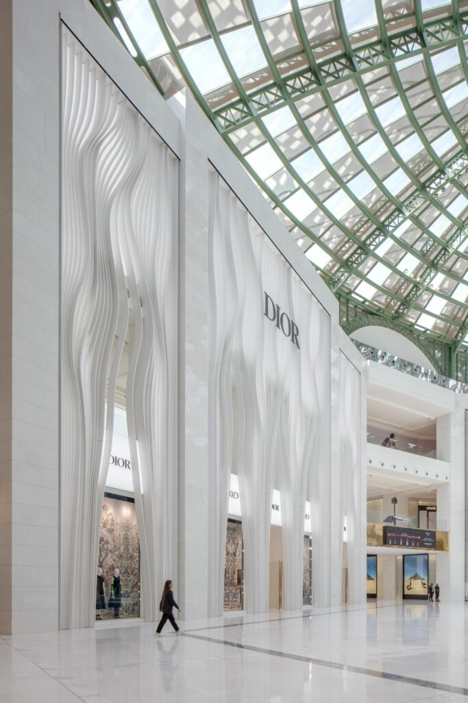
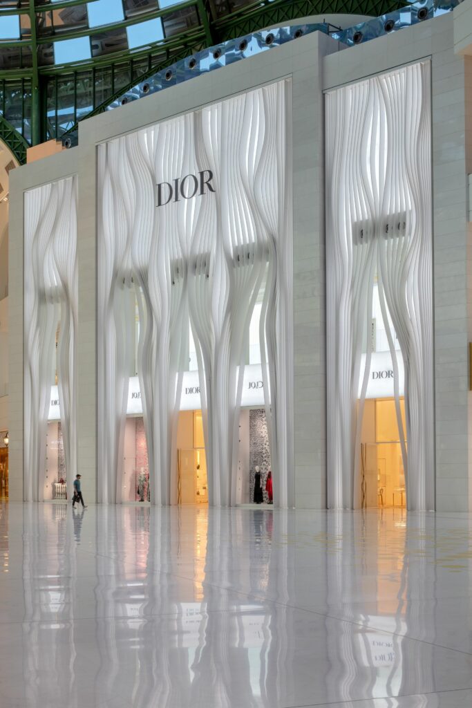
The new Christian Dior Femme store, in Qatar, has a unique twist to it: the facade resembles the iconic fashion house’s dresses, architecture and light working together to craft a dynamic pleating effect. Designed by Molly McKnight IALD MIES, alongside designers Ben Aranda, Chris Lasch, Joaquin Bonifaz, Barrett Miesfeld, and Alice Wilsey, the facade plays with the materials, resulting in an illuminated softness that can almost wave in the wind.
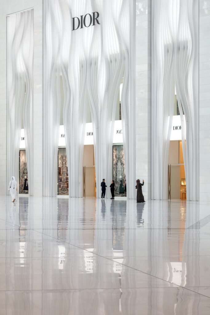
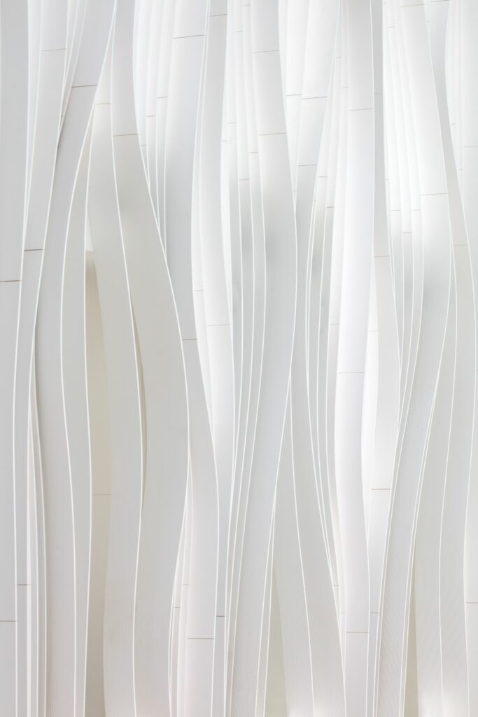
The effect was achieved by putting together a series of flowing opaque fins on top of translucent solid surface panels, all illuminated by tunable white light diffused throughout the surface. The trick in making the 22-meter facade look like fabric is in how light gives dimension to the materials, shadow and light working together in harmony. By adding texture to each fin, the light gets diffused in a weave-like effect, softening the hard materials.
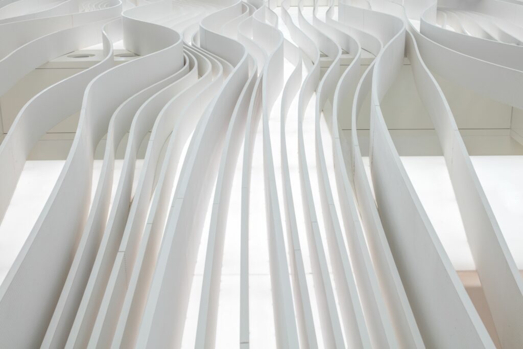
The lighting fixtures change intensity and tonality throughout the day, following the natural daylight shifts entering through the atrium’s skylight. Walking in front of the store is an experience on its own, as the interplay between artificial light, daylight, and materials creates different depths in the facade, an architectural pleat in motion.
The lighting used in the design uses an Ecodesign Compliant tunable white light as the main light source, increasing energy efficiency by 34%, which was created by a carbon-neutral company with 18 CSR initiatives completed. To cool the system, an access cavity in the facade was added to allow air to flow through, reducing material and energy usage. The control system is automatic, reducing the light emitting sheets’ output and underdriving them, which increases the materials’ lifespan and saves on energy consumption.
