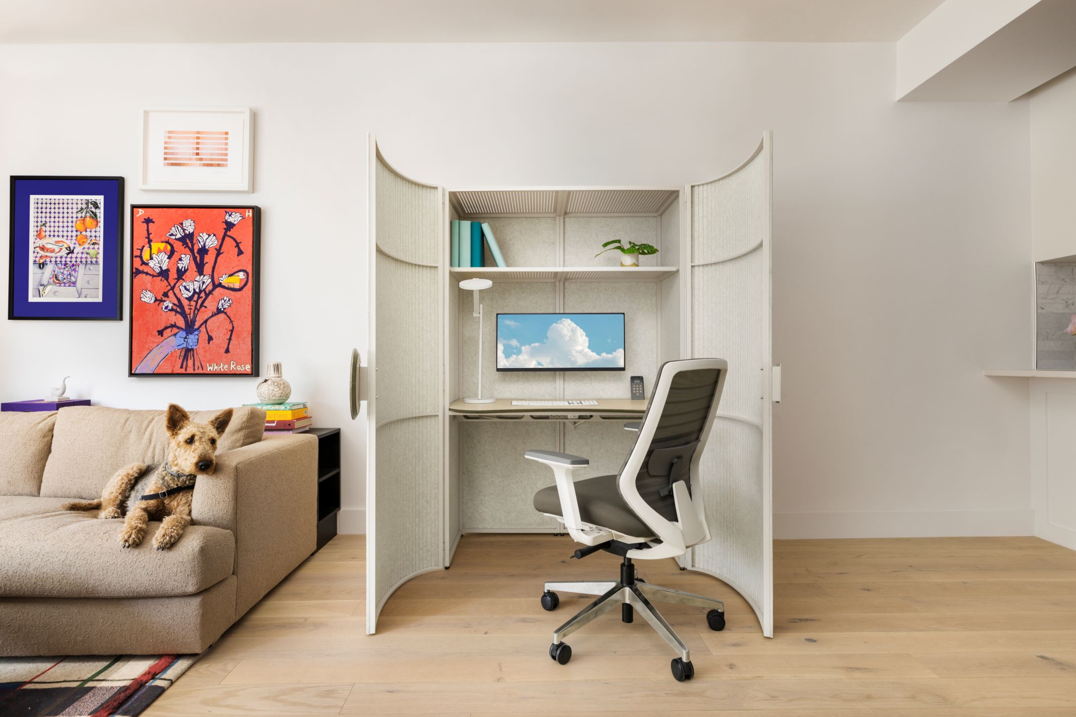
In the wake of a shift towards remote work and the dawn of the “work from home” era, Piper Skillman and Emma Robson, the founders of Demarc, are leading the way in changing how we use home offices. They started in corporate office projects but are now reimagining how we work from home.
In this interview with Piper, we talk about Demarc’s beginnings, their commitment to eco-friendly materials, their use of color and texture in designs, and how they make things look good and work well. She also shares her creative process, fueled by the vibrant energy of New York City, and highlights the boundless opportunities for innovation in our ever-evolving virtual and physical design landscape.
Join us on a journey through Demarc’s design philosophy and discover how they are pioneering a new era of remote workspaces. As the boundaries between work and home blur, Demarc is here to not only demarcate your space but elevate your experience.

Piper, can you share the inspiration behind co-founding Demarc and your vision for demarcating spaces in the home office?
We started Demarc in May of 2020. At that point — two-and-a-half months into the pandemic — everything was starting to blur. I think in the months that followed people got a better sense of how to deal with the changing nature of working from home, but in the beginning, there was a bit of placelessness and timelessness.
Cofounder Emma Robson and I had worked together for years in a different capacity. She imported wonderful contract furniture pieces from vendors in Europe and I would source from her showroom for the tech offices I worked on in my role as an interior designer. We had been working on a few projects together, but in April 2020, commercial offices in NYC came to a grounding halt. Crickets. With the unexpected spare time and most of the city closed, we decided to bring what we had learned designing commercial offices and office furniture into the home. In part, this was because our own office setups were very insufficient! Emma was balancing her laptop on yoga blocks and I had samples strewn everywhere. Both of us also felt unmoored and what would become HQ was our way of establishing not only a space for work but boundaries around working from home.
Demarc’s commitment to sustainable materials is commendable. How do you balance sustainability with aesthetics and functionality in your designs?
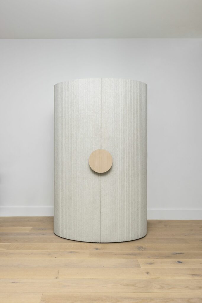
I love that the HQ exterior is made up of roughly 400 recycled plastic bottles — but I also can’t imagine a better material than PET felt in terms of look, feel, and performance. We are in such a wonderful (and critical) moment in terms of materials with a focus on sustainability. When I graduated with an industrial design degree over twenty years ago, the options were much more limited, and many times a sustainable product had an “eco” look.
Now, I’m constantly inspired by the sustainable options for designers— and we’re no longer limited by a particular aesthetic. I think it’s part of the designer’s role to seek these materials out, to keep questioning what is out there and how it can be used.
The HQ exterior utilizes recycled PET and polyester fibers with remarkable acoustical properties. Can you elaborate on how this choice of material enhances the user’s workspace experience, particularly in terms of noise reduction?
A vital part of the quality of sound within the HQ is optimizing the space with absorptive acoustic panels to quiet the room of background noise, increase the acoustic comfort of the space, and simultaneously increase the clarity, articulation, and presence of what you are trying to hear.
At the start of the pandemic when we were developing HQ, the CEO of a tech firm I designed an office space for asked me to help him build a home office in his media room. We were able to carve out a great nook in a spare closet, but the echo was awful on Zoom calls. HQ creates a work nook in your home (not many people can give up a closet in NYC!) and eliminates the echo. The sound is not reverberating off walls, instead, it’s being absorbed by the PET and as a result, it’s much clearer.
Can you discuss the role of color and texture in your design work, and how they impact the overall atmosphere of a space?
I love color and texture — I could spend hours obsessing about either quality. When I’m working on a project as an interior designer, I embrace a more complex color palette. I want to invite moments of surprise, like a chocolate dining room with black trim, a dark purple library, or ceilings with a whisper of blue in the paint.
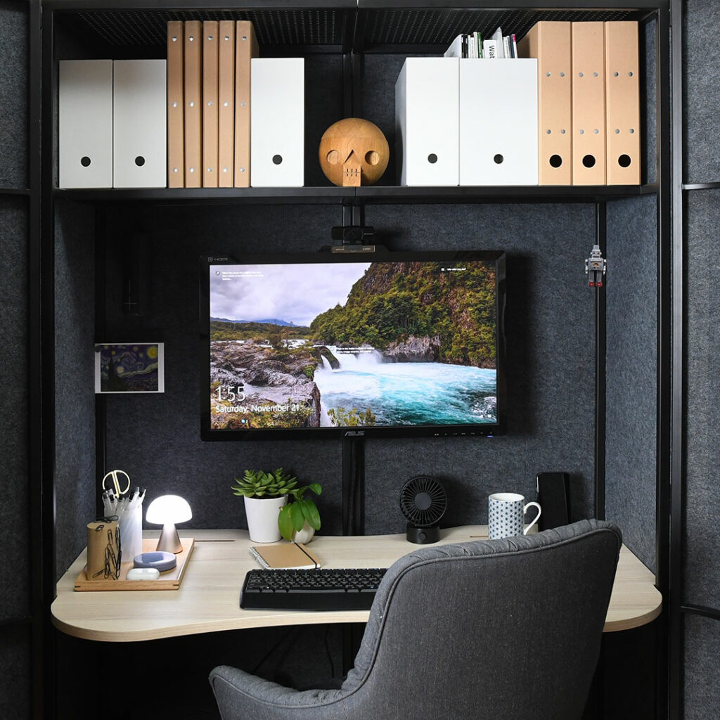
HQ was about balance and creating a furniture piece that contributed to a larger whole. Due to its size and unique footprint, it physically has a strong presence in a space. We decided to embrace neutrals and start with two colors “Oatmeal” and “Charcoal” that work with a range of contemporary interior styles. There are also two finish selections for the Desktop and Handle: “Washed Oak” and “Smoked Walnut.” With these options, we were able to create four versions of the HQ that become part of a holistic interior scheme rather than dominating — we are all about balance 🙂
In terms of texture, the mélange of the PET is critical to the look. Not only is it better in terms of cleaning and stain removal (all upholstery does better with some variance), it adds depth to the product and creates a warm, tactile appeal that sits well within the home.
As an interior designer looking at an overall scheme, I study the interplay of all the different components to create a unique cadence suited to the space and those that inhabit it. As a product designer focused on solution-based products, I wanted to design something that was compelling but also “played well with others” in various schemes.
Can you share some insights into your creative process? How do you find inspiration for your design concepts?
I feel very fortunate to live in NYC. It’s an incredible, inspiring place! It’s also very challenging — nothing is really “easy” in New York. While I think people move here for all sorts of reasons, in the 15 years I have been here, I never met someone who said, “Oh New York. That will be easy, I think I’ll do that!”
In terms of space, logistics, costs, and weather… you have to consider all of it. I find that to be a wonderful source of inspiration. I walk the city frequently and it is motivating … I see all of the beautiful, compelling designs (from the buildings to a simple graphic detail in a shop window) and it gives me the energy to create. Living in NYC invites this constant dialogue between frustration and creation.
How has the ever-evolving virtual and physical design landscape influenced your work, and what opportunities do you see for designers in this changing landscape?
Change is a wonderful impetus for innovation. We can’t always use old tools to tackle new problems!
As the workplace evolves this idea of a generic space to work in (rows of desks or cubicles and few conference rooms) seems less and less appealing. Instead, both in the creation of HQ and in my role as an interior designer, I believe strongly in Activity-Based-Working (ABW). This allows employees to choose from a variety of settings according to the nature of what they are doing. If you are part of a hybrid work model, this may be a series of different gathering spaces in the office that facilitate different types of learning, presenting, ideation, or other forms of collaboration.
At home with HQ design, we focused on features that facilitate a better working environment for a person in a home space. These considerations included zoom acoustics, ergonomics, smart storage, organization, privacy, and also the importance of delineation between home and work — your dining table should not be your desk! The idea is that someone is more productive when they have the right space for the tasks they need to accomplish.
I believe in thoughtful design on the manufacturing end and careful curation on the consumer end. With so many choices and the environmental impact of over-consumption, it’s not about more stuff. Instead, it’s about quality products that will enrich your experience for a long time. Buy beautiful objects you love and hold on to them! It’s another aspect of the balancing.
What upcoming projects or goals do you have for Demarc that our readers should look out for, and how can they stay updated on your latest designs and ventures?
As working from home evolves, we will continue to as well! We are looking at balancing home life and work life through a series of products as well as expanding on our cornerstone product the HQ by making it bigger. The current model is a compact footprint that works well for people who have about 4’ x 3’ for a home office. We have received several requests for a larger HQ as well as a sit-to-stand version. This would be a unit that you could fully enclose yourself in with storage on the side as opposed to above the desk.
Staying up to date — Instagram (@demarcspace)! Follow us, like photos, and do all of the things. The support and feedback from the community is incredibly motivating.


