Header: Jaime Navarro
Peyrelongue Jewellery is located in Mexico City on one of the most exclusive thoroughfares in the metropolis, Avenida Masaryk. Originally intended to showcase jewellery from the same brand, over 10 years ago, the owners turned to us to include a watch store and more jewellery brands, aiming to diversify their business. They wanted to emphasise the identity of each brand while homogenising the aesthetic style of the space to reflect elegance and sobriety, and that’s where the firm responsible for the design, GERARDO GARCÍA, came in.
A new face
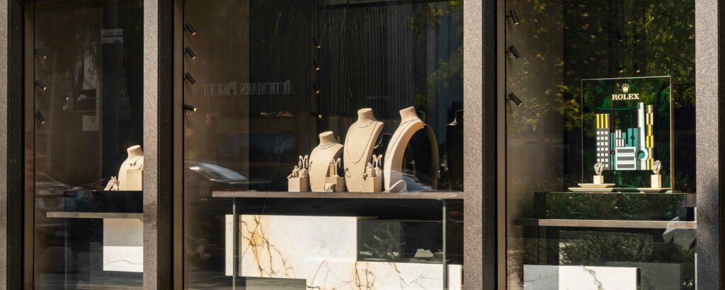
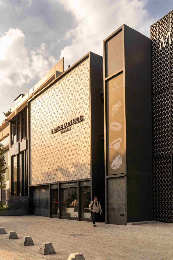
Being situated on Masaryk, the jewellery store required a response that aligned with this luxurious context and had a positive impact on the surroundings. The original facade of the jewellery store was entirely clad in beige marble, including the parking doors, with only a small showcase to display all the jewellery. Lacking any apparent appeal or something to attract beyond the stony material, it was decided to replace everything and design a new proposal.
The new facade aims to attract customers through a textured design while maintaining the previous orthogonality and cleanliness. It frames a finish of absolute black granite and a 3 mm Equitone beige ceramic panel measuring 1.5 m x 3 m, resembling a wall formed by small geometric natural stone pieces in varied beige tones. This enhances the visual interest of the facade while preserving the elegance and sobriety associated with Peyrelongue.
High expectations and aesthetics
The new glass showcase, armoured to the ground, complements the black frame at the bottom, along with the car door. It better showcases Peyrelongue’s jewellery, illuminating it throughout the day and attracting more foot traffic. This maintains the discreet style of the brand, revealing little to passersby who discover the full range available inside the store. External lighting consists of an RGB light system behind the ceramic finish, placing light points on the edges of the geometric pieces, creating the appearance that the facade shines like the jewellery Peyrelongue sells.
Next to the ceramic wall is a screen that accompanies the display of light points, showing the watches and jewellery exhibited inside. The project focuses on creating hierarchy through varying heights, emphasising the visual importance of the jewellery display cabinets through a triple-height volume at the rear. The formal inspiration comes from this notion of height variation to achieve visual emphasis; its purpose is to enhance the presentation of the jewellery and, as mentioned earlier, with a unified aesthetic language that highlights the relevance of each brand on display.
Thoughtful decisions
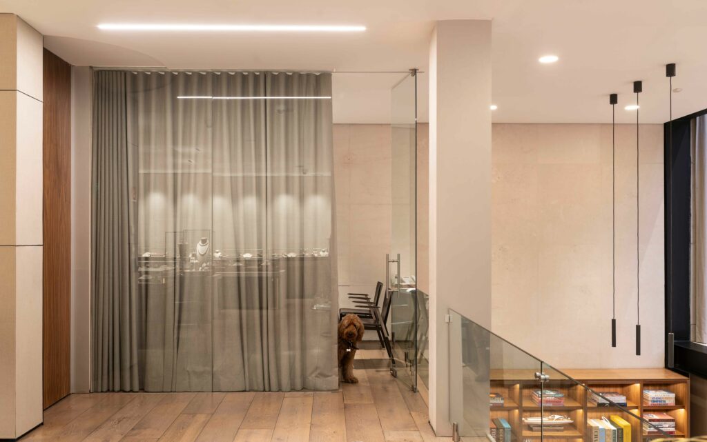
The construction of the project took place over 24 months and presented particular challenges due to the client’s requirements. They requested the inclusion of offices in the store, which involved creating independent areas for clients and partners with separate access but allowing communication between public and private spaces.
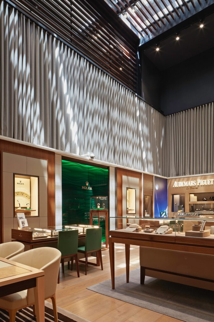
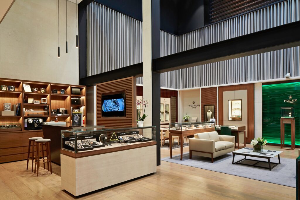
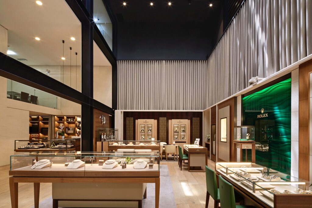
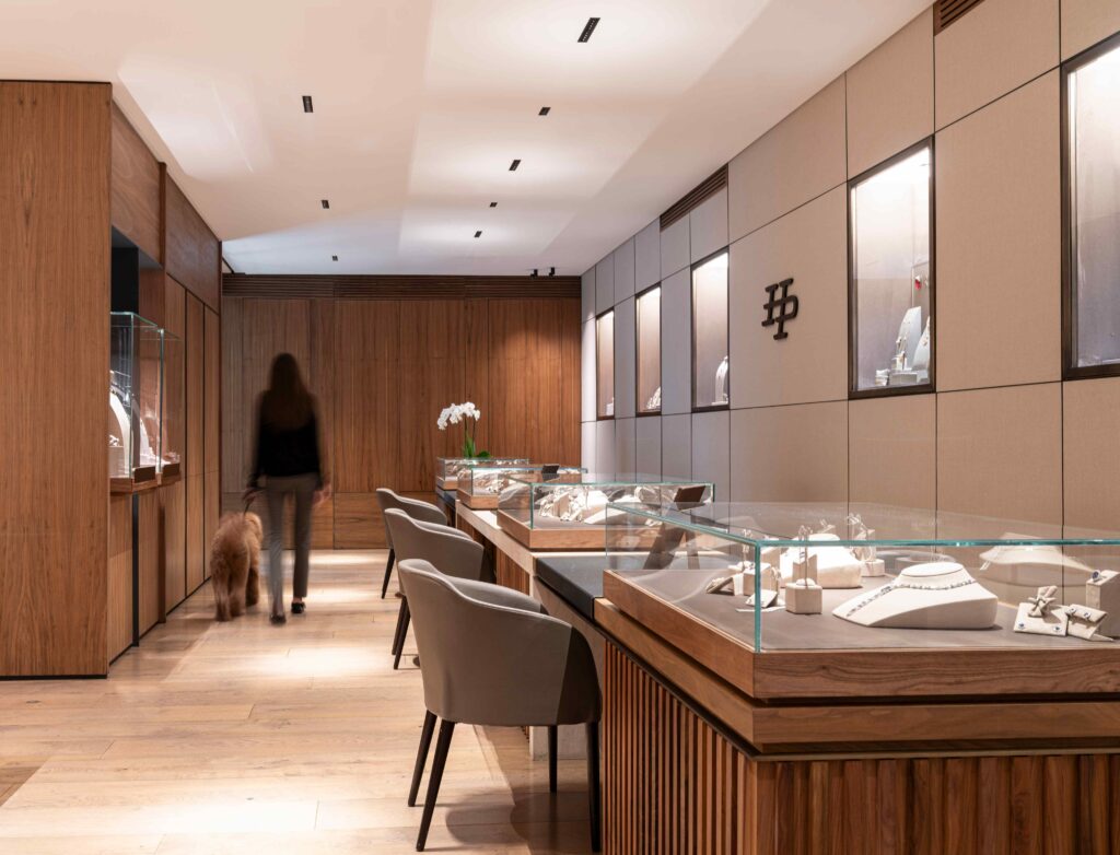
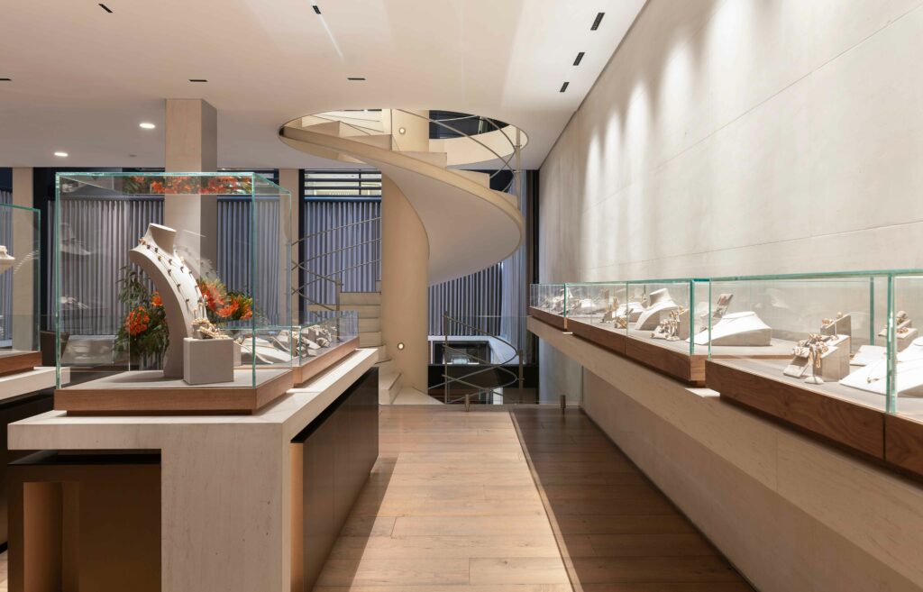
Internally, the project offers three different atmospheres: areas for employees and high-traffic services, customer areas with sophistication and elegance, and offices for partners. The most prominent central space is the customer area, particularly the basement, where the most expensive watches—Rolex, Cartier, and Patek Philippe—are displayed. There is a covered, triple-height courtyard from which the other store floors can be seen.
Quiet luxury
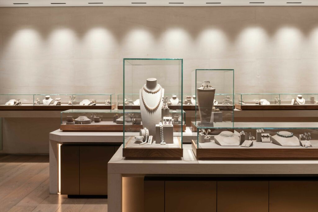
In this space, the design focuses on conveying the luxury of the jewelry. Following this line, materials such as beige limestone were selected, full of personality without falling into exaggerated opulence and without losing elegance. This stone covers virtually the entire space, creating a palette of neutral colours that does not distract, allowing the exclusive nature of the jewellery to stand out.
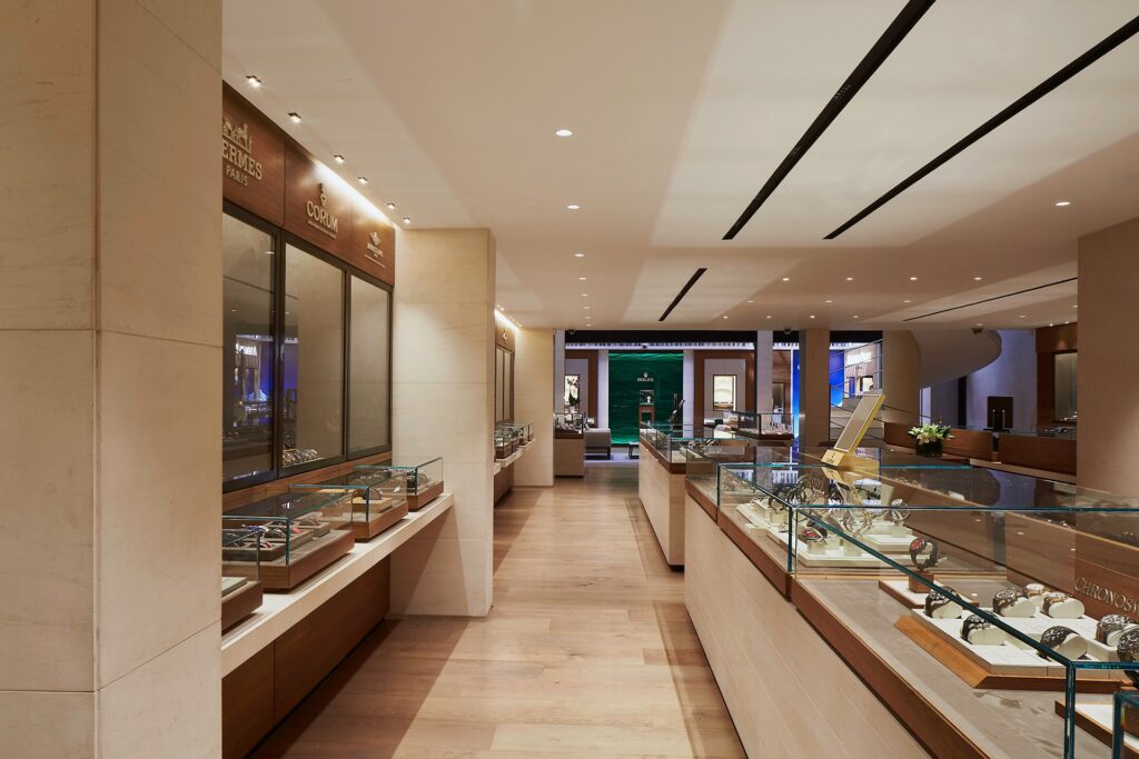
Thanks to the details of walnut wood on the shelves and showcases, covered in beige suede and designed from scratch by the firm, as well as frames that accompany the beige limestone, the style of the jewellery store is perfectly matched and defined. It orderly contains the spaces for each brand, especially in the basement where the watch section is located, with frames where brands add their representative colours or tones.
Warm light and shiny items
The lighting, a Lutron system designed by Kai Diederichsen of Luz en Arquitectura, focuses on showcasing the displayed jewellery perfectly from any angle, emphasizing its elegance and luxury. This is achieved through warm light, both focused on the showcases and the general space, achieving a uniform space with pleasant tones that encourage the user to spend more time in the store.
Notes from the designers
The firm responsible for the design, GERARDO GARCÍA has collaborated with Veronica Peyrelongue to create the space. In the case of Peyrelongue, receiving positive feedback from high-end jewellery experts like Rolex regarding the distribution, design, and lighting left the team very satisfied concerning the initial goal, of meeting and exceeding expectations.