


Header: Pantone
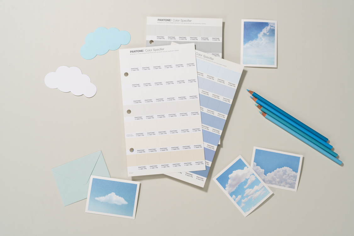
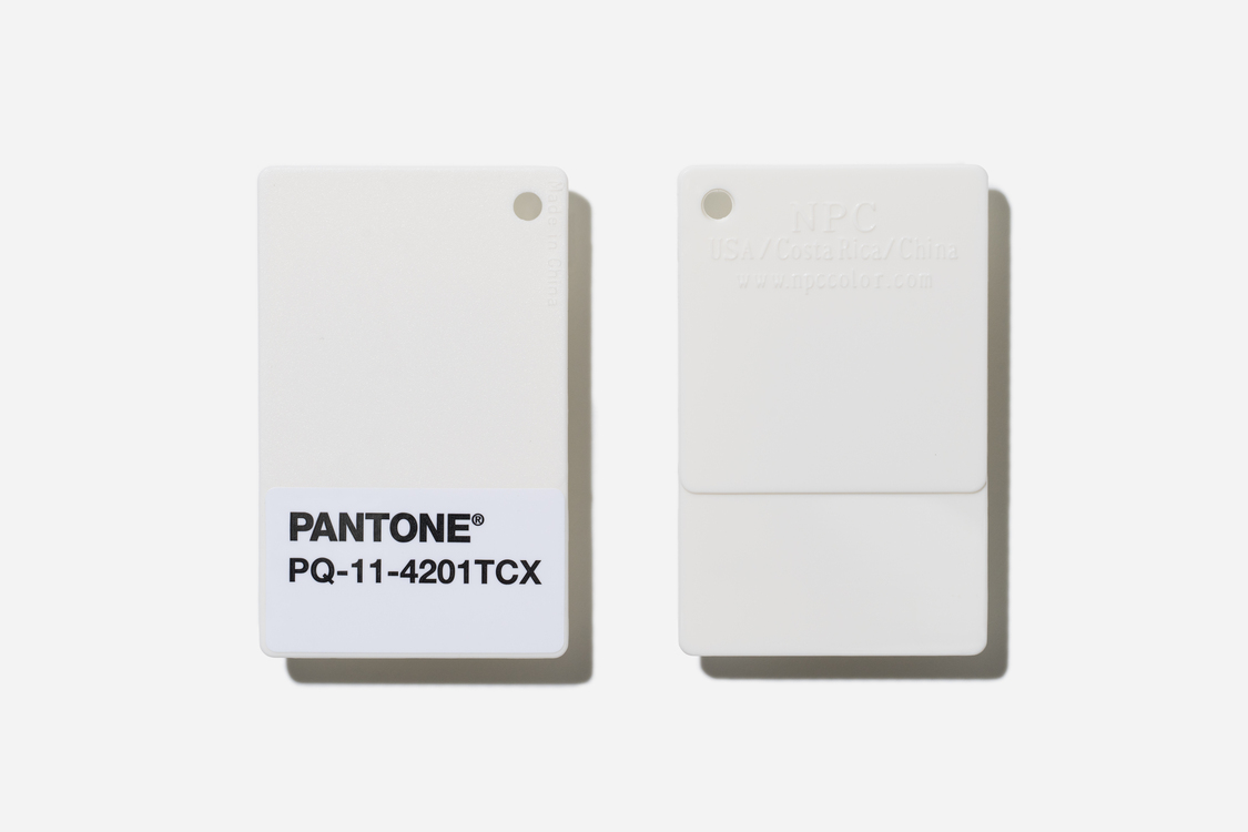
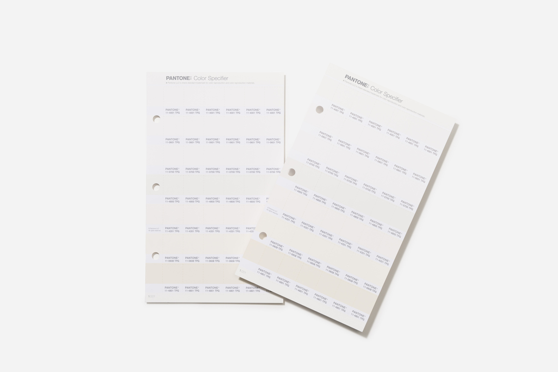
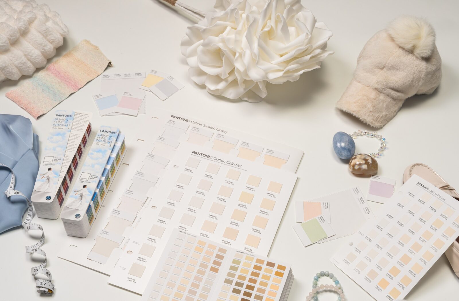
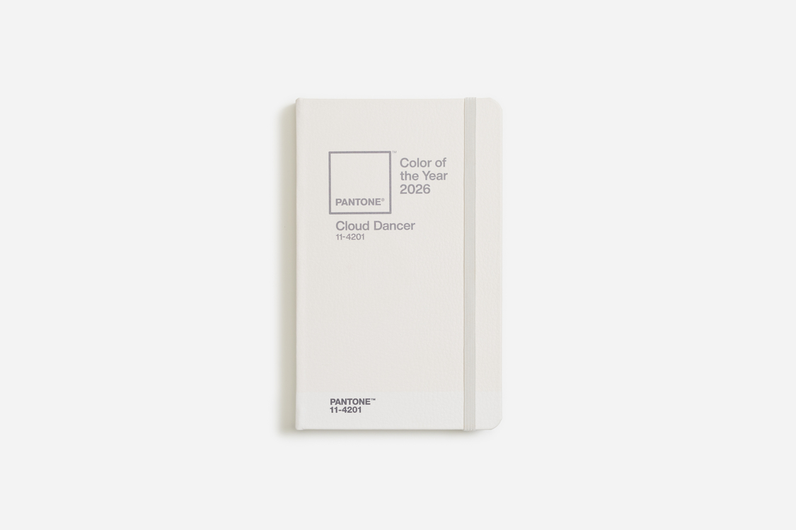
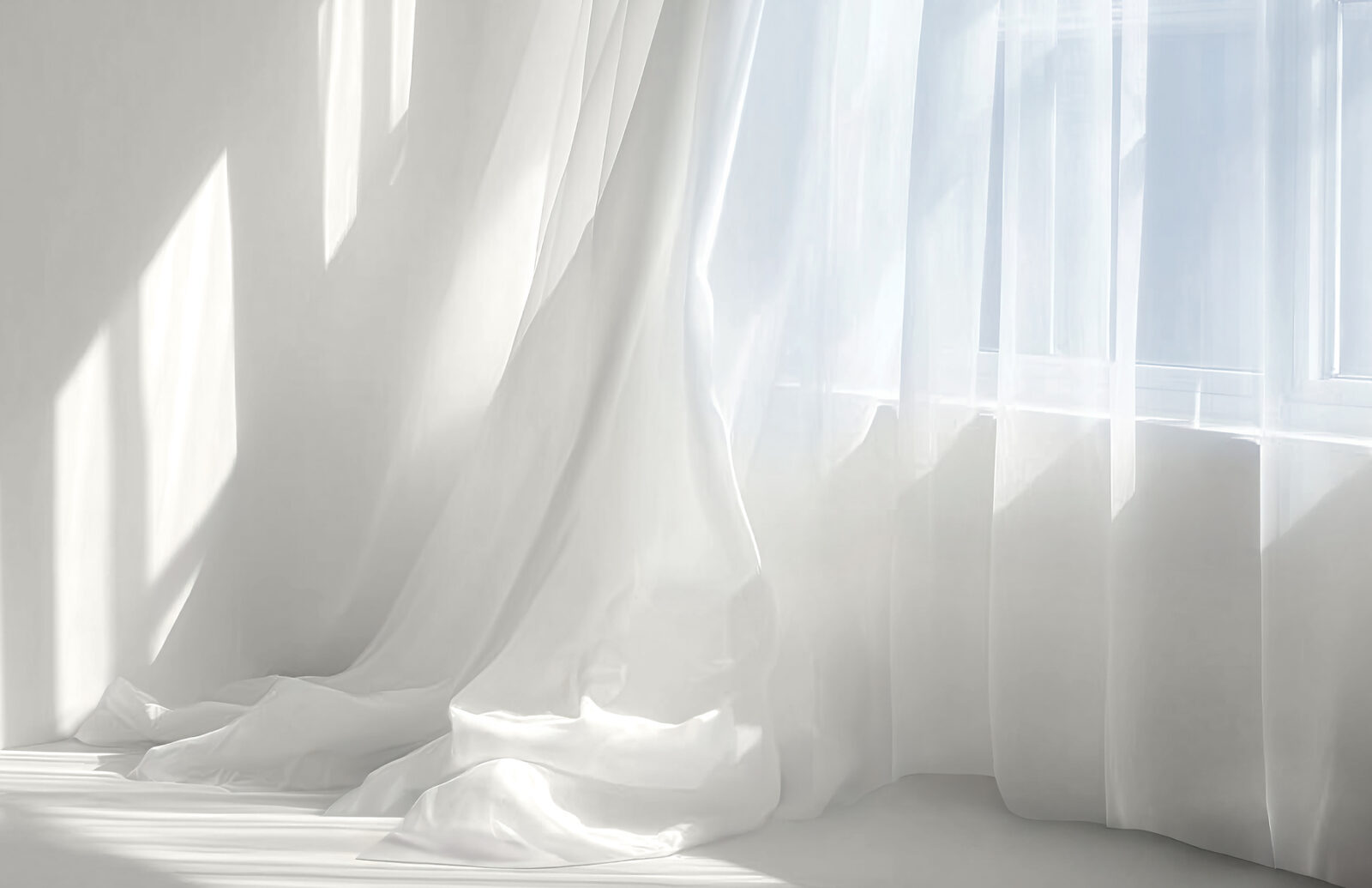
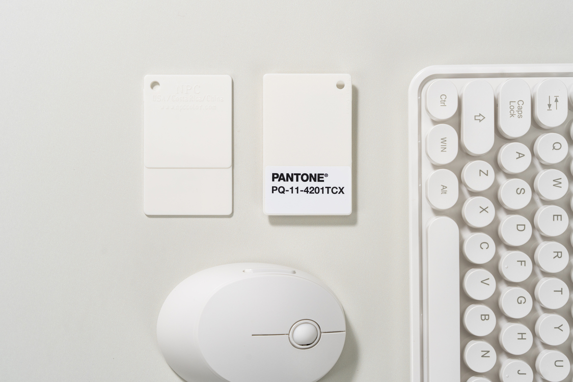
The world feels louder than ever, and in response, the global authority on colour has decided it is time to turn down the volume. For 2026, Pantone has selected PANTONE 11-4201 Cloud Dancer as its Colour of the Year. This isn’t just your standard white; it is described as a billowy, aerated hue that mimics the feeling of a blank canvas. It represents a shift toward stillness, offering a visual break from the noise of daily life and a chance for our minds to wander.

A return to clarity and focus
Leatrice Eiseman, the Executive Director of the Pantone Colour Institute, describes Cloud Dancer as a discrete white that offers a promise of clarity. In a time where we are constantly distracted by external influences, this colour acts as a tool for simplification. It is about peeling away the old layers of outmoded thinking and opening the door to new approaches.
The choice suggests that true strength comes from rest, not just constant action. By consciously stepping away from relentless demands, we create the mental space needed for innovation. This colour symbolises calm in a frantic society rediscovering the value of quiet reflection.
“An airy white hue, PANTONE 11-4201 Cloud Dancer opens up space for creativity, allowing our imagination to wander and drift so that new insights and bold ideas can emerge and take shape.”
Laurie Pressman, Vice-President of the Pantone Color Institute
Collaborations that embrace the quiet
To mark this launch, Pantone is doing something different by spotlighting artists to interpret the shade. The first project features illustrator Emiliano Ponzi, who created a limited-edition tote bag that mixes conceptual depth with graphic precision. This kicks off a year-long initiative to support the creative community.
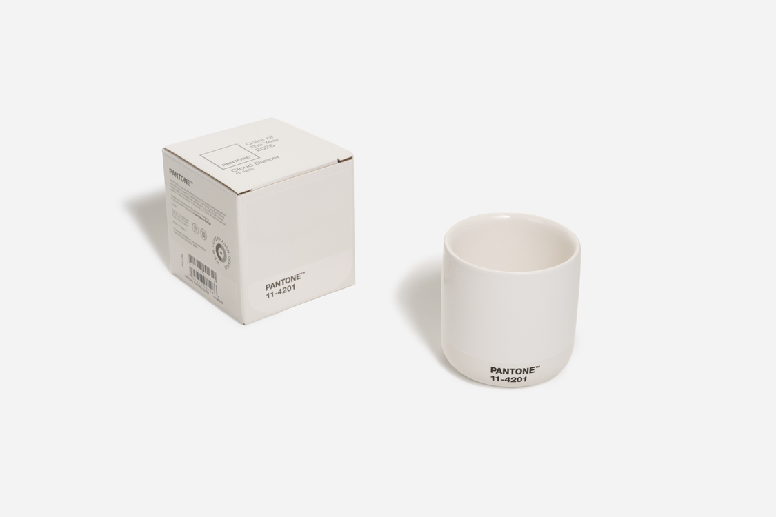
Major brands are also adopting the hue across various industries. Motorola continues its partnership with the special edition Motorola Edge 70. The phone features a vegan leather back with a quilted pattern and Swarovski crystals, turning a high-tech device into a tactile, calming object.
In the world of creative play, Play-Doh is celebrating its 70th anniversary by releasing the compound in Cloud Dancer. It serves as a literal tool for imagination, encouraging users of all ages to pause and sculpt their ideas from scratch. For the office, Post-it is launching a Neutrality Collection centred on the colour to help declutter workspaces, while Command Brand is releasing a Cream Speckled collection of hooks to help people organise their walls without fear of damage.
Interiors and experiences
The application of Cloud Dancer in home design emphasises texture and atmosphere. Joybird has introduced two new fabrics, a silky option called Karina and a textured chenille called Soul. These materials are meant to turn furniture into a sensory experience that invites touch and relaxation.
For a fully immersive experience, Mandarin Oriental hotels are serving as the official hospitality partner. Ten of their properties worldwide will offer “touch the clouds” experiences, ranging from themed afternoon tea sets to oxygenating spa treatments. Pura is also on board to translate the colour into a scent, creating a home fragrance described as luminous and airy.

Styling the shade
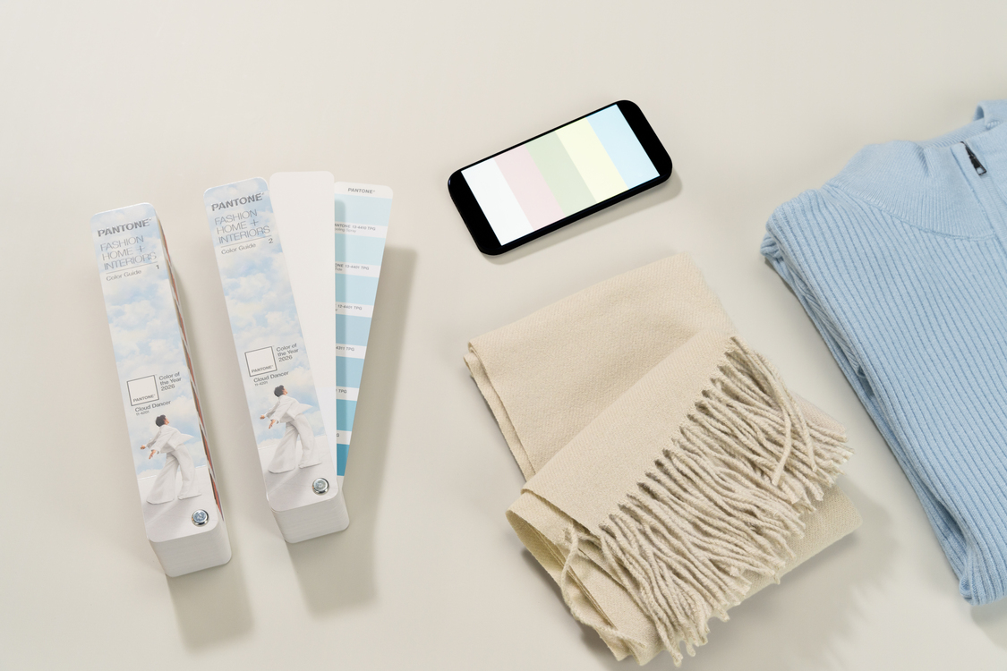
In fashion and beauty, PANTONE 11-4201 is a structural colour. It supports other shades rather than shouting over them. Designers are using it for puffy, spongy silhouettes that cocoon the wearer, as well as diaphanous chiffons that move easily with the body. It works for everything from crisp button-downs to soft activewear.
Beauty trends will see this shade as a modern base for nail art or as a standalone minimalist statement. It provides a clean, chic look that feels fresh without being overstimulating. In packaging, the colour offers a stark contrast to black, conveying luxury and sustainability, especially when paired with recycled materials.
The selection of Cloud Dancer for 2026 is a deliberate move away from visual excess. It challenges the design world to find impact in reduction and luxury in simplicity. By offering a visual pause button, PANTONE 11-4201 reminds us that the most powerful thing we can do for our creativity is to clear the clutter and let it breathe.


