Header: Caleb Chancey
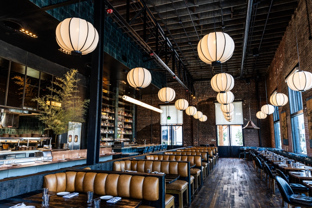
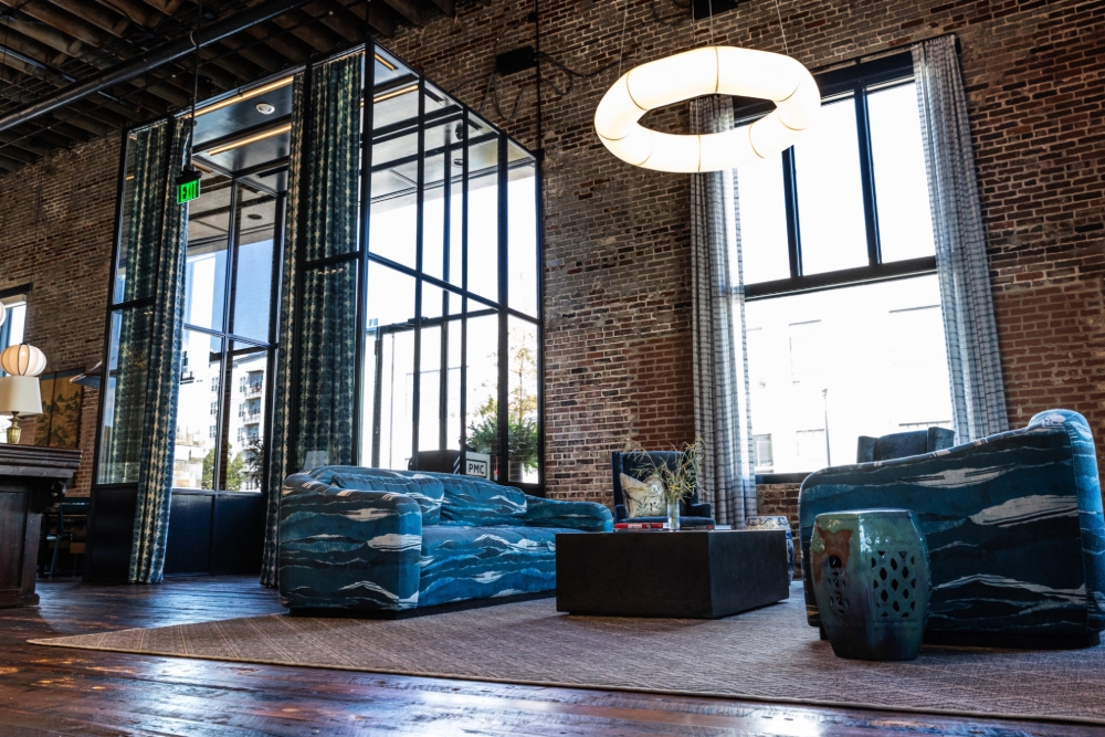
This new Asian restaurant occupies what used to be a 1920s warehouse, and rather than covering up the original structure, the designers from Suzanne Humphries Design decided to make the best out of what was already present in the space. Tall ceilings, exposed brickwork, and open spans are still intact and were given a spotlight, being now complemented by a thoughtful interior design. This and the interior design won the project the “Interior Design Brand New” category at the LIV Hospitality Design Awards.
The interior design
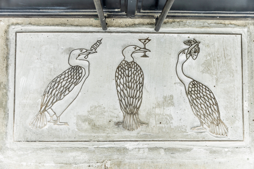
Three small cormorants are etched at the entrance onto the pavement just outside the door. These are not marked or framed in any particular way but positioned clearly enough that they are seen as intentional. They act as both a reference to the restaurant’s name and a signal to what customers might expect once inside.
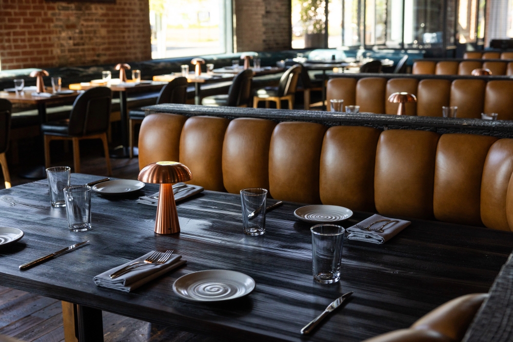
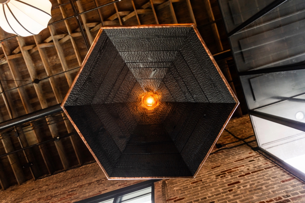
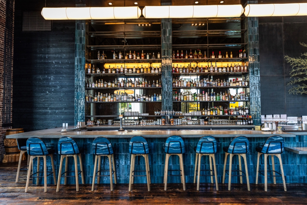
Inside, darker tones paint the rooms, with teal, blue, and black covering the tiled walls, soft furniture pieces, and other paint details. In contrast, the designers decided that copper and clay would be the perfect addition. Once inside, the bar appears against a wall finished in teal tile, with its raw copper counter matching the kitchen gas lines and the table lamps that sit low and close to the guests.
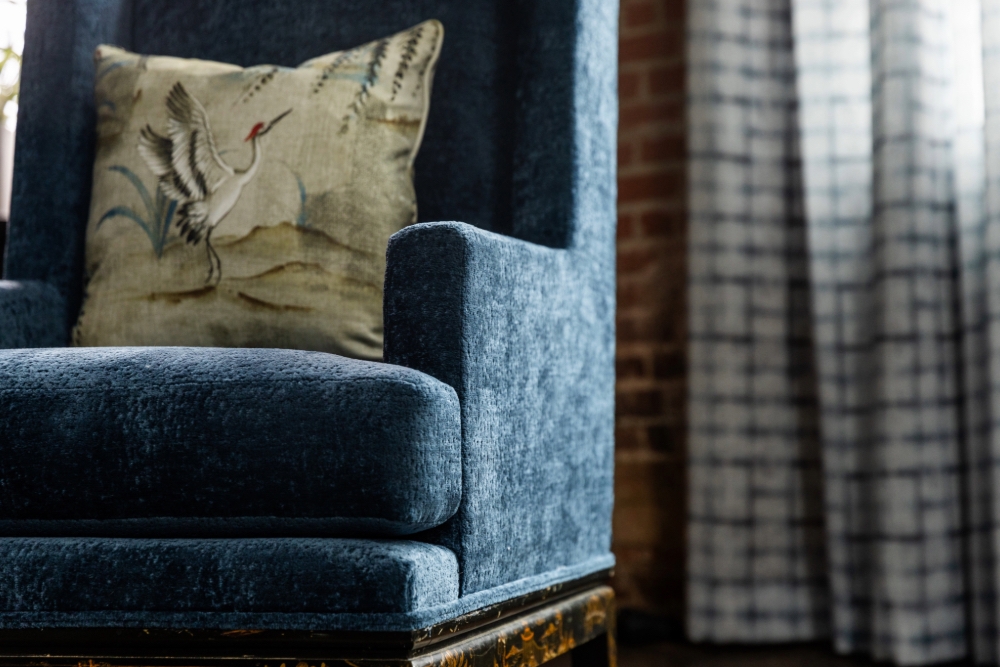
After enjoying the interior for a while, customers start noticing all of the references to Japanese and Chinese cultures: Shou Sugi Ban panelling was added to some areas to bring texture to the walls, and a 200-year-old Chinese altar table from a Buddhist temple sits in the centre of the dining area. Fabrics are simple and fit the same theme and colour palette, as they are mostly cotton dyed using the Shibori method, which keeps the patterns soft and simple.
The light
Lighting was kept low throughout the interior, with rice paper lanterns added loosely to the ceiling in a seemingly random pattern. These fixtures follow the architectural lines of the space, allowing the lighting to support the atmosphere without becoming a design move in itself. Although the building is large, the way the space has been planned makes it appear contained, as there’s a sense of calm everywhere, even in the busiest areas.