For over four decades, Benthem Crouwel Architects, led by partners Pascal Cornips, Daniel Jongtien, Saartje van der Made, and Joost Vos, has been at the forefront of architectural innovation, where each project is a reflection of their continuous pursuit of excellence and improvement. With a commitment to pragmatic idealism, they craft buildings that go beyond aesthetics, making meaningful contributions to urban ecosystems. Their collaborative approach, daring craftsmanship, and user-centric design have set them apart, creating structures that not only stand as testaments to architectural excellence but also seamlessly integrate into the fabric of the cities they inhabit.
Join us on a journey with Saartje van der Made and Joost Vos as they unravel the stories behind the award-winning architectural wonders, offering a glimpse into their innovative vision and the future of sustainable design.
Renovation of the Museum Arnhem Bridging Past and Present
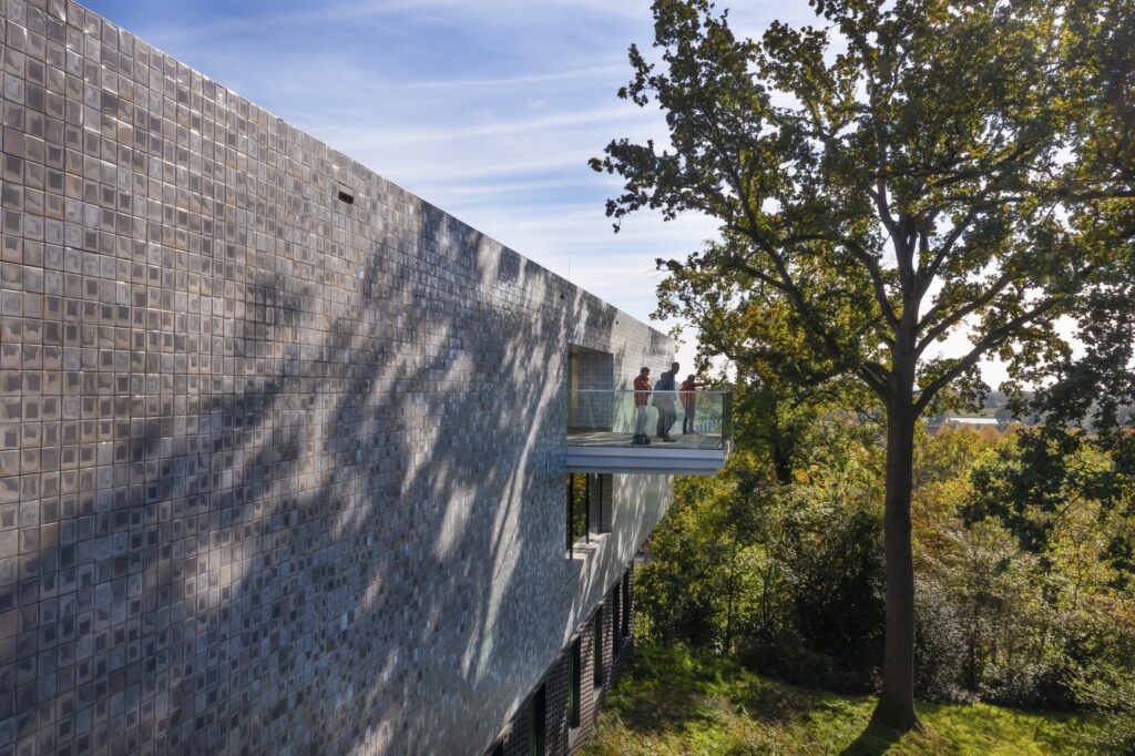
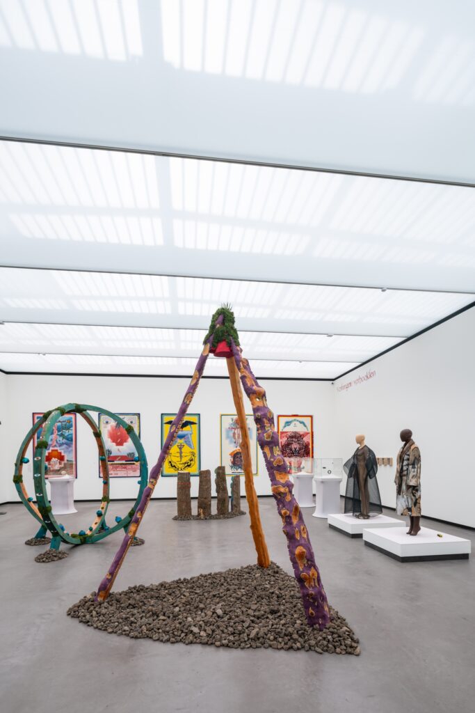
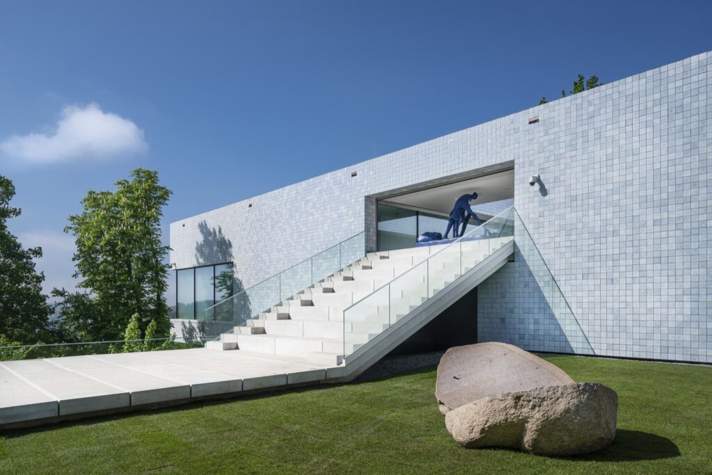
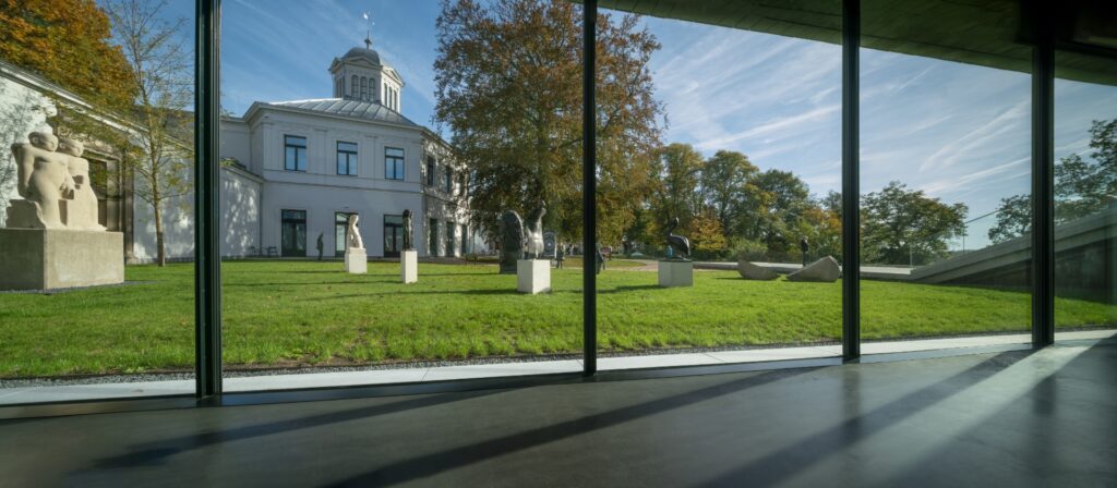
At the heart of Benthem Crouwel Architects’ portfolio is the transformative renovation and expansion of the Museum Arnhem, a project led by Saartje van der Made and Joost Vos. Recognized with the prestigious BLT Built Design Award in Architectural Design – Cultural, the museum’s renewal is an exquisite dance between the old and the new. The unique floating wing, delicately balancing 15 meters over the moraine, is a testament to the audacious vision of the architects. The façade, adorned with 82,000 hand-crafted tiles, not only stands out but also seamlessly integrates with the natural surroundings, creating a harmonious dialogue between the structure and its environment.
We recently had the privilege of speaking with Saartje van der Made, who played a pivotal role in leading the design for the restoration of the Museum Arnhem. Her insights provide a glimpse into the process that resulted in a visible, well-organized museum.
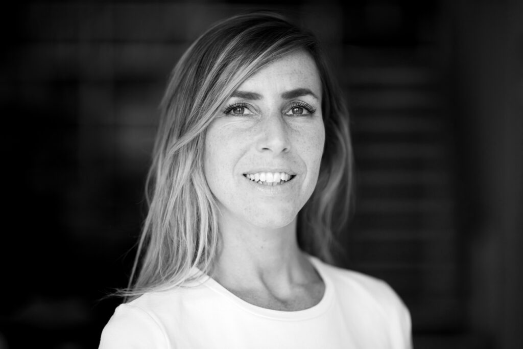
Your team has given new life to the Museum Arnhem by extending its space and renovating the old building: the result is a light space where art can truly be experienced. How did you integrate modern architectural design with the museum’s historic features?
Museum Arnhem asked for a design that addressed all their requests: a renovation, an expansion and better museum halls, all the while respecting the original building. We explicitly sought a contrast between old and new, expressing it through form, material and color. We wanted to add something truly contemporary, a new layer of time that represents the current zeitgeist. We took down the later extension that had been added to the historical dome, a former gentlemen’s club, to restore the original symmetry of the old building. Subsequently, we added a rectangular, simple volume with minimal detailing in opposition to the many details of the old building, such as the cast iron columns. By combining the existing historical structure with the newly designed volume, an exciting contrast emerges. In the converging areas between the old and new building, we emphasized this tension by making a subtle glass connection which makes it more pronounced. You consciously step from the old building into the new one, while the logical museum route seamlessly continues unnoticed, and the visitor is not distracted by the architecture navigating through the museum.
The Museum’s design incorporates 82,000 unique, hand-crafted tiles covering the facade and a monumental staircase inviting visitors in. Can you discuss the inspiration behind these design choices and how they reflect the museum’s connection with nature and art?
The wide staircase is the highlight of the route separate from the museum’s main pathway within the building. This is a route for which no admission ticket is required. In this way, we have emphasized the museum’s key value, accessibility – bringing art to everyone through our design. We have reopened the sculpture garden and the historical dome to the public. We allowed the separate flows of museum visitors and people exploring the public garden to intersect by incorporating a staircase that leads to a balcony cutting across the museum. On the balcony, you enjoy a spectacular view of nature while also getting a preview of what is happening inside, enticing you to purchase a ticket. The staircase is designed as a grandstand, providing an additional function as a stage and seating for outdoor performances.
For the façade, we looked for materials that would emphasize the sleekness of the new volume. The 82,000 handmade tiles give the building an extra layer, depth, and richness. From a distance, the perspective differs from what you observe up close. Approaching the museum, you see a sleek volume transitioning in color – from earthy tones on the streetside to icy blue on the side facing the river – symbolizing the museum’s location on the moraine created by a glacier. Up close, you notice that each tile is unique, a work of art in itself, aligning with the building’s function as a museum. The glazing imparts a distinct color to each tile, creating a unique reflection in daylight, sun, and shadow. This, together with the age-old craft of the baking process, adds an extra layer to the contrast of old and new.
By connecting the different exhibition and public spaces within the museum, you’ve not only enhanced the structure of the building but also the experience of the visitors. How did you approach the design process?
We wanted to open up the garden and add space, so we decided to bring all program requirements to one side. All spaces were connected into a single museum route that flows intuitively, guiding you through the museum. The greatest value of the location is the surrounding nature, the view of the beautiful landscape and the river below. Therefore, we chose to place the new volume on top of the moraine rather than below it. by doing this, we did not have to disrupt the ancient moraine, and we could keep one single level, making it highly accessible. We then added large windows, allowing visitors to have alternating moments of connection with art and nature.
With the addition of the spectacular overhang, making the building appear to float above the trees, we succeeded in giving the museum a contemporary new face, placing it back into the heart of society.
Read more about the project HERE.
LAB42 Sustainably Shaping the Future
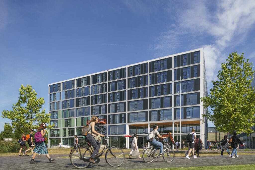
Designed by Joost Vos, LAB42 at the Amsterdam Science Park earned accolades in Architectural Design – Educational at the BLT Built Design Awards. This 14,000 m2 structure stands as a symbol of innovation, featuring a modular design that allows for adaptability, reusability, and expansion. The 100% recyclable steel main frame, coupled with incorporated solar panels and rainwater reservoirs, makes LAB42 a pinnacle of energy-neutral, circular architecture.
In an exclusive interview, Vos shares insights into the challenges and choices that make LAB42 a groundbreaking structure.
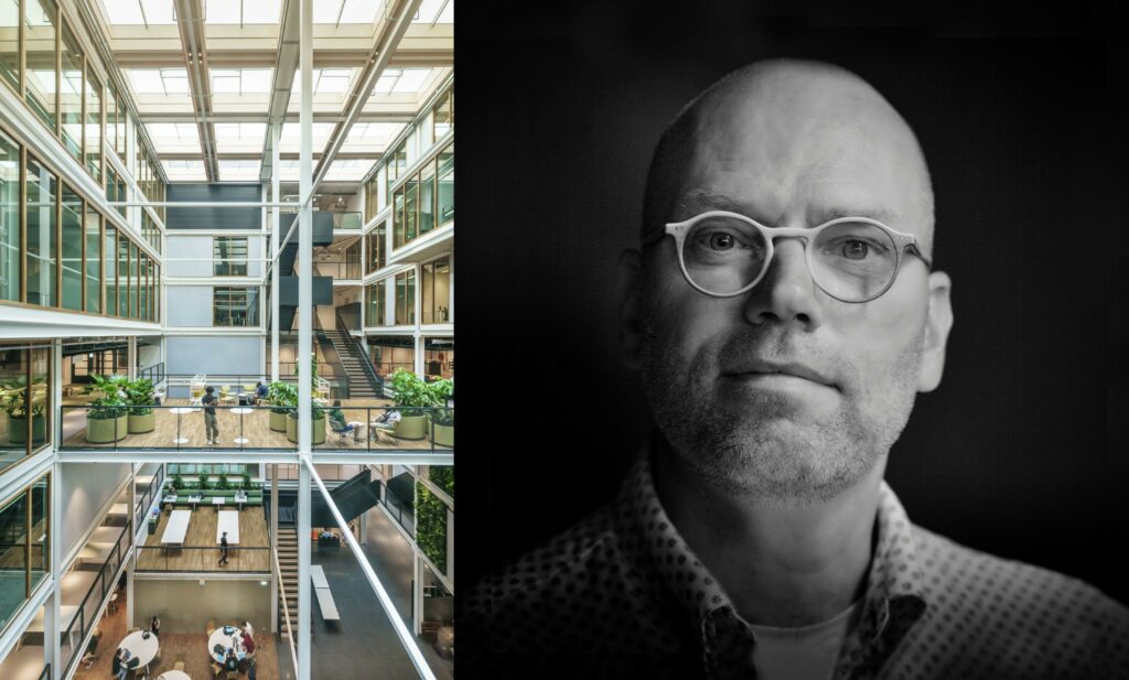
LAB42 boasts a unique modular and sustainable design. Can you tell us about the challenges your team faced, and the innovations involved in creating such a structure?
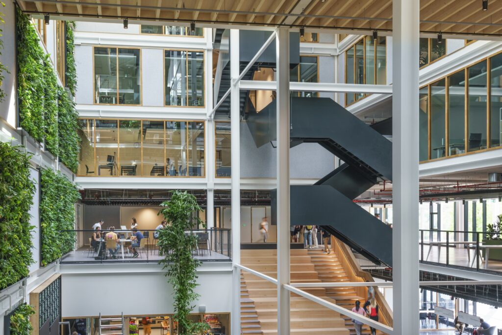
The challenge was to ensure that the modular system we devised was consistently implemented. We aimed to minimize exceptions within the structural system. This began with choosing the right grid size, determining the dimensions of the grid that could accommodate the entire program with all its components. It was a quest to find the best grid. Ultimately, we decided on 720 by 720 in plan. Subsequently, the system was implemented as rigidly as possible, including the atrium where long columns and beams are visible. Even if there isn’t always a floor installed, we created the option that floor panels could be inserted in the future. The primary challenge was the selection of the right structure and then the choice of materials used, ensuring it was entirely demountable. All connections had to be detachable and reusable. The goal was to make the building adaptable to changing circumstances over the next 50 years and beyond, immediately after construction was complete. After its eventual lifespan, the building can be disassembled, reconstructed elsewhere, or repurposed.
You have used 100% recyclable materials in the construction, plus added solar panels and rainwater reservoirs. Making this the future of buildings – or so we hope. How did you decide to add these features and materials to the project? Was this choice influenced by the design vision and aesthetics or was it the other way around?
The modular concept has largely determined the aesthetics; the idea of making the grid and materials visible. We wanted it to be a comprehensible, clear building. It started with intrinsic sustainability. It’s not so much about putting solar panels on the roof and reusing rainwater, as that is a given. Intrinsic sustainability is about creating a building that is adaptable throughout its lifecycle without the need for demolition or the destruction of materials. LAB42 is currently an educational facility, but it could also become an office building, a laboratory or even a residential building — everything should be accommodated within that lifecycle. That is the foundation of sustainability. Then you construct the building with responsible materials, so that results in choices like steel, wood, or concrete, preferably second-hand as well. Even second-hand structural materials can be adopted in this building such as concrete slabs and hollow core floors. We experimented with this in LAB42. In the near future we will take larger steps in this to be even more sustainable.”
LAB42 creates a dynamic environment where several labs are visible. Bridges connect work landscapes, and transparent plinths lighten the atrium. How does this openness contribute to the functionality of the space?
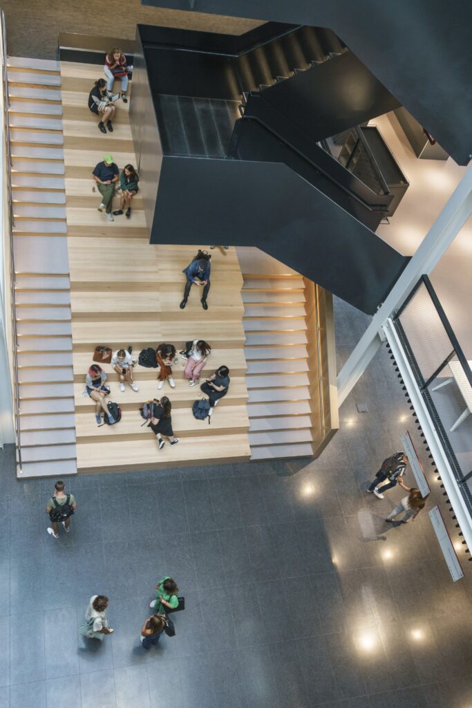
LAB42 is a building in which collaboration takes place, a building for students and scientists who need to conduct their research in peace, but it is also important that they can come together to share their knowledge and research. As an architect, you try to create a building that easily facilitates this co-creation. So, we designed an open building, for example, with complete floors instead of bridges in the atrium, where people can meet and share their research. It allows you to see what others are working on. On the ground floor for instance, there is a robotics lab, adjacent to the atrium, with glass walls so that you can literally see the current situation in that field. This openness certainly contributes to the functionality of the building. We have succeeded in creating an educational building as a space for co-creation. Everywhere you look, you see people talking or working, alone or in larger groups. We also designed it so that there is a beautiful public route via the stairs to explore the building. With each floor up, you find something different. Thus, the building facilitates such a journey of discovery, encouraging the user to be curious and open to meeting up and collaborating.
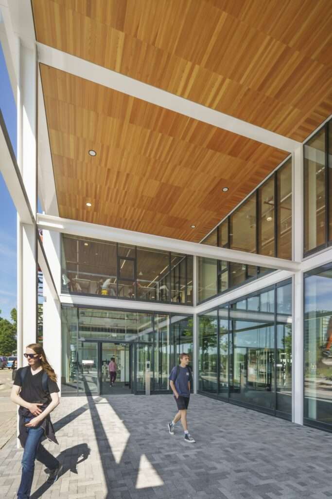
What is unique about Lab42?
It’s the first time that such an adaptable building has been realized on such a large scale. Consideration has been given to all aspects of sustainable construction, not just as an energy-neutral building, which it is, but also through responsible use of materials and resources, ultimately making it intrinsically sustainable. I believe this comprehensive approach hasn’t been applied on this scale in the Netherlands before.
The Netherlands is certainly at the forefront of such an integrated sustainability approach, and I dare say this building is particularly leading. Many sustainable buildings are being created, but the sustainability issue often focuses on one aspect, such as a wooden construction, or being an energy-neutral building. LAB42 encompasses everything — responsible handling of content, energy, and adaptability for the future. So, all these aspects are taken into account, making it a truly unique and pioneering building.


