Header: Courtesy of Herman Miller
In January 2024, Herman Miller introduced its refreshed brand identity, which includes the latest evolution of the brand’s logo and wordmark. Herman Miller worked with Order Design to design a complete set of brand standards, including a rich colour palette, a new wordmark, and a starring role for the iconic M logo (originally designed by Irving Harper in 1946). The design and development of Ideas magazine bring this new system to life in tactile form.
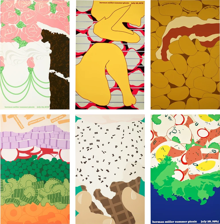
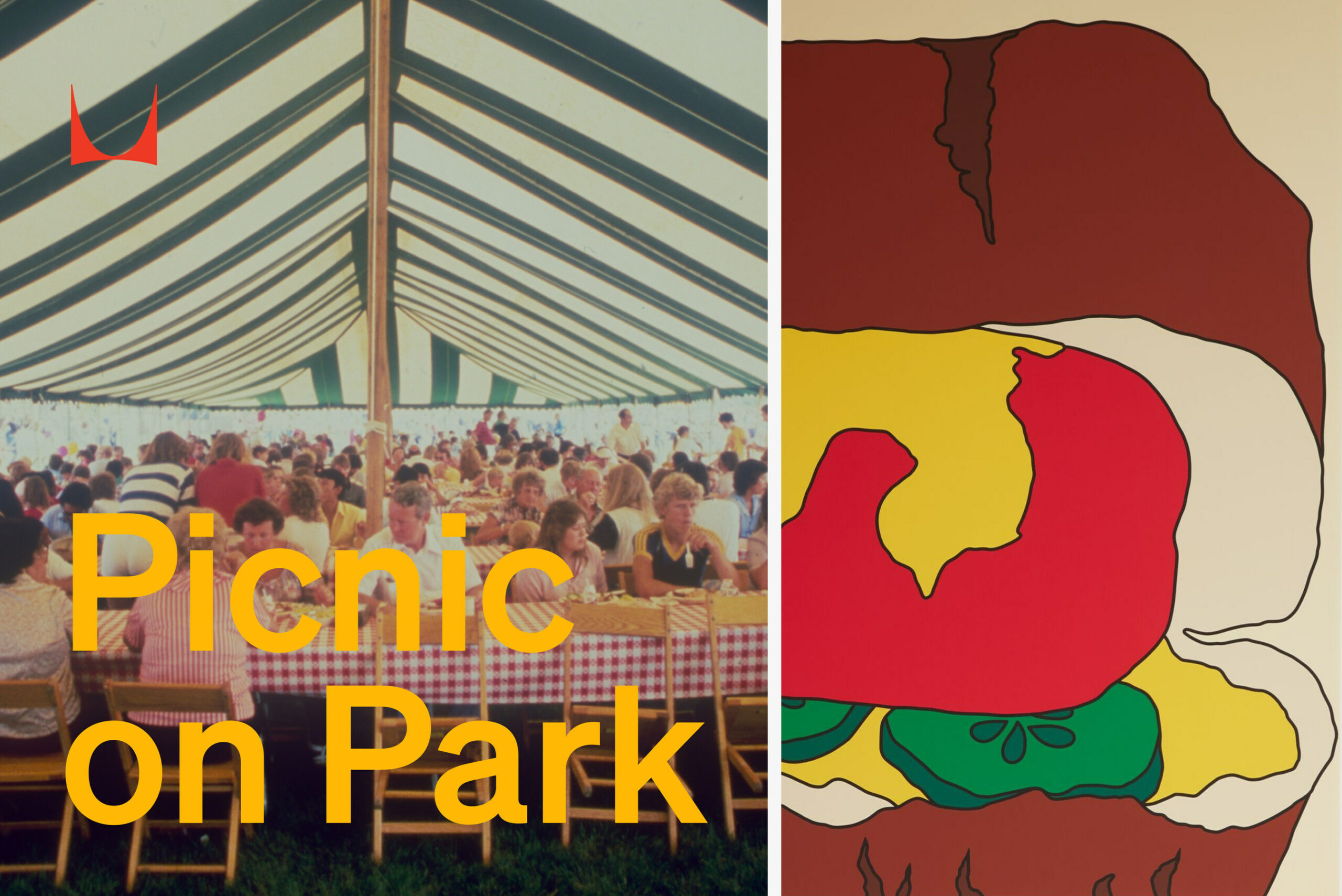
The poster and magazine, along with a sampling of Herman Miller’s rich graphic design history, will be on display during a “Picnic on Park” celebration at Herman Miller’s New York location at 251 Park Avenue South during NYCxDESIGN from Tuesday, May 21, through Thursday, May 23, 2024.
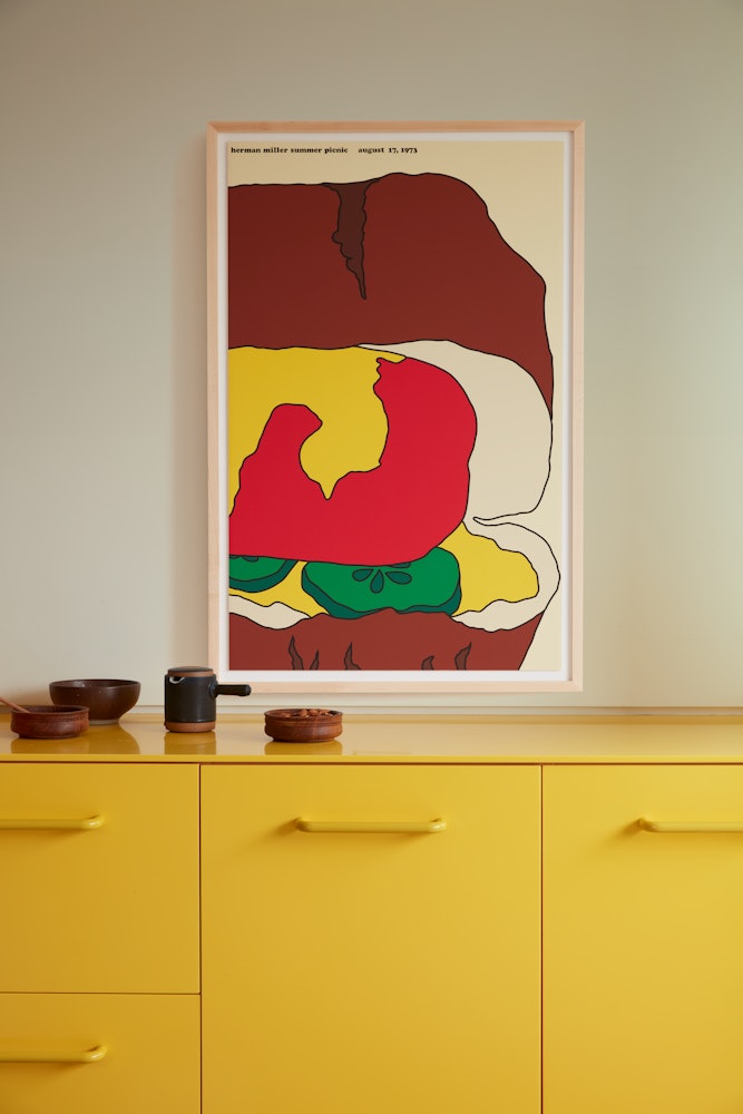
Hot Dog Picnic Poster
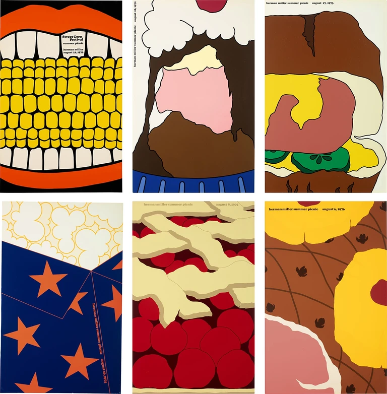
In 1970, Herman Miller hired its first in-house graphic designer, Steve Frykholm, fresh out of Cranbrook Academy of Art. Over Frykholm’s 45-year career, his role expanded to Vice President of Creative Design and included countless awards and achievements. For 20 consecutive years, one of the projects he expressed being most proud of was designing Herman Miller’s annual company picnic poster.
Each year brought a new design challenge in the form of a picnic theme inspired by quintessential American summer potluck menu items. The colourful artwork grew to become as highly anticipated a tradition as the picnic itself and has made its way into the permanent collections of the Museum of Modern Art (MoMA) and many other museums worldwide.
The Hot Dog Picnic Poster is the third in the Picnic Poster series to be offered by the brand as a limited-run reprint. Posters previously selected include the Sweet Corn Picnic Poster (1970), released in 2021, and the Watermelon Picnic Poster (1971), released in 2023.
The meticulous screen-printing technique used to remake the Hot Dog Picnic Poster still closely mirrors what Frykholm initiated in 1970, which he describes in a short film produced by the brand: “It’s a sequence of events. One colour at a time. And then that last one goes on, and it’s better than you imagined.” The story behind the printing process spans four decades and is covered in more detail in the new edition of Ideas magazine.
“The Picnic Poster series released from 1970 to 1989 brought joy to Herman Miller employees and represents a well-loved company culture and tradition. Originally, Frykholm created the designs for invitations and other promotional materials. The programme took off quickly, with posters made available exclusively to Herman Miller employees.”
Amy Auscherman, Director of Global Archives and Brand Heritage at MillerKnoll
Each poster is screen printed on 100% cotton paper and mounted in an American maple frame available in natural, white, or black finish. The dimensions are 42½” height, 28″ width, and 2½” depth.
Ideas magazine
Ideas magazine is inspired by a thought-leader-style publication of the same name by Herman Miller, published for internal and commercial audiences between 1978 and 1982. The newly released standalone issue considers Herman Miller today by examining ideas set in motion throughout the company’s history and highlighting emerging ideas.
“There are many reasons Herman Miller is thriving after 100 years, and our ongoing receptivity to ideas is central to the brand’s success. The stories we tell in the magazine—and its accompanying social and digital experiences—explore the ideas behind all aspects of design while tapping into Herman Miller’s spirit of adventure and history of innovation.”
Kelsey Keith, Brand Creative Director at Herman Miller
Source: Herman Miller
