Header: Ivo Tavares Studio
Some apartments have the privilege of resting in beautiful spots: by the sea, overlooking summits, in the middle of fields of green, or in the bustling organised chaos of our cities. However, such luck can be overshadowed by poor space planning. The Wave Apartment is a great example of this, as it is located on the Portuguese seafront but was excessively compartmentalised – instead of making residents feel free, they felt stuck in a box from the 1970s.
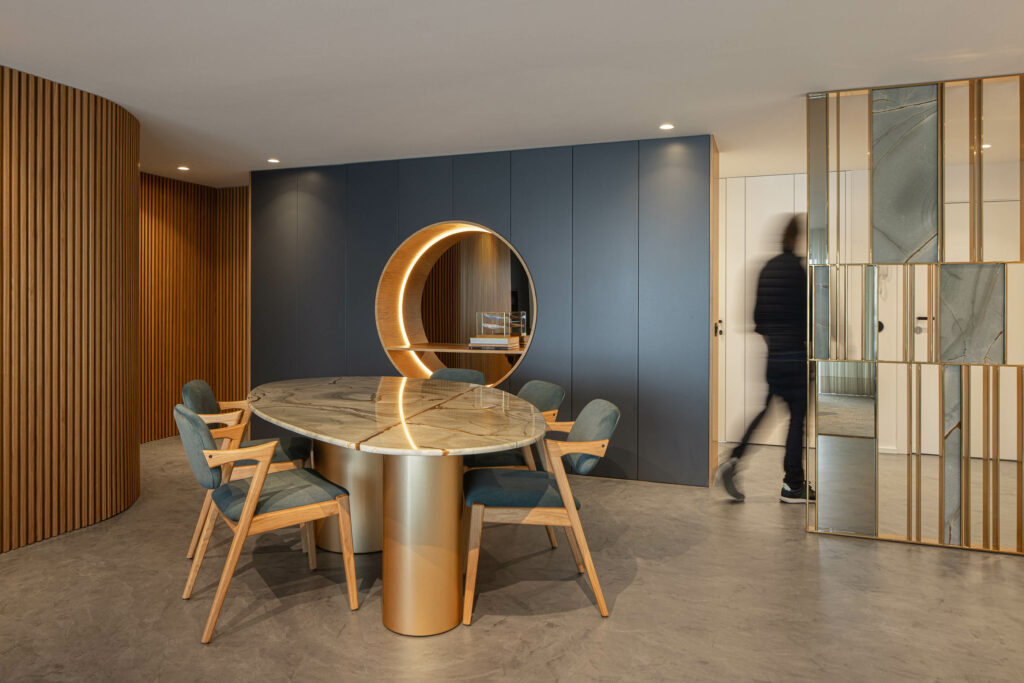
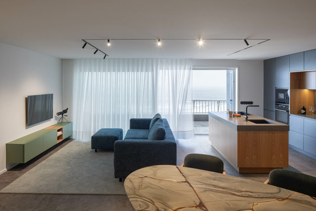
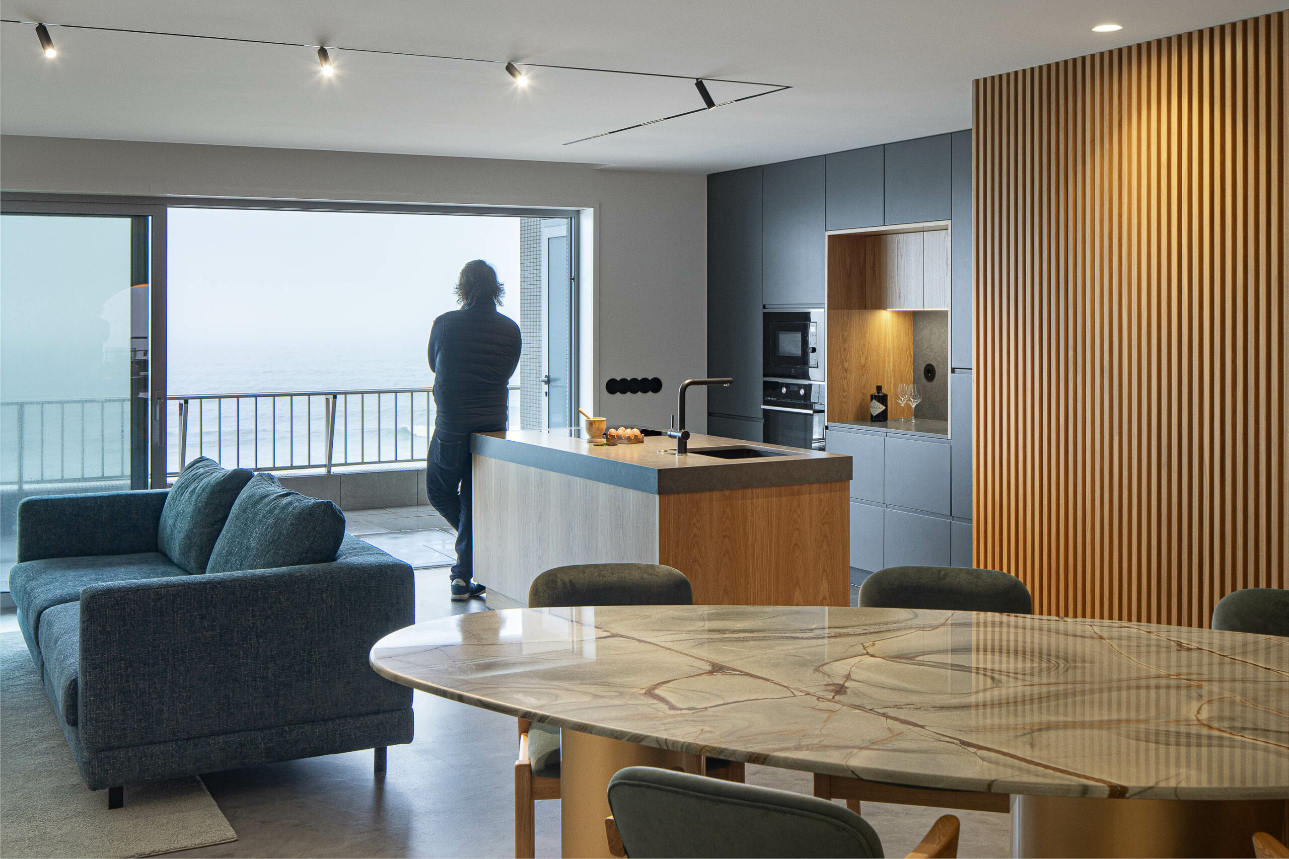
The architecture studio responsible for revamping the apartment is arQB arquitectura, which focused its efforts on the reorganisation and hierarchization of a space that had a lot to offer. The lead designers, Ricardo Ribeiro and Hugo Andrade, decided to open up the space and separate it into several living spaces: an arrival area, a social area, and an intimate area.
A wavy flow
Technical difficulties made achieving the final result hard, but the team had no trouble bending the space to their will, even among pillars and beams. After careful planning and loads of inspiration, the team decided to add the element that gives the house its name.
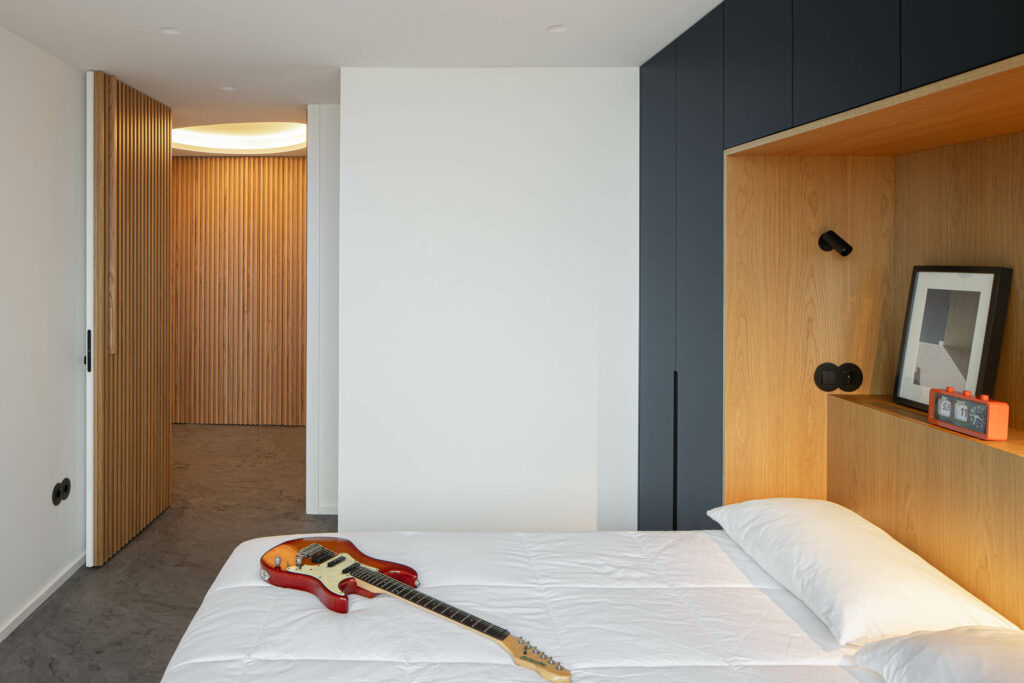
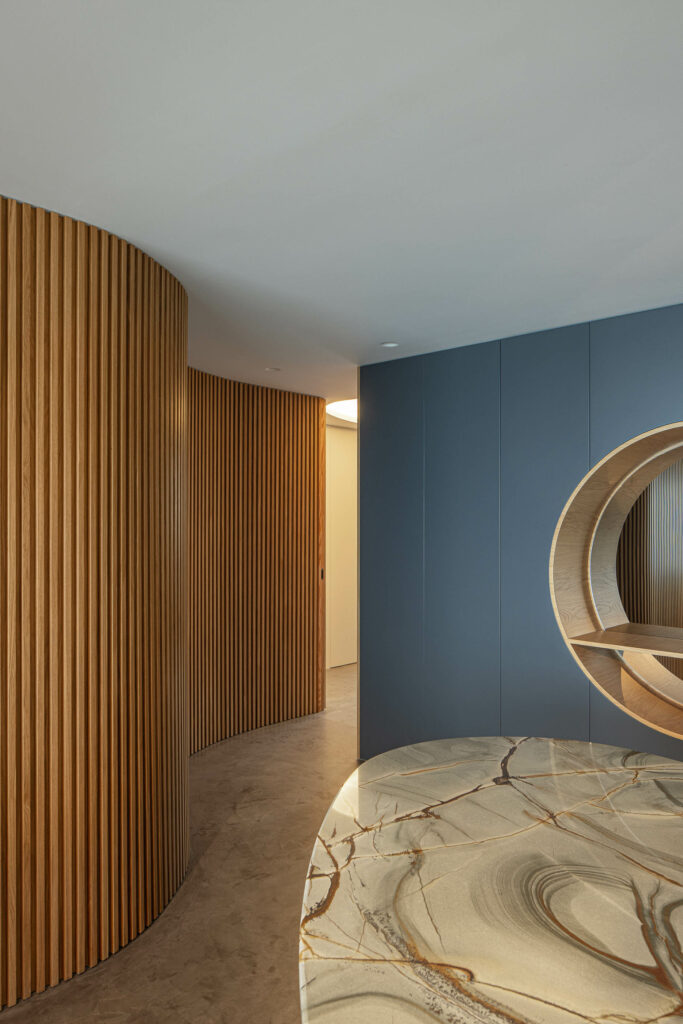
An organic “wave” wall helps separate the areas while also directing guests, almost giving the apartment a way to communicate with its residents. The wave takes residents from the social area to the intimate area of the house in an intuitive way, carefully erasing any feeling of compartmentalization that might arise in closed spaces.
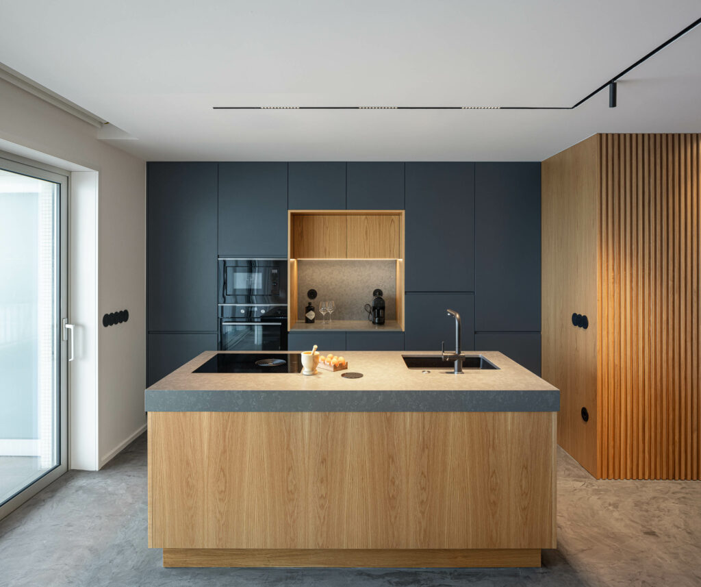
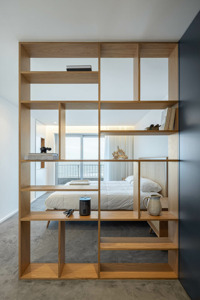
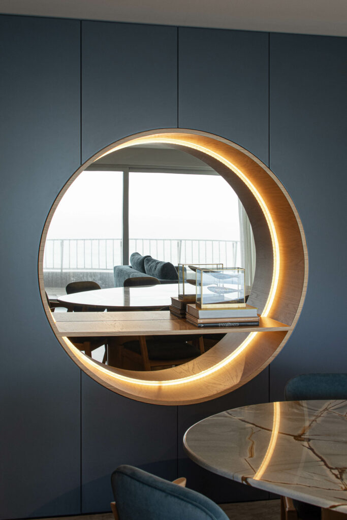
Another element that helps with the energy flow of the apartment is the furniture itself, as it separates the service area from the social area, housing a large round mirror that reminds one of a boat window. The mirror actually reflects the ocean and its horizon, further enhancing this idea of a boat window in the middle of the dining room.
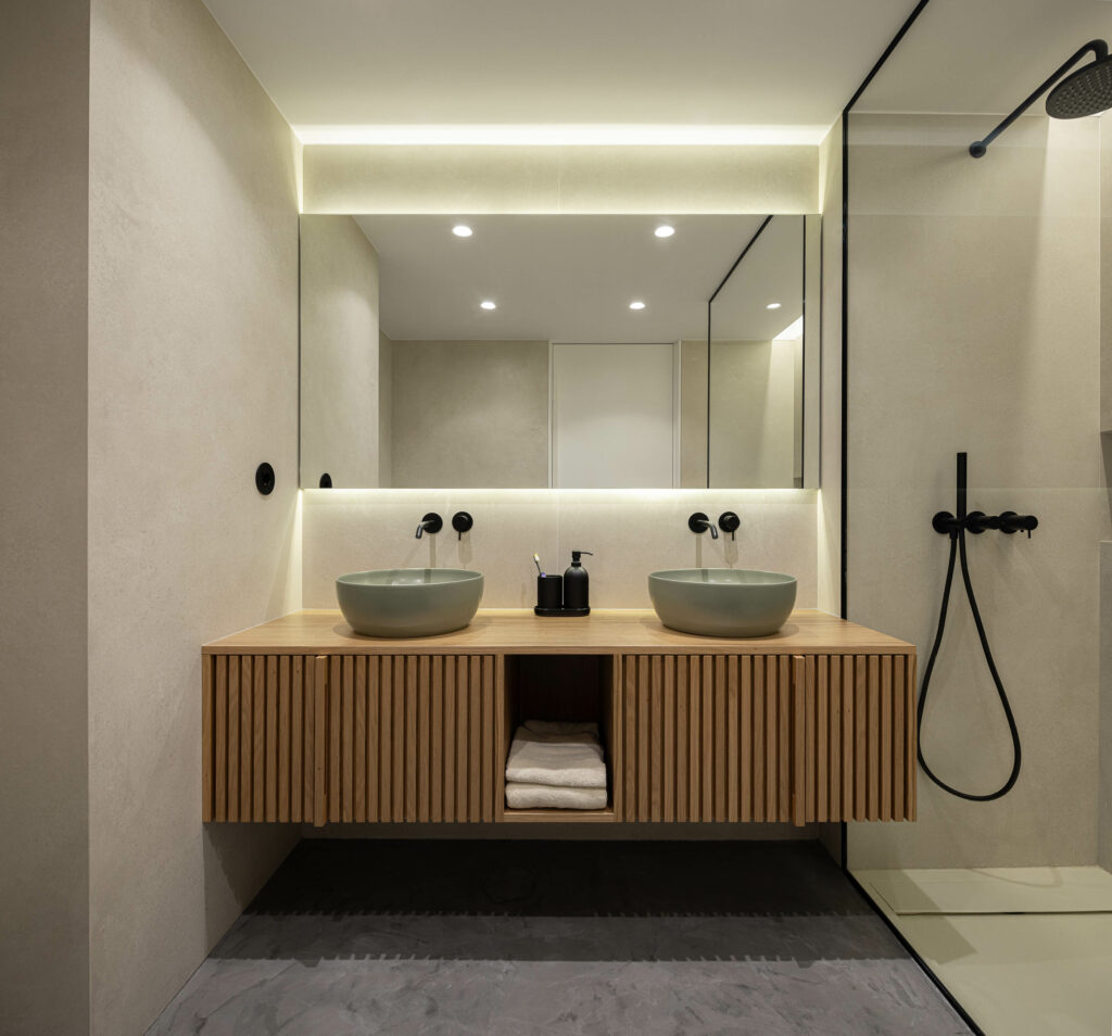
The decorative elements of the Wave Apartment were carefully selected to bring the beach and the ocean inside. As the colour blue is used throughout the design to convey tranquility and reflect the landscape around the apartment, the flooring and its tiny microcement remind residents of the local sand and beaches.
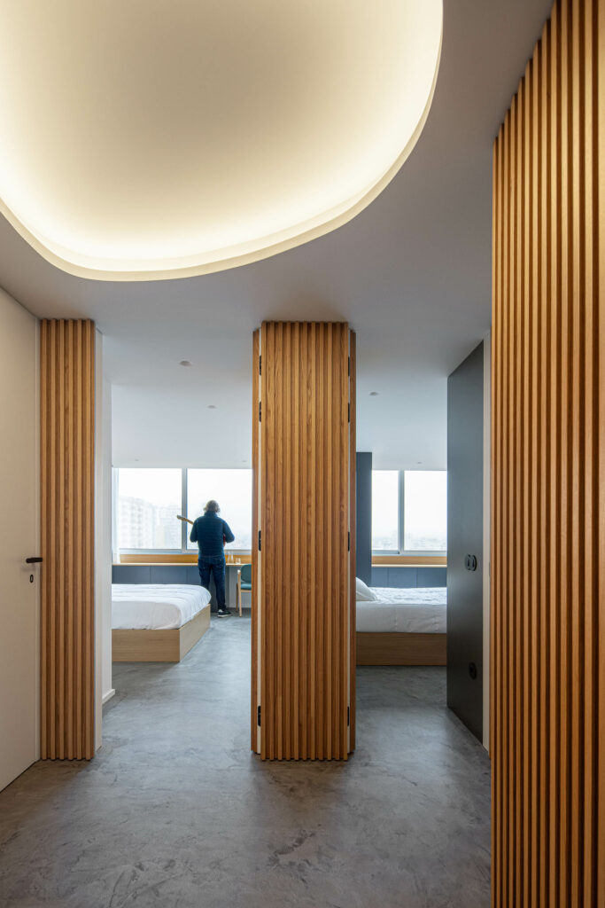
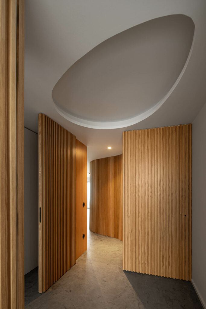
In the atrium where the rooms are, there is no natural lighting, so the team decided to place indirect lighting in place of an ovoid ceiling. The result is a comfortable environment that shows how lighting can change a space. This unnatural “natural”, design that tries to recreate the outside inside, shows how a home can be integrated into an environment instead of shaping the landscape itself, which, in the long run, can help us upkeep nature as we try to leave it as we found it.
