Header: Kaji, sufang
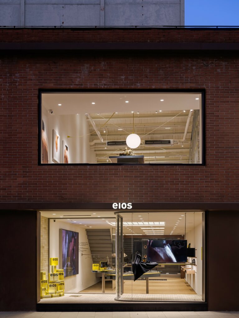
The second store of the body care brand eios is located on Dongping Road, Shanghai, and, compared with the brand’s first store, it has a larger area for brand display, retail, and SPA functions. The overall design was created by Hoii Design to be 100% functional, as the designers discarded unnecessary decorations, conceiving design based on functions and considering user experience throughout the process.
The space design language is organically integrated with the brand concept, having been customised especially for the brand, from structure and material to furniture. The brand’s concept of equally treating every inch of skin is integrated into the display, as the collision of wood and metal materials interprets the brand’s product highlights of natural strength and modern technology, while the more uniform and restrained materials create straightforward structural aesthetics.
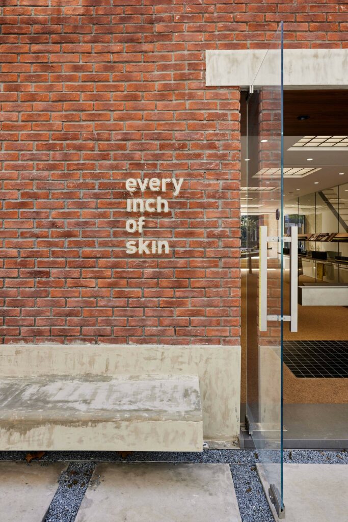
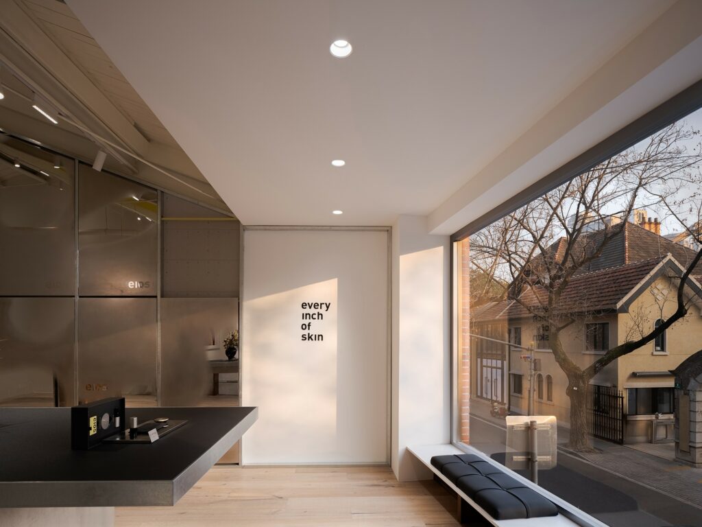
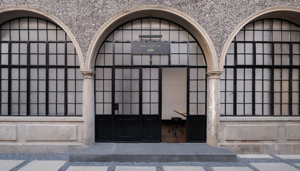
In the two-story space, a floor-to-ceiling window replaces the existing fence on the external facade to allow additional light in. The entrance is constructed as a recessed gateway, combining a metal rail with a glass structure. While maintaining transparency, it also provides extra display areas and encourages customers to enter. Meanwhile, the major materials in the store echo those in the first store, ensuring that the spatial language is maintained. When customers enter and exit the store, they will notice the brass plaque embedded in the ground in front of the door. The engraving of “every inch of skin” functions as a brand symbol in the space.
Refinement, scale, and obligingness
In the long and narrow space, the staircase, which was in the centre, was moved to one side to increase the permeability of the space. Combining the elements with a sense of scale and refinement, the space on the first floor is rigorous and equal. In the meantime, warm colours were used to make the whole atmosphere warmer and more comfortable.
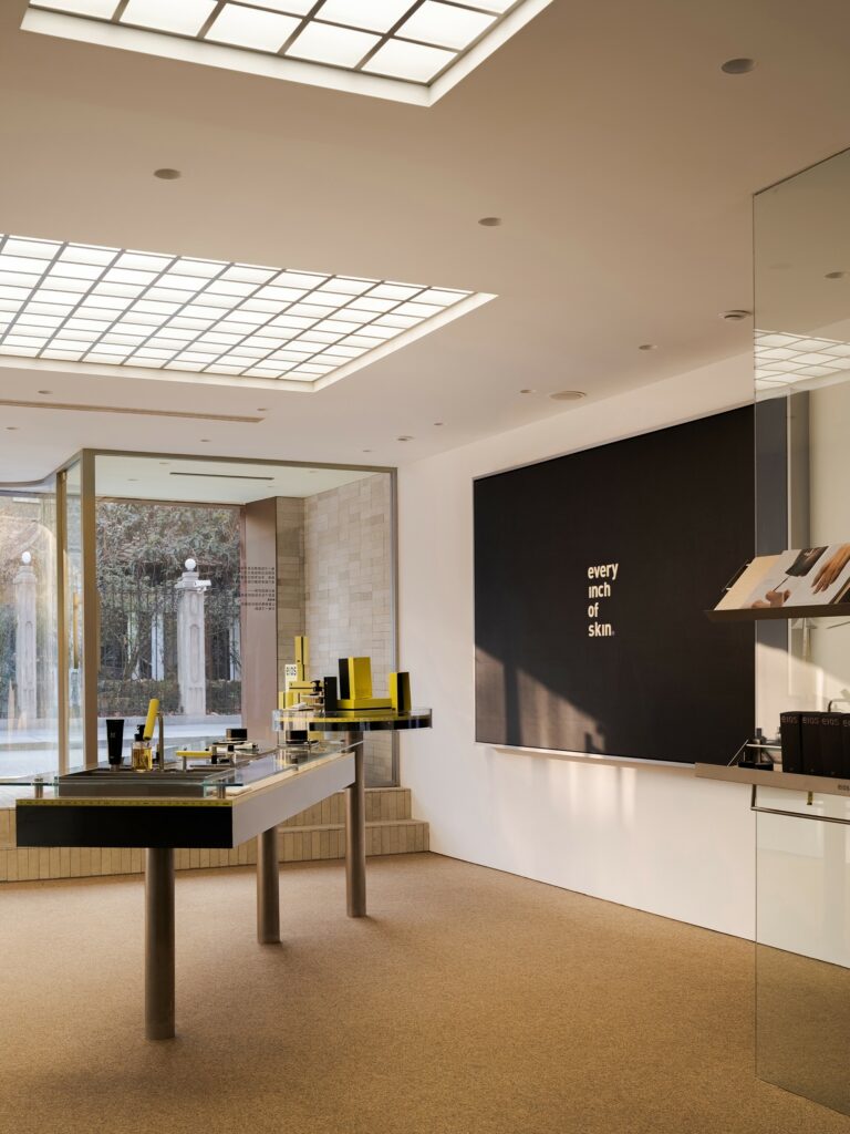
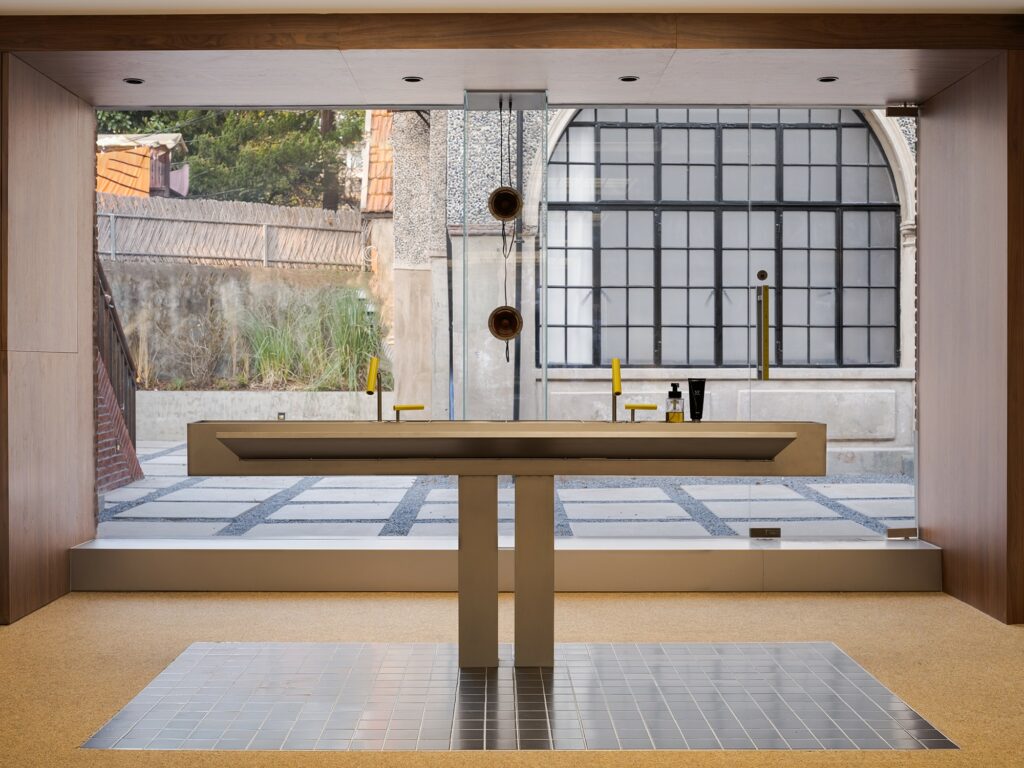
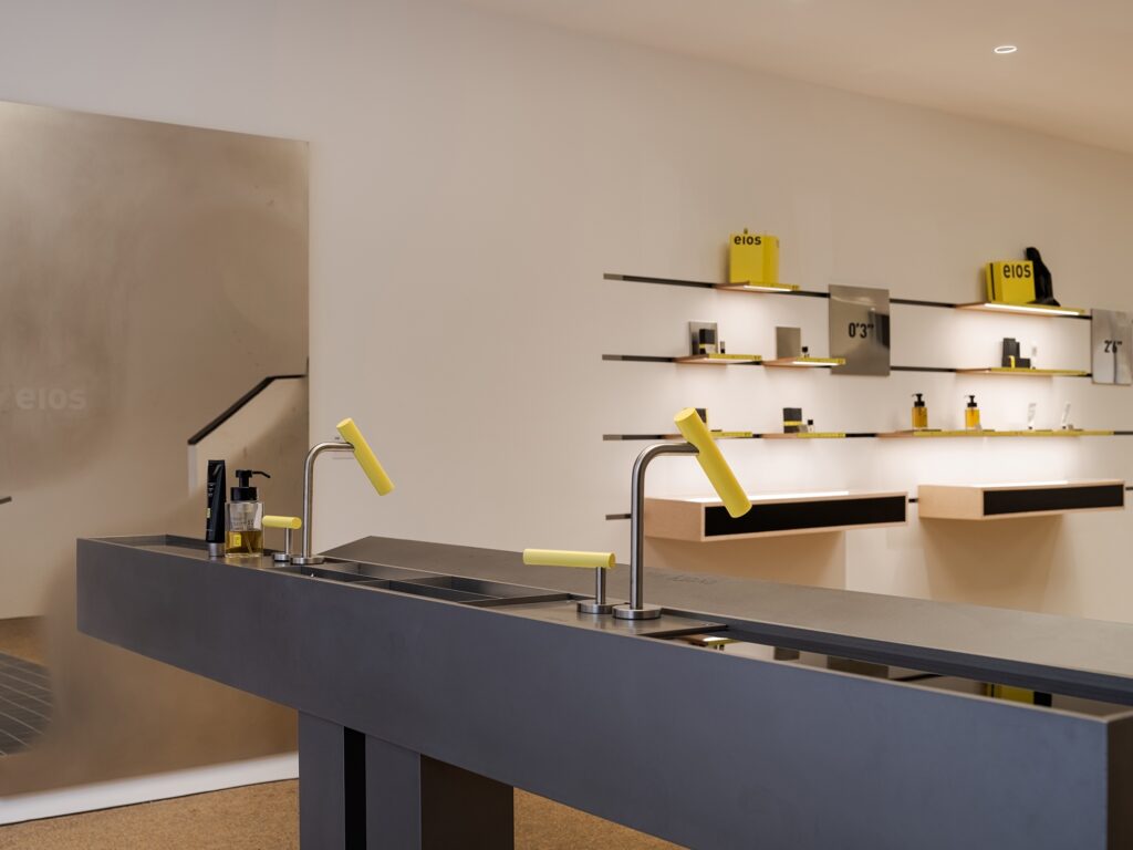
The front was designed as a product experience area, as the designers set up an island display to serve as the main body of the area. The island, in a concise and neat geometric shape, makes the clients focus on the product itself. At the same time, an electronic screen was mounted on the adjacent wall to accommodate a daily play function: when guests experience the products on the island display, they can watch the images at a comfortable height of the sighting line, which helps them better understand the brand. The light film module was installed directly on the ceiling to illuminate the display area, combining aesthetics and functionality while compensating for the light disadvantage of the long and narrow area.
The exhibition’s layout, inspired by the brand itself, was split and reorganised to create a fresh, new design that deviates from the traditional display habit of emphasising the completeness of goods and introduces the language of furniture and home furnishings, resulting in a more relaxed, daily retail environment. Throughout the store, large glass partitions and specific metal parts combine to create innovative display modules that overcome the limitations of ordinary shelves. On the opposite wall, the brand’s three main series of products are ingeniously presented in their own varying lengths, as the length of each shelf correlates directly to the name of the series, resulting in the brand’s distinct spatial expression.
The back area is mostly used for the exhibition and experience of wash supplies. Visually, it continues the transparent and delicate design of the front area as the back wall of the venue was removed to allow light to enliven the long and narrow space. To top it off, transparent glass columns support the music player device, ensuring that it suits the style of the venue. Following repeated structural design and countless proofing trials and modifications, the pool function was eventually integrated into the island display, optimising the simplicity of the vision and constructing a full and harmonious environment.

Observation, construction, and unconventionality
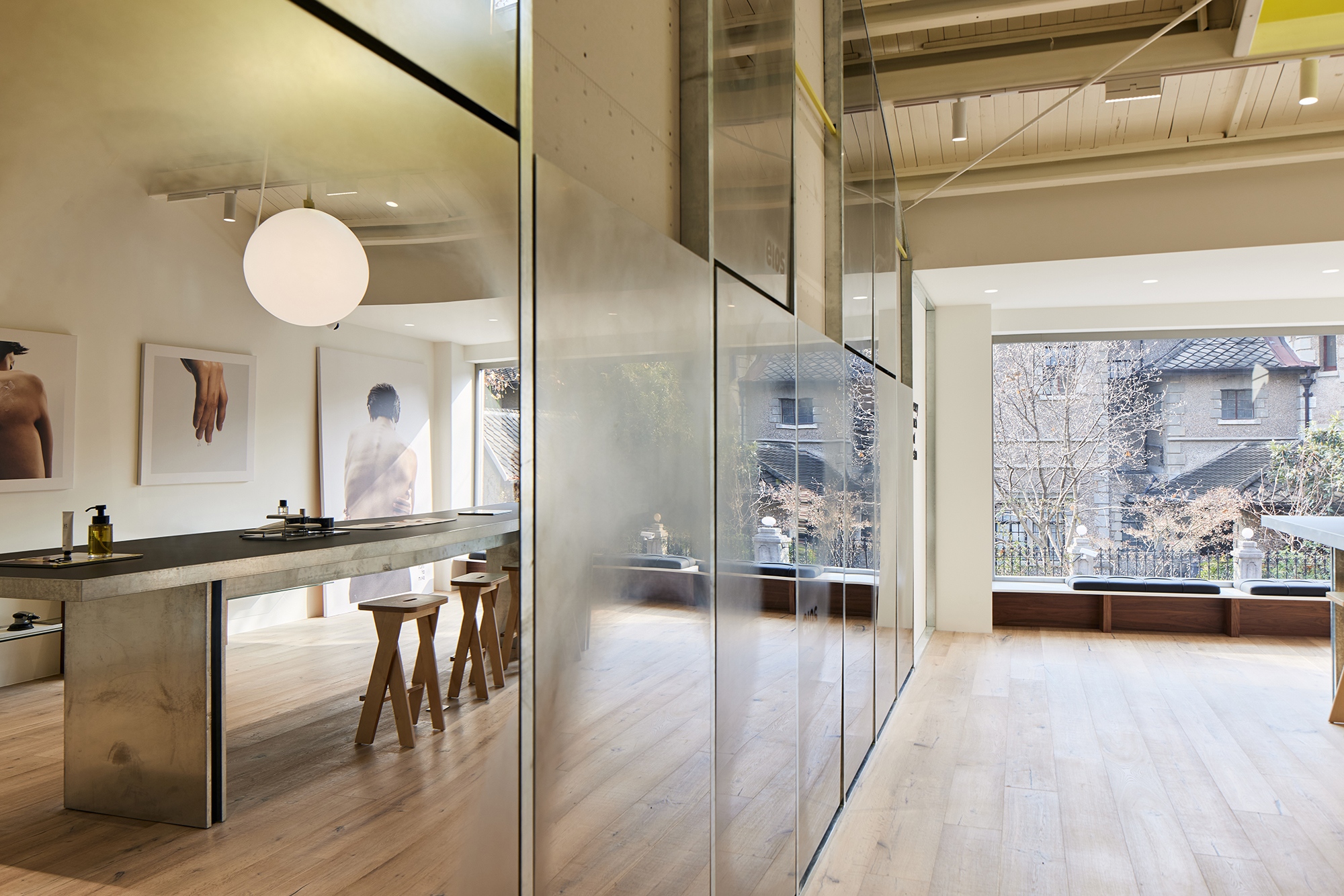
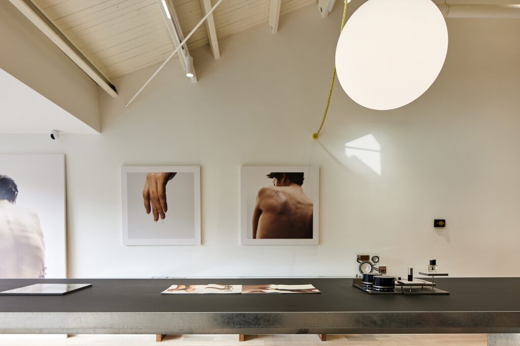
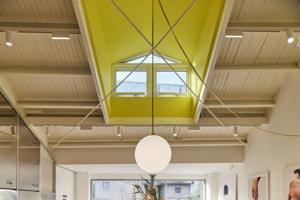
In addition to fulfilling the cashier role, the second-floor space provides capacity for future branding initiatives. Two walls were used to convey this, with one showing brand brochures and posters and the other displaying the brand’s exclusive “body mirror”. The original building’s pitched roof structure was left uncovered, and the yellow colour representing the brand was blended into the web steel structure of the wall. The surface is covered with body mirrors and galvanised sheets, a projection of the general spatial concept, which removes all extraneous decorations. The structure is regarded as the meridians and collaterals of the space, carrying its functional flow.
In the centre of the space, a large island display table is paired with wooden stools, which can be used as a venue for future brand activities. The yellow tape measure above serves as a chandelier line that echoes the elements of the first store, while the floor-to-ceiling glass windows at the end of the building bring the street view outside into the space. The landscape, which varies with the flow of the seasons, becomes a natural decoration in the space, making sitting on the stool and taking in the natural scenery, people, space, and nature a little treat for customers.
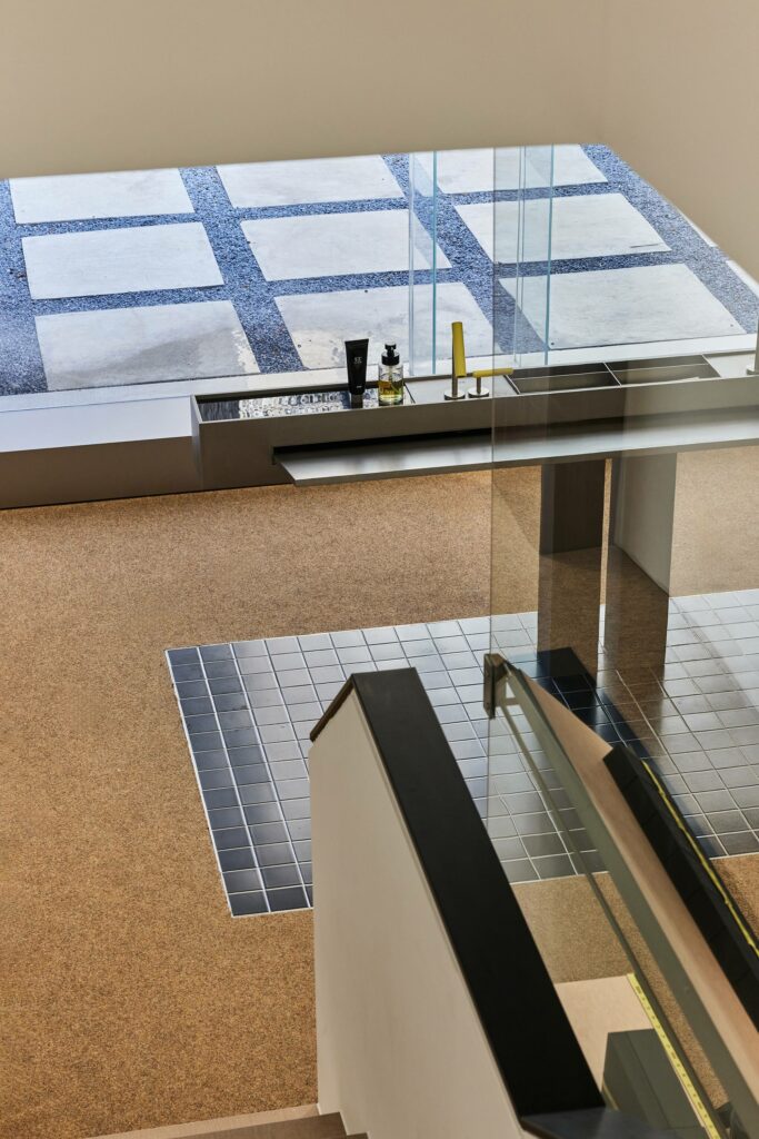
The spa space is located in the backyard, and the small courtyard between the two buildings acts as a buffer zone, making the spa area quieter and more independent. The space is on the first floor of an old foreign-style house, with the steel window structure of the external facade retained and refurbished. The interior was modified to make the best use of the limited available space, so the hand spa area and the sofa waiting area were set up outside. An entire white wall creates a more transparent and bright appearance, and the hand spa area features a disguised faucet to maintain a similar tone to the main space.
The single spa room, with its warm grey micro-cement wall, creates a more peaceful and relaxing feeling than the outside as it cleverly blends the storage function into one wall, freeing up extra space. The floor is covered with a yellow shag carpet, which matches the brand colour, complemented by both soft and hard furnishings that enhance the sense of comfort and warmth by focusing on the user’s feelings.