Header: SkyGround architectural film & photography
Before the Monow House existed, there was once an empty plot of land next to a couple’s house. Seeing the potential, the couple’s now-grown son decided to purchase it and start to build his own life and family. The first step? Building the house of his dreams.
Family connection
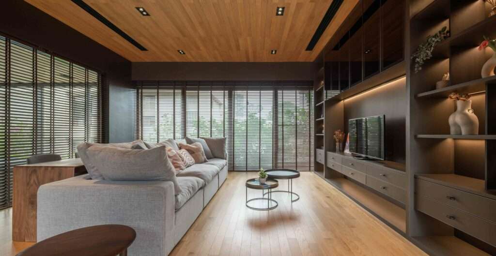
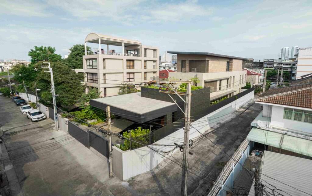
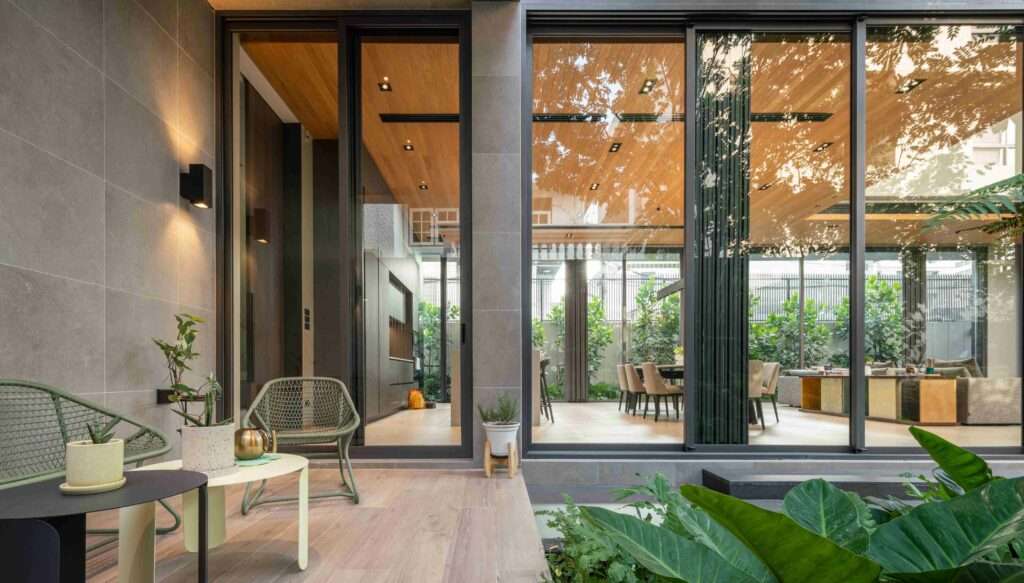
Once Monow was completed, the previous boundary wall between the two properties was removed and the new house was united with the parents’ house. This unity is characterized by several aspects, such as a visual linkage between the dad’s TV room and the son’s living room through the communal landscaped courtyard, a shared fitness room that the mom goes over to use daily, a provision of extra parking lots for both houses and a covered walkway connecting the kitchens of both houses for service sharing.
Designing the home
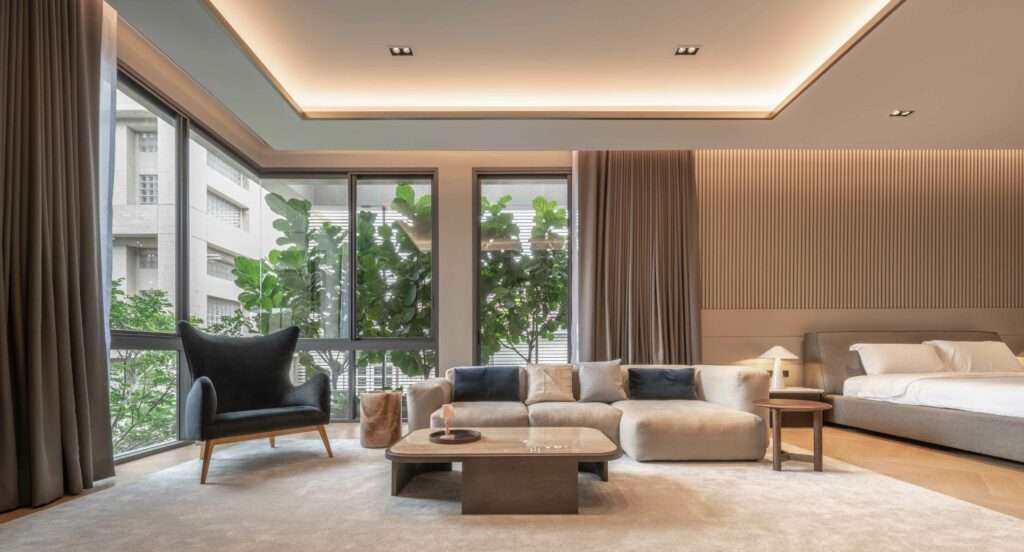
Contextually, the plot is long and narrow, surrounded by neighbours with close proximity, so the planning of massing and openings was crucial to ensuring sufficient privacy. The design team, from Archismith, conducted a thorough review of the location and distance of the neighbours’ windows to avoid confrontation. With a site constraint in terms of width, the design solution was to build a 3-storey structure that provides a decent amount of natural light and ventilation to all rooms. Out of care for the parents, the massing descends towards the front so as not to block their house’s natural light and ventilation.
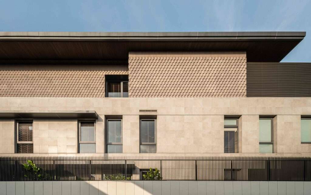
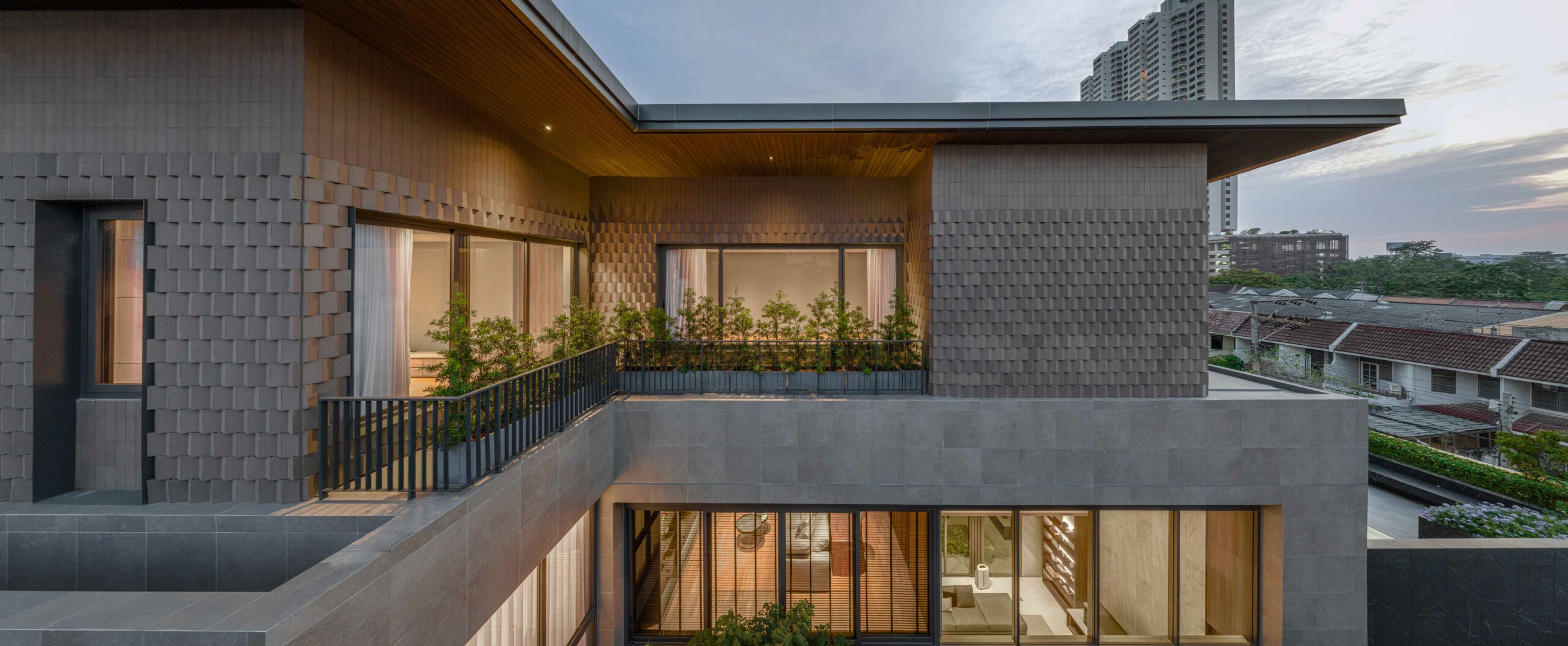
One of the requirements from the owner was that the appearance of both houses must be related. So, to avoid having to do similar massing or design language, the design team proposed to link them through the use of materials instead. The external cladding on the 3rd floor is from the same manufacturer as the one used on the exterior wall of the parent’s house, but a newer, more modern version. The exterior walls of the 3rd floor, being the ones most exposed to the elements, are cladded with hollow-core triangular-shaped ceramic tiles, which act as a thermal barrier. As an extra, the heat gain is reduced thermodynamically by a natural breeze flowing through the void of each tile. The folding texture of the cladding also helps to reduce a direct hit of sunlight, as 50% of the surface will be in shade most of the time. Since the thermal tiles are wrapped on almost all surfaces of the 3rd storey, this was no easy task, as the layout of the walls is not in a simple rectangular shape. Due to the 3-dimensional form of the tiles, they also cannot be cut, so the design team had to make sure that all wall dimensions could fit the tiles perfectly. The cladding on the 2nd floor, though not from the same supplier, is in a similar colour tone as the parents’ house for consistency.
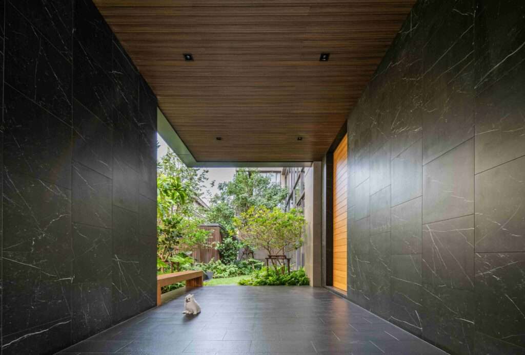
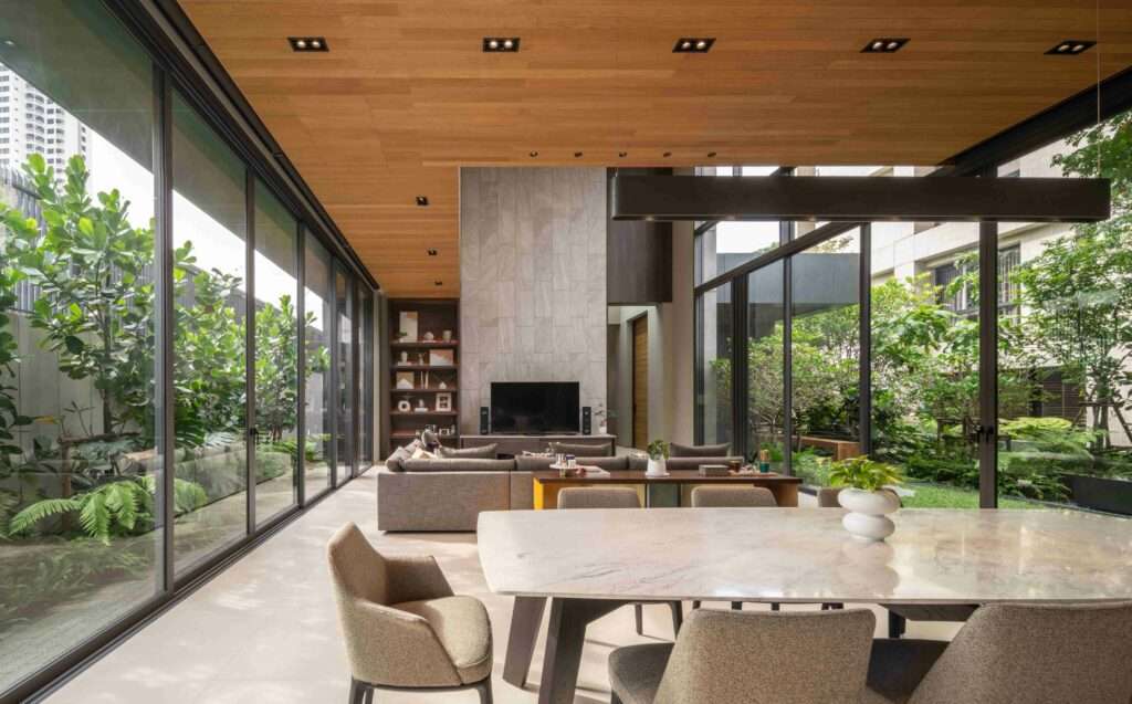
On the street level, the scale of the house appears to be similar to those rowhouses on the opposite side. The colour scheme at the entrance is intentionally kept dark to accentuate the greenery of the courtyard at the end of the arrival tunnel. Internally, the living room’s double-height glazed façade, facing north, provides optimal exposure to the courtyard view and daylight with minimum heat gain. The working room on the 2nd floor is structurally hung from above to avoid having columns blocking the garden view on the 1st floor.
