Header: Olivier Blouin
After opening its first grocery store in the Villeray-Saint-Michel-Parc-Extension borough in 2020, Montreal-based fruit chain, Fraîchement Bon, is opening another one in the same neighborhood, on Jarry Street. For this second edition, the architecture and design firm Dupont Blouin – which had signed Fraîchement Bon Villeray – remains at the helm and refines its expertise in food store design, wishing to reinvent the grocery store experience.
With the Fraîchement Bon Jarry fruit store, Dupont Blouin continues its foray into the design of neighbourhood businesses with an efficient and friendly concept. Wishing to make the routine activity of grocery shopping even more enjoyable, the architectural duo relies on a design that emphasizes light, curves, and colour for a smooth, efficient, and fluid experience.
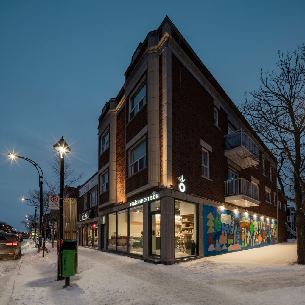
For several years now, new businesses have been opening on Jarry Street, contributing to the revitalization of the neighbourhood. The Fraîchement Bon family business forms part of that perspective, with a desire to contribute to the fresh winds of change that the neighbourhood is experiencing.
The less than 2,000 square foot space occupies the first floor of a typical Montreal red brick building dating back to 1935. To highlight the art deco sculpted stone frieze and columns, the architects opted for minimal exterior signage. The aluminium door and window frames are distinguished by their minimalism and colour. Forest Green soberly recalls the identity of the business, whose name in luminous letters is simply affixed in front of the frieze, discreetly blending with the waves.
As in the grocery store on Villeray Street, the cases of Fraîchement Bon Jarry are lit by Studio Botté, a local lighting company whose creations are made from recovered Montreal materials.
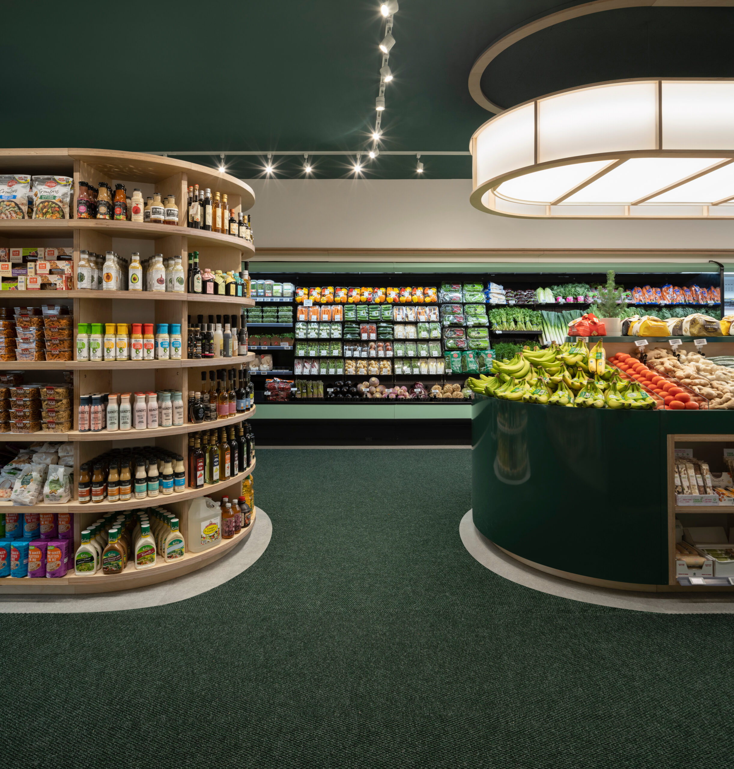
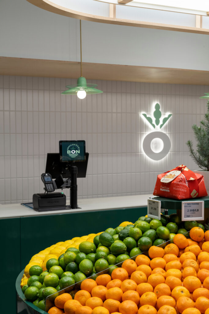
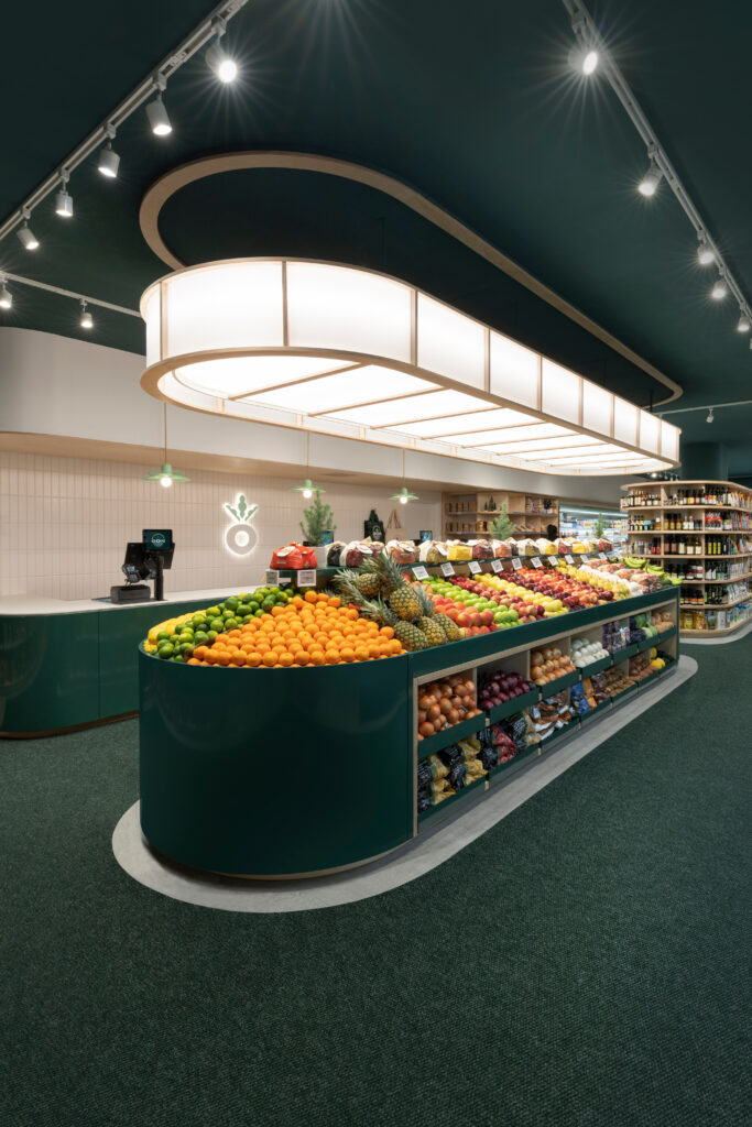
Located just around the corner from the Jarry Metro station, the grocery store enjoys a prime location. To attract passers-by, the architects have opted for an inviting design with a strong visual impact. Through the bay windows, furniture including a large fruit tray topped by a curved light fixture, like a suspended lantern, invites visitors to enter. That warm element single-handedly sums up the concept developed by the architects.
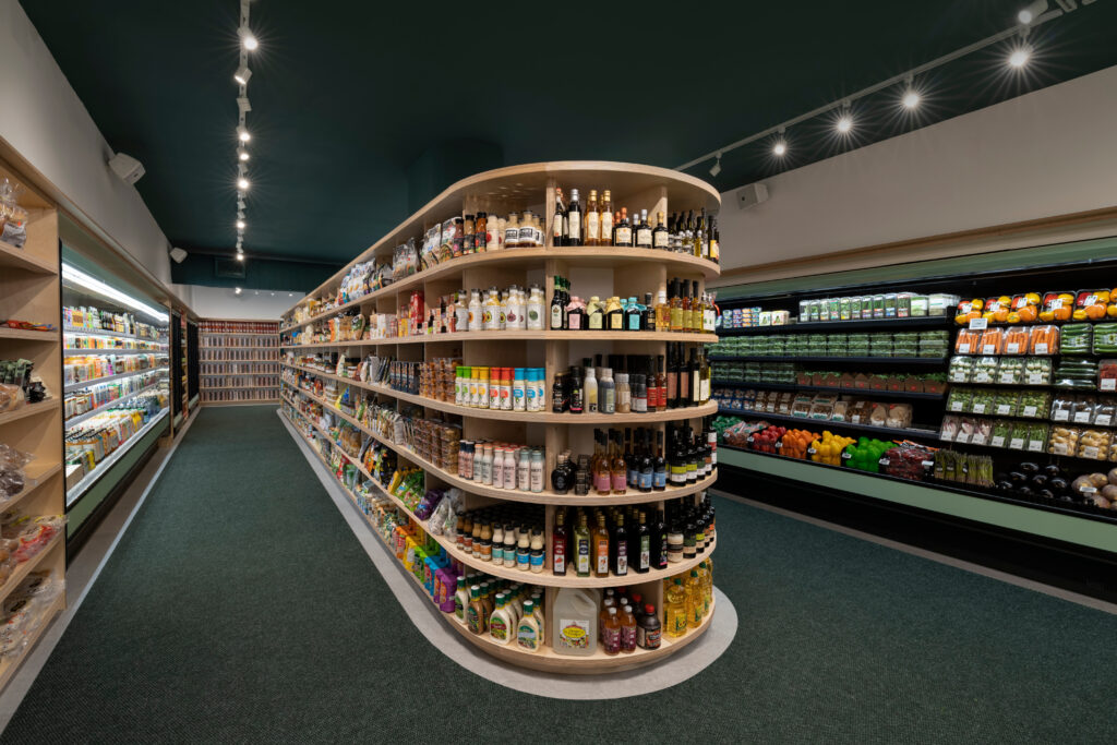
Inspired by the Freshly Good logo and the shape of the radish, the design proposes a circulation all in roundness. Instead of getting lost in a maze of aisles, the furniture, in the form of a band, accompanies the circuit and dresses the store: a continuous, elegant, and unifying gesture that makes movements more fluid and simplifies the experience of the route to the maximum. The 5-foot wide aisles allow for comfortable circulation and the concept of a single functional passage. The parallel plan and the attention to alignment of the elements promote a sense of visual calm.
Unlike the first grocery store concept where a huge refrigerator occupied the centre, here the refrigerators are placed on the periphery and the plywood furniture is located in the heart of the fruit store, hiding the building’s support columns. The grid drawn by the 7 levels of shelves allows a quick reading of the products and further contributes to the clarity and simplicity of the shopping experience.
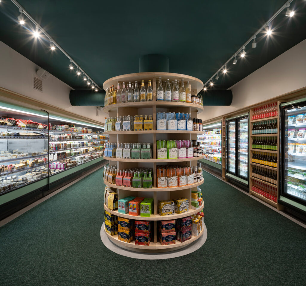
Once again, the architects succeeded in optimizing every square foot of the store, while giving a sense of visual lightness. By highlighting the delicatessen products and guiding placement habits by requiring more frequent attention and presence of the grocers in the store, the design helps improve service, maintenance, and human contact with the shopkeeper.
Fraîchement Bon Jarry rethinks the convenience store through an aesthetic more residential than commercial. The curves of the furniture bring a softness and conviviality that contrasts with the rectilinear forms of commercial spaces. LED lighting in warmer colours was chosen to create a warmer atmosphere.
The design encourages as much natural light as possible. The store’s glass façade lets in outside light and the northern orientation bathes the store in a soft glow without harming the food. Along the windows, low furniture displays certain products in the window, while allowing others to be seen further into the store. From the street, gazes plunge into the fruit shop, attracted by the colours, the layout, and the perspective effect generated by the depth of the premises. From the store, the large, unobstructed windows keep patrons in constant contact with the street and its bustle, mimicking the lively atmosphere of public markets.
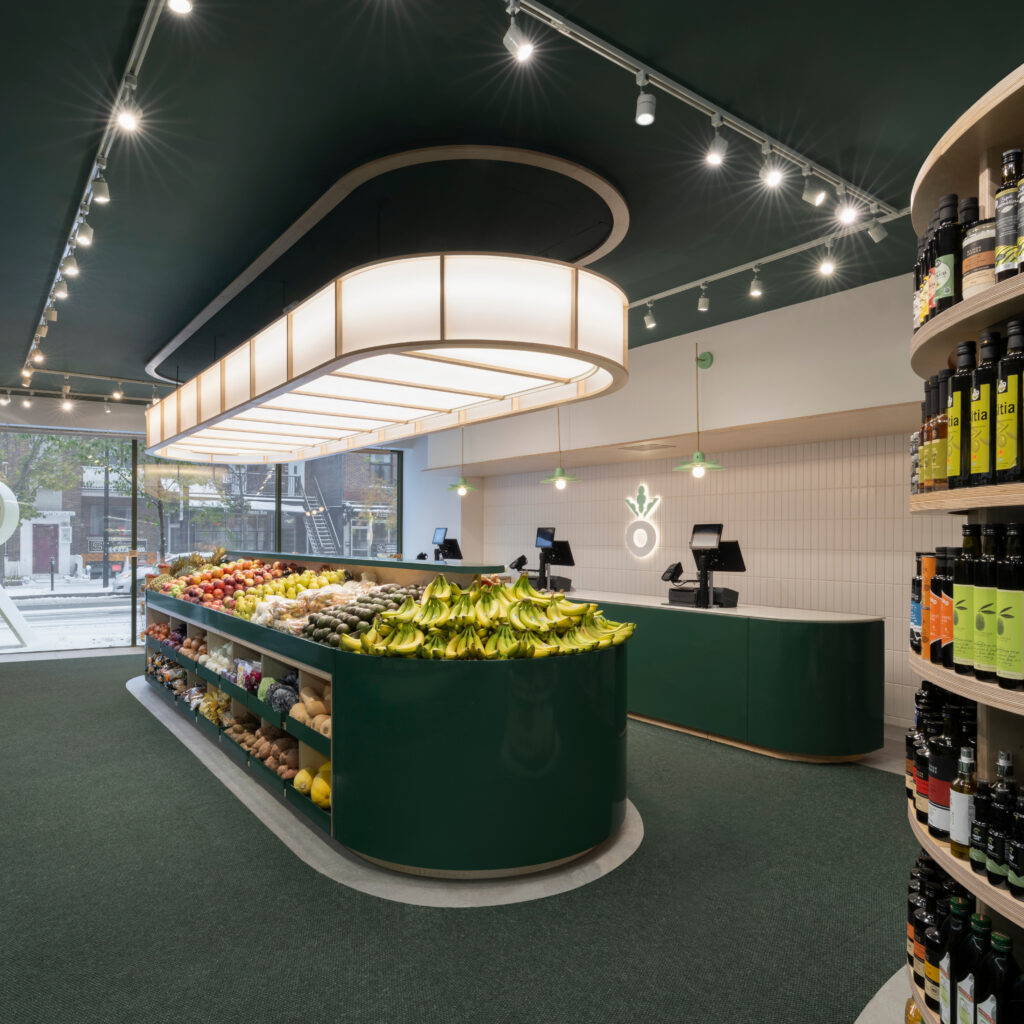
The choice of pre-painted steel makes it easy to wash surfaces such as the checkout furniture, refrigerator, and display baskets. To balance the cooler, industrial aesthetic of metal, the architects opted for integrated wood furniture and a crisp colour palette. Between soft green and forest green, the tone is plant-based and fresh, reminiscent of the fresh produce sold there.
A clear ceramic floor brings light to the space. To face the Quebec winters and its traditional muddy snow, the tiles are covered with a custom-made carpet, matching the green of the furniture. The bright aesthetic and the accent colours contribute to the joyful atmosphere of the place.
With its fresh colours, custom wood furniture, round design, and intuitive flow, Fraîchement Bon Jarry is part of the active commercial life of Jarry Street. Simplifying the shopping experience, Dupont Blouin makes grocery shopping a pleasant, even playful experience. It is a refined and inviting design that never loses sight of the essential: the products, which it humbly serves.
