Header: Sebastian van Damme
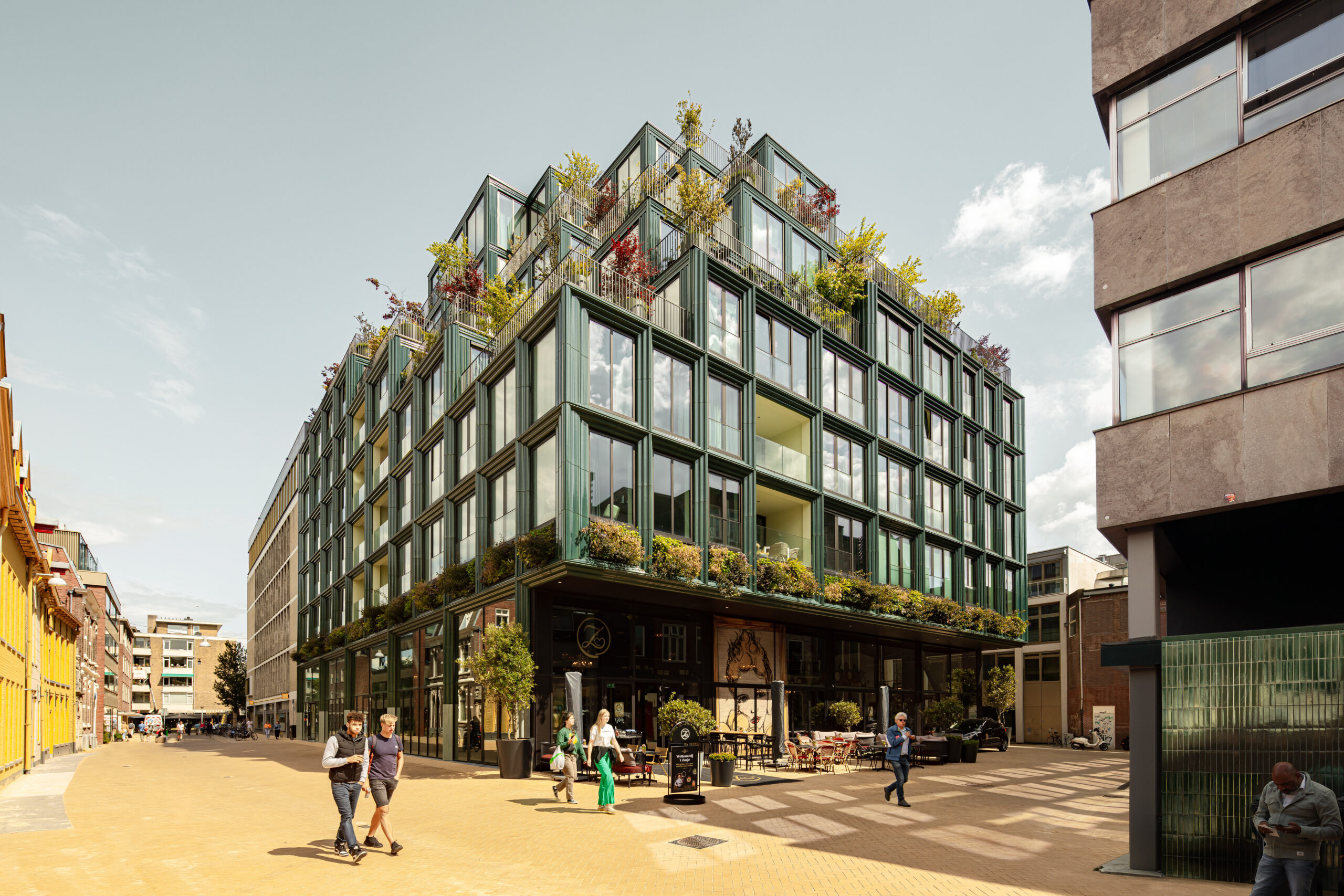
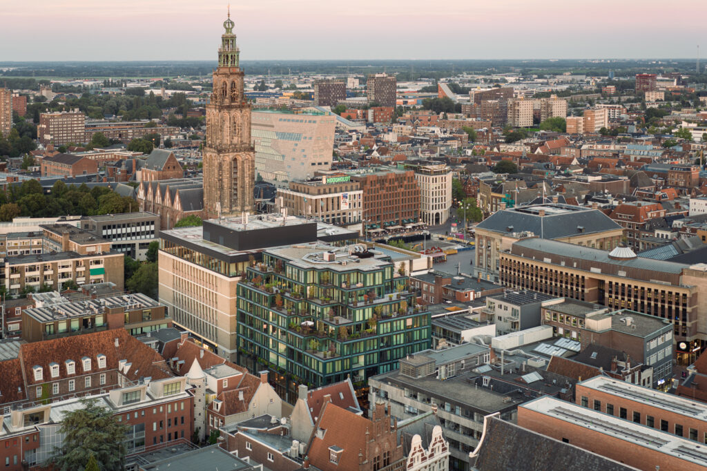
With the completion of Mercado and the redevelopment of Rode Weeshuisstraat, Groningen city centre’s north side gets a new boost. The building, together with the new Stalplein next to it, embodies an urban transformation geared towards pedestrians and encounters.
The design of Mercado and the urban plan for Rode Weeshuisstraat were created by the architectural collaboration of De Zwarte Hond and Loer Architecten on behalf of developers MWPO and Beauvast. Mercado features a monumental plinth with 41 sustainable apartments above it, built by Plegt-Vos.
Revitalizing the city centre’s north side
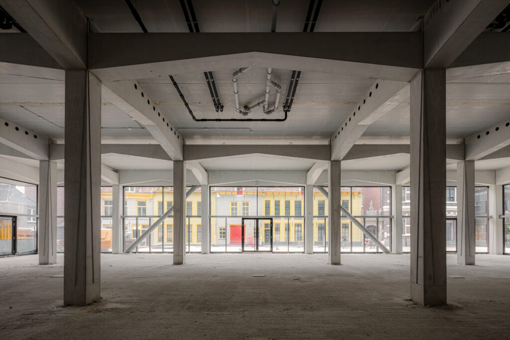
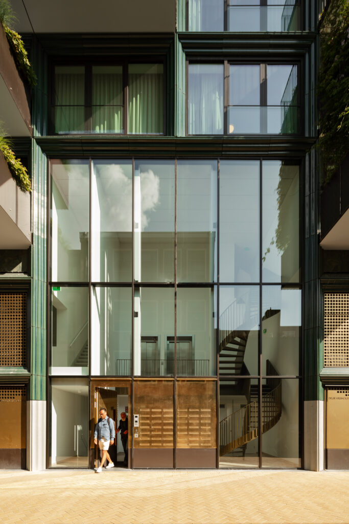
In the new urban development plan, Rode Weeshuisstraat is no longer the back of Grote Markt but the front of the city centre’s north side. In addition, cars will give way to pedestrians and Mercado, which replaces a former V&D department store warehouse, creates space for a new city square with a more compact footprint. The redesign of the street is combined with a generous 6-metre-high transparent plinth, which, together with the new square, creates a meeting place.
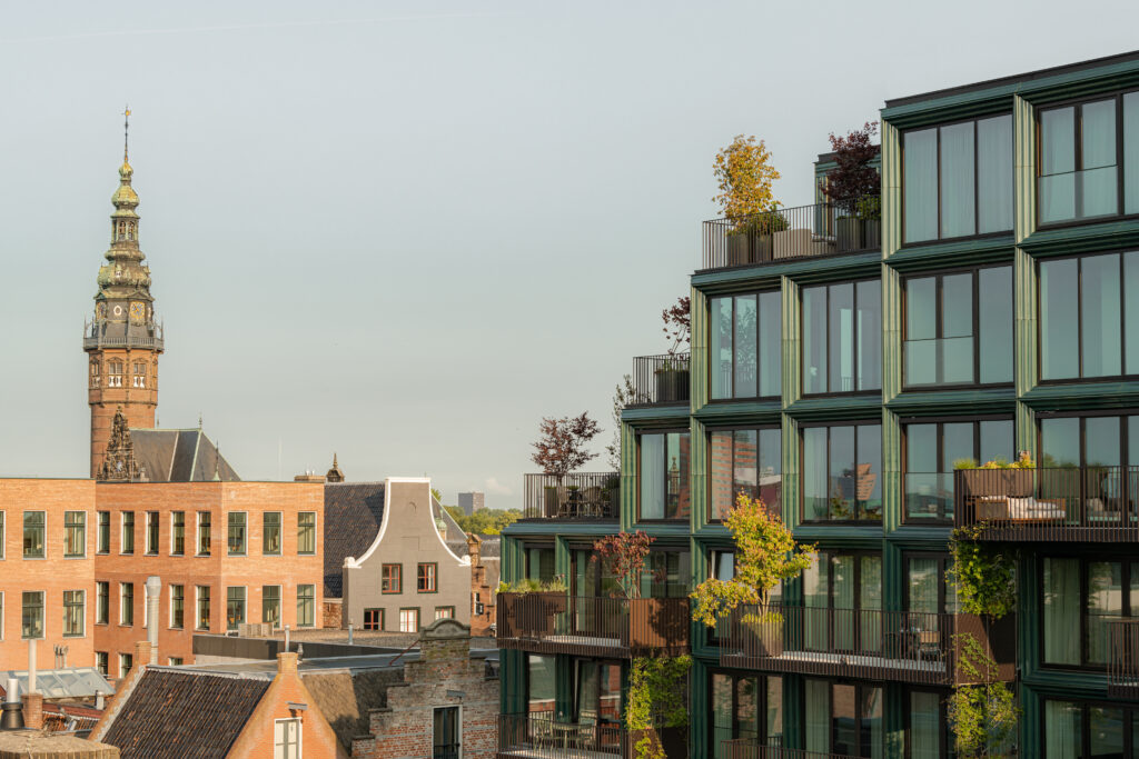
In terms of scale, Mercado forms the link between Grote Markt and Rode Weeshuisstraat. The buildings on Grote Markt are of a larger scale than those on the north side of Rode Weeshuisstraat, including the Weeshuis (orphanage) itself. Mercado combines these scales in its stepped volume, which is high where possible and lower where necessary. The result is a building that fits perfectly into the city centre in terms of scale yet has its own identity.
Craft and character
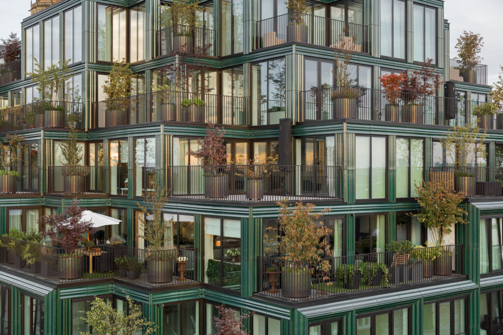
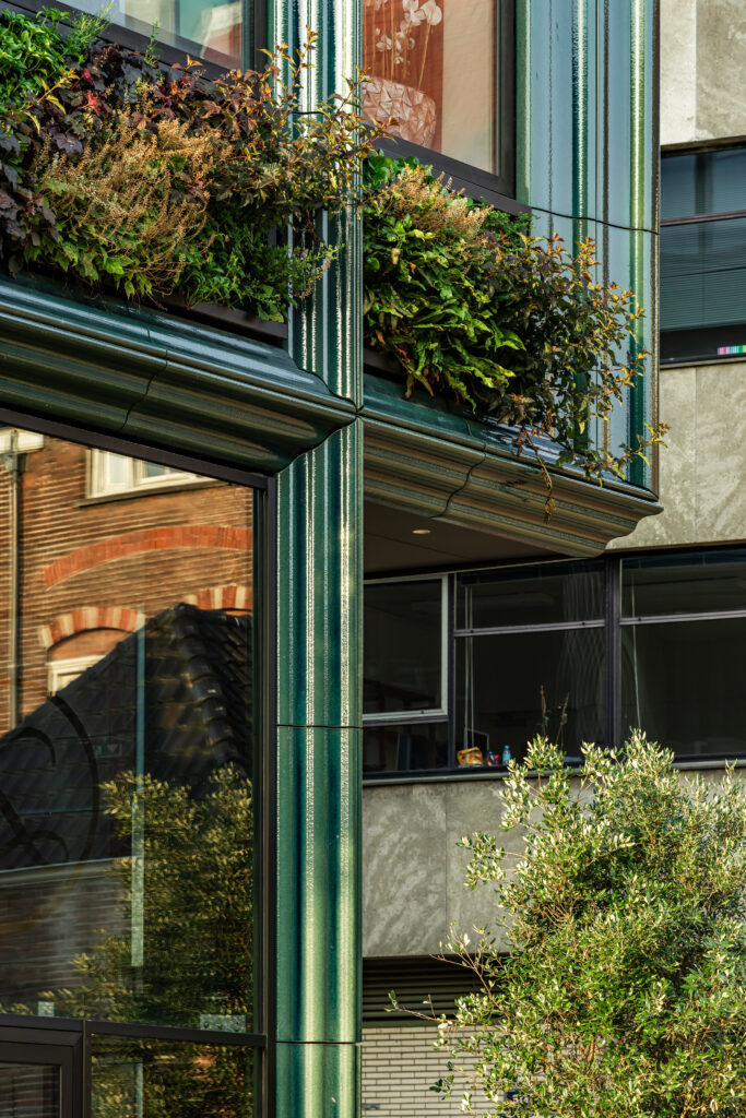
Mercado’s facade is made from ceramic elements. In close collaboration with ceramic manufacturer NBK and facade builder Bijlbouw, samples and mock-ups were used to find the perfect blue-green glaze for the facade with its custom-made details. Thanks to this glaze, the building appears a different colour in every type of weather, and a layering of colour and form can be discerned adding a touch of artistry that refers to the richness of Groningen’s historical buildings and the optimistic rawness of post-war architecture.
The reconstruction architecture on Grote Markt is characterized by glass, precast concrete, and natural stone, while the orphanage stands out with its ornaments and stucco facades in pastel shades. Mercado, with its beige clay and semi-transparent glaze, blends in well with both the pastel Weeshuis and the post-war block’s stone-like materials.
Flexible, sustainable, and nature-inclusive
The ground floor has been future-proofed by placing stairs and elevators to the side of the building. This creates an open, monumental space that can be flexibly configured for public events. Beneath the building there are wells for a thermal energy system (TES). In combination with heat pumps, the entire building is natural gas-free.
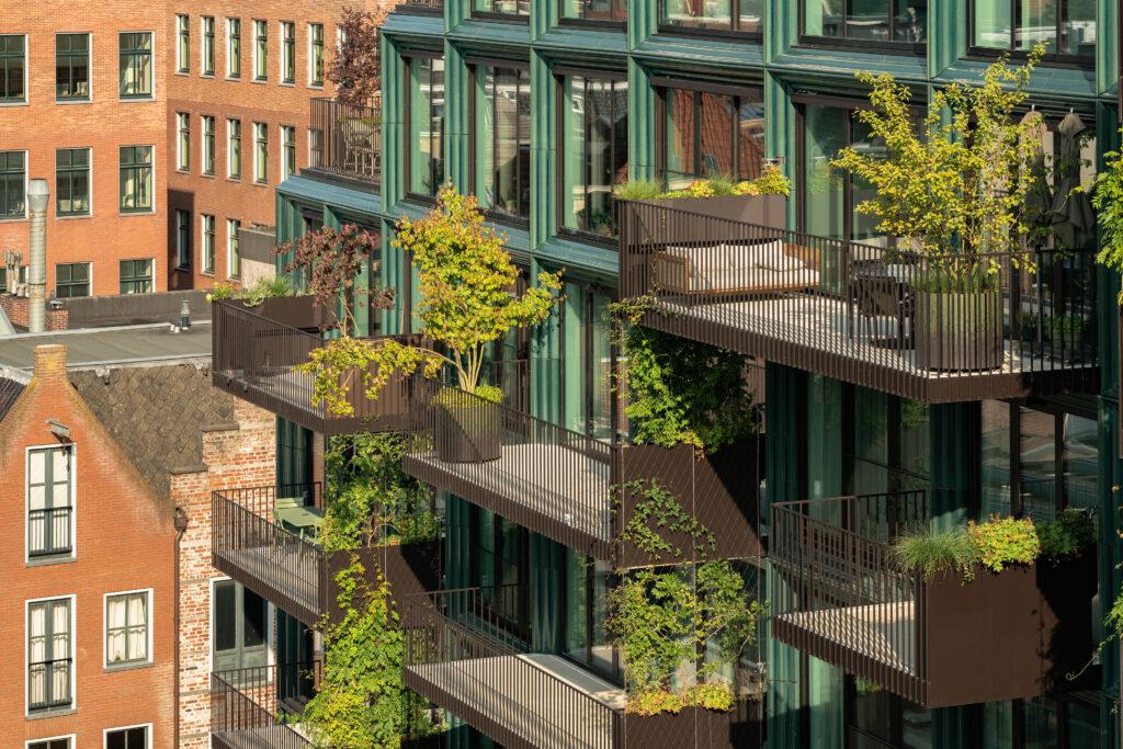
The vertical garden along the facade provides the building with 3.800 plants and contributes to biodiversity. On the south facade, climbing plants cover the balconies like green privacy screens. The building’s stepped volume provides space for roof terraces where colourful plants and trees are part of the design. Special planters were designed for Mercado with a unique colour scheme to match the building. Both the rooftop terraces and facade gardens are watered by a computerised system and regularly maintained by a gardener.
Successful Transformation
In five years, Rode Weeshuisstraat has transformed from a dark side street into a unique meeting place. Frank Loer (Loer Architecten) and Henk Stadens (De Zwarte Hond) state:
“The urban plan gives the city centre’s north side the sophistication it deserves. Mercado and the redesigned Rode Weeshuisstraat give the city centre a boost. The monumental plinth, greenery and ceramic facade add an exceptional quality to the centre of Groningen.”
Frank loer & Henk Stadens
