The William Gonord Architecte Agency (WGA), Métrotope, and Studio Trame have recently revealed the new offices of the Vaincre la Mucoviscidose association, located in the 13th arrondissement of Paris.
Through its new associative and strategic ViVa 2026 project, “Vaincre la Mucoviscidose“, a French association fighting against cystic fibrosis, has set the goal of strengthening bonds to build a stronger community. This objective translates into a need to renovate outdated and unwelcoming premises. By improving the quality of its offices and creating new reception spaces, the association’s headquarters will be a true rallying point for its partners and members.
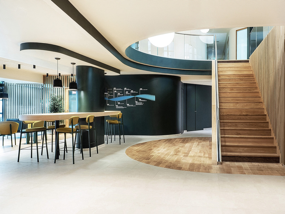
The association’s premises are located at 181 rue de Tolbiac in the basement levels of a 9-floor residential building dating back to the 1960s. Originally closed off with opaque sills and translucent windows, the facade has undergone a complete transformation.
The facade renovation achieves two primary goals: engaging with the city by opening up to its immediate surroundings, and harmonizing with the existing limestone facade on the upper floors. The new reception areas feature extensive glass, contributing to the vibrancy of the neighbourhood and making the Association more visible. Solid sections are treated with limestone cladding, showcasing the building’s heritage. Fluted stones on the first floor throw the smooth surface of those on the ground floor into relief, playing with light and shadow.
Enhanced spatial and social relations
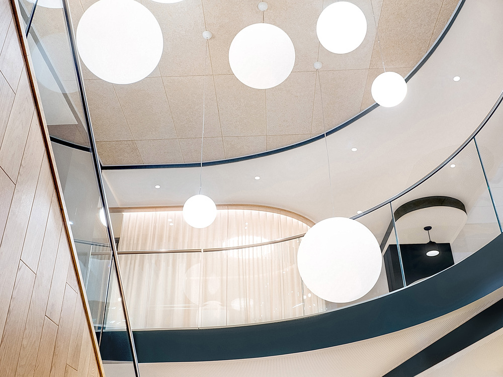
The existing premises had three major flaws: offices without natural light, a lack of welcoming spaces, and a lack of connections between the floors. Removing floorspace around the existing staircases provides a breath of fresh air to the lobby, creating more visual connections between levels.
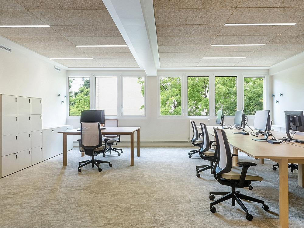
This new interior layout infuses fluidity between reception spaces and work areas. Through the creation of shared offices, the functional reorganization has placed all offices with access to natural light with more workstations than before. In addition to traditional workspaces, a range of intermediate spaces (coworking areas, gathering spaces, dining areas, etc.) have been designed to encourage greater interaction, strengthen the association’s bonds, and foster innovative ways of working.
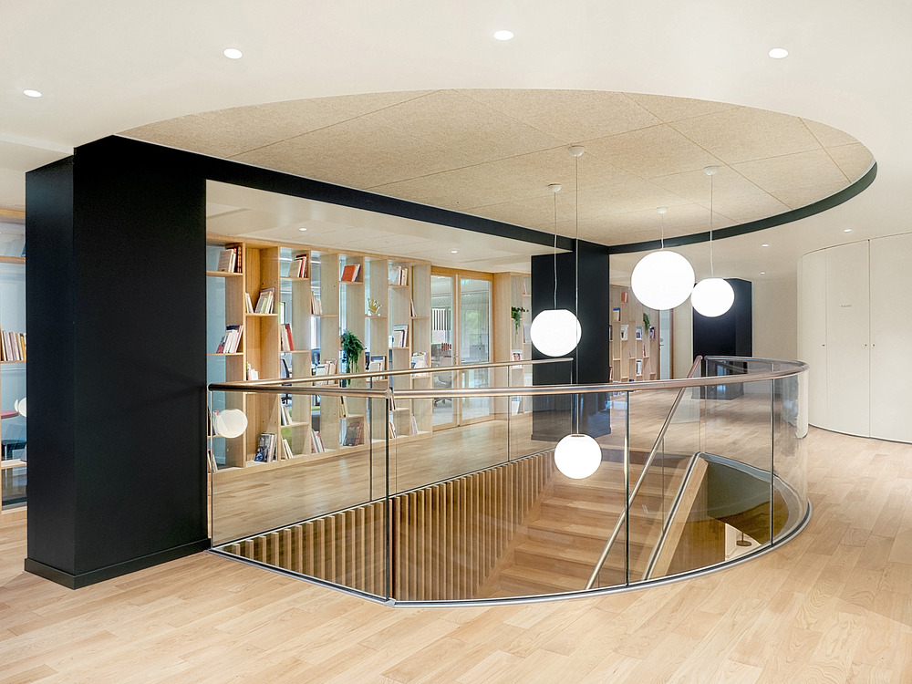
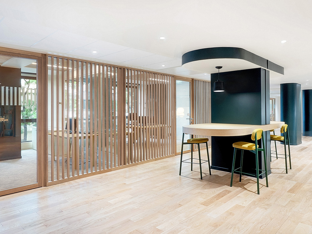
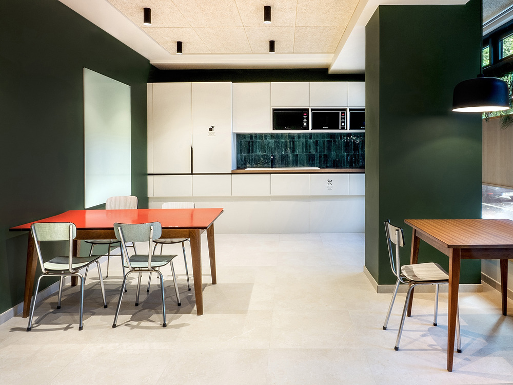
The functional organization of the new headquarters is divided by floor: on the ground floor, there are public spaces (reception, meeting rooms, social areas, coworking spaces, and dining), while the first floor houses workspaces for the association’s staff (individual offices, shared offices, and open workspaces available to all). The offices have extensive glass walls facing the central deck but, in order to maintain a high level of confidentiality, special attention has been paid to visual and acoustic insulation in certain areas. The double-skin glass partitions serve as both acoustic and visual filters, along with claustra, bookshelves, screen printing, curtains, and blinds.
A furniture layout in harmony with the Association’s values
As the physical heart of the association, Vaincre la Mucoviscidose‘s premises embody what it means to its patients: a humble, warm, caring spirit, with a backdrop of active advocacy. The spaces are designed to make everyone feel at home, and free to share their struggles and concerns related to the disease. Entering these spaces should feel like taking a breath of hope and resilience.
The colour scheme is reduced to two colours: Pantone’s Kombu Green, which is intense, and intimate, complemented by Farrow and Ball’s Dimity, a fresher, yet equally hospitable shade. Signage incorporates the association’s fresh and dynamic colours. Furniture shapes are flowing and curved, and the materials are unpretentious but warm, with a focus on solid oak for many pieces.
Sheer curtains create a sense of lightness and breath while creating a subtle play of transparency on the ground floor. On the first floor, the offices adopt the same warm and humble character as the ground floor, but with more of an official touch.
Source: v2com newswire


