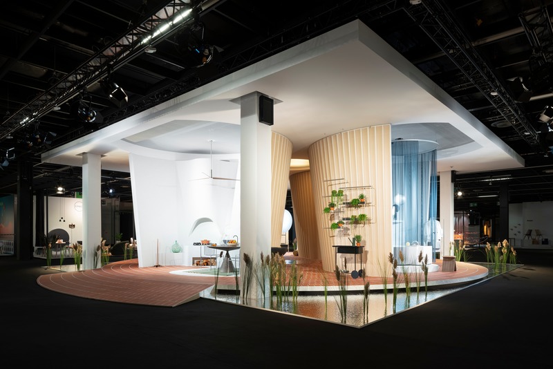
This year’s Das Haus installation enhances the International Furniture Fair Imm Cologne with an aspect that a lot of people find highly appealing: the idea of living “in between” – between architecture and nature, indoors and outside. Under the title “A la fresca!” – “Step out into the fresh air!” – the Spanish team MUT Design is creating an architecture that opens up to the outdoors, equipped with furniture that crosses the usual line between interior and exterior spaces.
In recent years, hot summers, a culture of sociable barbecue evenings, the surge of new weatherproof materials for patio furniture and a vague longing to live in touch with nature have turned outdoor living into a trend that is impacting many different areas of life – especially the way we use and design the interior and exterior spaces of our homes.
For the young Spanish team from MUT Design, there’s a lot more to orienting home life towards the outdoors than merely adapting interior design for patio use, as they demonstrate with their interpretation of the Das Haus design event at Imm Cologne 2020. It’s an experiment into how home life could function if the boundaries are blurred or even eliminated entirely – not just the boundaries between indoors and outside, but those between the individual areas of the home as well. How does that change the way spaces are perceived, how does it affect the requirements the furnishings have to meet?
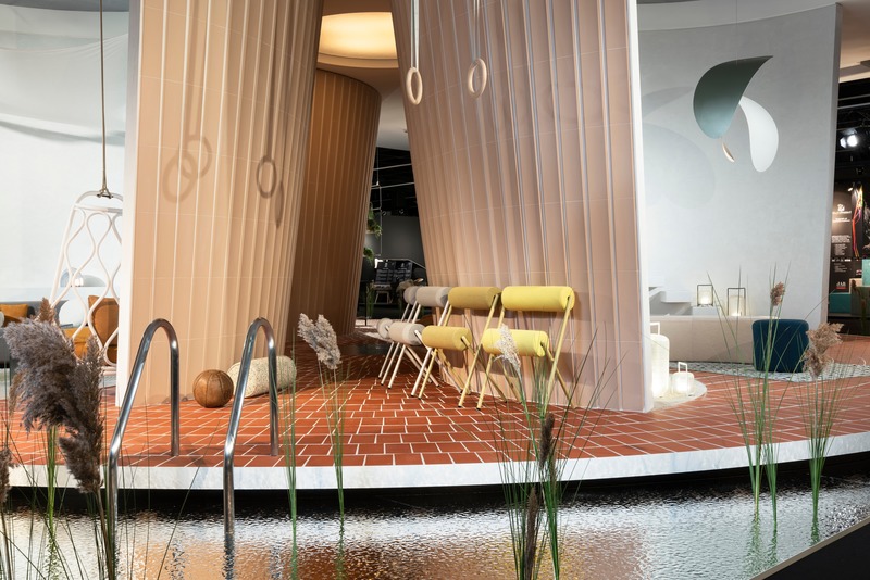
The stackable concept chair Roll (Sancal) looks mobile and robust.
Photo credit: Constantin Meyer; Koelnmesse
Clear-cut design for a home that hovers between nature and architecture
In the 2020 edition of Das Haus, some of the furnishings become part of the architecture – like a masonry bench that grows out of the whitewashed walls or a gangway that draws the gaze into the distance. Then, there are pieces that look as robust as a grill, some that hover over the bathtub like soap bubbles or, as in the case of the hammock that serves as a bed substitute, some that play with the shadows that the (imaginary) sun casts onto the floor through its open texture. The architecture and furnishings seem to merge into an informal whole. MUT Design anticipates the development of innovative lighting that will ideally simulate the natural course of the sun despite the fact that the light it emits is artificial. Because, for MUT Design, light is synonymous with energy.
While the forms of the “A la fresca!” house are inspired by modernism, the materials are more traditional – the designers include terracotta and ceramic tiles and white plaster resembling encalado. Varying between terracotta, cream and white and accentuated with blue, the warm colour scheme looks as if it has been taken straight from the Valencian landscape. The five living zones – the Active Area, Cleanness Area, Resting Area, Kitchen and Patio – have deliberately been assigned functions and names that leave plenty of scope for interpretation.
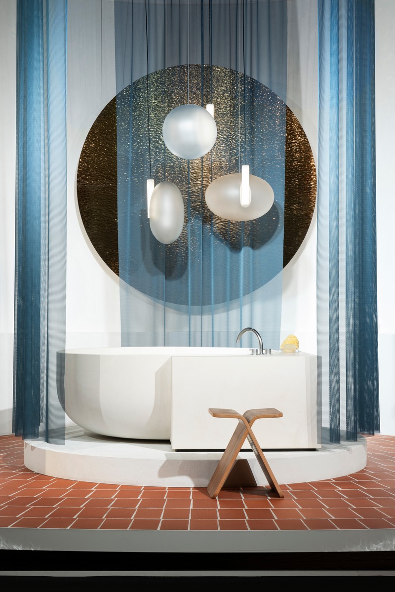
Photo credit: Constantin Meyer; Koelnmesse
Round forms, an empty centre and covered outdoor spaces
MUT Design’s interpretation of Das Haus for Imm Cologne 2020 features the canon of geometric forms that are typical of their work – and shows a clear preference for rounded shapes. At the same time, the Valencian-born designers Alberto Sánchez and Eduardo Villalón take a playful approach to the layout traditionally found in Spanish architecture by moving the patio, which is normally found at the centre of the building, to the outside. The patio is reinterpreted as a veranda, covering living areas that are totally open to their surroundings. In return, the only area the house provides for retreat occupies the position usually reserved for the inner courtyard.
This central space is surprisingly empty, almost bare – an ideal refuge with a thoroughly minimalist feel. “We pictured a space where you can focus without being influenced by anything, a space that doesn’t bombard you with stimuli so that you can retreat into yourself,” said the Spanish designers. “Because if you feel the urge to retreat, you ought to be able to do it properly.”
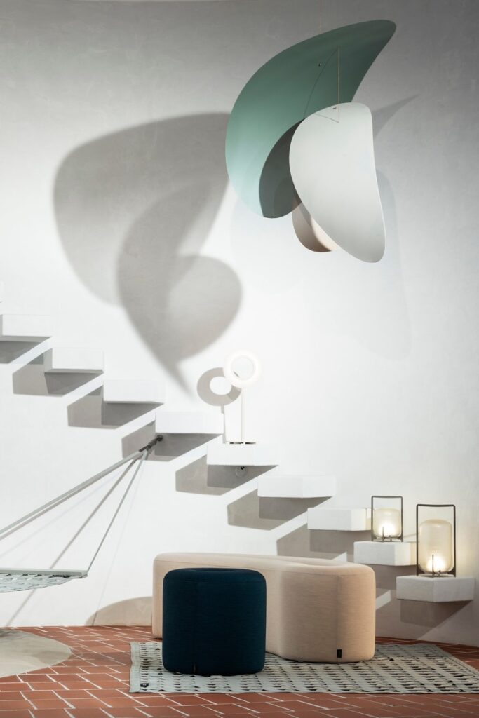
Photo credit: Constantin Meyer; Koelnmesse
Design for a community-oriented, active lifestyle
The inversion of the spatial structure doesn’t just stand for the elimination of boundaries between indoors and outside or the idea of interior spaces with an unspecified function; it also represents an approach to communal life that can be seen as a countermovement to cocooning. As stylish and minimalist as the design is, Das Haus 2020 is also a plea for an open interior concept in which functions like communication, relaxation and activity are more important than prestige.
With the title “A la fresca”, the Spaniards are alluding to the culture of evening get-togethers in the streets and squares that are still practised in village communities. After the heat of the day, which forces people to stay behind closed doors, this custom provides an opportunity to sit down together with neighbours and friends to enjoy the fresh breeze at leisure. “We’ve taken the concept of sharing and being together that moments like that embody and transferred it to Das Haus,” says MUT Design.
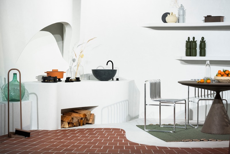
Photo credit: Constantin Meyer; Koelnmesse
Furniture designed for both/and instead of either/or
Contact with nature helps us relax – a function of the home that’s becoming increasingly important as we face growing challenges in terms of work commitments, overstimulation and mobility. That’s why architecture and design should incorporate links with nature as well by paying deliberate attention to the transitions. According to MUT Design, opening up the facades and creating outdoor furniture that satisfies the same high standards of design and cosiness as products for the living room are aspects that are worthy of closer consideration: “We don’t separate outdoor and living room furniture according to the usual norms. Nowadays, that’s the only way the interior design can create a consistent overall picture,” comments MUT Design.
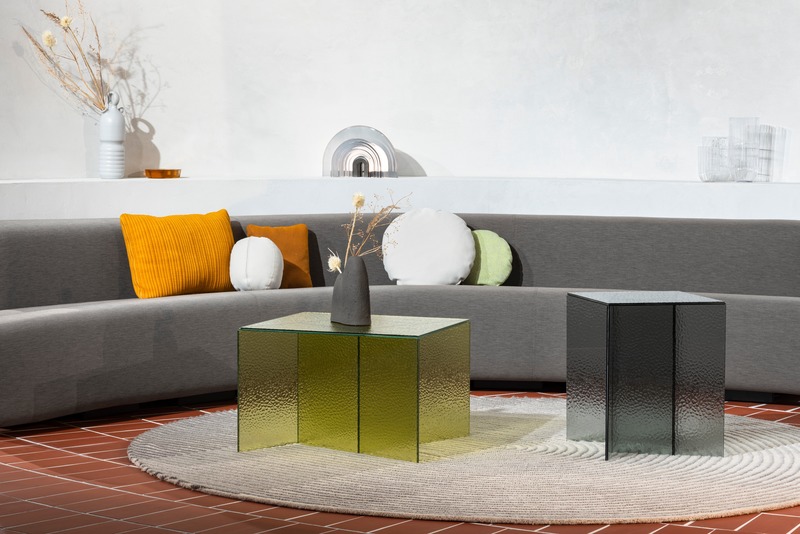
Photo credit: Constantin Meyer; Koelnmesse
A stunning showcase of prototypes
The furniture MUT Design has created for Das Haus underscores this both/and approach. Take the hammock and Zig Zag rug (GAN), for instance, which are made of artificial fibres suitable for outdoor use: their open weave incorporates the surroundings into the design by casting shadows and allowing the floor to peek through. A set of three glass side tables by the name of Aspa (Pulpo) also plays with transparency; the depth of colour varies depending on what angle they’re seen from. Then there’s the Armadillo armchair (Expormim); made from a material typically associated with classic outdoor furniture (rattan), it’s a reinterpretation of the papasan bowl chair that became popular in the middle of the last century. The stackable concept chair Roll (Sancal) and the Grill chair (Diabla), which is made of aluminium profiles, look mobile and robust, whereas the Bao pouffes (La Cividina) look as immovable as stones.
As for accessories, MUT Design is presenting Cala, a set of organically shaped ceramic vases (self-produced in collaboration with Porcelanas Lys, a traditional ceramics workshop near Valencia). Two new lighting ranges will also be on show in Das Haus: Plum (Preciosa Lighting), a collection of hand-blown glass luminaires that positions the light source on the outside of the shade as a coequal design element to astonishing effect; and Tomo (LZF), three suspension lamps that fit in anywhere and feature the translucent wood veneer the manufacturer is known for in a design evocative of book spines.
Photo credit: Roland Breitschuh; Koelnmesse
The design of the Cleanness Area mixes elements of the traditional bathroom with those of a communal bathing house. Like a hammam, this zone is meant as a cleansing place. The sanitaryware – a bowl-shaped bathtub and a washbasin reminiscent of a fountain basin (self-produced in collaboration with Mabello) – goes by the name of Eclipse and is combined with a new clothes stand that doubles as a room divider for the Nudo collection (Ex.t). Here in the Cleanness Area, the fusion of architecture and furnishings, indoors and outdoors is particularly striking.
The Bow ceramic wall tiles (Harmony) have also been created for Das Haus and mediate between the architecture and interior: inspired by the typical structures and roofing seen in Spanish towns, they evoke classic roof tiles but are concave rather than convex, giving interior walls and facades an expansive, modern but nevertheless familiar look. At Imm Cologne, they cover the striking, conical-looking walls of Das Haus with white ripples: a stylish look for an extraordinary house.
Source: v2com newswire


